
This content originally appeared on @mdo and was authored by Mark Otto
Sleek animations can help draw special attention to particular elements, actions, or content that might be important to people. It’s with movement we know an application in our docks is starting or that a webpage is still loading. With the right actions and context, well designed movement can be a very powerful tool for publishers like The New York Times and it’s readers.
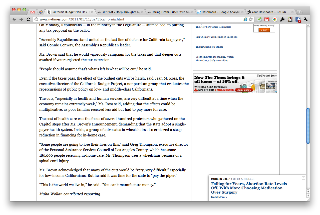
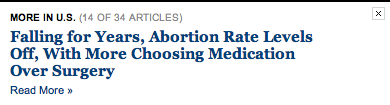
On NYTimes.com, movement is used to draw special attention to a “next article” link. Here’s how it works: when you get to the bottom of an article, a panel slides in from the right, overlaying the page’s content with a related article from that section of the site. For example, after I finished reading about the California budget crisis, I was presented with another article from the U.S. news section. Pretty spiffy if you ask me.
Why is this so awesome? Publishers want you to stay on their site, reading their content, sharing their content, viewing their ads, and participating in whatever social interactions they might throw at you. Business wise this is a huge win; it’s more time with them and less time with competitors. Design wise, it’s also a win for readers to find more great content behind an eye-catching animation.
In it’s brief moment of euphoria, engaging design movement can delight and surprise readers, all while meeting a business goal (more articles viewed) with a user need (wanting more great content). Win-win.
NYTimes.com may have seen they were losing site visitors after they read only one article, or they may have learned that visitors had a hard time finding more (related) content. Either way, presenting those visitors with a moving notification that playfully highlights more similar content is a click a way is a smart move.
I’d love to see some stats around this feature and how it has impacted user engagement. I’d also love to see what else they can do to iterate on this feature to make it more accurate, more useful, and easier to interact with.
Since writing this post, I’ve noticed that The Next Web has implemented the same element (in almost the exact same style I might add). Scroll down on an article to check it out there as well.
This content originally appeared on @mdo and was authored by Mark Otto
Mark Otto | Sciencx (2011-01-18T00:00:00+00:00) Movement in web design. Retrieved from https://www.scien.cx/2011/01/18/movement-in-web-design/
Please log in to upload a file.
There are no updates yet.
Click the Upload button above to add an update.