
This content originally appeared on Trent Walton and was authored by Trent Walton
I’m proud of myself because this is merely a post about new fonts rather than a post about a blog redesign. The perfectly-dialed-in textures and vibe from Phil Coffman’s recent redesign nearly pushed me over the edge, though. Anyways, I did what any sensible designer would do after letting the blog sit for too long: buy fonts!
I’ve had Grilli Type’s GT America on my font shopping list for a while. You’re reading GT America Standard Light + Light Italic now, and GT America Mono Regular is sprinkled across tags, meta info, etc.
Titles are set in a variable version of Denso by DSType Foundry who, I’d like to add, were so kind in helping me fine-tune some of the spacing.
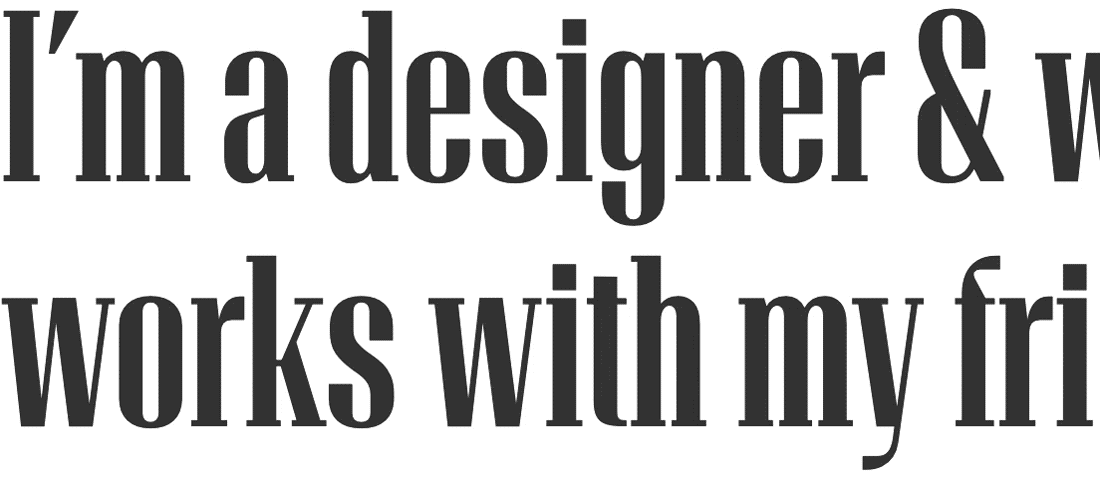
With the variable version, you can adjust levels for weight, serifs, and optical size/contrast. I’m still drinking the variable fonts Kool-aid—It’s fun to see the added utility (and kb savings) variable fonts can gain you.
This content originally appeared on Trent Walton and was authored by Trent Walton
Trent Walton | Sciencx (2020-02-18T00:00:00+00:00) New Fonts on the Ol’ Blog. Retrieved from https://www.scien.cx/2020/02/18/new-fonts-on-the-ol-blog/
Please log in to upload a file.
There are no updates yet.
Click the Upload button above to add an update.