
This content originally appeared on Level Up Coding - Medium and was authored by Mario Noble
Learning to embrace the WTF of Utility CSS: Part 2

Part 1 was a short “history of CSS” and an overview of Utility based CSS. Part 2 gets into Tailwind itself.
Why Tailwind
Ok, if you read Part 1, that was a loooong-winded “history” but we’ve arrived at the crux. If you didn’t check it out, it’s here.
Pat yourself on the back for reading it or scrolling quickly past. Yay! Oh no, didn’t read it? Review Part 1 here.
To Recap from earlier
So my friend had sent me a link to Tailwind and told me it was the bee’s knees. I said WTF is this dreck!

<div class="py-8 text-base leading-6 space-y-4 text-gray-700 sm:text-lg sm:leading-7">
Converting to the Cult of Tailwind
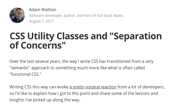
However, he also sent me this article (or maybe I found it, I don’t know):
CSS Utility classes and “Separation of Concerns” by the creator of Tailwind, Adam Wathan.
Reading it, I had a hard time arguing with his points and my personal experience pretty much dovetailed with his.
My friend said, just try it. I tried it on a few projects.
The past few years, I’ve never looked back.
Now, whenever I have to write and structure “normal CSS” I think to myself, “WTF!”.
What makes it different from the other utility frameworks?
- Better naming conventions. This is subjective though.
- Pretty easy customization. It has gotten more dev heavy and less designer friendly imho though.
- Built in Purge ability to automagically treeshake/prune down the file size.
- Awesome documentation.
- And most of all… the @apply feature.
The wonderfulness of @apply
With the other utility systems you had to either put your utilities into the html tag or not at all. I’m sure there were ways around this but that was the mentality.
Tailwind enables you to compose utilities in your regular CSS.
button {@apply rounded border-2 border-indigo-600 bg-indigo-200;
font-size: 1.5rem;
}
.button-primary {@apply bg-indigo-500;
}
You could also use your old css or styling that wasn’t covered by Tailwind at the time, like transitions, alongside.
And then use this in your html…
<a href="./special-page" class="button button-primary">My button</a>
Hey, that looks like my old CSS!
Yes, indeed.

This made Tailwind and a utility based approach much more practical to use and an easier sell to doubtful team members because you can more easily transition (pun intended) from your old css to the new approach.
Tailwind let people leverage utility classes in their regular CSS which enabled them to refactor their old css names but also take advantage of composition in those external CSS files and/or do it directly on the HTML tags if appropriate.
If they felt there was a common style that needed to be reused often, like buttons/links, they could put a custom class on it in the old way.
There are now better ways to add things like that in the Tailwind configuration like using plugins or adding utilities, but this made it easier to adopt quickly.
While this approach still leads to some of the problems using standard CSS approach, if you only create custom composed classes, then you should have more consistent styling (e.g. pt-4 is always padding-top: 1rem and not whatever padding the current team member thinks is correct).
Variants were cool too
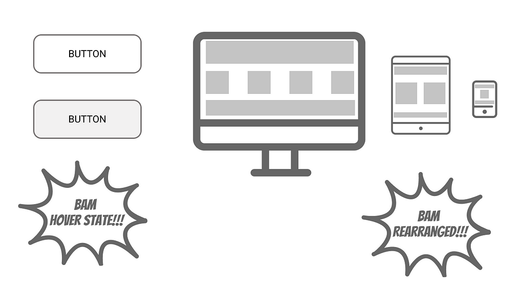
Tailwind also enabled you to write what they call variants, which let you target various event or device size states. They’re basically pseudo elements like hover and focus plus styles to be applied at different sizes right in the html itself.
<a href="./special-page" class="button button-primary hover:bg-red-300 focus:border-gray-600 md:w-16">My button</a>
This made it easier to reason about states right in the HTML if you wanted a particular effect on hover or add a style to a breakpoint like md (medium — 768px and above). Tailwind is mobile first, so all styles reflect that unless changed within a breakpoint.
By being flexible ideologically and adding lots of little convenience features, Tailwind is outpacing its competitors (even though Bootstrap still remains the most adopted) and it’s on track to perhaps be the CSS framework to Rule Them All.
I’ve been using the past tense, why?
This isn’t because Tailwind has gone away but because I was addressing the state of things a few years ago. It’s become considerably more robust since I first used it, pre-1.0. It is now up to 2.0 and change as of this writing.
By the way, I’m probably coming off as Tailwind booster. There are actually situations in which I don’t think it’s a good fit or not optimal. I’ll be going into them later on. As a side note, I am in no way affiliated with Tailwind right now although I might see if can contribute at some point.
How does it work?
While I can’t cover everything, I’ll try to give a brief conceptual overview of the main points. Want more? Check out the very thorough documentation.
Warning: We’re getting in the “weeds” ahead.

Basic One-to-One Utility properties
Usually some version of the actual css property will be written out like:
<span class="text-base">Some phrase</span>
The base is usually 1rem and usually translates into 16px.
This may also be a shortened version of multiple properties like the transition utility class. This is what will be in the final generated CSS.
transition-property: background-color, border-color, color, fill, stroke, opacity, box-shadow, transform;
transition-timing-function: cubic-bezier(0.4, 0, 0.2, 1);
transition-duration: 150ms;
Applying to sides and axis
Usually some version of the actual css property will be written out like text-base for font-size: 1rem. This may also be a shortened version of multiple properties like transition
For properties that usually have “four sides”, like margins, you’ll use an abbreviation.
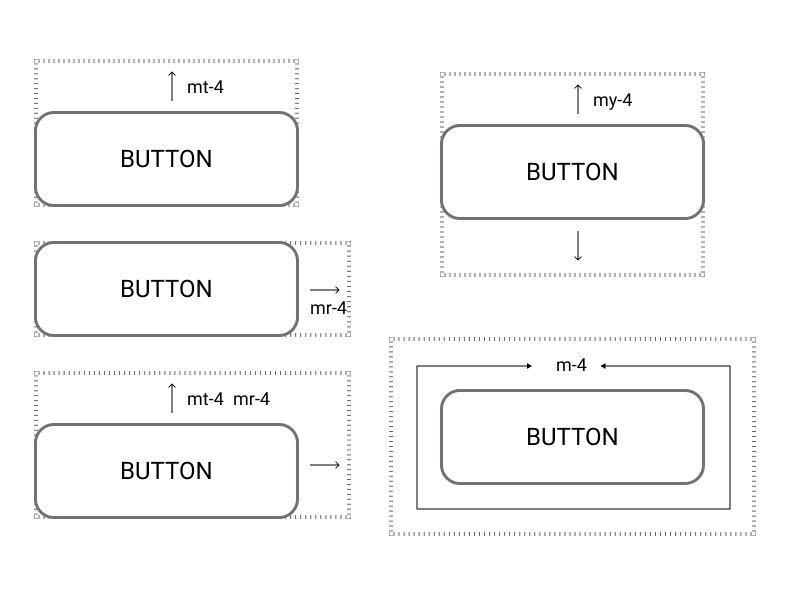
So, for padding or margin you’d use mt for padding top, and mb, mr, ml for bottom, right and left. Padding top would be pt. After the property, you add the unit of measure like mb-4 or mb-8. These units have a default value and scale usually equivalent to 1 rem per unit of scale.
4 is if you want the same 4 spacing to be applied around all sides, you’d use p-4.
You can also apply styling only on certain axis. Py-4 would add a unit to the top and bottom. Px-4 adds it to either side on the x-axis.
If py-2 and py-4 are used on the same element the one that comes last in the source CSS “wins”. Tailwind version 2.0 is different from version 1.0 in this respect.
Other measurement values
Some measures don’t use exact values but are more descriptive such as:
Sm, md, lrg, xl for borders or font sizing which uses a mix of units and descriptions (e.g text-4xl).
For tracking aka letter spacing: tracking-tighter, tracking-tight, tracking-normal, etc.
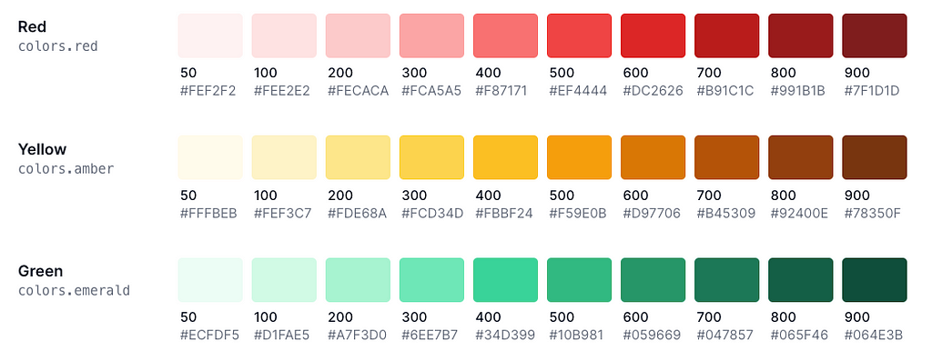
For colors it usually uses measurement unit in the hundreds: text-red-700, bg-red-800.
Opacity in tens, based on a 0–100 scale: opacity-50, opacity-80
Sometimes you’ll also see ¼ or full, min, max when dealing with widths and heights as well as minuses for things like negative margins. For example, -my-32 for 32 units of negative margin on the y axis.
Variant pseudo classes
Variants are based on states like hover or are applied at certain Responsive breakpoints and use a colon before the property.
States
<input class="bg-blue border-gray focus:bg-white hover:bg-black focus:border-white hover:border-black">
Responsive
<div class="text-center sm:text-left md:text-right"></div>
Since Tailwind is Mobile First, sm would be applied at 640px and above, md at 768px and above, etc.
All defaults can be overwritten, extended or removed in your configuration file. You can add your own too. More on that later…
You don’t have to stack variants after the non-variant styles but it helps to organize and visualize what is the “default” and what changes.
Responsive and State classes can be “stacked”.
There are also motion-safe, motion-reduce, and dark-mode variants.
Extracting classes
As detailed before, when you want to reuse a class over and over, extract it with @apply. We’ve already covered that earlier though, so yay! You may also add it using a plugin or new utility class in the configuration file.
Other Goodies

- Grid (makes it much easier to reason about)
- Gradients (these are now a snap)
- Transitions and Animations (good standard options)
- Dark mode (it’s the rage)
- Ring in place of shadow (an alternative to odd focus and shadow styling)
- Transform GPU (more performant transforms)
- SVG styling (easy stroke and fill styling)
- Screen Reader Styles (screen reader friendly treatment)
Getting it going
I deliberately put this after the Main Points, so as to explain Tailwind first and not get people worked up about the build process.
I will say that the build process is a potential stumbling block for teams that haven’t done something similar before and don’t have a developer to help.
Tailwind also has a CDN based version for those who don’t want to mess around with all that and want to quickly prototype. So all you need is to drop it into a webpage like jQuery does. However, you won’t be able to customize colors, properties and so forth nor use @apply.
They have a Playground to mess around with a full Tailwind setup too!
Initial Setup Process
Tailwind uses an npm install and PostCSS version 8. If you use autoprefixer, you’re using PostCSS.
There are special builds for Vue, React, Next, Nuxt, Laravel, etc. Some of these don’t support PostCSS 8 so there’s a compatibility mode for now.
The current version doesn’t support IE but previous versions do. So if that’s an issue, look at those.
You can even use pre-processors like SASS alongside if that floats your boat and they have an Intellisense extension for VS Code.
Configuration
Tailwind is very flexible and allows you to pretty tweak out anything, add to it or even remove it.

// Example `tailwind.config.js` file
const colors = require('tailwindcss/colors')module.exports = {
theme: {
colors: {
gray: colors.coolGray,
blue: colors.lightBlue,
red: colors.rose,
pink: colors.fuchsia,
},
fontFamily: {
sans: ['Graphik', 'sans-serif'],
serif: ['Merriweather', 'serif'],
},
extend: {
spacing: {
'128': '32rem',
'144': '36rem',
},
borderRadius: {
'4xl': '2rem',
}
}
},
variants: {
extend: {
borderColor: ['focus-visible'],
opacity: ['disabled'],
}
}
}For example, properties that are in a theme section “category” will replace the default properties and values. If you extend a category, the value will be added.
You can also add custom plugins and import presets.
Importing Tailwind’s styles
It comes with some basic normalization and defaults and these can be viewed in the generated css or the npm module.
They follow this structure:
@tailwind base;
@tailwind components;
@tailwind utilities;
@layer base {
  h1 {
    @apply text-2xl;
  }
  h2 {
    @apply text-xl;
  }
}
As an alternative to the configuration option, if you want to use or add your own, you can now add to a specific layer or add some conventional css outside of all that.
You can also add a screens function to tweak breakpoints here in addition to the regular, base, components and utilities.
Optimizing
Many people complain that Tailwind generates a massive CSS file (~3MB). This is totally true if you don’t use PurgeCSS to “tree shake” used styles to reduce the files size. This usually gets things down to 15K. It used to be that you had to do some special Purge configuration to make this happen. Now, it’s built in!
// tailwind.config.js
module.exports = {
  purge: [
    './src/**/*.html',
    './src/**/*.vue',
    './src/**/*.jsx',
  ],
  theme: {},
  variants: {},
  plugins: [],
}
Purging is usually best set to be done for production builds and not dev builds.
You can tweak this out in more granular details or prune using other methods outlined in the documentation.
Firing it up
If you’re using the CDN version, there’s not a lot to do.
If you’re building using npm or yarn, you’ll usually use whatever build process you usually do like npm start or npm run dev.
When not to use Tailwind
While I obviously think Tailwind is great and have detailed a lot of the advantages, there are some situations where I think it doesn’t work as well or shouldn’t be used at all.

Non-component based websites or apps
You can still use Tailwind, particularly with @apply, but if you’re just using some partial/server includes for a header, sidebar, footer and so forth, it may not be worth it; particularly if you want to use the utilities over and over. Doing a find and replace is possible though, and might be actually easier than hunting down styling issues in conventional CSS structures.
You have an extensive legacy CSS framework
It may not be worth it as well to refactor in part or as a whole your current setup. Doing so may just cause more headaches than it’s worth. However, if you’re already in CSS Hell, maybe go for it if everyone is on board. I’d test things out with a blank slate project/site/app first to see how you like it first. @apply makes this approach at least viable.
Needing to theme/skin very often
Although Tailwind has some good theming capabilities, if you use a regular non-component MVC site and need to skin versions that differ radically from each other such as tweaking pt-8 from many card sections or stripping indigo-700 that might be more difficult than just changing the padding or color on a general “card” class. That said, if you plan for this ahead of time and try to be agnostic or use a composition approach in your external CSS this might not be an issue.
Winding up
That took a while, huh?
TLDR;
We’ve been trying many approaches to style websites and apps for a while. These were often difficult to maintain and scale, particularly over time and with many people. Naming structures/conventions, CSS frameworks and design systems can get pretty unwieldy, ignored and often are more trouble than they’re worth.
Utilities enable styles to be composed, briefer and act as tokens between the properties and their values. They work best with component based systems like React, Vue, Angular, etc. Although they can also work with MVC systems too.
Retrofitting the approach with legacy styling can be challenging but Tailwind’s @apply helps a lot to make the transition. It also has good naming conventions, state management using variants and file size mitigation.
A Tailwind based Utility approach means:
- Everyone is literally on the same page/element so changes are scoped.
- Reduction, if not elimination, of CSS bloat and creep over time.
- Better customization and less Fighting the Framework™.
- No need to special file structures, name or naming conventions.
- Little need to think of good semantic names (or create bad ones).
- More composition and less inheritance.
- A more consistent approach overall via Mediation.
- Being able to leverage the CSS you have right now.
- Faster Prototyping
- Easily manage element states using variants.
- Fewer styling conflicts and less time debugging, if any.
- A good basis for creating a Design System.
Learn some new tricks and have some fun!
Even if you feel the approach isn’t correct for you, it’s worth knowing about it because it’s literally going to be one of the top major, modern solutions teams may adopt.
Give utility based styling with Tailwind a try!
Styling with Tailwind was originally published in Level Up Coding on Medium, where people are continuing the conversation by highlighting and responding to this story.
This content originally appeared on Level Up Coding - Medium and was authored by Mario Noble
Mario Noble | Sciencx (2021-02-25T01:10:13+00:00) Styling with Tailwind. Retrieved from https://www.scien.cx/2021/02/25/styling-with-tailwind/
Please log in to upload a file.
There are no updates yet.
Click the Upload button above to add an update.