
This content originally appeared on DEV Community and was authored by Atul Prajapati
Yes, you can make a responsive navbar with only HTML and CSS. Let's learn how?
First of all, you have to create an HTML file with these codes.
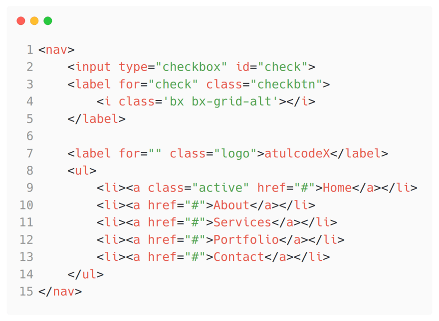
In this HTML file, I have created a nav tag for navigation I that I have separated into elements first is menu links which is visible by default on the desktop screen and second is the square box which will visible on small screen devices to hide/show the menu links in smartphone screens.
I have used <section></section> tag to add a huge image to cover the blank screen of the device.
That's it for the HTML code.

@import url('https://fonts.googleapis.com/css2?family=Poppins:ital,wght@0,200;0,400;0,600;1,200&display=swap');
By this line of code, I'm getting 'Poppins' font family from google font
Now i just you to play around with this codepen project
NOTE: ~ this is if else condition
This content originally appeared on DEV Community and was authored by Atul Prajapati
Atul Prajapati | Sciencx (2021-05-21T04:20:28+00:00) Responsive Navbar with only HTML and CSS. Retrieved from https://www.scien.cx/2021/05/21/responsive-navbar-with-only-html-and-css/
Please log in to upload a file.
There are no updates yet.
Click the Upload button above to add an update.