
This content originally appeared on DEV Community and was authored by Pritam Patil
The Problem
When working on UI layouts, for testing responsiveness - you may be used to either:
- DevTools with custom viewport sizes
- Or some extension e.g. Window Resizer
- Or resize the browser window itself
The problem with above approaches is you would be testing with fixed window sizes.
The solution
Enter css property resize
The property accepts 4 different values:
- both - resized both horizontally and vertically
- horizontal - resize it in the horizontal direction
- vertical - resize it in the *vertical direction
- none - no user-controllable method for resizing it.
The rules to use
resize:
- NO inline elements
overflowis NOTvisible
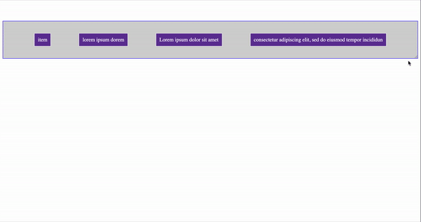
Say you have code that has items wrapped in a flex container:
  <ul class="items">
    <li> item </li>
    <li> lorem ipsum dorem </li>
    <li> Lorem ipsum dolor sit amet </li>
    <li> consectetur adipiscing elit, sed do eiusmod tempor incididun </li>
  </ul>
.items {
  display: flex;
  flex-flow: row wrap;
  justify-content: space-evenly;
}

li {
  border: 1px solid;
  padding: 10px;
}
To use resize, you'll wrap the ul with style as:
.container {
  display: block;
  overflow: auto;
  resize: both;
}
<div class="container">
  <li> item </li>
    <li> lorem ipsum dorem </li>
    <li> Lorem ipsum dolor sit amet </li>
    <li> consectetur adipiscing elit, sed do eiusmod tempor incididun </li>
</ul>
With this, you can test the responsiveness easily:
Codepen for a demo is available here
...
Follow me on twitter or Github.
This content originally appeared on DEV Community and was authored by Pritam Patil
Pritam Patil | Sciencx (2021-06-16T15:00:01+00:00) How to test your UI without resizing browser. Retrieved from https://www.scien.cx/2021/06/16/how-to-test-your-ui-without-resizing-browser/
Please log in to upload a file.
There are no updates yet.
Click the Upload button above to add an update.