
This content originally appeared on DEV Community and was authored by John Idogun
Motivation
Sometimes last year, around October, I came across this post1 about slack's biggest redesign. It looked quite appealing to me and I tasked myself to make a clone of this page

using pure CSS3 and HTML5. I also wanted to ensure that it's totally responsive irrespective of the screen size.
Declaimer
I am not fully into frontend stuff and hence not an expert. This was just for learning purposes. Comments, suggestions and constructive critism are welcome.
Source code
The full code for the clone is on github.
 Sirneij
/
slack-clone-ui
Sirneij
/
slack-clone-ui
A responsive and beautiful slack clone UI with rich text editor created from scratch using HTML5, CSS3 and Vanilla JavaScript
slack-clone-ui
A beautiful and responsive clone of the popular collaborating software, Slack! It has most of its UI's features implemented. It was written in pure HTML5, CSS3 and Vanilla JavaScript.
Demo
To see it in action, check here.
It was also hosted on github pages and can be accessed here.
Implementations and decisions
Before starting out, I was a bit comfortable with CSS3 and HTML5 but grids and flexboxes were a bit fuzzy for me. I decided right there and then to learn these features. Therefore, the whole application was built using them.
Starting from with the container which is the wrapper for all the element's page:
...
 <body>
    <div class="container">
    ...
    </div>
    ...
</body>
I ensured that it fills the entire width and height of the screen with one column and two rows:
...
.container {
  height: 100vh;
  width: 100vw;
  display: grid;
  grid-template-columns: 1fr;
  grid-template-rows: 2.375rem 1fr;
}
...
The header starts from row 1 and ends on row 2:
...
.header {
  grid-row: 1 / 2;
  ...
}
...
main howevers starts from row 2 till the end and it was also made a grid layout which comprises a sidebar(another grid layout) and body(yet another grid layout):
...
.main {
  grid-row: 2 / -1;
  display: grid;
  grid-template-columns: 16.25rem 2fr;
  ...
}

.sidebar {
  ...
  grid-column: 1 / 2;
  ...
  display: grid;
  grid-template-columns: 4rem minmax(6.25rem, 16.25rem);
}
...
.body {
  grid-column: 2 / -1;
  ...
  display: grid;
  grid-template-columns: 1.5fr 1fr;
}
...
The leftmost part of the sidebar contains flexboxes likewise many other parts of the entire application.
To ensure proper responsiveness, notable breakpoints were screens with maximum width of 1250px, 960px, 918px, 834px, 806px, 724px, 786px, 754px, 600px, 506px, 500px, 495px, 422px, ...
That was mouthful!!! There should be a better way!!! I couldn't figure that out though! Help me out using the comment section.
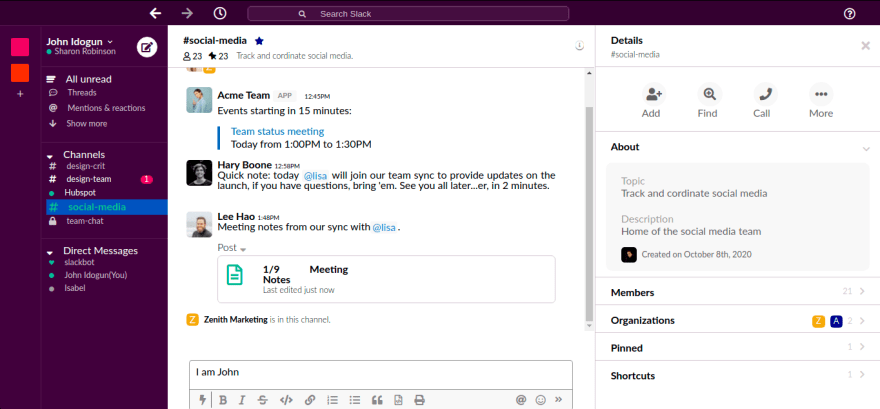
All the styles and markups gave rise to the artifact below:
One cool thing about the sojourn was the implementation and styling of slack-like rich-text editor using the deprecated JavaScript's execCommand. It was fun and exciting.
A bit of JavaScript handled the rich text editor and some toggles for showing and hiding some parts of the grids.
...
// sidebar
if (user) {
  user.addEventListener("click", () => {
    if (sideBarWrapper) {
      sideBarWrapper.classList.add("sidebar-wrapper-display");
    }
    if (sideBar) {
      sideBar.classList.add("user-sidebar-display");
    }
  });
}
if (closeSideBar) {
  closeSideBar.addEventListener("click", () => {
    sideBar.classList.remove("sidebar-display");
    sideBarWrapper.classList.remove("sidebar-wrapper-display");
  });
}
...
All vanilla!!! For the rich text editor, this MDN guide2 was my saviour.
That's the bit I want to talk about. Kindly check it out and make suggestions.
-
Slack unveils its biggest redesign yet - by Tom Warren ↩
This content originally appeared on DEV Community and was authored by John Idogun
John Idogun | Sciencx (2021-06-30T21:54:41+00:00) Building Slack UI with pure HTML5, CSS3 and JavaScript: The power of CSS grids and flexbox. Retrieved from https://www.scien.cx/2021/06/30/building-slack-ui-with-pure-html5-css3-and-javascript-the-power-of-css-grids-and-flexbox/
Please log in to upload a file.
There are no updates yet.
Click the Upload button above to add an update.