
This content originally appeared on DEV Community and was authored by Sai Pavan
What is a media-query?
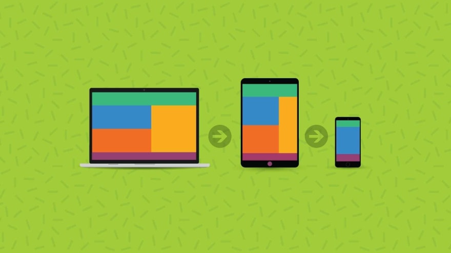
A Media Query is a CSS Technique that uses a @media and @import at-rules which helps in invoking CSS properties inside a block only if the desired condition is true for various device resolutions.
Ex:
@media only screen and (max-width: 600px) {
  body {
    background-color: lightyellow;
  }
}
Adding breakpoints..
Breakpoints help in eliminating clutter of rows and columns made in a web page. It was responsive but it wasn't made for a smaller screen with a lower resolution like Mobile Phones, Tablets, etc.
Ex:
@media (max-width: 768px) {
  html {
   color: gray;
   font-size: 1rem;
  }
}
Improving the compatibility with outdated or older browsers
Certain browsers don't support media queries and the applied media features like styling does not get implemented. The example being displayed below has no effects on modern browsers.
@media only screen and (max-width: 600px) {
  body {
    background-color: lightblue;
  }
}
This content originally appeared on DEV Community and was authored by Sai Pavan
Sai Pavan | Sciencx (2021-10-23T20:23:45+00:00) Media Queries – CSS. Retrieved from https://www.scien.cx/2021/10/23/media-queries-css/
Please log in to upload a file.
There are no updates yet.
Click the Upload button above to add an update.