
This content originally appeared on DEV Community and was authored by Ewald van Veen
I’m a big fan of layout systems like CSS Grid and Flexbox. Whether you choose Grid to build a web page from scratch or Flexbox or both at the same time, either one of them can get the job done for you. Add a few media queries and you can build a responsive layout for multiple devices and screen sizes.
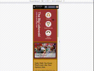
In this example (link to Codepen below) I have built a web page using only CSS Grid. Maybe for some specific styles in the example Flexbox might have been a more suitable choice, but CSS Grid will definitely get the job done.
Because I’m also a big fan of the Coen Brothers movies, I gave the web page example a Big Lebowski movie theme. Hopefully you’ll enjoy it and if you’ve got any feedback please feel free to respond.
Here is the link to the example on Codepen.
This content originally appeared on DEV Community and was authored by Ewald van Veen
Ewald van Veen | Sciencx (2021-12-10T13:26:30+00:00) Create a responsive web page with CSS Grid – Big Lebowski style. Retrieved from https://www.scien.cx/2021/12/10/create-a-responsive-web-page-with-css-grid-big-lebowski-style/
Please log in to upload a file.
There are no updates yet.
Click the Upload button above to add an update.