
This content originally appeared on Bits and Pieces - Medium and was authored by Fernando Doglio
A well defined, documented and easy to use UI components library

There is a running joke within the JavaScript community about how a new framework is released every month.
Well, there should be one for how a new React component library is released every month. The number of options out there is too big and picking one is not trivial.
Recently I started working with a particular component library that has everything you might need and more, so let’s take a look at the Material UI library, which has been around for a while, but not everyone knows about it for some reason.
What is MaterialUI?
MaterialUI aims to be the only UI library that you’ll ever need by providing you with every component that you might think of.
Now, keep in mind this is not a replacement for something like Bootstrap, where you’re only provided with a set of basic building blocks that are purely visual.
MUI (which is how we can abbreviate MaterialUI’s name) provides different types of components:
- Input related, such as buttons, sliders, rating selectors, text fields and more.
- Data display components, like lists, icons, tables, badges, avatars, etc.
- Feedback-related components allow you to transmit something back to your users, like progress bars, modals, skeleton placeholders, etc.
- Surface components. These are like special containers with specific functional purposes in mind, like the main nav bar, an accordion menu and others.
- Advanced nav elements, like steppers (the ones you’d use to create wizard-like UIs), paginations, menus and more.
- Basic layout components that allow you to organize the visual structure of your app. We’re talking about the classic grids, image lists, stacks, boxes and more.
- Utility components that help you improve the UX of your app, like easy transitions, modals, a CSS baseline to kick-start the CSS your development and more.
And if you want to go even further, you can install MUI-X which provides you with a Data Grid component and a very powerful, yet simple, Date & Time pickers.
Getting started with MUI
Installing MUI into your project is trivially easy, simply use the following line:
After this is ready, you can simply start importing your favorite components. But it would be good to also install some optional elements that aren’t added by default, like the fonts and the icons, which you’ll most likely use anyway:
Let’s now build something interactive with it, so you get an idea of how easy it is to get started with MUI.
Building a simple To-Do app with MUI
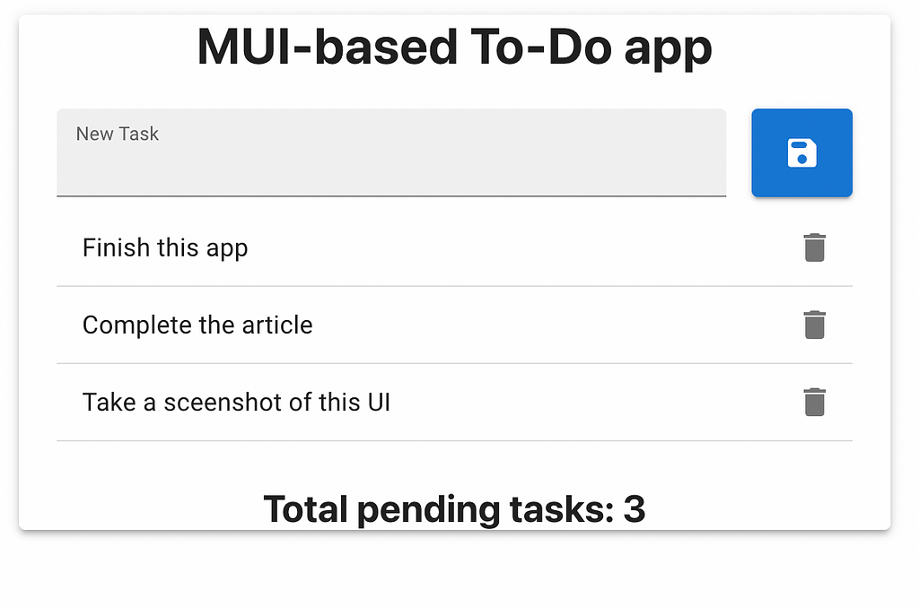
Everybody knows To-Do apps are the “Hello World” of UI development, so let’s see what it would take to build one using MUI.
The end result will look like this, using all default styles and zero customization:
The first thing we’ll want to do is make sure our layout is horizontally centered, and for that, we’ll simply make use of the Container component.
However, while this component will perfectly center our app, it will not make it “pop” as it does on the screenshot. For that, we’ll use the Paper component which allows us to define an “elevation”. Meaning, we’ll add a shadow behind our container.
Our HTML so far looks like this:
I’ve set the maxWidth property of the Container to “sm” because I don’t want it to take the full width of the page. And the elevation of 3 gives it a small but noticeable shadow.
Next, we’ll add the title with a simple h1 element, nothing fancy here. We’ll then add a new Container to add some padding inside the container box.
Inside this new container, we’ll add:
- The input field and the “save” button.
- The list of to-do items
- The final task counter
To get the input field and the save button next to each other, we’ll use a Stack container, which allows us to define if we want the stack to be vertical or horizontal. And we can even set a spacing value, like this:
See the Stack component on line 5. That’s all we need to have our horizontal layout. The TextField component will render the nice-looking input box, and we’ll use its inputRef to add a direct reference to the internal input element. We’ll use it later for the logic of the application. Same for the error and helperText properties, they will come in handy once we start implementing the validation logic.
The list of to-do items is going to use a List component, and inside it, we’ll add a custom ToDoItem component that looks like this:
Leaving the boilerplate code aside, this component is using the ListItem component with a secondary action (which is the delete button that shows on the right edge of the item).
And inside the ListItem we’ll add a ListItemText element to display the name of the task.
Finally, the task counter will only be an h2 element inside a Container component.
So the final JSX looks like this:
Let’s now add a bit of JavaScript to make everything work.
Adding the business logic
We have 2 triggers on this app:
- Clicking the “save” button will add the task to our list.
- Clicking the task’s “delete” button will remove it.
To add the task, we’ll take advantage of the inputRef property set on the TextField component. So the addToDo function will look like this:
Notice how we’re also performing the input validation here, if the text field is empty, we’ll set a state variable with an error message (which we’re using to trigger the error state on the TextField above).
Adding the new task then, it’s just a matter of setting the state variable that contains these elements. They are objects with an id property and a text property. The id is simply the length + 1, but it helps later to identify the item when we’re trying to remove it.
I’m also resetting the content of the input field on line 14.
Removing items is trivial with this setup. Since we have the ID of each element, we call the removeTodo function which looks like this:
I’m just filtering out the unwanted task, and then resetting the state variable with the result.
That’s all.
If you’d like to review the code of this sample application, you can check it out in this Github repo.
Have you tried using MUI before? What do you think about it? I personally find it quite complete and easy to use. And on top of that, their documentation is fantastic, super detailed and most importantly filled with examples.
If you’re looking to build a new app with and are wondering what UI library to go with, give MUI a chance, you won’t regret it!
Go composable: Build apps faster like Lego

Bit is an open-source tool for building apps in a modular and collaborative way. Go composable to ship faster, more consistently, and easily scale.
Build apps, pages, user-experiences and UIs as standalone components. Use them to compose new apps and experiences faster. Bring any framework and tool into your workflow. Share, reuse, and collaborate to build together.
Help your team with:
Learn more
- How We Build Micro Frontends
- How we Build a Component Design System
- The Bit Blog
- 5 Ways to Build a React Monorepo
- How to Create a Composable React App with Bit
The Last Component Library You’ll Ever Need: an Intro to Material UI was originally published in Bits and Pieces on Medium, where people are continuing the conversation by highlighting and responding to this story.
This content originally appeared on Bits and Pieces - Medium and was authored by Fernando Doglio
Fernando Doglio | Sciencx (2022-09-13T07:56:24+00:00) The Last Component Library You’ll Ever Need: an Intro to Material UI. Retrieved from https://www.scien.cx/2022/09/13/the-last-component-library-youll-ever-need-an-intro-to-material-ui/
Please log in to upload a file.
There are no updates yet.
Click the Upload button above to add an update.