
This content originally appeared on Level Up Coding - Medium and was authored by Andrew Allison
With a little help from Material UI

Ever wondered how a website can have a persistent navigation menu on every page? How about performing URL routing on the frontend? For some this functionality might seem basic but if you are brushing up or new to it the following walk through will be useful.
Scenario
Let’s say you have a client that wants you to build a UI with the following menu options:
- Home
- Shop
- Dashboard
- Settings
- Account
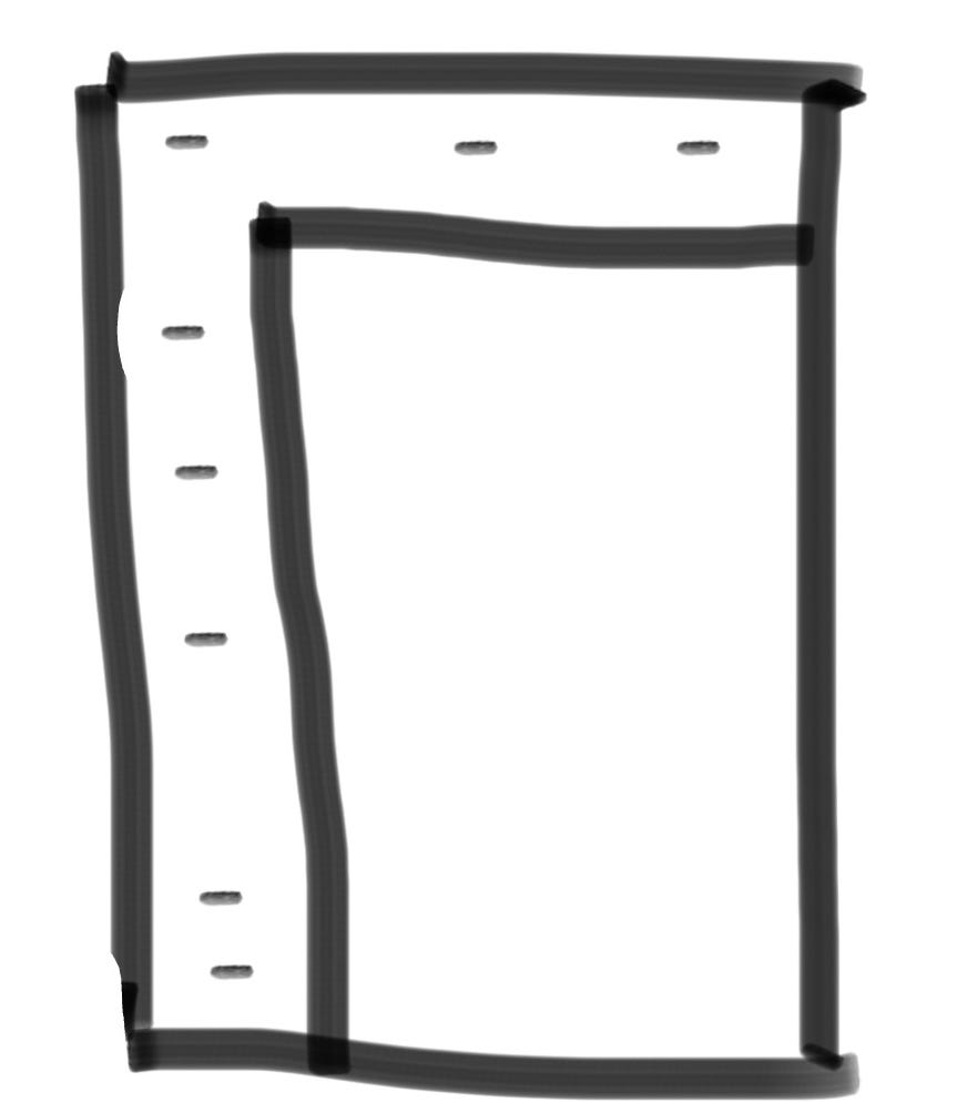
Furthermore, you have been provided with some mock ups that show the Navigation Bar bordering the left side and top of the screen. Menu options are shown with icons next to the text and an expandable drawer.
Setup
As a prerequisite you should install node version manager. Once you have that up and running we’re going to use (as of October 25th, 2022) the latest long-term-support version of Node.js:
$ nvm install 18 && nvm use 18
Next we are going to bootstrap our React project using our trusty create-react-app:
$ npx create-react-app navigation-drawer --template typescript
Here the name is “navigation-drawer” but feel free to call whatever you want. create-react-app will create a directory for you so change into that directory in your terminal:
$ cd navigation-drawer
Then we’re going to start by installing some packages we will use later:
$ npm i react-router-dom @mui/material @mui/icons-material @emotion/react @emotion/styled
Just for reference here is an explanation of what these packages are doing:
- react-router-dom — (Version 6.3.0, Unpacked Size: 169 kB) — React Router is a lightweight, fully-featured routing library for the React JavaScript library. React Router runs everywhere that React runs; on the web, on the server (using node.js), and on React Native
- @mui/material — (Version 5.10.1, Unpacked Size: 9.51 MB) — A comprehensive library of components that features an implementation of Google’s Material Design system
- @mui/icons-material — (Version 5.8.4, Unpacked Size: 17.8 MB) — A package that provides the Google Material Icons converted to SvgIcon components
- @emotion/react — (Version 11.10.0, Unpacked Size: 549 kB) — A performant and flexible CSS-in-JS library. Building on many other CSS-in-JS libraries, it allows you to style apps quickly with string or object styles. It has predictable composition to avoid specificity issues with CSS. With source maps and labels, Emotion has a great developer experience and great performance with heavy caching in production
- @emotion/styled — (Version 11.10.0, Unpacked Size: 174 kB) — The styled API for @emotion/react
Coding
This always everyone’s favorite part. Open the bootstrapped React project in your favorite IDE. Start by creating 5 directories inside the src/ directory:
$ cd src && mkdir components media pages styles types
Now your project directory structure should look like this:
public/
src/
  --> components/
  --> media/
  --> pages/
  --> styles/
  --> types/
.gitignore
README.md
package-lock.json
package.json
tsconfig.json
Within the src/index.tsx file, replace the boilerplate contents with this:
import React from 'react';
import ReactDOM from 'react-dom';
import App from './components/App';

ReactDOM.render(<App />, document.getElementById('root'));
You ought to see a ton of red lines everywhere but that’s okay because we’re going to fix it up soon. Then we’re going to create a file inside the components/ directory App.tsx and populate it with this:
import React, { FC } from 'react';
import { BrowserRouter as Router } from "react-router-dom";
import AppRouter from './AppRouter';

const App: FC = () => (
  <Router>
    <AppRouter />
  </Router>
);

export default App;
BrowserRouter (which we’ve aliased to Router) is a component that uses the HTML5 history API to keep your UI in sync with the URL. We’ve wrapped this around our app’s routes which are in AppRouter. Next we need to create our app’s routes in components/AppRouter.tsx. This component will start out looking like this:
import React, { Suspense } from 'react';
import { Route, Routes } from "react-router-dom";
import { Grid } from '@mui/material';

const DemoPage = ({ pageName }: DemoPageProps) => <h1 style={{ margin: '1rem' }}>Demo Page: {pageName}</h1>;
const DemoSpinner = () => (<p>Spinner</p>);
const AppRouter = () => (
    <Grid className="container">
      <Suspense fallback={<DemoSpinner />}>
        <Routes>
          <Route path="/" element={<DemoPage pageName="Home" />} />
          <Route path="/shop" element={<DemoPage pageName="Shop" />} />
          <Route path="/dashboard" element={<DemoPage pageName="Dashboard" />} />
          <Route path="/about" element={<DemoPage pageName="About" />} />
          <Route path="/settings" element={<DemoPage pageName="Shop" />} />
          <Route path="/account" element={<DemoPage pageName="Account" />} />
        </Routes>
      </Suspense>
    </Grid>
);

export default AppRouter;
Here our default route is the Home page. Note how we can specify a route at the “root” / above a list of sub-routes, i.e. /about . Previously this would have added a bug to the app since the / route would intercept anything that came after it. This has since been addressed in the react-router-dom package. Right now we only have a single content component which we are reusing for all routes so let’s go ahead and update that. In the pages/ directory create Page.tsx :
import React from 'react';

interface PageProps {
  pageName: string;
}

const Page = ({ pageName }: PageProps) => (
  <h1 style={{ margin: '1rem' }}>Demo Page: {pageName}</h1>
);

export default Page;
This is going to act as a placeholder for the purposes of the tutorial but ideally you wouldn’t do it this way in a professional project. I won’t cover it in this article but you should create a different React component inside the pages/ directory for each page you want in your website. This isolates the functionality and is a cleaner implementation than having every page fit into this one React component. Looking back at our AppRouter.tsx component we see that there is also a Spinner component being used. This is going to be displayed whenever we are loading new content into the DOM. Let’s give Spinner it’s own file; in components/ create Spinner.tsx :
import React from 'react';
import { CircularProgress, Box } from '@mui/material';

const Spinner = () => {
  return (
    <Box sx={{ display: 'flex', color: 'grey.500' }}>
      <CircularProgress />
    </Box>
  );
};
export default Spinner;
Going back to AppRouter.tsx we should now have a Page and Spinner component ready to use. An updated version of this component looks like this now:
import React, { Suspense, lazy } from 'react';
import { Route, Routes } from "react-router-dom";
import { Grid } from '@mui/material';
import SiteNavigation from './SiteNavigation';
import Spinner from './Spinner';

const About = React.lazy(() => import("../pages/DemoPage"));
const Dashboard = React.lazy(() => import("../pages/DemoPage"))
const Account = lazy(() => import('../pages/DemoPage'));
const Shop = lazy(() => import('../pages/DemoPage'));
const Home = lazy(() => import('../pages/DemoPage'));

const AppRouter = () => (
  <SiteNavigation>
    <Grid className="container">
      <Suspense fallback={<Spinner />}>
        <Routes>
          <Route path="/" element={<Home pageName="Home" />} />
          <Route path="/shop" element={<Shop pageName="Shop" />} />
          <Route path="/dashboard" element={<Dashboard pageName="Dashboard" />} />
          <Route path="/about" element={<About pageName="About" />} />
          <Route path="/settings" element={<Shop pageName="Shop" />} />
          <Route path="/account" element={<Account pageName="Account" />} />
        </Routes>
      </Suspense>
    </Grid>
  </SiteNavigation>
);

export default AppRouter;
Notice how we are lazy loading our pages to accept requests to the corresponding route. Lazy loading let’s you defer loading the bundled code for a certain component until the moment it’s being called. There is also a SiteNavigation component that we are wrapping the routes inside. Here is where it gets interesting. To create SiteNavigation.tsx let’s start off with the following code in the components/ directory:
import React, { useState } from 'react';
import { useNavigate, useLocation, NavigateFunction } from 'react-router-dom';
import { Grid } from '@mui/material';
import * as H from 'history';
import ErrorBoundary from './ErrorBoundary';
import '../styles/SiteNavigation.css';

interface SiteNavigationProps {
  children: any,
}

function setInitialRoute(
  location: H.Location,
  navigate: NavigateFunction,
): void {
  // eslint-disable-next-line @typescript-eslint/no-unused-vars
  const [_root, route] = location.pathname.split('/');
  if (route && route === 'logout') navigate('/');
}

const SiteNavigation = (props: SiteNavigationProps) => {
  const { children } = props;
  const location = useLocation();
  const navigate = useNavigate();
  setInitialRoute(location, navigate);
  // eslint-disable-next-line @typescript-eslint/no-unused-vars
  const [isSideBarOpened, setIsSidebarOpened] = useState(false);

  return (
    <Grid className="SiteNavigation">
      <Grid className="top">

      </Grid>
      <Grid className="bottom">
        <Grid className={isSideBarOpened ? 'left opened' : 'left'}>
          <Grid className="bottom-left-top">

          </Grid>
          <Grid className="bottom-left-bottom">

          </Grid>
        </Grid>
        <Grid className="right">
          <ErrorBoundary>
            {children}
          </ErrorBoundary>
        </Grid>
      </Grid>
    </Grid>
  );
};

export default SiteNavigation;
Take a minute to pause and look at the app so far; it’s looking very plain:
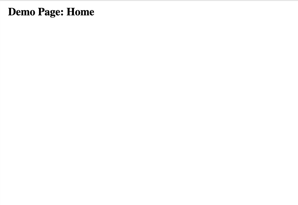
If I were coding this from scratch I would start to add styling to all components at this point. Let’s start with styles/index.css and styles/App.css :
For the purposes of doing a tutorial I’m writing the styles in plain CSS. For a professional project you might want to use the preferred way of styling with Material-UI using Theming and CSS-in-JS. Next let’s style the SiteNavigation component (styles/SiteNavigation.css):
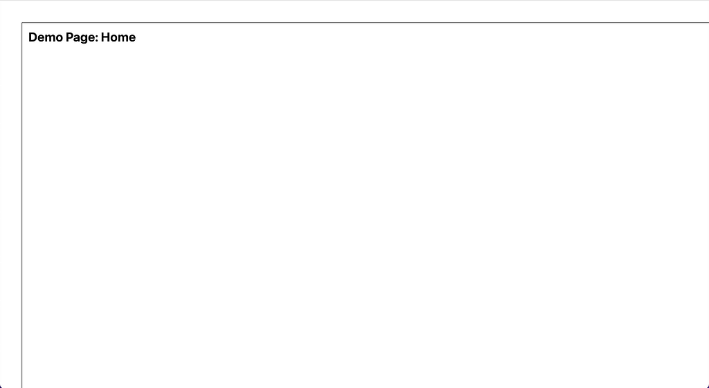
Now when we look at the app in the browser it’s starting to look a little more professional. Some important things to note about the styling:
- It uses a responsive design with flexbox layout. Line 118 of styles/SiteNavigation.css shows the media query used to hide non-core functionality elements on mobile screens.
- We stick to a standard color scheme with primary and secondary color hex codes (#61DAFB for light blue highlights and #FFFFFF for white background and #000000 for black text and border).
- Clicking the Arrow Icon controls the drawer open/close state. It also rotates depending on the this state. The lines 154 to 172 of styles/SiteNavigation.css show how this is done.
- There is a split between the top menu icons and bottom menu icons
- Highlighting the current page/route is also animated as shown in lines 135 through 151 in styles/SiteNavigation.css.
The last thing for us to do now is add the menu options. We can update the components/SiteNavigation.tsx component with the following:
import React, { useState } from 'react';
import { useNavigate, useLocation, NavigateFunction, Link } from 'react-router-dom';
import { Alert, Badge, Grid, Typography } from '@mui/material';
import { NotificationsOutlined } from '@mui/icons-material';
import * as H from 'history';
import { bottomIcons, SiteNavigationIcon, topIcons } from '../types/SiteNavigationIcon';
import { NotificationItem } from '../types/NotificationItem';
import NotificationsList from './NotificationsList';
import RotatingArrow from './RotatingArrow';
import ErrorBoundary from './ErrorBoundary';
import Search from './Search';
import Logo from '../media/logo.svg';
import '../styles/SiteNavigation.css';

interface SiteNavigationProps {
  children: any,
}

function setInitialRoute(
  location: H.Location,
  navigate: NavigateFunction,
): void {
  const [, route] = location.pathname.split('/');
  if (route && route === 'logout') navigate('/');
}

const SiteNavigation = ({ children }: SiteNavigationProps) => {
  const location = useLocation();
  const navigate = useNavigate();
  setInitialRoute(location, navigate);

  // eslint-disable-next-line @typescript-eslint/no-unused-vars
  const [error, setError] = useState<Error | undefined>(undefined);
  const [pageName, setPageName] = useState('');
  const [isSideBarOpened, setIsSidebarOpened] = useState(false);
  const [numNotifications] = useState<number>(0);
  // eslint-disable-next-line @typescript-eslint/no-unused-vars
  const [showNotifications, setShowNotifications] = useState<boolean>(false);
  const [notifications] = useState<NotificationItem[]>([]);

  const onClickShowNotifications = () => {
    // Fill in your code for displaying the notifications list here!
  };

  const onSearch = (searchString: string) => {
    // Fill in your code for calling the backend API here!
  };

  const toNavLink = (icon: SiteNavigationIcon) => {
    const IconComponent = icon.component;
    return (
      <Link
        to={icon.path}
        onClick={() => setPageName(icon.key)}
        key={icon.key}
        className={pageName === icon.key ? 'underlined icon' : 'icon'}
      >
        <IconComponent
          fontSize="large"
          htmlColor="#000"
        />
        {!!isSideBarOpened && (
          <Typography variant="body1">{icon.key}</Typography>
        )}
      </Link>
    );
  };

  return (
    <Grid className="SiteNavigation">
      <Grid className="top">
        {error && <Alert severity="error">{error.message}</Alert>}
        {!error && (
          <>
            <Grid className="left">
              <img className="logo" src={Logo} alt="logo" />
            </Grid>
            <Grid className="middle">
              <Search onSearch={onSearch} />
            </Grid>
            <Grid className="right">
              <Badge
                badgeContent={numNotifications}
                color="error"
                anchorOrigin={{
                  vertical: 'bottom',
                  horizontal: 'right',
                }}
                overlap="circular"
              >
                <NotificationsOutlined
                  fontSize="large"
                  htmlColor="#000"
                  className="icon"
                  onClick={onClickShowNotifications}
                />
              </Badge>
              {(showNotifications && notifications.length > 0) && (
                <NotificationsList
                  notifications={notifications}
                  onClickShowNotifications={onClickShowNotifications}
                />
              )}
            </Grid>
          </>
        )}
      </Grid>
      <Grid className="bottom">
        <Grid className={isSideBarOpened ? 'left opened' : 'left'}>
          <Grid className="bottom-left-top">
            {topIcons.map(toNavLink)}
          </Grid>
          <Grid className="bottom-left-bottom">
            {bottomIcons.map(toNavLink)}
            <Grid className="rotating-arrow">
              <RotatingArrow onOpen={() => setIsSidebarOpened(!isSideBarOpened)} />
              {!!isSideBarOpened && (
                <Typography variant="body1">Close</Typography>
              )}
            </Grid>
          </Grid>
        </Grid>
        <Grid className="right">
          <ErrorBoundary>
            {children}
          </ErrorBoundary>
        </Grid>
      </Grid>
    </Grid>
  );
};

export default SiteNavigation;
You’ll need the Icons for displaying in the menu (types/SiteNavigationIcon.ts):
import React from 'react';
import HomeIcon from '@mui/icons-material/HomeOutlined';
import SettingsIcon from '@mui/icons-material/SettingsOutlined';
import AccountIcon from '@mui/icons-material/AccountCircleOutlined';
import ShopIcon from '@mui/icons-material/StorefrontOutlined';
import DashboardIcon from '@mui/icons-material/BarChartOutlined';
import AboutIcon from '@mui/icons-material/InfoOutlined';

export type SiteNavigationIcon = {
  key: string;
  component: React.ComponentType<any>;
  path: string;
}

export const topIcons: SiteNavigationIcon[] = [
  {
    key: 'Home',
    path: '/',
    component: HomeIcon,
  },
  {
    key: 'Shop',
    path: '/shop',
    component: ShopIcon,
  },
  {
    key: 'Dashboard',
    path: '/dashboard',
    component: DashboardIcon,
  },
  {
    key: 'About',
    path: '/about',
    component: AboutIcon,
  },
];

export const bottomIcons: SiteNavigationIcon[] = [
  {
    key: 'Settings',
    path: '/settings',
    component: SettingsIcon,
  },
  {
    key: 'Account',
    path: '/account',
    component: AccountIcon,
  },
];
Conclusion
Once the menu options have been added you should be able to return to the terminal and start the server:
$ npm start
Compiled successfully!

You can now view navigation-drawer in the browser.

  Local:            http://localhost:3000
  On Your Network:  http://xxx.xxx.x.xxx:3000

Note that the development build is not optimized.
To create a production build, use npm run build.

webpack compiled successfully
No issues found.
Open a browser to http://localhost:3000 and check out your awesome navigation drawer in action:
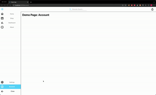
To recap what we’ve built:
- A Responsive Navigation Menu (break point at 768px screen width). This hides the search bar on mobile screens for example.
- Routing for our Single Page Application which directs requests to the proper page, i.e. /shop shows the shop page.
- A Higher Order Component that we can now wrap around the content of every page in our site. This is more performant because the navigation menu is persistent and we can lazy load and replace the main content of the page only when needed.
If you’d like to add more functionality I can suggest some ideas for inspiration. These are some features that logically follow creating a Navigation Menu in professional projects:
- User Authentication and Route Guards
- Adding a dismissable Popover listing notifications under the Notifications Icon
- Debounce requests to the back end API for searching (using the fetch API on the front end)
- Product Details view in the Shop page for a given product ID shown in the URL as a query variable (http://localhost:3000/shop?productId=xxxx)
To see the completed code you can visit the public GitHub repo below
GitHub - beatleboy501/react-custom-navigation
If you like my style of writing please follow. I publish ~1x a month and I love to network, thanks!
Tutorial: Develop a Responsive React Navigation Drawer HOC with Routing was originally published in Level Up Coding on Medium, where people are continuing the conversation by highlighting and responding to this story.
This content originally appeared on Level Up Coding - Medium and was authored by Andrew Allison
Andrew Allison | Sciencx (2022-09-28T12:29:09+00:00) Tutorial: Develop a Responsive React Navigation Drawer HOC with Routing. Retrieved from https://www.scien.cx/2022/09/28/tutorial-develop-a-responsive-react-navigation-drawer-hoc-with-routing/
Please log in to upload a file.
There are no updates yet.
Click the Upload button above to add an update.