
This content originally appeared on Level Up Coding - Medium and was authored by bitbug
how to using tailwind CSS with material UI component

Preface
In my Next.js project, I try to use the Material UI as ui library to improve the efficiency. In order to customize the layout, the Tailwind CSS was involved. But there will be some conflicts after importing according to their tutorials.
In this article, we will look at how to make them work well.
The style conflict
When I want to use the Button component of Material UI, I found that the background of it has some unexpected effect:
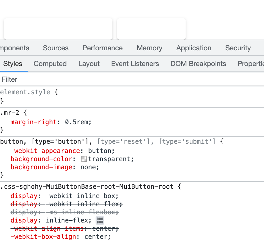
The button’s background is overridden by Tailwind CSS, because we need to add the @tailwind directives in the global.css file:
@tailwind base;
@tailwind components;
@tailwind utilities;
// other global css
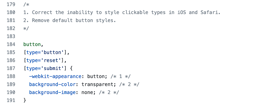
The @tailwind base will auto add a preflight.css file into project, which contain the rules of reset the button’s background.
When we know the cause of the style conflict, there will two ways to solve this problem:
- Don’t import the preflight.css file by removing the @tailwind base directive.
- Override the button style with style property or add selector that have high weight.
I used the first way for other component may have conflict style too. But this way may cause some elements are out of style, such as the img, and we have to add some required reset css rules in the global.css:
// from the tailwind's preflight.css
img,svg,video,canvas,audio,iframe,embed,object {
  display: block; /* 1 */
  vertical-align: middle; /* 2 */
}
img,video {
  max-width: 100%;
  height: auto;
}
If you also have some problems with other elements, see if you are missing some reset style rules from preflight.css .
Customize the Material UI Component style
If we just need to add some space between buttons or some small layout changes, we can accomplish this by adding className to these components like below:
<Button className="mr-2">Click Me</Button>
But in some case, we need to customize all the style of component, the best way is to use the unstyled component:
import {ButtonUnstyled, ButtonUnstyledProps} from "@mui/base";

const CustomButton = (props: ButtonUnstyledProps) => <ButtonUnstyled {...props} componentsProps={{
  root: {
    className: `hover:text-cyan-500 p-2 border-2 border-indigo-600`
  }
}} />
And you can learn more from ButtonUnstyled and Working with Tailwind CSS.
Conclusion
Using Tailwind CSS and Material UI can make the webpage-development more easier, in this article, we learn how the using the Tailwind CSS to customize the style of Material UI component. There may some conflict in Next.js project, we can remove the reset rule of Tailwind CSS without using the @tailwind base directive.
Thanks for reading, hope this can help you~
Using TailWind CSS to Customize Material UI Component Style was originally published in Level Up Coding on Medium, where people are continuing the conversation by highlighting and responding to this story.
This content originally appeared on Level Up Coding - Medium and was authored by bitbug
bitbug | Sciencx (2022-10-14T12:23:53+00:00) Using TailWind CSS to Customize Material UI Component Style. Retrieved from https://www.scien.cx/2022/10/14/using-tailwind-css-to-customize-material-ui-component-style/
Please log in to upload a file.
There are no updates yet.
Click the Upload button above to add an update.