
This content originally appeared on Level Up Coding - Medium and was authored by Adejumo Ridwan Suleiman
It is a popular saying that action speaks louder than word, which is why in the field of data analysis we can’t over-emphasize the importance of data visualization. A single visualization has the power to convey loads of information.
In this article, you will be learning how to create data visualizations in R Programming using the popular ggplot2 package.
The ggplot2 package allows you to create data visualizations based on the grammar of graphics which is made up of 7 layers.
- Data — The data you are interested in visualizing
- Aesthetics — The scales you will map the data, which is your x and y-axis.
- Geometry — This is where you define the kind of shape you want your visualization to have.
- Facets — This is the process of splitting your plot into various subplots to get a clearer view.
- Statistics — In this layer, you define statistical summaries or trends in the data.
- Coordinates — This is where you describe your plotting space.
- Themes — This is where you can customize non-data elements in your data such as font, graph fill and outline, and so on.

In this article, you will learn how to plot and interpret the 5 major data visualizations with ggplot2.
- Bar-plots
- Box-plots
- Scatter-plots
- Line graph
- Histogram
Installing and Loading ggplot2 Package
Before you can use the ggplot2 package, you need to, first of all, install the package from C.R.A.N, which is an archive of thousands of R packages.
You can install and load the package by running the command below.
# install package
install.packages("ggplot2")

# load package
library(ggplot2)
Diamonds Data-set
The data set you will use throughout this article is the diamonds data set, which is loaded together with the ggplot2 package.
To have a convenient view of the data, run the code below.
View(diamonds)
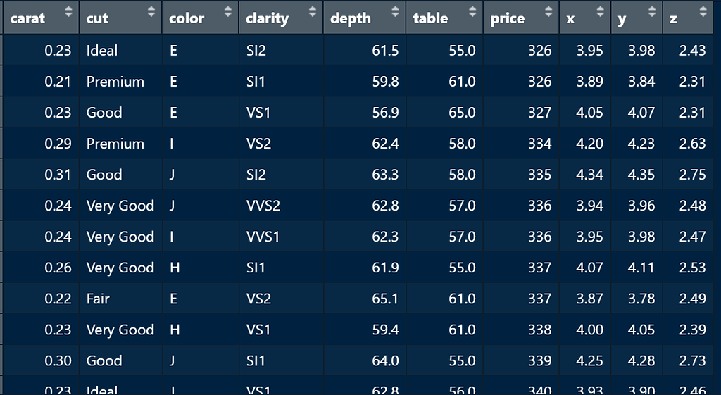
This data set contains the price and attributes of almost 54,000 diamonds.
- carat — This is the weight of a diamond
- cut — This is the quality of the diamond cut; Fair, Good, Very Good, Premium, Ideal.
- color — The color of a diamond from D (best) to J (worst).
- clarity — a measurement of how clear the diamond is; I1 (worst), SI2, SI1, VS2, VS1, VVS2, VVS1, IF (best).
- depth — total depth percentage = z / mean(x, y) = 2 * z / (x + y) (43–79)
- width — width of the top of the diamond relative to the widest point (43–95).
- x — length of diamond in mm
- y — width in mm
- z — depth in mm
With the aid of the data visualizations, you are going to use this data-set to answer various questions like
- The most expensive diamond
- The least expensive diamond
- Are diamond prices evenly distributed?
- The average and median prices of diamonds.
- Is the diamond carat likely to affect the diamond price?
Structure of ggplot2
Regardless of the kind of plot you want to build, the ggplot2 has a specific structure.
ggplot(data = diamonds,
       mapping = aes(
         x = cut,
         y = price
       ))
The ggplot() function is where you pass in the data and aesthetics, the data argument takes in the data you are visualizing which in this case it’s the diamonds data set, while the mapping argument takes in the x and y axis and also if you want to have a variable as a fill, which I will explain later.
When you run the code above, you are going to get something like this,

This graph is where you are going to define the kind of visualization you want to create. You can as well see the axis you have defined.
The next step is to add the type of visualization you want to create with a + sign.
Let’s say you want to create abox plott, the function to create a box plot is geom_boxplot(), which is going to be added like this.
ggplot(data = diamonds,
       mapping = aes(
         x = cut,
         y = price
       )) +
  geom_boxplot()

For now, just focus on the structure, this is your building block in creating any visualization with ggplot2.
In the coming sections, you will learn how to customize your plots.
Just like you added the box plot, you can add additional elements with the + sign so far you know the function for the element you want to add.
Your visualization can have both the x and y-axis, or just the x-axis which we will come to in the case of the bar plots.
Now let’s start with the most common data visualization, the Bar-plot.
Bar-plots
Bar plots are the most popular type of plot in data analysis.
It is used to visualize the frequency of categorical variables in data.
Just like you are going to demonstrate now, the frequency of each diamond cut.
The first thing you are going to do is to lay your structure first, but this time around without the y-axis, the bar plot only takes one axis since the other axis is the frequency of the diamond cut you are interested in.
ggplot(data = diamonds,
       mapping = aes(
         x = cut
       ))
Then you can add in the geom_bar() function
ggplot(data = diamonds,
       mapping = aes(
         x = cut
       )) +
  geom_bar()
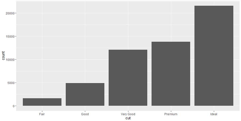
You can see that from the bar plot, the diamond with the highest and lowest frequency.
I will leave that to you to answer!
The plot looks dull, let’s make it colorful by adding the fill argument to the aes() function.
ggplot(data = diamonds,
       mapping = aes(
         x = cut,
         fill = cut
       )) +
  geom_bar()
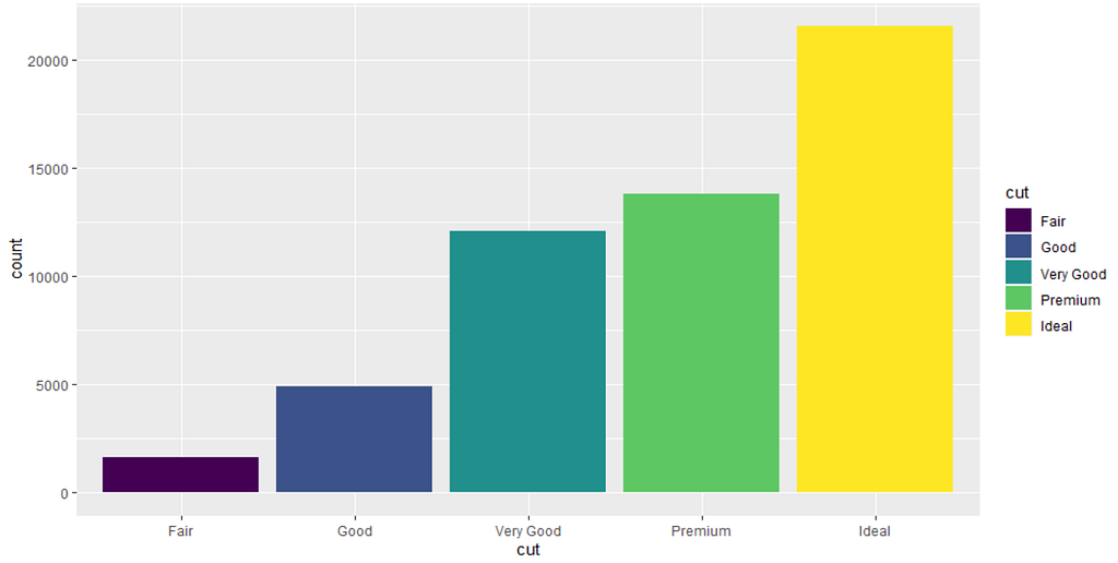
That’s more like it, this is called a Vertical Bar plot.
It is used when the number of categories you want to visualize is few.
In the case where you have a lot of categories to visualize, it is recommended to use the horizontal bar plot.
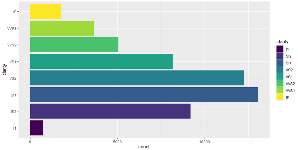
Let’s visualize the frequency of diamond clarity on a horizontal bar plot,
ggplot(data = diamonds,
       mapping = aes(
         y = clarity,
         fill = clarity
       )) +
  geom_bar()

Did you notice what happened?
The x argument in aesthetics was changed to y. This little change is powerful, it changes the orientation of your plot.
Initially, you made your categories on the x-axis but now you switched it to the y- axis.
You can also add the coord_flip() function on a vertical bar plot to flip it instead of changing the x argument in aesthetics to y.
ggplot(data = diamonds,
       mapping = aes(
         x = clarity,
         fill = clarity
       )) +
  geom_bar() +
  coord_flip()
Yeah! you still get the same plot.
The method you choose is up to you, all are convenient to use.
What if you want to see the frequency of diamond color in various cuts, how do you do it?
Stacked and Grouped Bar-plot
Stacked Bar Plot
The stacked bar plot allows you to visualize numeric values across one categorical variable to another.
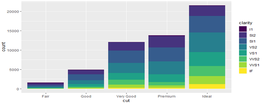
A stacked bar plot is just like plotting two categories in the same plot, except, each category is going to explain another subcategory as sub bars.
From the plot above, you can tell that the Ideal diamond is the most occurring and diamonds with clarity VS2 are the most occurring under the Ideal diamond cut.
Let me give you a quick exercise, what’s the least occurring diamond clarity across all diamond cuts?
You guessed right, the IF clarity.
Don’t worry, you are going to plot one now and get a better grasp of it, you are going to visualize the frequency of various diamond colors in various diamond cuts.
To plot a stacked bar plot, the only thing you will be changing is the fill argument.
In previous examples, the x variable and the fill variable were the same, this time around the sub-category or the fill is going to be another categorical variable from the data set.
ggplot(data = diamonds,
       mapping = aes(
       x = cut,
       fill = color)) +
geom_bar()

You can see that a lot of questions can be answered from this single plot like diamonds with color J is the least occurring diamond across all cuts.
What other information can you carry from the plot?
Grouped Bar Plot
Similar to a stacked bar plot, a grouped bar plot instead plot the sub-bars side by side.
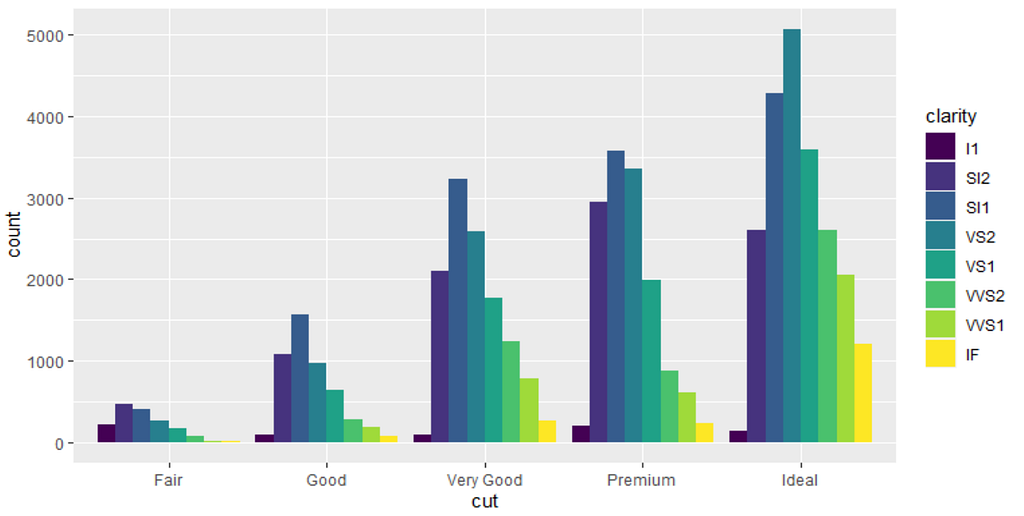
You can see, in each diamond cut you have the respective diamond clarity side by side.
ggplot(data = diamonds,
       mapping = aes(
         x = cut,
         fill = color)) +
  geom_bar(position = "dodge")
Just add the position = “dodge” argument and you have a grouped bar chart instead of a stacked bar chart.
Box-plots
The box plot is one of the most comprehensive plots in data visualization, the box plot is used to visualize the distribution of numerical data based on its quartiles.
Quartiles are values that split a data set into 4 equal parts.
A box plot is also known as a box-and-whisker plot.
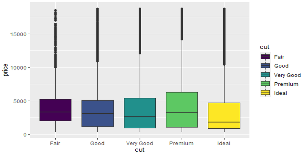
This box plot is used to visualize a categorical variable against a numerical variable, just as you are going to visualize a diamond cut against a diamond price.
From the box plot, you will be able to know the median and quartile values of the diamond price.
To plot the box plot, you just have to give the x argument a categorical variable while the y argument a numeric variable in the aesthetics function.
ggplot(data = diamonds,
       mapping = aes(
         x = cut,
         y = price)) +
  geom_boxplot()
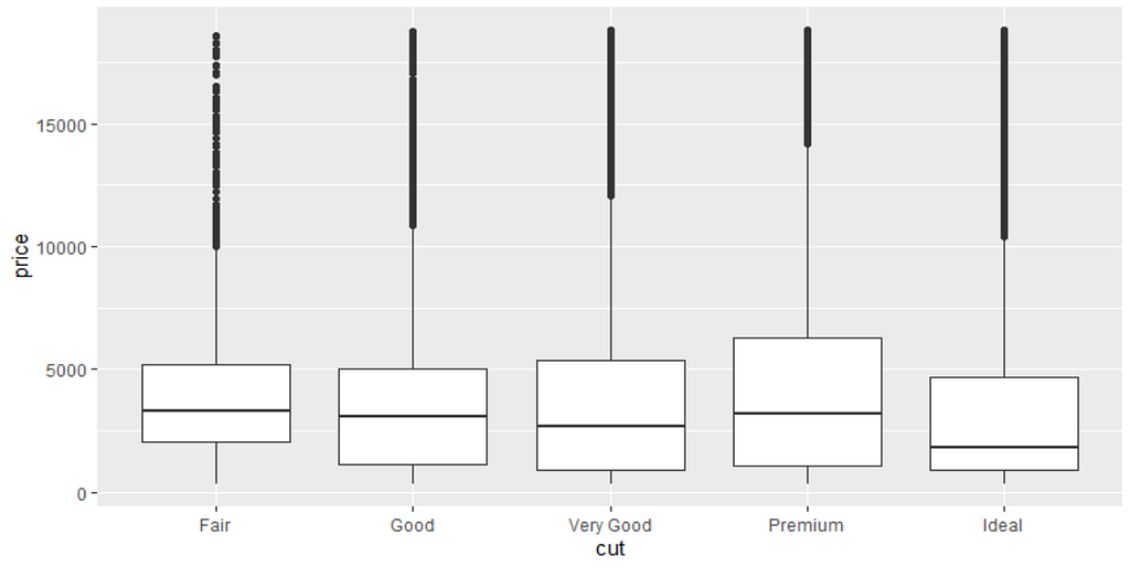
How do you interpret this?
Let’s use this detailed diagram for an explanation,

The box plot is made up of a box and whiskers hence the name box and whiskers plot.
I explained earlier that the box plot divides a data set into 4 equal parts which are called quartiles.
Hence you have 1st quartile, 2nd quartile, and 3rd quartile.
- 25% of observations are under the 1st quartile
- 50% of observations are under the 2nd quartile which is also known as the median.
- 75% of observations are under the 3rd quartile
- Highest values in the data set are usually located above the 3rd quartile, this is where you can see the maximum values.
So going back to the plot of diamond cuts against diamond price, if you compare all diamond cuts, you will notice that Ideal diamonds have the lowest median price while premium and good diamonds have the highest median price.
You will also notice that in Ideal diamonds the values below the median price are not much when compared to the values above the median price, the same also applies to Premium diamonds.
A shorter box plot indicates that the prices of diamonds in that particular diamond cut are closer to each other just like that of the Fair diamond cut.
Unlike longer ones where the prices of diamonds are not relatively close, this you can see in that of Premium diamonds.
You can add a variable as color to the box plot using the color argument to make it look pleasing.
ggplot(data = diamonds,
       mapping = aes(
         x = cut,
         y = price,
         color = cut)) +
  geom_boxplot()

Or use the fill argument if you find this looking weird to you.
ggplot(data = diamonds,
       mapping = aes(
         x = cut,
         y = price,
         fill = cut)) +
  geom_boxplot()
Scatter-plot
Correlation is the measurement of the relationship between two variables, for example, students with high IQs are likely to have higher test/exam scores than those with low IQs.
This implies that as a student’s IQ increases, his/her possibility of passing a test score also increases.
You might be wondering why I am talking about correlation, a scatter-plot is one of the traditional methods of measuring the correlation between two variables.
A scatter-plot will let you know if diamond price and carat are related to each other, and it will give you the opportunity to know if higher-carat diamonds are more expensive than lower-priced diamonds.
To understand more about correlation, you can check the article How Does Correlation work In Recommender Systems?
Unlike the previous plots above, a scatterplot only takes numerical variables. These values in these variables are plotted hence the direction of the points on the plots is used to interpret the correlation between the two variables.
Let’s get back to the diamond data set and see if price and carat variables have a relationship.
This time around you are going to pass price as your x-axis and carat as your y-axis and add the geom_point() function.
ggplot(data = diamonds,
       mapping = aes(
         x = price,
         y = carat)) +
  geom_point()

From the plot above, you will see that as the diamond carat increases diamond price also increases and vice-versa.
This shows diamond and carat have a strong positive relationship.
The plot below summarizes how you can interpret any scatter-plot you come across.
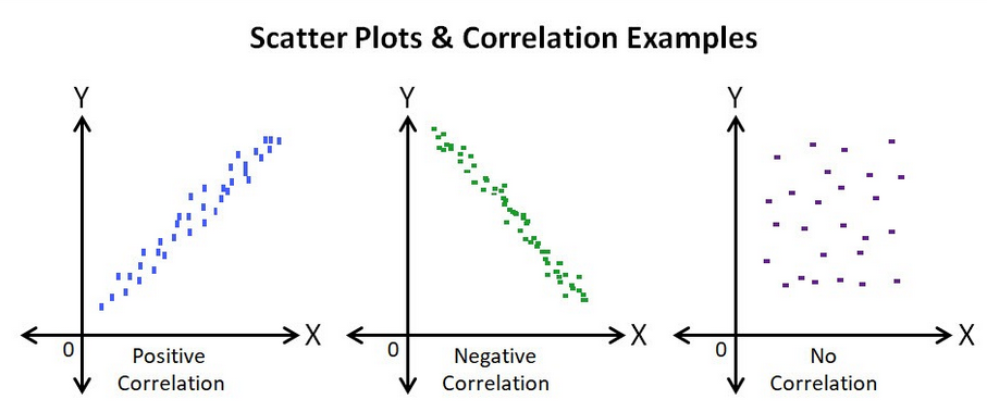
- The first diagram shows a positive correlation just like the example plot you plotted above where diamond price increases by carat value.
- The middle diagram is the opposite of the first diagram, indicating a negative correlation, an example is a student’s increase in absence and decrease in grades. The more a student misses class, the more likely that student is going to have lesser grades.
- The situation where both variables have no relationship is known as No Correlation, and you a get graph looking like the last diagram.
Histogram
By now you should know that Bar-plot is used for plotting the frequency of categorical variables in a data set.
What if you want to get the frequency of numerical variables in a data set?
This is where the histogram comes to play.
The histogram and the bar plot are similar except for the fact that in the former the bars are joined together while in the latter the bars are separated by equal spaces.
Just like the bar plot the histogram only takes one variable which is a numerical variable.
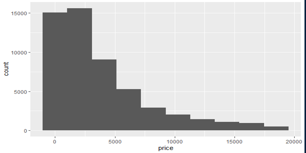
Let’s use the histogram to visualize the diamond price in the data set by making the x-axis set to price and passing the geom_histogram() function.
ggplot(data = diamonds,
         mapping = aes(x = price)) +
  geom_histogram(bins = 50)
The bins argument allows you to set the number of bars you want on the graph. The higher the number of bins, the higher the number of bars on the histogram, and vice versa.
From the histogram below, you will observe, most diamonds are priced between $0 — $5,000 while few are between $15,000 — $20,000.

Setting the bins to 10, you are going to have a histogram with 10 columns.
ggplot(data = diamonds,
         mapping = aes(x = price)) +
  geom_histogram(bins = 10)
Sometimes using higher bins gives you more information than lower bins.
Line graphs
Line graphs are a type of data visualization that displays data based on time, for example knowing how the population in a country has changed over the years.
In a line graph, the x-axis carries the time which is in minutes, days, weeks, months, or years.
The y-axis contains the variable of interest just like in the example above, the total population in a country.
The line graph is plotted using the geom_line() function just as you have plotted other graphs
The diamonds data set you have been using throughout does not contain a time variable but don’t worry we have the economics data set which also comes with the ggplot2 package.
It contains economic time series data from United States of America, it has 574 rows and 6 variables.
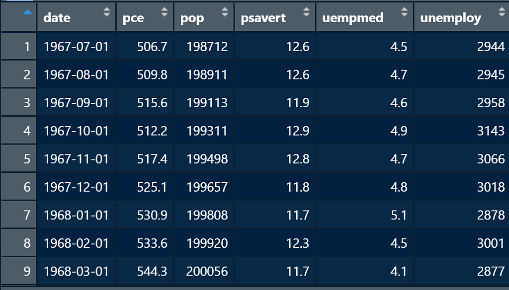
- date — the month of data collection
- pce — personal consumption expenditures in billions of dollars
- pop — total population in thousands
- psavert — personal savings rate
- unempmed — median duration of unemployment in weeks
- unemploy — number of unemployed in thousands
To demonstrate how you can visualize the line graph with R, you are going to visualize how the population in the U.S has changed over the years from the year 1967 to 2015.
ggplot(data = economics,
       mapping = aes(
       x = date,
       y = pop)) +
  geom_line()
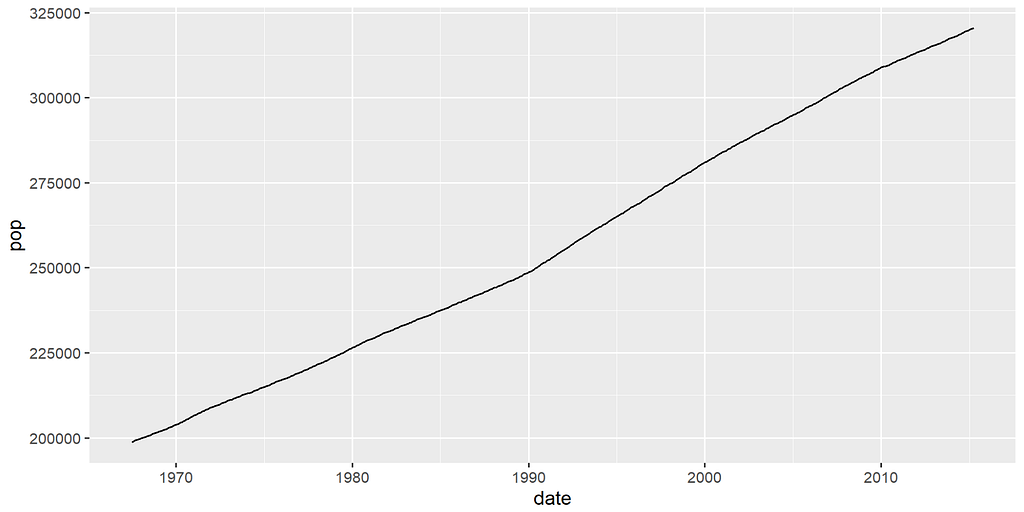
You can see an upward trend in the population of the U.S over the years.
As a quick exercise, I will leave you to visualize any of the other variables.
Labeling
If you have noticed, the plots you have created throughout don’t have titles, the variables’ names also appear as the names of the axis.
You can customize the plot axis and titles and give the names you want using the;
- ggtitle — for title label
- xlab — for x-axis label
- ylab — for y-axis label
The line graph you plotted above is recreated by;
ggplot(data = economics,
       mapping = aes(
       x = date,
       y = pop)) +
  geom_line() +
  ggtitle("Population of the United States from 1967 - 2015") +
  xlab("Date") +
  ylab("Population")

Faceting
Faceting is the splitting of a plot into various sub-plots, faceting gives you the opportunity of viewing a plot over various categories.
Faceting can be done in ggplot2 either by adding facet_wrap() or facet_grid() to a visualization.
Using the diamonds data-set example, let’s say you want to know the number of diamonds in a particular cut but under various colors.
You can use faceting to display this particular information, you pass the facet_wrap() function with some arguments which I will explain in a bit to the code that plots the graph below.
library(ggplot2)
ggplot(data = diamonds,
       mapping = aes(x = cut,
                     fill = cut)) +
  geom_bar() +
  facet_wrap(color ~ .)

The ~ sign is called Tilda and it tells the facet function that the graph should be split by the color variable, just as you have seen above.
facet_grid() does the same thing except for the fact, any variable passed into the function, splits the plot into the number of values in that particular variable either on a single row or a single column.
This is unlike facet_wrap(), which wraps the plots into several rows and columns depending on the number of values in the variable.
library(ggplot2)
ggplot(data = diamonds,
       mapping = aes(x = cut,
                     fill = cut)) +
  geom_bar() +
  facet_grid(color ~ .)

Passing the faceting variable on the L.H.S, the plot is split horizontally into a single column and multiple rows by the number of colors which in this case is 7.
Passing the color variable on the R.H.S, the plot is split vertically into multiple columns and a single row by the 7 cases in the color variable.
library(ggplot2)
ggplot(data = diamonds,
       mapping = aes(x = cut,
                     fill = cut)) +
  geom_bar() +
  facet_grid(. ~ color)

It is advisable when the faceting variable has a lot of values, to use horizontal splitting to avoid axis labels overlapping each other just like above.
Conclusion
ggplot2 is the most used visualization library in R programming and in this article you just learned how you can plot major plots and also interpret them.
There are a lot of packages giving you the opportunity to extend the power of the ggplot2.
I hope in your next project you can be able to incorporate this and even more.
Thanks for reading.
References and Related Reads
- ggplot2 Documentation
- ggplot2 Cheat-sheet
- How To Combine Multiple Plots In One Page With R Programming
Level Up Coding
Thanks for being a part of our community! Before you go:
- 👏 Clap for the story and follow the author 👉
- 📰 View more content in the Level Up Coding publication
- 🔔 Follow us: Twitter | LinkedIn | Newsletter
🚀👉 Join the Level Up talent collective and find an amazing job
A Beginners Guide to ggplot2 was originally published in Level Up Coding on Medium, where people are continuing the conversation by highlighting and responding to this story.
This content originally appeared on Level Up Coding - Medium and was authored by Adejumo Ridwan Suleiman
Adejumo Ridwan Suleiman | Sciencx (2022-11-22T02:16:45+00:00) A Beginners Guide to ggplot2. Retrieved from https://www.scien.cx/2022/11/22/a-beginners-guide-to-ggplot2/
Please log in to upload a file.
There are no updates yet.
Click the Upload button above to add an update.