
This content originally appeared on Bits and Pieces - Medium and was authored by Mike Chen
Building Scalable, Collaborative, and Developer-First Design Systems for Modern Frontend Development
As web applications grow increasingly complex, the demand for consistent, scalable design systems has become more critical than ever. Design systems are not just the domain of design teams — they require active collaboration with developers to ensure their usability, adaptability, and effectiveness.
However, many design systems fail to address the specific workflows and challenges developers face. When overlooked, this can lead to inefficiencies, inconsistencies, and frustration within development teams.
A developer-friendly design system addresses these challenges by improving team productivity and collaboration. It ensures that components are not only easy to use but also easy to modify, version, and extend across multiple projects.
Why Prioritize Developer-Friendliness?
- Improves productivity and developer experience (DX): Developers can quickly onboard and efficiently build features using well-documented, reusable components.
- Reduces friction between designers and developers: Collaboration flows seamlessly when both teams have shared access to components and a clear understanding of design standards.
- Supports scalability and maintainability: Components can be versioned and updated individually, reducing the risk of large-scale regressions.
- Promotes reusability across projects: Developers can reuse and extend components, reducing duplication of effort and speeding up development cycles.
In this article, we’ll explore the five core pillars that make a design system truly developer-friendly, with practical insights and examples from real-world systems like the Material-UI (MUI) design system and Shadcn-UI built using Bit Platform.
Pillar 1: Modular and Composable Architecture
Modular and composable architecture is the backbone of a scalable design system. Instead of bundling components into monolithic libraries that are difficult to update and maintain, modern systems break them down into independent, self-contained components. These components are version-controlled and reusable, allowing developers to integrate only the parts they need.
A composable design system removes the dependency on bulk installations by allowing teams to version and consume components independently.
Key Benefits:
- Reduced dependency bloat: Developers can import individual components without pulling in unnecessary dependencies.
- Safe updates: Versioning at the component level ensures that updates don’t unintentionally break other parts of the project.
- Rapid development: Teams can create new features faster by combining existing components.
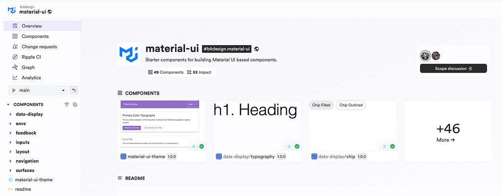
The Material-UI (MUI) design system built under Bit follows a modular approach. Each component (e.g., a Button or a Modal) exists as an independent Bit component, which can be updated and versioned independently. Teams using this system avoid monolithic library upgrades and benefit from granular updates.
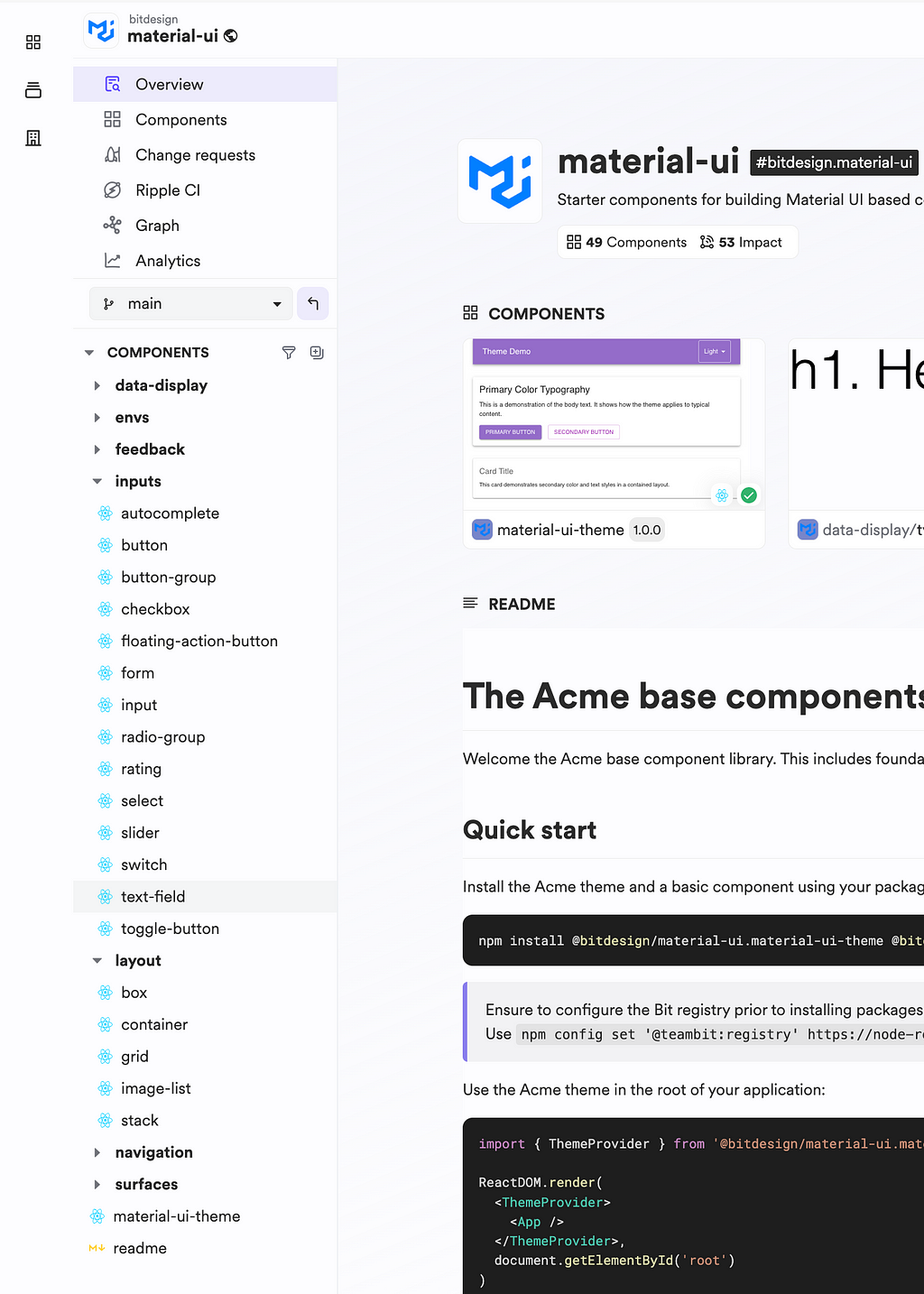
Best Practice: Organize components into scopes (e.g. inputs, navigation, layouts, etc) to keep them manageable and logically grouped.
Pillar 2: Comprehensive Documentation and Onboarding
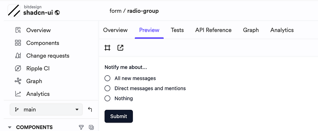
Comprehensive documentation is a must-have for developer adoption and productivity. Without proper guidance, even well-built design systems can be a source of confusion. Documentation should provide more than just API references — it should include usage examples, code snippets, best practices, and live previews.
Documentation is more than instructions. It’s an enabler that accelerates onboarding and boosts development efficiency.
Essential Elements of Good Documentation:
- Component usage guides: Show how to integrate components with real-world examples.
- Live previews: Allow developers to see how a component behaves before using it.
- Versioning information: Indicate what has changed between component versions to prevent unexpected issues during updates.
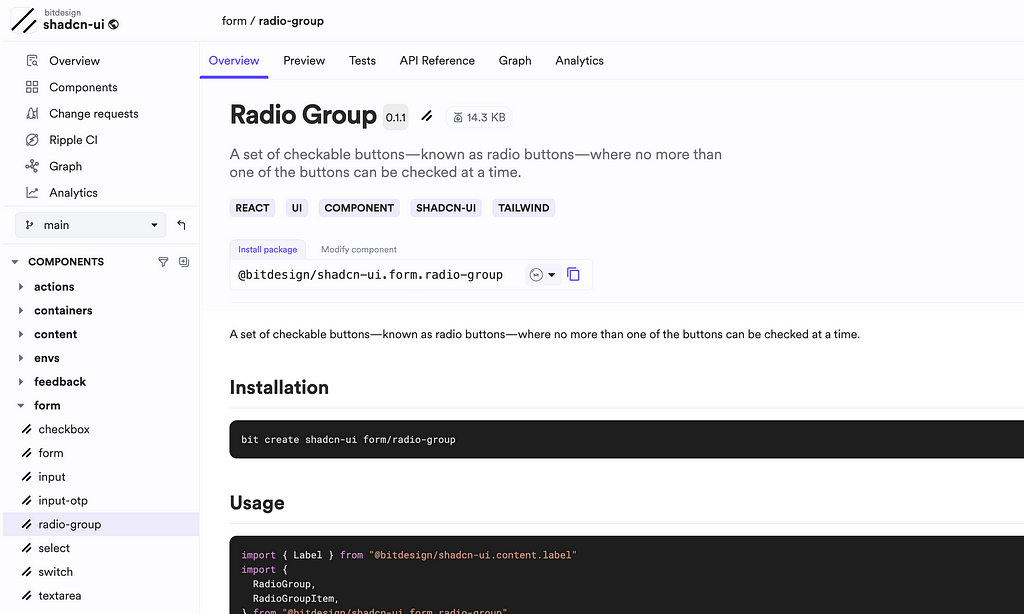
The Bit platform generates the placeholders for component documentation with live previews and version histories (maintained within the component code as an mdx file), allowing developers to keep it up to date and a quick reference when using the component.
Pillar 3: Built-In Tooling and Developer Workflows
A developer-friendly design system should integrate seamlessly into existing development workflows and provide built-in tools to simplify common tasks like testing, versioning, and deployment. By automating repetitive processes, developers can focus on building features rather than managing manual tasks.
Built-in tools and workflows reduce friction, enabling developers to work smarter and deliver faster.
Essential Tools:
- Versioning and dependency tracking: Tools like Bit’s version control ensure that every component is tracked independently.
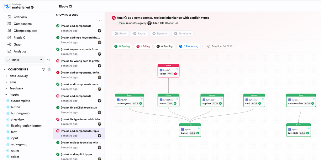
- Automated testing: CI/CD integration (e.g., using GitHub Actions or Bit’s Ripple CI) automatically tests component changes, preventing regressions.
- Command-line utilities: Developers can create, modify, and export components easily using CLI commands, reducing the need for manual configuration.
MUI’s design system uses Ripple CI (Native design system design specifically for component development) workflow for versioning and exporting components. Developers create change requests, and the CI/CD system handles versioning, testing, and publishing updates to Bit Cloud, ensuring safe, automated deployments.
And most notably the development workflow is also unique, where you can create a workspace by using bit init command and import only the components you need to modify. And, Bit will ensure that all the dependent versions are built and tested and handle the ripple effect of dependency updates.
Tip: Incorporate CI/CD tools, such as Ripple CI, that support selective builds — only rebuilding components affected by recent changes.
Pillar 4: Flexibility and Customization
Every project has unique requirements, and design systems must balance consistency with flexibility. While design standards should be enforced, developers also need the ability to extend or customize components without creating inconsistencies.
A flexible design system provides guardrails for consistency while allowing developers to customize and extend components as needed.
Customization Approaches:
- Wrapping components: Developers can create custom wrappers around components to add project-specific functionality (e.g., integrating React Router for navigation).
- Global overrides: Minor style adjustments can be applied globally using a theme configuration without modifying individual components.
- Design tokens: Centralized variables for colors, typography, and spacing ensure that theming and customization are controlled consistently.
All these are possible since design systems built with components are composable and provide the ability to extend, override and compose as required.
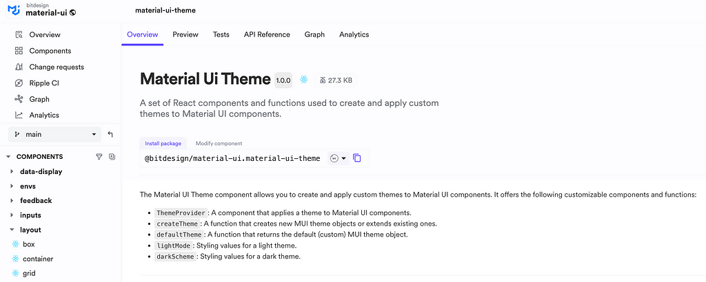
In the MUI design system, global overrides enforce consistent styles, while custom wrappers allow teams to create variations tailored to specific use cases. Design tokens provide flexibility by allowing developers to apply project-specific theming. All these configurations are also encapsulated in components (e.g. theme component), allowing us to quickly modify them as required.
Tip: Use design tokens as the single source of truth for theming across all components.
Pillar 5: Collaborative Features and Community Support
Design systems are not static assets — they evolve with contributions from developers, designers, and other stakeholders. A collaborative environment ensures that teams can propose, review, and implement changes without disrupting ongoing development.
Collaboration is key to a design system’s long-term success. Tools that support versioned contributions and feedback loops enhance scalability and maintainability.
Key Collaborative Features:
- Direct access to code: Developers and designers can collaborate on components and contribute when they see each component's implementation details.
- Change requests: Modifications can be proposed through change requests (e.g., Bit Change Request, Git Pull Requests).
- Dependency graphs: Visualizing component dependencies helps teams understand the impact of changes and avoid potential issues.
Bit platform allows developers to create change requests, review modifications, and merge updates safely. Ripple CI ensures that changes are automatically tested and validated before updating its version.
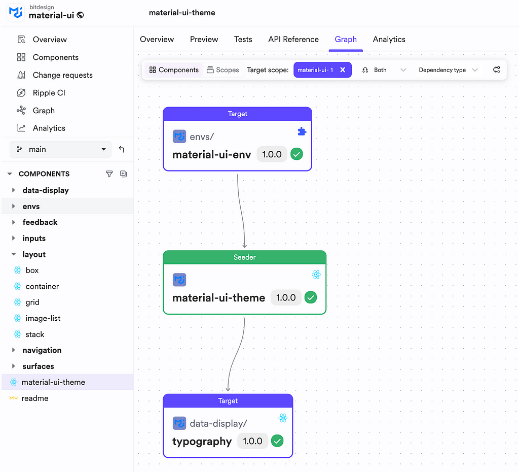
Tip: Use dependency graphs to visualize how updates to one component will impact others, enabling better decision-making.
Conclusion
A design system that developers love isn’t just about reusable components — it’s about creating an environment that supports rapid development, collaboration, and maintainability.
By embracing modularity, comprehensive documentation, built-in tools, flexibility, and collaboration, teams can build systems that scale efficiently across projects and teams. By applying these pillars, your design system can become a core asset for your organization, delivering consistent, scalable, and maintainable solutions.
Thanks for reading. Cheers !!
Learn More
- A Modern Workflow for Design System Development and Reuse
- Creating a MUI Design System: Wrapping vs. Global Overrides
- Building React Design Systems with AI
- Modern Frontend Design Systems: Built for Reusability and Improved Collaboration
5 Pillars for Highly Effective Design Systems was originally published in Bits and Pieces on Medium, where people are continuing the conversation by highlighting and responding to this story.
This content originally appeared on Bits and Pieces - Medium and was authored by Mike Chen
Mike Chen | Sciencx (2025-02-06T02:45:56+00:00) 5 Pillars for Highly Effective Design Systems. Retrieved from https://www.scien.cx/2025/02/06/5-pillars-for-highly-effective-design-systems/
Please log in to upload a file.
There are no updates yet.
Click the Upload button above to add an update.