
This content originally appeared on HackerNoon and was authored by Lior Barak
Hello, data Shokunin-deshi!
Welcome to the final installment of our Data Ecosystem Vision Board implementation series! In our previous editions, I shared how I helped Sarah at 4seconds.com build the Present Inputs and Future Vision layers of her Data Ecosystem Vision Board.
\ Today, we complete the journey by exploring the Success Metrics layer, the compass that guides transformation and measures progress.
\ My neighbor's so obsessed with his lawn, I'm pretty sure he thinks he's the Zen master of his backyard. He came over the other day, and for about the fourth time, started talking about my tree. This time, though, he prefaced it with a story from some "advanced gardening course" he took.
\ "How will we know if our pruning is correct?" an eager apprentice asked. The master, apparently radiating serene wisdom, replied, "We judge by three measures: the tree's health, its beauty, and how it harmonizes with the garden as a whole. These three tell us everything we need to know."
\ Then, he looked me dead in the eye and, with all the Zen calm he could muster, informed me that my wildly un-Zen-like tree was failing on all three counts, especially the "harmonizes with his garden" part. He then patiently explained that while he values harmony, his patience for my arboreal negligence was, shall we say, not boundless. He might just have to apply those pruning principles himself.
\ And honestly, his point about the tree's intrusion, however un-Zen-like his delivery, perfectly illustrates the purpose of our Success Metrics layer. With the right measures, we can evaluate complex transformations through a simple yet powerful lens that guides our actions and decisions. Because sometimes, even the most profound principles need a little push, or a neighbor with a very specific definition of "harmony."
\ The Success Metrics layer transforms a vision from aspiration to action by defining what success looks like and how we'll know when we've achieved it.
Executive Summary
In this edition, I share how I guided Sarah through building the Success Metrics layer of her Data Ecosystem Vision Board:
✅ Learn how to apply the 5 W's framework to develop focused, impactful KPIs
✅ Discover how to select organizational health metrics (Data ROI and Data Utilization) that measure overall transformation success
✅ Master the art of creating clear guiding principles that drive decision-making
✅ Implement a change management approach that ensures capability adoption and value realization
The Metrics That Matter: Beyond Measurement to Action
After completing the Future Vision layer with Sarah's team, we needed to establish how success would be measured and how the transformation would be guided. The Success Metrics layer addresses three critical questions:
How will we measure success? (KPIs)
What principles will guide our decisions? (Guiding Principles)
How will we manage the organizational change? (Change Management)
\
Based on my implementation experience, I recommend a focused approach with:
A maximum of 6 total KPIs (including 2 core organizational metrics)
No more than 6 guiding principles
A structured change management plan linked to capability implementation
\
This deliberate constraint prevents metric proliferation while ensuring comprehensive coverage of what truly matters.
\
The 5 W's Framework for Effective KPIs
At the heart of meaningful metrics lies the 5 W's framework, a structured approach to ensure each KPI drives real business value:
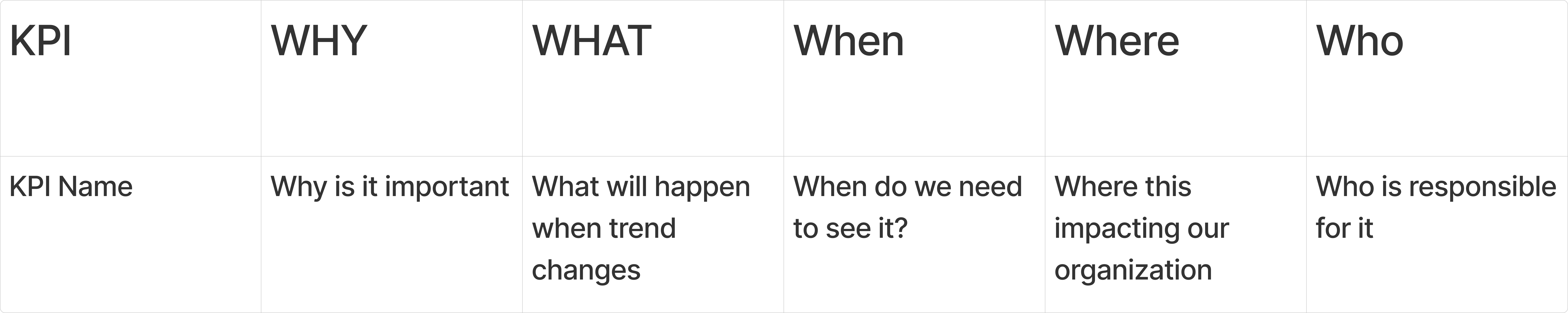
The 5 W's Framework for Effective KPIs: Mapping those KPIs into a simple Excel Table already will give you a better overview and understanding.
\
Why: Understanding the Purpose
Every KPI must have a clear purpose: "We measure [KPI] because it tells us [insight], which helps us achieve [business objective]."
Example from 4seconds.com: "We measure Inventory Accuracy because it tells us how reliably we can plan and execute flash sales, which helps us maximize revenue and customer satisfaction."
:::tip Implementation Lesson: Many organizations struggle with too many metrics rather than too few. Be ruthless in requiring a clear purpose for every KPI, several proposed metrics should be eliminated when teams can't articulate a compelling why.
:::
\
What: Aligning KPIs with Actions
KPIs must connect to specific actions: "When [KPI] [increases/decreases], we [take this action] to [achieve this goal]."
Example from 4seconds.com: "We measure Campaign Attribution Accuracy because it tells us how effectively we're tracking marketing performance. When it decreases below 85%, we investigate data collection gaps and pipeline issues to ensure marketing investment decisions are based on reliable data."
:::tip Implementation Lesson: The action statement is where many KPIs fall short. By explicitly defining response actions, teams ensure their KPIs drive behavior rather than just measure it.
:::
\
Where: Mapping KPI Impact
Document primary impacted teams, in case the KPIs trend changes, who are the teams that influence it, the teams that will feel the pain, and how it relates to what "When [KPI] [Increases], [Team] [What action needs to happen].
Example from 4seconds.com: For "Data Quality Score". Primary ownership: Data Engineering; when the quality score goes down, the data team needs to investigate what caused the trend change, and the data producers need to check on their side, whether data flows as expected
:::tip Implementation Lesson: The "Where" dimension often reveals unexpected dependencies. When we work with the KPIs, they will have a different impact on different teams. By mapping where a trend change of the KPI influence will help us better understand the impact of the KPI
:::
\
Funny story, once I was with a marketing team that were super happy they managed to reduce the budget spending due to better data on the campaigns performance, on the other side of the room the finance team were freaking out how to explain investors that the company won’t reach the commited marketing budget and how to not lose it for next year
\
When: The Rhythm of Measurement
Set frequency when the KPIs are required, based on how quickly metrics change and how rapidly action can be taken.
Example from 4seconds.com: "Flash Sale Readiness Score". Calculated daily, reviewed weekly by operations, 48 hours before sales by executives, with 90-day trend analysis and holiday season adjustments.
:::tip Implementation Lesson: Don't default to daily reviews regardless of the metric's natural rhythm. Aligning review cadence with business needs dramatically improves performance.
:::
\
Who: The Keeper of the Metrics
Assign clear ownership with both responsibility and authority to influence performance.
Example from 4seconds.com: "Marketing Data Timeliness", Owner: Marketing Analytics Lead; Contributors: Data Steward, Data Engineer; Stakeholders: CMO, Campaign Managers; Audience: All marketing team, Executive team.
:::tip Implementation Lesson: Ownership must include authority to drive change. Ensure each KPI owner has both responsibility and authority to influence the metric's performance.
:::
For detailed examples and implementation lessons, see our previous newsletter on The 5 W's Framework for Effective KPIs
\
Organizational Health Metrics: Data ROI and Data Utilization
The Strategic KPI Portfolio: Six Metrics That Matter
The Success Metrics layer accommodates six KPIs maximum, a deliberate constraint that forces strategic focus. Overpopulate with metrics and you lose track of what truly matters; under-populate and you lose visibility into critical areas.
\ My recommendation follows a proven structure:
Two Foundation KPIs Data Health Indicators: These long-term metrics assess the overall health of your data ecosystem:
- Data ROI: Measures the monetary value generated by your data investments
- Data Utilization: Tracks how effectively you use the data you collect and store
These foundation KPIs provide your "vital signs"; if these trend poorly, your entire data strategy needs attention.
\ Two to Four Capability KPIs, Progress Trackers: These metrics measure progress toward the specific capabilities outlined in your Future Vision. They should:
- Connect directly to your vision board priorities
- Enable early identification of implementation issues
- Demonstrate tangible progress toward strategic goals
- Provide clear signals when course correction is needed
Example from 4seconds.com: Their capability KPIs included "Data Pipeline Reliability" (99.5% uptime target) and "Self-Service Analytics Adoption" (60% of business users actively querying data independently).
\
Data ROI: Measuring Value Creation
Data ROI measures the financial return generated from data investments. This metric answers the fundamental question: "Is our data ecosystem creating real business value?"
\ Implementation Approach:
Define the Formula:
Data ROI = (Financial Value Generated - Cost of Data Operations) / Cost of Data Operations

If Cost of Data Operations = €100 and Financial Value Generated = €90, then (90−100)/100=−0.10 or -10%.
\ Calculate Components:
Financial Value Generated: Quantified benefits from data-driven decisions and automations
Tip: Defining "Financial Value Generated" Accurately: This is often the trickiest part. Be clear and consistent about what you include. Avoid double-counting or attributing value that isn't directly a result of data operations.
Cost of Data Operations: All expenses related to data collection, storage, processing, and analytics
\
Set Targets:
Minimum acceptable ROI (typically 0.01-0.7x)
Target ROI (typically 0.8-2.5)
Stretch ROI (typically 2.6x+)
\
Implement Measurement:
Timeframe: Specify the period over which you are calculating the ROI (e.g., quarterly, annually). Value and costs should align with this timeframe: In our case:
Quarterly calculation
Year-over-year trend analysis
Breakdown by data domain or capability
\
Example from 4seconds.com: After implementing the measurement, their initial Data ROI was 0.2x, barely positive. We set targets of 2x by year-end and 4x within three years. More importantly, we created a detailed tracking mechanism that identified which capabilities were creating the most value and which needed intervention.
:::tip Implementation Lesson: Sometimes it's useful to compare the "Financial Value Generated" with data operations to a hypothetical scenario without them, especially for initiatives aimed at maintaining or improving existing processes.
:::
Qualitative Benefits: Remember that ROI is a quantitative measure. Data initiatives often have significant qualitative benefits (e.g., improved decision-making, better customer experience, innovation) that are harder to directly monetize but are still valuable. Don't let a purely financial ROI be the only factor in assessing data's success.
\
The Real Challenge: What Sarah's Team Discovered
When we started calculating Data ROI, Sarah's team hit an immediate roadblock: "How do we quantify all the income generated by data?" The challenge was particularly acute with financial data, which is essential but doesn't directly generate ROI.
\ We had to evolve our approach:
"Must Have" Data Exclusion: We classified essential data like financial data, compliance data, and operational data as "must have" and excluded them from ROI calculations. But we needed to tag it properly so this wouldn't become a manual process.
Tagging System Implementation: We created a comprehensive tagging system to automatically categorize data by its business purpose:
Revenue-generating data
Cost-saving data
Must-have/compliance data
Experimental data
Value Tracking Mechanism: For every significant data-driven decision or automation, we implemented a value tracking system where stakeholders estimated the business impact, and when possible we created automatic process, for example in the marketing campaigns we identified the campaigns we optimized and they stopped spending budget on bad traffic and accomilated it, and when increased we mark it as value created.
:::tip Implementation Lesson: Many organizations struggle to quantify value from data initiatives. I worked with Sarah to implement a value tracking system where every significant data-driven decision or automation had an estimated value attached. While not perfect, this approach provided a foundation for measuring return that was far better than no measurement at all. Just start with what you have and slowly learn more and improve; stakeholders will wish to be included in the calculation as they fear they may lose access to the data due to low ROI.
:::
\
Data Utilization: Measuring Effective Usage
Data Utilization measures how effectively your organization leverages the data it collects. This metric addresses another critical question: "Are we making the most of our data assets?"
\ Implementation Approach:
Define the Formula:
Data Utilization = Data Assets Actively Used / Total Data Assets Collected

* Over a fixed period, in our case it was three months, but in bigger organizations I used six months timeframe
\ Calculate Components:
- Data Assets Actively Used: Data elements used in reports, analyses, or automated processes
- Total Data Assets Collected: All data elements stored in your data ecosystem
\ Set Targets:
- Minimum acceptable utilization (typically 55-60%)
- Target utilization (typically 61-78%)
- Stretch utilization (typically 79%+)
\ Implement Measurement:
Quarterly calculation
Trend analysis
Breakdown by data domain or system, as well as team/user, if possible
\
Sarah's Big Discovery: The Data Utilization Reality Check
The biggest "aha moment" for me was discovering that no one in the company was thinking about understanding the patterns of data usage, although they were associating some costs with teams, they accepted the server bill as a given thing. For Sarah and her team, it was the shocking discovery of their super low data usage – they had always been under the impression they were effectively using their data.
\ The Technical Challenge: When we tried to implement Data Utilization tracking, we immediately hit a wall. There were no tags, no database collecting logs (Data Catalog) and information, and no way to track what data they had, who owned it, when it was accessed, or by what system. We couldn't follow the lineage.
\ Building the Foundation: We had to start from scratch:
Activity Logging Database: Created a comprehensive system to log all data interactions, creating a data catalog
Ownership Documentation: Mapped every dataset to an owner and purpose
Access Tracking: Implemented monitoring to see which data was being used and when
Lineage Mapping: Built systems to track data flow from source to consumption
\
:::info The Results: Sarah's initial calculation revealed only 48% utilization of their 32TB of stored data. This led to a massive data rationalization initiative that not only reduced storage, processing, and security costs by over €1,000 monthly but also focused analytics efforts on high-value data.
:::
\ Implementation Lesson:
Low utilization is common and often hidden. At another client, I discovered they were storing over 200 website behavioral events but only using 8 in any decision-making process. The cost of collecting and storing unused data was substantial, and the unnecessary complexity slowed down legitimate analytics. By implementing utilization measurement, Sarah's team gained visibility into this previously hidden issue.
Use of Tags for data helps a lot when coming to investigate it, the ability to identify who owns it, what exactly it is, and creating a process that logs this information into some database was super helpful. This practice is not common and should be encouraged even more
While maybe storing 32TB is only $700, the backup, moving of data, security… costs money, it top it to over $1,000 a months or even more, if only 50% is used, it's good thing to ask Why do we keep the data, and can we move it to some lower costs long terming plan
Data not in use moved into a long-term container, which is extended twice, each with a six-month long-term plan, and if is not required can be deleted by the end period of the second extension, if it's not data the company is obligated to store, such as financial or user health data. Think about this process as well
Always set a data retention plan. I will deep dive into it in Data Flavors issue #15, covering a few methods, and my view on it.
\
Supporting KPIs: Measuring Capability Success
In addition to the two organizational health metrics, I helped Sarah select a maximum of four supporting KPIs that would track the success of their key capabilities:
\
The Selection Process
To avoid KPI proliferation, I guided Sarah through a structured selection process:
- For each Future Vision capability, identify 2-3 potential success metrics
- Apply the 5 W's framework to each candidate metric
- Evaluate candidates based on:
- Coverage (how broadly applicable across capabilities)
- Measurability (how feasible to track consistently)
- Actionability (how it drives specific behaviors)
- Impact (how directly it connects to business outcomes)
- Select the 3-4 metrics with the highest evaluation scores
:::tip Implementation Lesson: This rigorous selection process is crucial. At previous clients, I've seen metrics chosen based on what's easy to measure rather than what drives value. By focusing on coverage, measurability, actionability, and impact, Sarah's team ensured they selected metrics that would genuinely guide their transformation.
:::
\
Selected Supporting KPIs
For 4seconds.com, the supporting KPIs included:
Data Quality Score
- What it measures: Accuracy, completeness, timeliness, and consistency of key data domains
- Why it matters: Directly impacts decision quality and operational efficiency. The vision was to include more marketing data to steer campaigns automatically, and bad data could cause a loss
- Action triggers: Below 90% triggers remediation; below 80% triggers emergency review
- Calculation: Composite score across data quality dimensions and domains
\ Marketing campaigns automated
- What it measures: The share of marketing campaigns generated by smart systems and not humans
- Why it matters: The goal is to automate the effort of the marketers and remove the need for agencies to support them. With the system, the marketing team can focus on the high-effort campaigns and let the system set and optimize the rest
- Action triggers: If the share is below 65%, the capability is not acting as expected; if it's under 35%, the capability is causing issues that may damage the marketing team
- Calculation: Average time across key business decisions
\ Self-Service Adoption
- What it measures: Percentage of analytics requests fulfilled through self-service
- Why it matters: Indicates democratization progress and analyst leverage
- Action triggers: Below target triggers enablement review; stagnation triggers capability assessment
- Calculation: Self-service requests / Total analytics requests
\ Data Literacy Index
What it measures: Organization-wide data skills and confidence
Why it matters: Foundation for a data-driven culture
Action triggers: Skill gaps trigger targeted training; confidence gaps trigger communication initiatives
Calculation: Composite score from skills assessment and confidence survey
\
The Marketing Automation Story: KPIs as Capability Guardians
Let me share the story behind the "Marketing campaigns automated" KPI, which became one of Sarah's most valuable metrics.
\ Sarah's team had set an ambitious goal: automate 80% of campaign budget steering decisions and 60% of campaign creation. This wasn't just about efficiency; with the hiring freeze, they needed to increase the marketing budget to generate 10% revenue growth without adding staff.
\ The Challenge: The marketing team was terrified. Would they lose their jobs to automation?
The Solution: We positioned this as an enhancement, not a replacement. The KPI measured progress, but more importantly, it tracked whether the automation was helping or hurting campaign performance.
\ On the Company Core Dashboard: They tracked two connected KPIs:
Marketing campaigns automated (% of campaigns managed by AI)
Revenue estimated from marketing campaigns (should stay stable or increase as automation progresses)
\
These twin KPIs became powerful indicators of both capability development and the collaborative effort between the data team and the marketing team. When the automation percentage went up but revenue estimates stayed flat, it showed the system was learning. When both went up together, it proved that the capability was delivering real value.
\
:::tip Implementation Lesson: Each supporting KPI should connect to multiple capabilities rather than tracking a single initiative. This provides broader coverage with fewer metrics. Sarah's initial list had 12 potential KPIs, but by focusing on metrics that spanned multiple capabilities, we achieved comprehensive coverage with just four.
:::
Guiding Principles: The North Star for Decisions
I must admit that the below method I copied from my agile coaches at Zalando, they did such an awesome job, so I never felt a need to change it
\ Beyond metrics, I worked with Sarah to establish clear guiding principles for their data ecosystem. These principles guide day-to-day decisions and help resolve conflicts or ambiguities.
Principles Development Process
To create meaningful principles, I facilitated a structured process:
Gather Input:
- Review workshop notes for recurring themes
- Identify current implicit principles (what guides decisions today)
- Collect stakeholder perspectives on what should guide the future
Draft Candidate Principles:
- Focus on areas where guidance is most needed
- Ensure principles address both technical and cultural aspects
- Frame positively as aspirational statements
- Keep language simple and memorable
Evaluate and Refine:
- Test each principle against real-world scenarios
- Ensure principles are specific enough to guide decisions
- Eliminate overlap and redundancy
- Limit to a maximum of six principles
Finalize and Document:
- Create clear definitions for each principle
- Develop examples of applications
- Document decision hierarchy when principles conflict
- Create a communication and socialization plan
:::tip Implementation Lesson: Principles should be actionable, not aspirational platitudes. During our drafting session, I challenged every principle with, "How would this help you make a different decision?" If we couldn't identify specific scenarios where the principle would guide behavior, we refined or replaced it.
:::
\
4seconds.com's Guiding Principles
After this process, Sarah's team established these six principles:
Data as a Product
- Definition: Every dataset is treated as a product with clear ownership, quality standards, an iteration process, monetary value, and user support
- Example application: New data sources require defined ownership and quality metrics before implementation
- Decision guidance: Quality and reliability take precedence over speed of delivery
Share by Default
- Definition: All non-sensitive data should be discoverable and accessible across the organization, and documented in the company’s data catalog
- Example application: Departmental datasets are published to the central catalog automatically
- Decision guidance: Access restrictions require explicit justification
Business Impact First
- Definition: Data initiatives are prioritized based on measurable business impact
- Example application: All project proposals include the estimated monetary value
- Decision guidance: Higher-impact initiatives take precedence over technically interesting ones
Automate the Routine
- Definition: Manual data tasks should be automated to free human capacity for insight generation
- Example application: Any report produced more than twice is automated
- Decision guidance: Invest in the automation of repetitive tasks over manual optimization
Right-time, Not Always Real-time
Definition: Data timeliness should match business need, not default to the most frequent possible
Example application: Daily aggregation for metrics that drive weekly decisions
Decision guidance: Performance and cost efficiency over unnecessary immediacy
\
Design for Trust
Definition: Data systems and processes should build confidence through transparency and reliability, and be proactive in communicating issues
\ Example application: Quality metrics are visible alongside all reports
Decision guidance: Transparency about limitations of exaggerated capabilities
\
The "Business Impact First" Transformation
Of all the principles Sarah's team adopted, "Business Impact First" created the most profound change. Here's how it played out in practice:
The Decision: When evaluating two competing capabilities, self-service analytics vs. marketing automation, the teams initially argued based on technical preferences and departmental needs.
The Principle in Action: We applied "Business Impact First" and calculated the monetary value for each option:
Self-service analytics: €45,000 annual savings in analyst time
Marketing automation: €120,000 annual revenue increase potential
\
The Result: The principle guided them to prioritize marketing automation, but more importantly, it changed how they approached all future decisions. Teams started thinking in terms of business value rather than technical elegance.
\
:::tip Implementation Lesson: Principles should reflect both aspirations and practical constraints. At a previous client, I established "real-time everything" as a principle without considering cost implications. This led to overinvestment in infrastructure that provided minimal business value. I helped Sarah's team find the right balance with principles like "Right-time, Not Always Real-time" that acknowledged practical limitations while still providing clear guidance.
:::
\
Socializing Principles: Making Them Stick
Communication Strategy: We communicated the principles at an all-hands meeting, created a board, and invited people to react and suggest ways they can execute the principles. During the session, we explained that we had already experienced them during the workshops for the future layer, and some had emerged through the present layer discovery process.
\ The Testing Approach: We agreed that the principles would be tested for the next six months and could be re-evaluated for their fit with organizational culture and usage. This made them "fixed but temporary," giving everyone time to get used to them while providing a clear path to refer back to them when decisions got complex.
\ Implementation Lesson: Making principles "fixed but temporary" reduced resistance and permitted people to experiment with using them as decision-making tools.
Change Management: Ensuring Adoption and Value
Introducing new data capabilities isn't just about tools, it’s about changing how people work, think, and decide. Together with Sarah, we developed a change management approach focused on three pillars: Impact, Adoption, and Learning.
\
Understanding the Impact
We began with a Change Impact Assessment to map how different teams would be affected:
Stakeholders: Users, data producers, indirect roles, and leadership
Impacts: Process, skills, tools, mindset, decision-making
Example (4seconds.com):
Marketing: High impact – full shift in workflows
Finance: Medium – new sources, familiar processes
Product: Low – minimal change
\
:::tip Implementation Lesson: Even small changes, like a dashboard redesign, can deeply affect workflows if not planned properly.
:::
\
Adopting Capabilities, Not Just Tools
Each capability had its own Adoption Plan, focused on success metrics, barriers, and rollout strategy:
Success Criteria: Usage frequency, efficiency gains, adoption timeline
Adoption Strategy: Comms, training, support, incentives
Example (4seconds.com - Self-Service Analytics):
Goal: 60% report access via self-service in 6 months
Barriers: Low trust, data literacy gaps
\
Approach: Champion program + workshops + office hours
\
:::tip Implementation Lesson: Adoption needs more than training. Address trust, habits, and emotional resistance head-on.
:::
\
Learning as an Enabler
Capability adoption required skill growth across the board:
Data Team: Learned marketing workflows and how to talk about business value
Marketing Team: Learned how to guide automation and work with data tools
Executives: Shifted from urgent demands to structured prioritization
\
Approach: Role-based learning paths, on-demand resources, real-data challenges
\ Example: 4seconds.com’s Data Literacy Program included biweekly sessions, hands-on challenges, and a Slack channel for peer support.
\
:::tip Implementation Lesson: Generic training doesn’t stick; contextualize learning around real company problems.
:::
\
Communicating Change at Scale
We built a structured communication strategy to maintain momentum:
Messaging: Why, what’s changing, what’s in it for each team
Channels: All-hands, newsletters, Slack, dashboards
Cadence: Weekly for involved teams, monthly org-wide, quarterly execs
Example:
“Data Digest” email
Transformation dashboard (in-office + intranet)
Office Hours for Q&A
\
:::tip Implementation Lesson: Regular, visible communication builds trust. Irregular updates kill momentum.
:::
Maintaining the Success Metrics Layer
Once Sarah had her Success Metrics in place, the next step was making sure they stayed useful over time.
\
Quarterly Check-Ins
We set up a lightweight, recurring review cycle:
Performance Review: Are metrics on target? What trends are emerging? Any surprising correlations?
Relevance Check: Are these KPIs still tied to business goals? Are people using them? Is the data still solid?
Adjustments: Tweak thresholds or calculations if needed. If a metric hasn’t driven a decision in 6 months, it might be time to retire it.
\
:::tip Implementation Lesson: At another company, I saw metrics tracked long past their relevance, cluttering dashboards and wasting time. Sarah introduced a “sunset protocol” to avoid that.
:::
\
Annual Vision Refresh
Every year, I recommend a full refresh of the Vision Board; however, for the first time, it’s better to do it quarterly until you get into the rhythm and learn the system:
- Update the Present: Where are we now vs. when we started? What’s improved? What’s still missing?
- Adjust the Future: Do we need new capabilities? Has our strategy changed?
- Reassess the Metrics: Are KPIs still telling the right story? Are principles still actionable?
- Re-engage Stakeholders: Exec sessions, team updates, company-wide refresh, and space for feedback.
- \
Example: At 4seconds.com, Sarah ran a compressed workshop to refresh their board exactly one year in. It helped the team celebrate wins, update priorities, and refocus for the next phase.
Tying the Vision Together
Once the Success Metrics were live, all three layers of the Vision Board came together:
Present Inputs set the baseline
Future Vision defined what needed to change
Success Metrics showed if progress was being made
\
Each layer feeds the others in a cycle:
Metrics track movement from present → future
Gaps in the present inform future priorities
The future vision tells us which metrics matter most
\
Without this integration, I used to get stuck with clients, using metrics disconnected from strategy. Sarah avoided that by reviewing how each layer linked together.
\
:::tip Implementation Lesson: The Vision Board's power comes from this integration. When a client implemented only parts of the framework, they lost the holistic view needed for effective transformation. I helped Sarah ensure all three layers worked together by regularly reviewing the connections between them.
:::
\
Making It Visible
To keep the Vision Board top-of-mind, Sarah made it accessible at every level:
Digital Board in FigJam, updated regularly and shared with stakeholders
Exec Dashboard: One-pager with key KPIs and decisions, updated monthly
Team Views: Tailored summaries for departments with relevant metrics
Office Display: A simplified, visual tracker showing progress and celebrating wins
\
Example from 4seconds.com: Sarah created a "Data Transformation Hub" in their office with physical and digital components. This central reference point kept the Vision Board visible and top-of-mind throughout the organization, reinforcing its importance to their strategy.
\
:::tip Implementation Lesson: Visibility drives accountability. At a previous client, their vision document was filed away after creation and quickly forgotten. By making the Vision Board highly visible in multiple formats, Sarah ensured it remained an active guide for day-to-day decisions rather than a forgotten artifact.
:::
\
Special Tips for SMBs
For smaller teams, I usually recommend simplifying:
Fewer, Better Metrics
Stick to 2 org-wide KPIs (like Data ROI and Utilization) and maybe 2-3 supporting ones.
Simple Tracking Methods
Manual tracking is fine. Focus on direction, not perfection.
Use Existing Processes
Don’t reinvent the wheel. Add a metrics check-in to existing leadership meetings.
Targeted Change Management
Focus on influencers, decision-makers, and power users, not everyone at once.
\ This targeted approach maximizes impact with limited resources. For their Self-Service Analytics capability, Sarah identified 8 "power users" across departments who, if successfully converted, would influence 80% of potential users.
Exercise: Your 30-Minute Success Metrics Starter
Objective: Begin defining the KPIs and principles for your Data Ecosystem Vision Board.
\ Steps:
Identify your two most important organizational data health metrics (10 minutes)
For each one, define why you're measuring it and what actions you'll take based on trend changes
Draft 2-3 guiding principles (10 minutes)
\
That would help your organization make better data decisions
- Plan one capability adoption (10 minutes)
- For one key future capability, identify what would constitute success beyond just implementation
Reflection Questions:
- Which of the 5 W's (Why, What, Where, When, Who) do you find most challenging to define clearly?
- How might the "Business Impact First" principle change how your organization evaluates data initiatives?
- What organizational changes would be required to successfully implement a Success Metrics layer?
Looking Ahead: What's Coming Next
This concludes our implementation series on the Data Ecosystem Vision Board. In future newsletters, I'll explore how to operationalize your Vision Board through yearly strategic planning, initiative management, and continuous improvement. Thank you for joining me on this journey!
\ Through these actions, Sarah began transforming the Vision Board from strategy to reality – a journey that would unfold over the coming months and years as 4seconds.com built the data ecosystem needed to support their business goals.
May your data flow with purpose!
Lior
\ P.S. What's your biggest challenge in measuring data transformation success? Reply to this email, and I'll personally share insights from my experience working with companies like yours.
\
:::info Originally published here. Subscribe to my Substack page and newsletter, and let me help you transform your business knowledge!
:::
\
This content originally appeared on HackerNoon and was authored by Lior Barak
Lior Barak | Sciencx (2025-07-02T14:00:06+00:00) What If Your ‘Messy’ Data Is Actually Perfect?. Retrieved from https://www.scien.cx/2025/07/02/what-if-your-messy-data-is-actually-perfect/
Please log in to upload a file.
There are no updates yet.
Click the Upload button above to add an update.