
This content originally appeared on Level Up Coding - Medium and was authored by Itsuki

First of all, I don’t hate the built-in indicators! They fit great into the entire Apple Design system!
However, there are times where I would want something custom. For example, when I want the users to be able to drag on those with ease. (The built-in ones are tiny!)
So!
Let’s check out how we can create some custom draggable indicators, both the horizontal one and the vertical one!
Basic Idea
The approach is fairly simple!
We basically apply the same idea as what we had in my previous article SwiftUI ScrollView: Scroll to Any Arbitrary Coordinate & Set Content Offset!
In case you haven’t get a chance to read it, here is the basic steps.
- Wrap the ScrollView inside a ScrollViewProxy
- Give the entire content View (Scrollable area within the ScrollView) an ID
- For a location we want to scroll to, find the UnitPoint representing the location
- Use scrollTo(_:anchor:) function to scroll!
Different from my previous article, instead of a random point within the Scrollable area (obviously), the location we will be scrolling to will be obtained from a DragGesture.
Specifically,
- we get the location in the local coordinate space within the Value structure of the onChange closure
- Divide that by the size of the view to obtain the UnitPoint. Visible part! Not the size of the scrollable area!
Sounds pretty abstract?
Let’s check it out with some code!
struct CustomScrollIndicator: View {
    @State private var contentOffset: CGPoint = .zero
    @State private var contentInset: EdgeInsets = .init()
    @State private var mainViewSize: CGSize = .init()

    private let mainViewId: Int = 0

    var body: some View {
        GeometryReader { geometry in
            // to avoid recalculating on Drag gesture
            let unitPointX: CGFloat = max(0, min(1, (self.contentOffset.x + self.contentInset.leading) / (mainViewSize.width - geometry.size.width)))
            let unitPointY: CGFloat = max(0, min(1, (self.contentOffset.y + self.contentInset.top) / (mainViewSize.height - geometry.size.height)))

            ScrollViewReader { proxy in
                ScrollView([.horizontal, .vertical], content: {
                    Rectangle()
                        .fill(RadialGradient(colors: [.yellow, .red.opacity(0.8),  .blue.opacity(0.8)], center: .center, startRadius: 50, endRadius: 1000))
                        .frame(width: 2000, height: 2000)
                        .id(mainViewId)

                })
                .onScrollGeometryChange(for: CGSize.self, of: { geometry in
                    return geometry.contentSize
                }, action: { old, new in
                    self.mainViewSize = new
                })
                .onScrollGeometryChange(for: CGPoint.self, of: { geometry in
                    return geometry.contentOffset
                }, action: { old, new in
                    self.contentOffset = new
                })
                .onScrollGeometryChange(for: EdgeInsets.self, of: { geometry in
                    return geometry.contentInsets
                }, action: { old, new in
                    self.contentInset = new
                })
                .defaultScrollAnchor(.topLeading)
                .scrollIndicators(.hidden)
                .overlay(alignment: .topTrailing, content: {
                    let imageWidth: CGFloat = 72
                    let imageHeight: CGFloat = 72

                    // vertical indicator
                    Image(systemName: "heart.fill")
                        .resizable()
                        .scaledToFit()
                        .frame(width: imageWidth, height: imageHeight)
                        .offset(x: self.contentInset.trailing, y: geometry.size.height * self.contentOffset.y / (mainViewSize.height - (geometry.size.height - imageHeight) ) + ((self.contentInset.top != 0) ? (self.contentInset.top / 2) : -imageHeight/4))
                        .highPriorityGesture(
                            DragGesture(minimumDistance: 1.0)
                                .onChanged({ value in
                                    print(unitPointY, value.location.y, geometry.size.height, geometry.safeAreaInsets.top, contentInset.top)
                                    proxy.scrollTo(self.mainViewId, anchor: .init(
                                        // keep x to be the current
                                        x: unitPointX,
                                        y: max(0, min(value.location.y, geometry.size.height)) / geometry.size.height
                                    ))

                                })
                        )
                })
                .overlay(alignment: .bottomLeading, content: {
                    // horizontal indicator
                    let imageWidth: CGFloat = 56
                    let imageHeight: CGFloat = 56
                    Image(systemName: "heart.fill")
                        .resizable()
                        .scaledToFit()
                        .frame(width: imageWidth, height: imageHeight)
                        .offset(x: geometry.size.width * self.contentOffset.x / (mainViewSize.width - geometry.size.width + imageWidth)  + ((self.contentInset.leading != 0) ? self.contentInset.leading / 2 : -imageWidth/2), y: self.contentInset.bottom)
                        .highPriorityGesture(
                            DragGesture(minimumDistance: 1.0)
                                .onChanged({ value in
                                    print(self.contentInset.bottom)
                                    proxy.scrollTo(self.mainViewId, anchor: .init(
                                        x: max(0, min(value.location.x, geometry.size.width)) / geometry.size.width,
                                        // keep x to be the current
                                        y: unitPointY
                                    ))

                                })
                        )
                })
            }

        }
        .frame(width: 300, height: 500)
        .ignoresSafeArea(.container)
        .overlay(alignment: .bottomLeading, content: {
            Text("ContentOffset: \(String(format: "(%.1f, %.1f)", self.contentOffset.x, self.contentOffset.y))")
                .foregroundStyle(.white)
                .padding(.all, 8)
                .background(RoundedRectangle(cornerRadius: 4))
                .padding(.all, 8)
        })

    }

}
To keep it simple so that we can focus on the actual approach, I have hard-coded in some of the parameters! We will remove those in a bit!

It might be a little hard to recognize, but!
Those indicators positions will be updated as the user (or me!) scroll on the ScrollView, and we can also drag on those indicators to scroll the view as well!
This approach (or the calculation) will remain working even when we don’t ignore the safe area.

Or when the view size is constraint to a specific value.
GeometryReader { geometry in
    //...
}
.frame(width: 300, height: 500)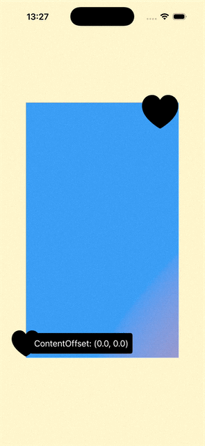
You might be wondering why don’t we calculate the indicator offset from unitPointX and unitPointY instead? It actually works a little better and smoother this way! Give it a try yourself!
And of course, you can further adjust the offsets based on the way you like. For example, we can set the vertical indicator to come further into the scrollable area by minus some additional constant to the x value, ie: offset(x: self.contentInset.trailing — 10, y: …)
Now, unfortunately, I cannot get it to work with a List!
The indicators will work only as an indicator, dragging on it will not actually cause the view to scroll!
I tried to give the entire List the ID, Wrap it with a ScrollView, a VStack, and assign ID to those, but unfortunately, no success!
Calling proxy.scrollTo doesn’t really scroll the view to anywhere!
View Modifier
If you only have one ScrollView within your entire App that you want a custom scroll indicator, I guess you can get away with what we had above!
But!
Let’s make it our indicators a little easier to use by turning it into a view modifier!
extension ScrollView {
    nonisolated func scrollIndicators<V, W>(
        @ViewBuilder horizontalIndicator: () -> V,
        @ViewBuilder verticalIndicator: () -> W,
        scrollableAxis: Axis.Set = [.horizontal, .vertical]
    ) -> some View where V: View, W: View {
        self
            .modifier(ScrollIndicatorModifier(
                horizontalIndicatorView: horizontalIndicator(),
                verticalIndicatorView: verticalIndicator(),
                scrollableAxis: axes)
            )
    }

    nonisolated func scrollIndicators<V>(
        @ViewBuilder horizontalIndicator: () -> V,
        scrollableAxis: Axis.Set = .horizontal
    ) -> some View where V: View {
        self
            .modifier(ScrollIndicatorModifier(
                horizontalIndicatorView: horizontalIndicator(),
                verticalIndicatorView: EmptyView(),
                scrollableAxis: axes)
            )
    }

    nonisolated func scrollIndicators<W>(
        @ViewBuilder verticalIndicator: () -> W,
        scrollableAxis: Axis.Set = .vertical
    ) -> some View where W: View {
        self
            .modifier(ScrollIndicatorModifier(
                horizontalIndicatorView: EmptyView(),
                verticalIndicatorView: verticalIndicator(),
                scrollableAxis: axes)
            )
    }
}


struct ScrollIndicatorModifier<V, W>: ViewModifier where V: View , W: View {

    var horizontalIndicatorView: V
    var verticalIndicatorView: W

    var scrollableAxis: Axis.Set

    @State private var contentOffset: CGPoint = .zero
    @State private var contentInset: EdgeInsets = .init()
    @State private var contentSize: CGSize = .init()

    @State private var horizontalIndicatorSize: CGSize = .init()
    @State private var verticalIndicatorSize: CGSize = .init()

    private let mainViewId: UUID = UUID()
    private var hiddenAxes: Axis.Set {
        var axes: Axis.Set = []
        if !(self.horizontalIndicatorView is EmptyView) {
            axes.insert(.horizontal)
        }
        if !(self.verticalIndicatorView is EmptyView) {
            axes.insert(.vertical)
        }
        return axes
    }

    func body(content: Content) -> some View {

        GeometryReader { geometry in
            // to avoid recalculating on Drag gesture
            let unitPointX: CGFloat = max(0, min(1, (self.contentOffset.x + self.contentInset.leading) / (contentSize.width - geometry.size.width)))
            let unitPointY: CGFloat = max(0, min(1, (self.contentOffset.y + self.contentInset.top) / (contentSize.height - geometry.size.height)))

            ScrollViewReader { proxy in
                ScrollView(scrollableAxis, content: {
                    content
                        .id(mainViewId)
                })
                .defaultScrollAnchor(.topLeading)
                .scrollIndicators(.hidden, axes: hiddenAxes)
                .onScrollGeometryChange(for: CGSize.self, of: { geometry in
                    return geometry.contentSize
                }, action: { old, new in
                    self.contentSize = new
                })
                .onScrollGeometryChange(for: CGPoint.self, of: { geometry in
                    return geometry.contentOffset
                }, action: { old, new in
                    self.contentOffset = new
                })
                .onScrollGeometryChange(for: EdgeInsets.self, of: { geometry in
                    return geometry.contentInsets
                }, action: { old, new in
                    self.contentInset = new
                })
                .overlay(alignment: .topTrailing, content: {
                    let indicatorHeight: CGFloat = self.verticalIndicatorSize.height
                    let offsetY = geometry.size.height * self.contentOffset.y / (contentSize.height - (geometry.size.height - indicatorHeight) ) + ((self.contentInset.top != 0) ? (self.contentInset.top / 2) : -indicatorHeight/4)

                    verticalIndicatorView
                        .overlay(content: {
                            GeometryReader { geometry in
                                if self.verticalIndicatorSize != geometry.size {
                                    DispatchQueue.main.async {
                                        self.verticalIndicatorSize = geometry.size
                                    }
                                }
                                return Color.clear
                            }
                        })
                        .offset(x: self.contentInset.trailing, y: (offsetY.isNaN || !offsetY.isFinite) ? 0 : offsetY)
                        .highPriorityGesture(
                            DragGesture(minimumDistance: 1.0)
                                .onChanged({ value in
                                    proxy.scrollTo(self.mainViewId, anchor: .init(
                                        // keep x to be the current
                                        x: unitPointX,
                                        y: max(0, min(value.location.y, geometry.size.height)) / geometry.size.height
                                    ))

                                })
                        )
                })
                .overlay(alignment: .bottomLeading, content: {
                    // horizontal indicator
                    let indicatorWidth: CGFloat = self.verticalIndicatorSize.width

                    let offsetX = geometry.size.width * self.contentOffset.x / (contentSize.width - geometry.size.width + indicatorWidth)  + ((self.contentInset.leading != 0) ? self.contentInset.leading / 2 : -indicatorWidth/4)

                    horizontalIndicatorView
                        .offset(x: (offsetX.isNaN || !offsetX.isFinite) ? 0 : offsetX, y: self.contentInset.bottom)
                        .highPriorityGesture(
                            DragGesture(minimumDistance: 1.0)
                                .onChanged({ value in
                                    proxy.scrollTo(self.mainViewId, anchor: .init(
                                        x: max(0, min(value.location.x, geometry.size.width)) / geometry.size.width,
                                        // keep x to be the current
                                        y: unitPointY
                                    ))

                                })
                        )
                })
                .frame(maxWidth: .infinity, maxHeight: .infinity, alignment: .center)
            }
        }
    }
}
Couple notes I would like to make here!
- Modifier only available for ScrollView. This is because if it is just a VStack, adding this modifier will actually change the view Layout and if the base view is a List, as you might know, List will not even show up when wrapped within another ScrollView.
- mainViewId: UUID = UUID(). This is just to avoid some possible duplications. Okay, Okay, I know, UUID is not guaranteed to be unique either! But whatever!
- ScrollView Frame: frame(maxWidth: .infinity, maxHeight: .infinity, alignment: .center). Otherwise, if the view attaching this modifier to has some size constraints, due to the GeometryReader, the view position might change.
- isNaN check on the offset. This is needed if the original view is wrapped within a NavigationStack. Otherwise, we will get this crash telling us that view origin is invalid: (-16.0, nan), UnitPoint(x: 0.0, y: 0.0), (48.0, 8.0).
Time to use it!
Vertical Only
struct CustomScrollIndicatorWithModifier: View {
    var body: some View {
        NavigationStack {
            ScrollView(.vertical) {
                VStack {
                    ForEach(0..<20, id: \.self, content: { int in
                        Text("Item \(int)")
                            .font(.system(size: 32))
                            .fontWeight(.bold)
                            .foregroundStyle(.white)
                            .padding(.vertical, 16)
                            .frame(maxWidth: .infinity)
                            .background(
                                RoundedRectangle(cornerRadius: 8)
                                    .fill(LinearGradient(colors: [.yellow, .blue.opacity(0.8)], startPoint: .top, endPoint: .bottom))
                            )

                    })
                }
                .padding()
                .scrollTargetLayout()
            }
            .scrollIndicators(verticalIndicator: {
                let image = Image(systemName: "heart.fill")
                    .resizable()
                    .scaledToFit()
                    .frame(width: 40)

                VStack(spacing: 0) {
                    image.foregroundStyle(.green)
                    image.foregroundStyle(.blue)
                    image.foregroundStyle(.purple)
                }
                .padding(.all, 4)
                .contentShape(Rectangle())
            })

            .background(.yellow.opacity(0.2))
            .navigationTitle("Custom Indicators")

        }
    }

}
Vertical + Horizontal
struct CustomScrollIndicatorWithModifier: View {
    var body: some View {
        NavigationStack {
            ScrollView([.vertical, .horizontal]) {
                VStack {
                    ForEach(0..<20, id: \.self, content: { int in

                        HStack {
                            Text("Item \(int)")
                            Spacer()
                            Text("Item \(int)")
                            Spacer()
                            Text("Item \(int)")
                        }
                        .padding(.horizontal, 24)
                            .font(.system(size: 32))
                            .fontWeight(.bold)
                            .foregroundStyle(.white)
                            .padding(.vertical, 16)
                            .frame(width: 1000)
                            .background(
                                RoundedRectangle(cornerRadius: 8)
                                    .fill(LinearGradient(colors: [.yellow, .blue.opacity(0.8)], startPoint: .top, endPoint: .bottom))
                            )


                    })
                }
                .padding()
                .scrollTargetLayout()
            }
            .scrollIndicators(horizontalIndicator: {
                Image(systemName: "heart.fill")
                    .resizable()
                    .scaledToFit()
                    .frame(width: 72)
                    .foregroundStyle(.red)

            }, verticalIndicator: {
                let image = Image(systemName: "heart.fill")
                    .resizable()
                    .scaledToFit()
                    .frame(width: 72)

                VStack(spacing: 0) {
                    image.foregroundStyle(.green)
                    image.foregroundStyle(.blue)
                    image.foregroundStyle(.purple)
                }
                .padding(.all, 4)
                .contentShape(Rectangle())

            })
            .background(.yellow.opacity(0.2))
            .navigationTitle("Custom Indicators")

        }

    }

}

A Little Additional
If you want the indicators to disappear, for example, after the ScrollView stops scrolling completely, all you have to do is to
- Add onScrollPhaseChange(_:) modifier
- Add couple states variable to control whether to show the indicators or not
- Set the state variables based on the ScrollPhase. For example, if the isScrolling property is true, indicating the scroll view is actively scrolling, you can set to show the indicators. Or you can also decide to display those if the phase is anything but idle.
Thank you for reading!
That’s it for this little article!
Happy scroll indicating!
SwiftUI: Custom Draggable Scroll Indicator was originally published in Level Up Coding on Medium, where people are continuing the conversation by highlighting and responding to this story.
This content originally appeared on Level Up Coding - Medium and was authored by Itsuki
Itsuki | Sciencx (2025-09-08T00:19:18+00:00) SwiftUI: Custom Draggable Scroll Indicator. Retrieved from https://www.scien.cx/2025/09/08/swiftui-custom-draggable-scroll-indicator/
Please log in to upload a file.
There are no updates yet.
Click the Upload button above to add an update.