
This content originally appeared on Zach Leatherman and was authored by Zach Leatherman
This is another post in the series entitled Conservative Design Patterns for Form Elements.
Next we’ll look at a web component that is almost ubiquitous among user interfaces today, the Option List. The Option List can take any one of the following three forms.
- Multiple Selections: User can select any number of the options presented to them. Types: Checkbox Group, Multiple Select Element
- Single Selection: User can select none or one of the options available. Types: Radio Group, Select Element
- User Input List: User types in the options that they want to use. All inputs are marked as selected. Types: Group of Textboxes
We’ll describe each of these variants separately.
Multiple Selections:
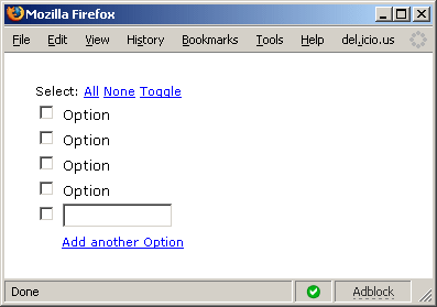
Minimum Feature Set:
- Validation: The user can select at least one, an integer range of options, or any number of the options presented.
- Quick Links: optional links to select all options, clear the options, and toggle the options to the opposite value of what they currently hold.
- Customizable Values: optionally allow the user to add their own options (one, an integer range, or many) to the list.
- Other Variants: Any Select Element, as described in the original post.
Single Selection:
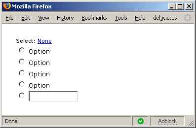
Minimum Feature Set:
- Validation: The user can select at most one of the options presented.
- Quick Link: optional link to clear the options
- Customizable Value: optionally allow the user to add their own option (only one is required, since only one can be selected).
- Other Variants: Any Select1 Element, as described in the original post.
User Input List:
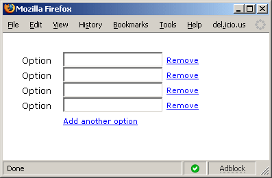
Minimum Feature Set:
- Validation: The user must have at least one of the text fields with a value (doesn’t matter which one). Or the user must have an integer range number of fields with values.
- Quick Link: optional link next to an element to remove that element from the list (not clear it, remove it)
- Customizable Values: optionally allow the user to add their own options (up to an integer limit).
- Other Variants: Any List of InputX Elements, as described in the original post (could be passwords or textareas).
The images above for all three component types show a textbox for the addition of another option, but this should also allow customization to allow any type of (Select or InputX) element for the addition of another option.
This content originally appeared on Zach Leatherman and was authored by Zach Leatherman
Zach Leatherman | Sciencx (2007-02-26T06:00:00+00:00) Conservative Design: Option List. Retrieved from https://www.scien.cx/2007/02/26/conservative-design-option-list/
Please log in to upload a file.
There are no updates yet.
Click the Upload button above to add an update.