This content originally appeared on Zach Leatherman and was authored by Zach Leatherman
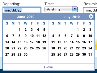
The Date Picker component is one of the most popular user interface components on the web today. Its operation is very simple: focus into a field (sometimes a click on a dedicated calendar button is required) intended to contain a specific date and an on-screen calendar will be shown next to the form field, allowing the user to click on a specific date to populate the form field.
Date Pickers are helpful components that are useful for a couple of reasons:
- They allow you to easily map an existing real-world mental model (the Calendar) to form input (a text field). This provides additional context beyond what the simple string value of a date represents: days of the week, Calendar month labels, leap year information.
- They allow for more usable and actionable data restrictions and error feedback. Want the user to select a weekday? Just show them on the calendar which days are available.
- Visual cue as to what the form field’s data format should be. If a calendar icon is next to the form field, it becomes very obvious what kind of data the user should put into the field.
Now, the last two reasons are all well and good, but carry no intrinsic incentive for the user to actually click on and use the Date Picker component. The first reason is what actually motivates a user to bring up the Date Picker and select a date on it.
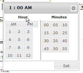
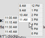
Now, consider the following Time Picker component, popularized by a John Resig blog post:
Comparing to the Date Picker component above, one could easily make the argument that it offers little to no incentive over simple keyboard input. It offers no additional context, extra data, or an existing physical mental model for the user to associate with. The only advantage it might offer is an easy calculator for those unfamiliar with 24-hour (military) time. I would argue that placing the AM/PM selection at the beginning of the selection creates a reversal of the closest established mental model a person typically uses to represent a time: the digital clock (hours, minutes, seconds, and AM/PM at the end).
Examples #
Here’s a sampling of some other time picker implementations:
This implementation is very similar to the first example, just organized differently. We can do better.
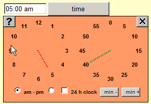
Reading an analog clock isn’t the problem. When we think of time, we start with numeric representations of the hours and minutes. The first thing that pops into the average person’s head when they hear “6:00 PM” probably isn’t: the little hand on the 6 and the big hand on the 12. The analog clock representation is a mental hurdle.
Now we’re getting closer. The user selects a full representation of the time, not just the last piece of the puzzle. I like the intuitive and simple organization of this time picker. You know immediately what you’re selecting. I think we can organize the times a little bit better though, give them a visual hierarchy.
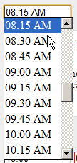
This picker represents more of the spirit of what we’re looking for. It shows a simple list of the hourly options and progressively discloses the minute selections. I think switching to a single column layout would be more intuitive for keyboard navigation (combining the above two implementations into one super-component) and would do well with larger click targets.
These implementation examples speak to a larger trend of front end engineers that concentrate too much on code optimization and cross browser compatibility, and not enough on usability and user driven design. It’s an easy trap to fall prey to, but one we must be wary of. A Time Picker might offer benefit in terms of data restriction (e.g.: select an hour in the range of a normal workday), but it does very little for the efficiency and usability of data entry. So, before you start putting Time Pickers on all of your forms, make sure the Time Picker you add represents something like this:
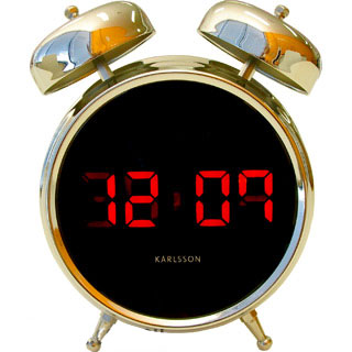
and not this:
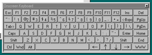
Image Sources: tesora.com.au and codeproject.com
This content originally appeared on Zach Leatherman and was authored by Zach Leatherman
Zach Leatherman | Sciencx (2010-06-08T05:00:00+00:00) A Race Against Time Pickers. Retrieved from https://www.scien.cx/2010/06/08/a-race-against-time-pickers/
Please log in to upload a file.
There are no updates yet.
Click the Upload button above to add an update.

