
This content originally appeared on @mdo and was authored by Mark Otto
I like WordPress. I like WordPress in Helvetica Neue. I also would like WordPress even more if their upload modal didn’t look like garbage. So, I took a crack at mocking something up in Photoshop. It’s only the first state of the modal, but it captures a lot of my feedback nicely.
Before
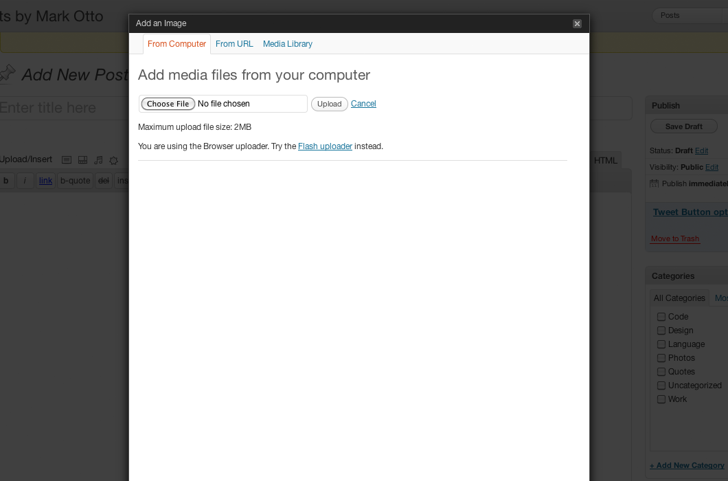
But wait, why does this suck? Well, I’ll tell you:
- Attaching media (particularly images) and inserting them into my posts is a difficult process
- It barely resembles the visual style of the rest of WordPress
- It’s narrow, awkwardly tall, and has really pointy corners (every other corner in WordPress is rounded)
The meat of my problem with the modal comes from using media, but I’m not tackling that just yet. That’s a little more work than I’m want to put in for now.
After
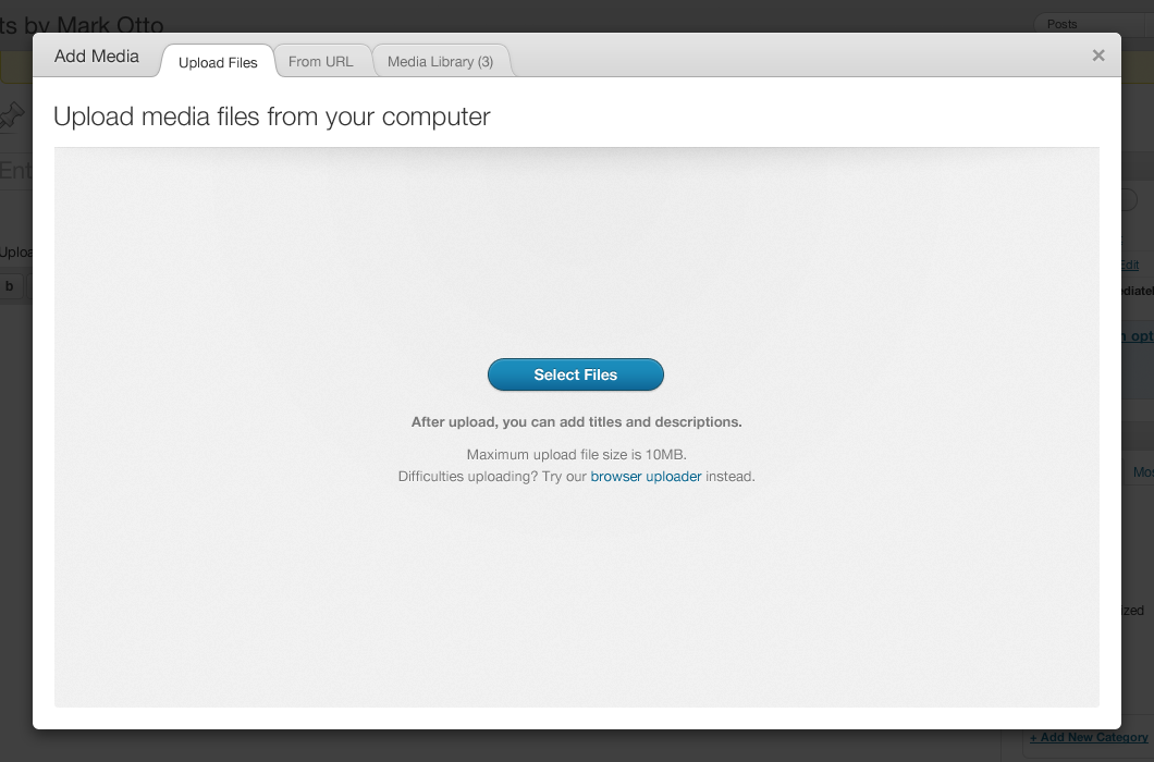
The mockup addresses a few issues I have with the current modal’s design:
- Uses the same top bar style as the rest of WordPress (light gray gradient)
- Rounds the corners of the modal
- Collapses the modal’s header and tabs into one horizontal bar
- Adds a little flair to the tabs by using a style similar to Chrome for Mac
- Improves spatial relationship between different elements
- One modal heading to rule them; instead of “Add an Image” or “Add a Video,” we just have “Add Media”
- Adds just a hint of color by making the primary action blue, just like the Publish/Schedule button for new posts in WordPress, to reinforce what you’re doing within the modal
And that’s it. It’s nothing official—just putting down an idea that was in my head. Up next? Exploring the other states of the modal. The presentation of and interactions for media files suck even more than it’s general design, so that’ll be a fun and rewarding follow up to this post in due time.
This content originally appeared on @mdo and was authored by Mark Otto
Mark Otto | Sciencx (2010-12-26T00:00:00+00:00) Redesigning the WordPress upload modal. Retrieved from https://www.scien.cx/2010/12/26/redesigning-the-wordpress-upload-modal/
Please log in to upload a file.
There are no updates yet.
Click the Upload button above to add an update.