
This content originally appeared on Viljami Salminen and was authored by Viljami Salminen
Recently I started testing how proportional scaling of bigger layouts would work in reality and if it makes any sense. It’s possible when using EM units and then changing body’s font-size when viewport’s height grows above certain point. Basically that means, that I have to change only one or two css properties between @media queries which are targeting larger screen sizes.
The reason why I started doing this, is that I wanted to rethink my current approach to responsive design and try something which would make the process at least a bit easier.
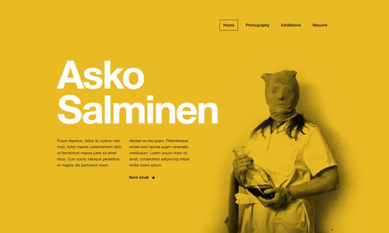
Warning: You’ll need to view my demo on at least 24" or 27" monitor with 1920×1200 resolution or bigger. Otherwise you won’t see this method in full effect and it might be harder to understand the benefits.
Demo viewed on 27" and 15" screens:
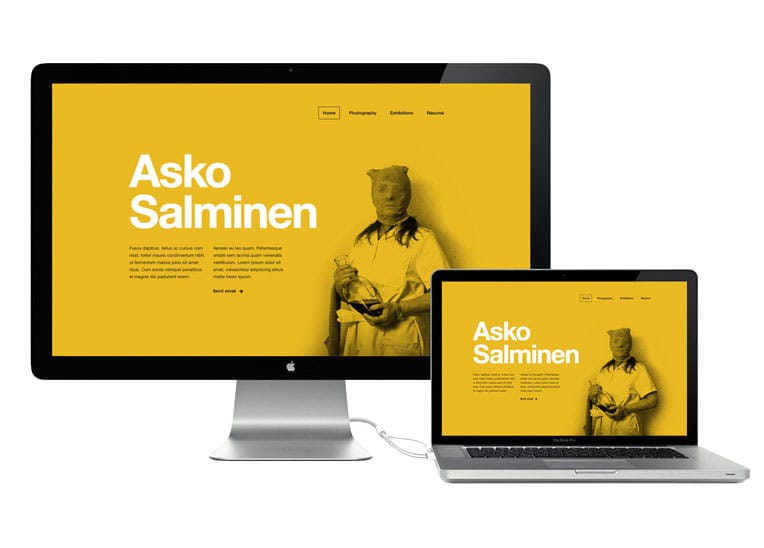
The idea is that when the screen size grows, the demo still takes approximately the same amount of screen estate.
CSS and @media queries #
This method makes most sense when combined with mobile first approach. After you’ve reached the “optimal desktop size” you can start scaling the layout up for larger screen sizes. The most important thing is to specify all units in your stylesheet with EMs, so that we can scale everything by changing body’s font-size. That works because EMs are relative to parent element’s font-size.
You can easily figure out the needed break points by scaling the window bigger and looking when the layout starts to break apart or look awkward. That’s the point when you’ll want the next @media query to trigger and scale the layout a bit bigger.
body {
  font-size: 81.25%;
}

@media (min-width: 68em) and (min-height: 53em) {
  body {
    font-size: 87.5%;
  }
}

@media (min-width: 75em) and (min-height: 57em) {
  body {
    font-size: 93.75%;
  }
}

@media (min-width: 80em) and (min-height: 62em) {
  body {
    font-size: 100%;
  }
}
Check out my demo to get a better picture of this. Try also scaling the browser window bigger/smaller + remember to do the testing on a big screen.
Images #
I recommend using either SVG or some sort of adaptive images approach with this technique. You can get going with just one image version, but you should remember that when you optimize for the largest size possible it’s usually way too heavy for mobile devices + can also look quite awkward when browsers scale it down too much.
The future #
This method won’t work with all designs, but at least when combined with a design which has elements which are somehow relative to the viewport dimensions, it makes it much easier to adapt the layout to different sizes.
Also: I heard two days ago that Webkit nightly builds started supporting viewport-relative lengths through the “vw” and “vh” units in CSS. In addition to Webkit, IE9 is the only browser out there right now that supports these new units. We cannot probably start using them right away, but they’ll open up many new possibilities to make it much easier to scale elements according to the viewport. Before we reach the point where all major browsers support these units we can use this EM method.
Resources #
Please note that the demo layout I’m using is copyrighted work and cannot be used as a template/boilerplate for your work. The actual site will be launched later on different URL. The actual site is here. ❦
This content originally appeared on Viljami Salminen and was authored by Viljami Salminen
Viljami Salminen | Sciencx (2012-03-05T00:00:00+00:00) Scaling with EM units. Retrieved from https://www.scien.cx/2012/03/05/scaling-with-em-units/
Please log in to upload a file.
There are no updates yet.
Click the Upload button above to add an update.