This content originally appeared on Laura Kalbag’s Blog Posts and was authored by Laura Kalbag
First steps: choosing a typeface
The first step in my grid design was to choose an appropriate typeface. I knew this would be everything on such a text-heavy site, and I really struggled because, as with all the elements on my personal site, I wanted it to reflect “me”. I wanted a typeface that felt friendly and not too formal whilst still appearing clean, readable and professional. I sunk money on a few lesser-known typefaces (everybody wants to be different and original, right?!) before completely falling for Avenir. Avenir was only available (with the delivery method I preferred) as a web font from fonts.com so that made choosing the font service much easier.
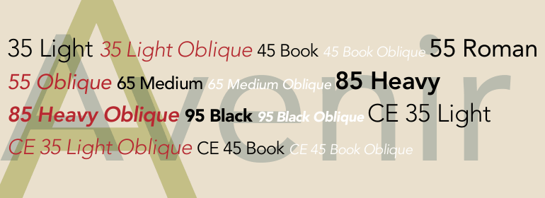
Avenir typeface sample
Basic setting of the typeface
Playing with Avenir in Typecast gave me an idea of the size I wanted to use it. Making it pretty big allowed its character to show whilst maximising readability. I’m also keen on a bigger line height on rounded sans serif type faces as their spacious counters can make their lines harder to distinguish if the leading is tighter.
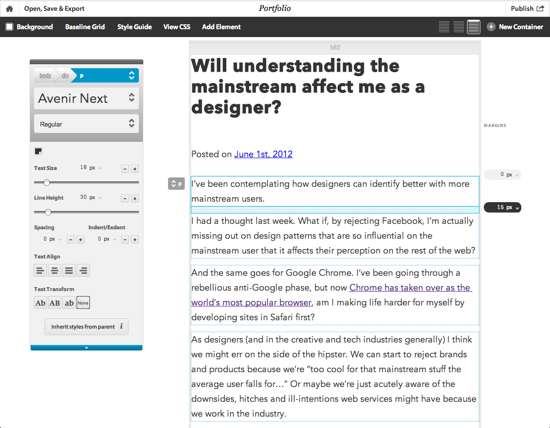
Playing with content set in Avenir in Typecast
Base units and vertical rhythm
It was then time to decide on the base unit I was going to use as the foundation for my grid. Admittedly, I did this somewhat arbitrarily; I tend to go with multiples of 10 (occasionally using 5) as it makes the maths easier, so this time I challenged my maths with multiples of 12 (using 6 for detail.) Another justification I had was that it would be more harmonious working with what would probably become a three column grid, thus roughly using “thirds” as a concept. To create a consistent vertical rhythm I used multiples of my base unit on all vertical measurements, including line-heights, margins and padding.
Horizontal grids
When I was creating the grid design for this site I was dying to play more with Gridset. My content was fairly flexible; most pages consisted of a large amount of body text, which just needed to be as readable and digestible as possible, and some meta information which could sit to one side or above the content depending on the space available in the viewport.
Having this flexibility in my content meant the fancy grids in Gridset were mine to try out. I chose grid A as my primary grid to stick to for as many of the layouts as suited the content, and B as my secondary grid when the content better fitted to points between the grid A’s columns. Using the grids overlaid in this way gave me consistency whilst still maintaining a level of flexibility.
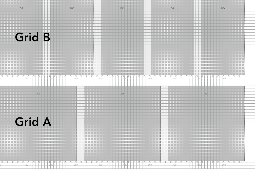
Grid A and Grid B overlaid on my base unit grid

Grids A and B overlaid
Flexible grids
Now I don’t really believe in creating a fully (often based entirely on percentages) horizontal grid along with a fixed vertical grid (usually described through line-heights and vertical margins/padding.) If you do this, the ratio/proportions relating the horizontals and verticals change every time the page is loaded in a different width viewport. This can have far less than harmonious results.
Instead, as my viewport reduces in width, I remove the columns from the right end of the grid and re-distribute the content where relevant in order to achieve readable content and consistent, structured feel. So this might be me as designer ‘not letting go’ of fixed constraints or embracing fluidity as much as I possibly can, but I believe that it’s this structure that allows us to maintain a level of control over the measure (line length) necessary for pleasurable reading experience. If you’re going to create breakpoints at arbitrary positions in order to keep your text readable, why not fit it around a balanced grid layout instead?
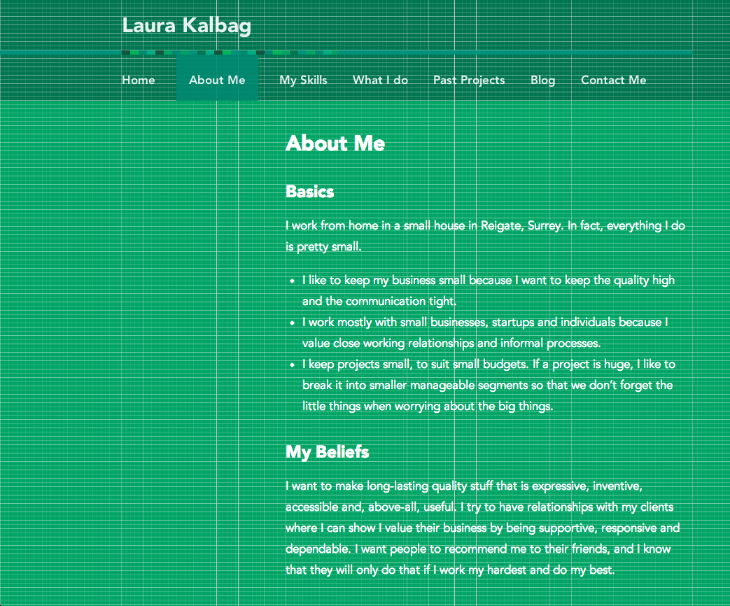
Wide About page, utilising the full grid
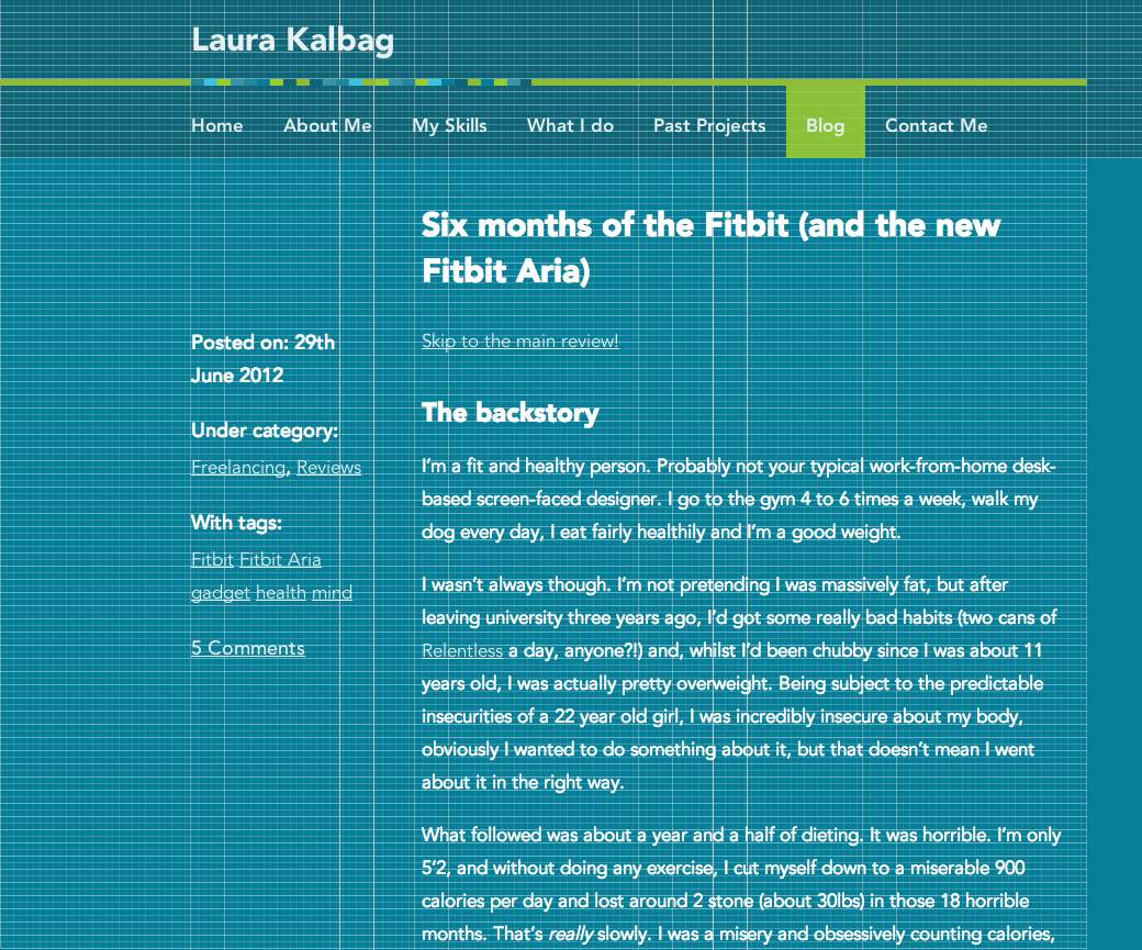
Wide Blog page, utilising the full grid
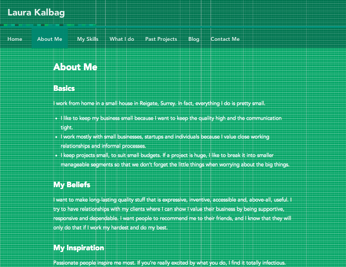
Medium-width About page, moved one column to the left
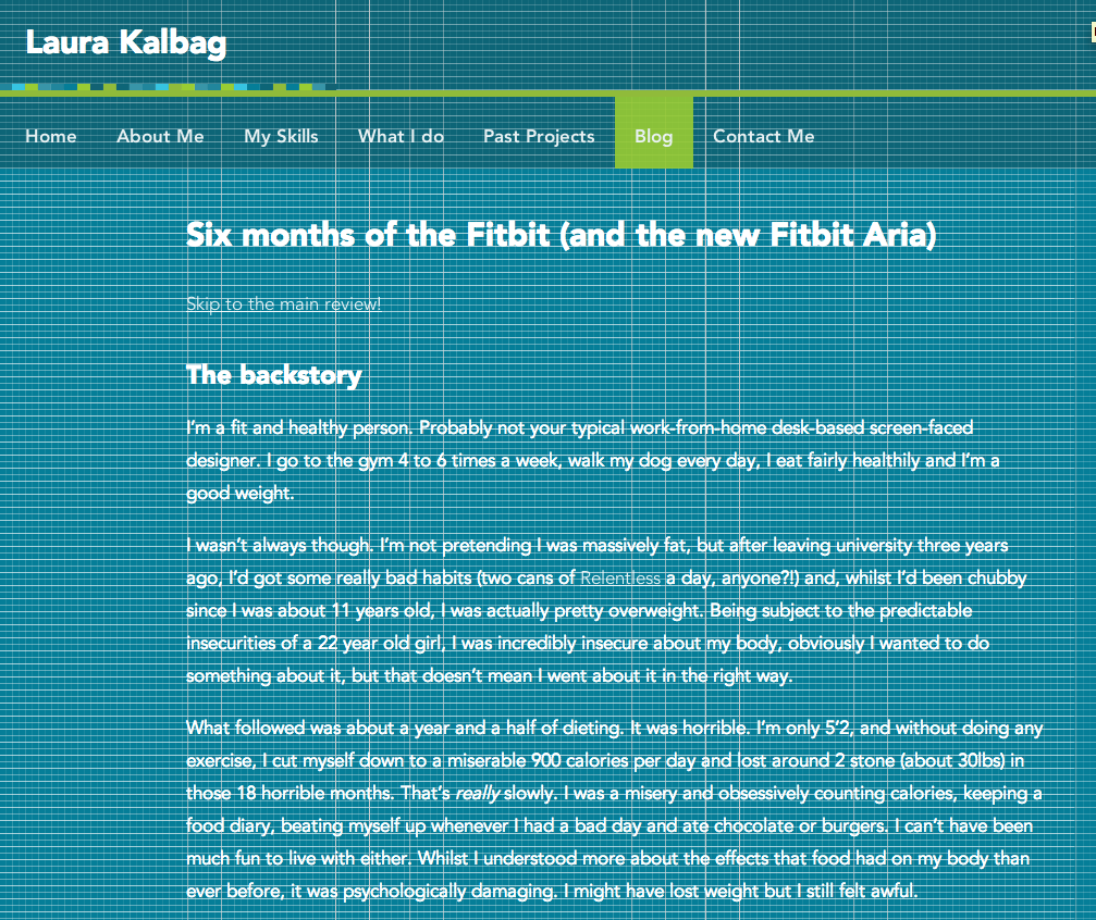
Medium-width blog page, with meta content shown below the main content rather than in left column
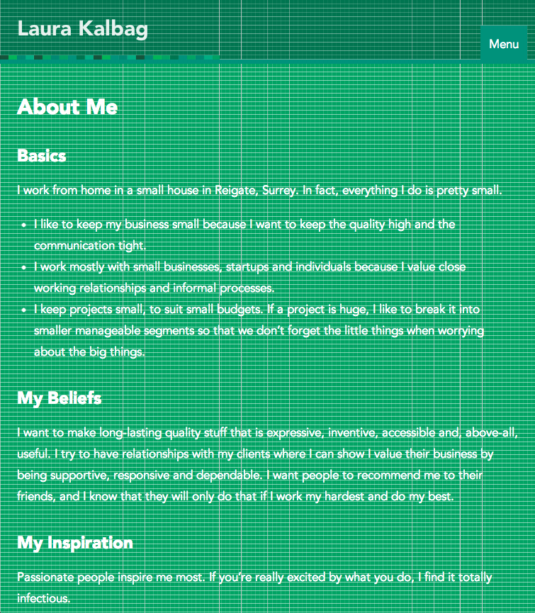
Smaller-width About page, not using the grid structure but using padding based on the base unit size
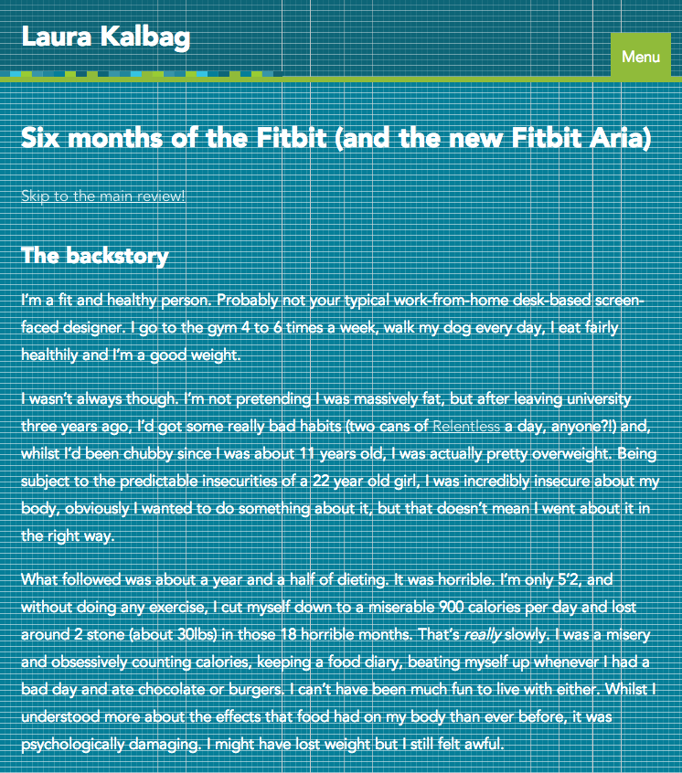
Smaller-width Blog page, not using the grid structure but using padding based on the base unit size
Paddings and margins
Just like in my vertical rhythm my column padding, and with any horizontal margins in the layout, I stuck to multiples of my base unit. This helps keep the balance between the horizontal and vertical elements of the layout and prevents it from feeling stretched or condensed in some viewports, which I think is often an unfortunate side effect of a truly fluid layout with a stingy lack of breakpoints.
Breaking the grid (content comes first)
There were points at which I broke from my grid structure in order to better serve my content: project archive pages. These are more optimised for the viewport width to keep the images big enough to identify their subject but small enough that they’re not creating excessive page length (or indeed weight.) But these image/column widths are still multiples of the base unit grid, so subtly remain consistent and true to my grid design.
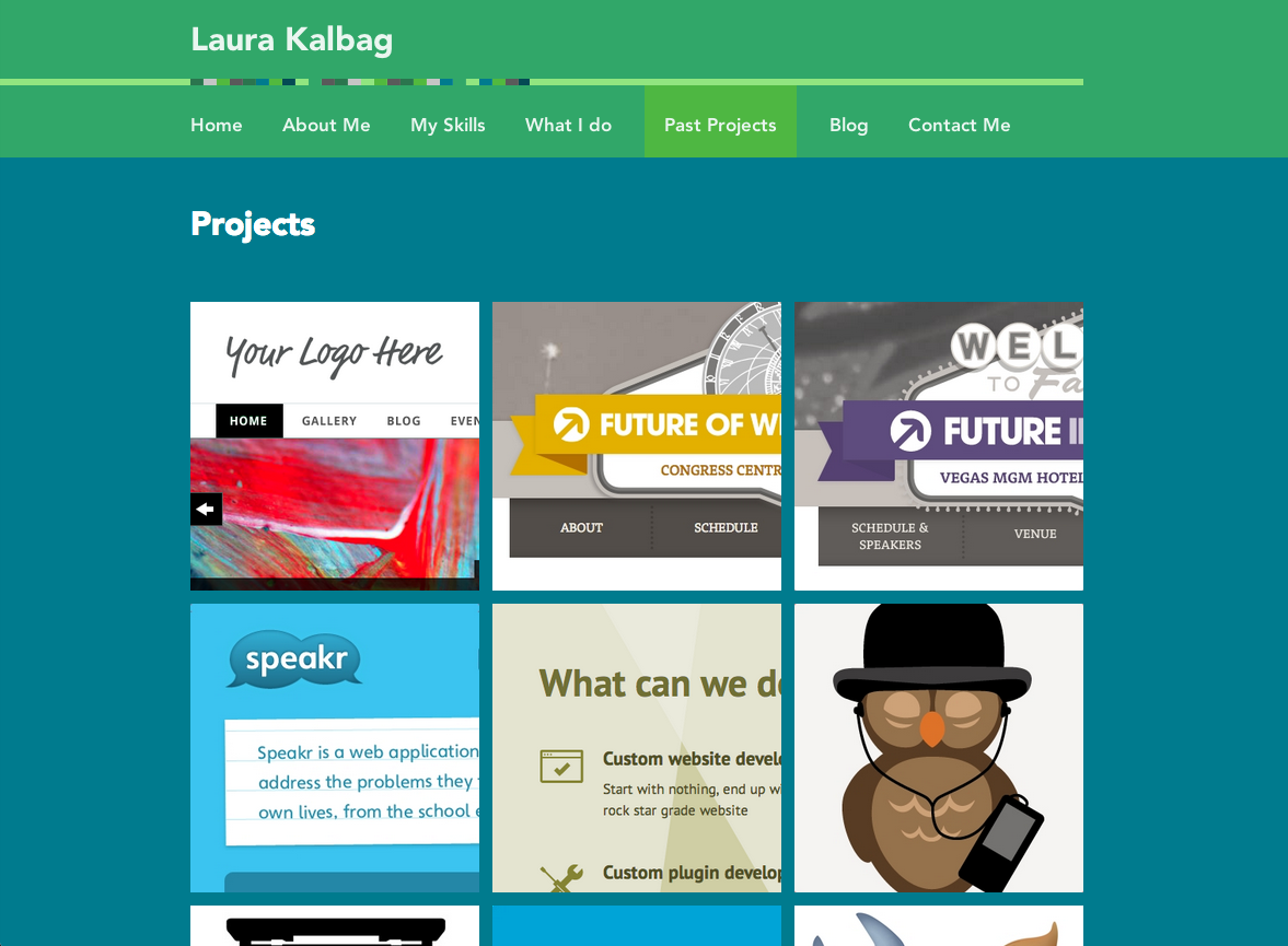
Past projects page breaks the grid by having a more content-appropriate layout
Left-aligning the grid
For a long time, I had centred my page layouts in the browser window, believing that it was the most optimal use of space (or rather broke up large expanses of white space!) However, for this design I decided that I’d left-align the grid to the viewport. This kept my grid looking structured as it didn’t leave an infinitely resizable column on the left side of the browser, and also preserved the rigidity of that left-aligned grid as I removed right-hand columns as the viewport width was reduced.
Often the whitespace resulting from a left-aligned page layout would could feel gaping, so I decided (on pages that didn’t otherwise have much imagery) I would use that space for a background illustration that I hoped would be better use of otherwise redundant space.
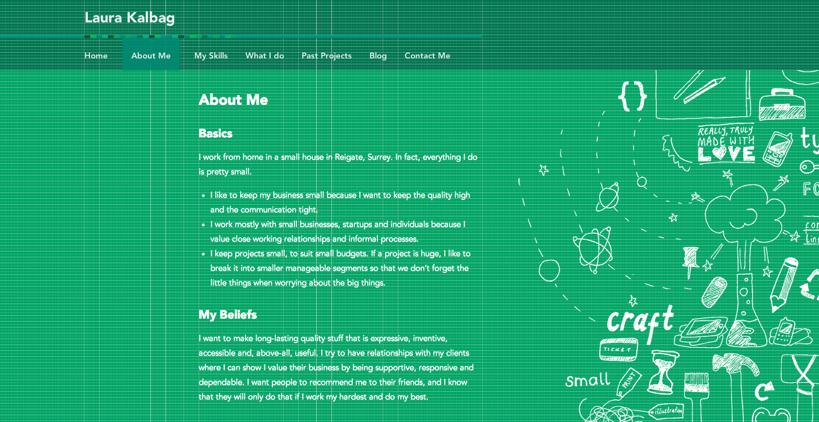
Very wide About page showing the background illustration
Tweaks
A few days after the launch of my site I made a few tweaks. The most significant to my grid being adjusting the main content font size and line height on narrower viewports. I didn’t want to go with that awful trend of shrinking text to an unreadable size just because the screen is smaller. As Simon Foster said in his great Responsive Designer talk at Web Expo Guildford just today; it’s about balancing measure with a readable font size and a readable font size should always win. I shrunk the font size by only 1 (1/12) unit , but shrunk the line-height by 6 (1/2) units. This made the measure a little better whilst still preserving a (hopefully) readable font size, but also fitted considerably more text into smaller viewports making it a little less distracting to read.
Evaluating
This approach to grid design works for me. I’m not saying I will use it for every project in the future, but at the moment it feels like it has the right balance of flexibility and control with content- and experienced-based priorities. Perhaps I could make my base unit em-based, or even percentage based (that’s got to be one hell of a Sass mixin) to make it even more ‘responsively’ flexible, I’m still exploring what’s possible.
15 comments
Read the original post, 'Grids, flexibility and responsiveness'.
This content originally appeared on Laura Kalbag’s Blog Posts and was authored by Laura Kalbag
Laura Kalbag | Sciencx (2012-10-12T21:39:30+00:00) Grids, flexibility and responsiveness. Retrieved from https://www.scien.cx/2012/10/12/grids-flexibility-and-responsiveness/
Please log in to upload a file.
There are no updates yet.
Click the Upload button above to add an update.

A great article Laura, I’ve always wanted to try using grids and after reading about your workflow am certain to give it a try. I love seeing how other people approach their layouts. :)
P.S. I’m still a sucker for centre aligning! :D
Thank you for the insight. :)
It appears that the meta content is shown below the main content, actually b/w the main content and the comments.
I also see you fixed the Menu bounce problem on iOS 4 (at least it now works on my iPhone 4). Are you going to write about that as well?
And yes, I fixed the menu bounce problem. It was actually thanks to the lovely [Berklee](http://alpha.app.net/berklee" title="Berklee on app.net” rel="nofollow), who rewrote my function slightly and had the ability to test it on iOS5 (something I was struggling with!)
One thing I have noticed recently is that using ’em’s for media queries seems to be working a little better than pixel values. You can view what happens when you zoom in to the page with the browser (CTRL + usually) and see that the media query ‘breaks’. By using ’em’s, which are relative, they will keep working, which is great if content should decide the breakpoints and you value your users settings.
My 2 cents on this subject!
Great article, Laura :)
I really like the design of you site, so simple and beautiful.