This content originally appeared on Zell Liew and was authored by Zell Liew
Continuing the series on creating a clean and simple website, I’m going to share with you how I coded my blog from scratch. In this article, I’ll discuss how to go about first creating fixed width layouts using pixels. If you’re new to this, you might want to check out the previous article on writing HTML for the website that we’re creating
II’ll try to explain everything clearly and simply in a way that you should be able to follow even if its your first time looking at CSS. My blog design definitely doesn’t have the bells and whistles around the internet, and thats why I think its such a good place to start from.
Linking your CSS files to your HTML files##
The easiest way to link your CSS files to your HTML files is to use the <link> tag and is to be placed within the <head> and </head> of the HTML document.
If you stylesheet is placed in the same directory as the HTML file, simply type the name of the stylesheet to the href attribute. (I usually name my file as style.css.)
If the stylesheet is placed in a folder above, type ../ infront of the name.
If the stylesheet is placed in a folder below, type the folder name, followed by the stylesheet name.
This is how the code should look like
<link rel="stylesheet" href="style.css">
// if stylesheet is in the same folder

<link rel="stylesheet" href="css/style.css">
// if stylesheet is in the folder named css.

<link rel="stylesheet" href="../css/style.css">
// if stylesheet is a sibling folder named css. Not as often used
1. CSS Reset
Before even attempting to play with CSS, it is important to use a CSS reset. By default, each browser, Safari, Chrome, Firefox and Internet Explorer inclusive, has its own default styles for a website to make sure that everything looks at least with hierarchy if no styles are being set. This however, severely hinders our cause as we now have to remove them to start off with a blank slate. A CSS reset does this.
Two very good CSS resets are:
- Eric Meyer’s Css reset
- Normalize.css
Choose either one, and place it right at the top of your css file. You should know what the reset contains, but lets leave that discussion for another day.
2. Look at the big picture
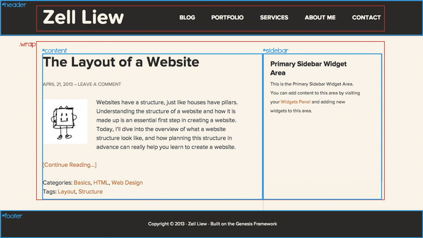
Lets revisit the big picture that we previously spoke of while writing up the initial HTML

Recall that we have marked 4 areas with ids and inserted several .wrap classes into the HTML markup in our previous article. Incase you were wondering, we will be using these ids and classes to tell the browser which part of the webpage should take up which styles.
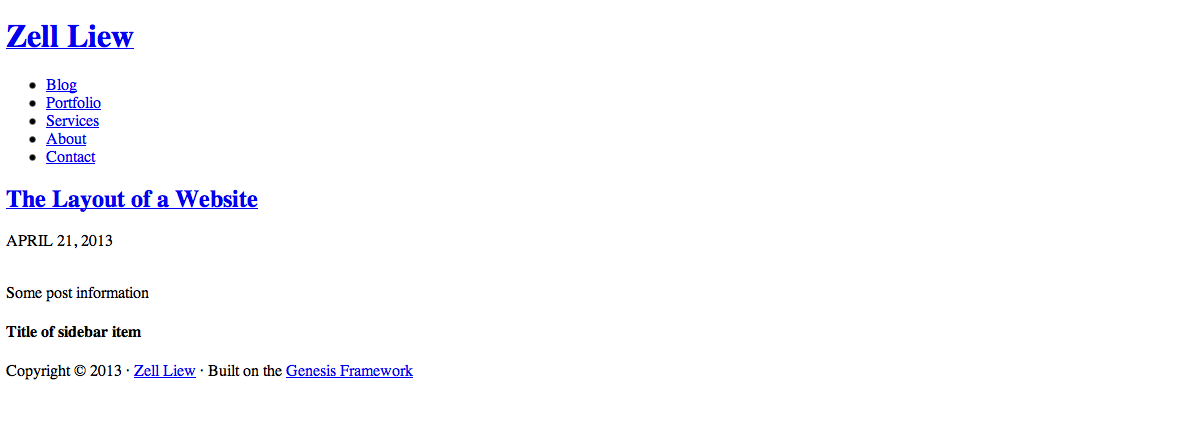
Lets also take a look at our HTML without any styling involved

3. Style the Header
The first thing we notice is that the header takes up the whole width in the browser window, no matter what the size of the window is. (We say it spans the whole width in more technical terms). In this case, we must make sure that a div that spans the whole width of the window encompasses the items within.
Looking back to our HTML document, we know that #header is the div containing the background while .wrap is the div that contains our contents within the header.
#header {
  background-color: #2b2927;
   /* This shows the background color */

  margin-bottom: 81px;
   /* This ensures that there is a margin of 81px between the header of other elements */

  overflow: hidden;
  /* Overflow hidden is used because we will be floating all children elements. */
}

.wrap {
  width: 1152px;
  /* Sets the width of the elements to be 1152 pixels. */

  margin: 0 auto;
  /* Shorthand for margin. Auto on left and right allows .wrap to be centered in the browser */
}
Within the header, there are a few things we have to take care of as well, specifically the title of the website and the navigation panels. Here’s a quick refresher of the HTML that we have previously coded:
<div id="header">
    <div class="wrap">
        <div id="title-area">
            <h1 id="title">
                <a href="#">Zell Liew</a>
            </h1>
        </div>

        <nav>
            <ul>
                <li><a href="#">Blog</a></li>
                <li><a href="#">Portfolio</a></li>
                <li><a href="#">Services</a></li>
                <li><a href="#">About</a></li>
                <li><a href="#">Contact </a></li>
            </ul>
        </nav>
    </div>
</div>
Here’s the CSS to style the title area. Explanations are found within the code:
#header {
  background-color: #2b2927;
  /* This shows the background color */

  margin-bottom: 81px;
  /* This ensures that there is a margin of 81px between the header of other elements */

  overflow: hidden;
  /* Overflow hidden is used because we will be floating all children elements. */
}

.wrap {
  width: 1152px;
  /* Sets the width of the elements to be 1152 pixels. */

  margin: 0 auto;
  /* Shorthand for margin. Auto on left and right allows .wrap to be centered in the browser */
}

#title-area {
  display:block;
  /* Display block allows setting of width and height values  */

  line-height: 108px;
  height: 108px;
  /* height determines the amount of vertical space allocated for the header.

  Also, a line-height that equals the height ensures that the element is centered on the horizontal axis */

  width: 30%;
  /*A small width is to ensure that there is space for navigational elements*/

  float: left;
  /* floating the title area left ensures that it can be placed side by side with the navigational elements, which would be floated to the left as well */
}
The navigation area is marked up in the HTML as an unordered list. In this case, we have to set the display of each list item either inline, or we would have to float them to the left. Its a choice that you can make, and either works fine. I coded it in this manner:
nav {
  line-height: 108px;
  height: 108px;
  float: right;
  width: 65%;
}

nav li{
  display: inline;
}

nav ul {
  text-transform: uppercase;
  /* This is to convert all letters to uppercase */
  text-align:justify;
  /* text-align: justify and the following few lines of codes inclusive allows my navigation elements to have equal spaces within between them no matter how many elements there are.*/
}
nav ul:after {
  content:'';
  display:inline-block;
  width: 100%;
  height: 0;
}

nav a {
  padding: 1em 0;
}
Alternatively, you could use paddings on a tags to enlarge the clickable area and separate the navigation options. This would be much easier to achieve. To find out more about my above code in creating items that are spreaded evenly, check out Chris Coyier’s post on equidistant objects with CSS.
This is what we currently have after the above steps. Not too pretty eh? Next up, lets fix the color of the text, typefaces and sizes.

4. Text styles and sizes
Lets first begin by setting the correct typeface as the text. In my actual website, I used the font “Proxima Nova”. Since its a paid font, lets use Montserrat (a free substitute) for this portion of the tutorial.
Head over to Google Web Fonts on and get the link to Montserrat
The steps to using this font is very similar to the process we linked our HTML to our stylesheet. Make sure you check both 400 and 700 weights. The font will be loaded if you insert the following code BEFORE the link to the stylesheet.
<head>
  <link href='http://fonts.googleapis.com/css?family=Montserrat:400,700' rel='stylesheet' type='text/css'>
  /* Link to Montserrat font */
  <link rel="stylesheet" href="style.css">
</head>
The next step is to add the font family to our CSS files. We’re going to use Montserrat for both the header title and navigation items. While we’re at it, lets determine the font families for the rest of our website as well. This is what the codes look like:
body {
  font: normal 18px/1.5 "Montserrat", helvetica, arial, sans-serif;
  /* This is a font shorthand that allows you to set many variables at one go, in this case its:
  font weight:    normal;
  font-size:      18px;
  line-height:    1.5;
  font-family:    "Montserrat", helvetica, arial, sans-serif; */
}

#title,
nav {
/* commas allow you to add more than one selector to have the same styles.
Since we want the text in both #title and nav to be bold, we can specify font-weight: bold; to both of them in this manner */
    font-weight: bold;
}

#title {
  font-size: 60px;
  /* This is to enlarge the font on the title text */
}
Ahh much better. Here’s what we have at the moment:

5. Adding Colors
Next up, we deal with colors of the text. Lets first deal with the color of the text. We set the color of the anchor tag to be #faf3e7 and we also use a pseudo element :visited on the anchor tag, and set the same color to #faf3e7.
The :visited pseudo element targets links that readers have already visited before. By default, a dark purple color will be applied to these links and we want to change it to what we like.
a {
  text-decoration: none;
  /* This removes the underline in anchor tags */
}

#title a, nav a,
/* This targets the <a> tag within #title and #nav respectively */
#title a:visited, nav a:visited
/* This targets links that were already visited before by the user  */
{
  color: #faf3e7;
}
Looking way better now.

To add on to the experience, we’re going to add some hover styles that changes the color of the navigation element when the user mouses over it. This added effect enhances the interaction between the user and the website, and you will definitely have seen it elsewhere before. In this time, we will also set focus and active states for screen readers to show the same styles as hover.
Here we go:
#title a:focus, /*Focus takes effect when the tab shortcut is used to navigate the links */
#title a:hover,  /* Hover takes effect when you mouse enter the specific area */
#title a:active  /* active takes effect when its the active page */
{
  color: #faf3e7;
  text-decoration: none;
  /* This ensures the header text doesn't change color on hover */
}

nav a:focus, nav a:hover, nav a:active
{
  color: #ce6f20;
  text-decoration: none;
}
Conclusion
This is it for this tutorial, its quite a lot to take in for just styling the header portion if you’re just starting to learn CSS. I’ll continue the series with styling the content and footer areas in the next article. In the meantime, play around with HTML and CSS codes to make your own stuff! I’m pretty sure my codes here are not perfect, and you’ll hone your skills if you discover the areas where I should improve :)
Here’s the codes we currently have so far. We will also talk about how to order the codes properly further down the road.
This content originally appeared on Zell Liew and was authored by Zell Liew
Zell Liew | Sciencx (2013-05-13T00:00:00+00:00) Creating a clean and simple website (Part 2 – Styling the header). Retrieved from https://www.scien.cx/2013/05/13/creating-a-clean-and-simple-website-part-2-styling-the-header/
Please log in to upload a file.
There are no updates yet.
Click the Upload button above to add an update.
