Designing a responsive menu without a hamburger

James Archer has explained why the hamburger menu can cause usability problems. I thought I’d jot down a few alternative designs here.
# 1. Medium
Medium’s success is down to it’s simplicity which can be seen in its navigation which simply drops undern…

James Archer has explained why the hamburger menu can cause usability problems. I thought I’d jot down a few alternative designs here.

# 1. Medium

Medium’s success is down to it’s simplicity which can be seen in its navigation which simply drops underneath the header.

Medium menu
Medium’s navigation stacks underneath the header on small screens

# 2. Product Hunt

Product Hunt follows the same approach as Medium, but does regardless of screen size. But, as Product Hunt has more links, they wrap onto two lines.

This menu could be designed a little better, it’s hard to argue with how simple this is to operate across all screen sizes.

Product Hunt menu
Product Hunt’s navigation stacks underneath the header regardless of screen size

# 3. Node

Node’s site has eight links, and they lay them out plainly in two columns on small screens. On large screens they are displayed on one line.
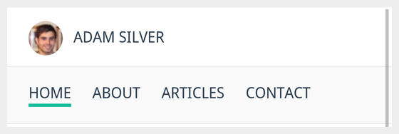
Node menu
Node’s navigation is displayed in two columns on small screens

# 4. Adamsilver.io

My site follows suit and I’ve had no complaints.

Adam Silver menu
My site navigation is like Medium’s

# 5. Google Design

Google Design lets users horizontally scroll which I’ve noticed a number of news sites are employing.

Google Design menu
Google Design keeps links on one line while letting users horizintally scroll

It’s good to avoid horizontal scroll, but on small screens, this approach works well and scales too.

# 6. The Minimalists

The Minimalist’s site keeps their navigation bar simple just like their overall message. Links simply wrap.

The Minimalists
The Minimalists

# Summary

These designs are boringly simple and user-friendly. User’s don’t mind scrolling and it’s wise not to exert too much energy trying to fit everything above an imaginary fold.


Print Share Comment Cite Upload Translate
APA
Adam Silver | Sciencx (2024-03-29T09:03:48+00:00) » Designing a responsive menu without a hamburger. Retrieved from https://www.scien.cx/2015/09/14/designing-a-responsive-menu-without-a-hamburger/.
MLA
" » Designing a responsive menu without a hamburger." Adam Silver | Sciencx - Monday September 14, 2015, https://www.scien.cx/2015/09/14/designing-a-responsive-menu-without-a-hamburger/
HARVARD
Adam Silver | Sciencx Monday September 14, 2015 » Designing a responsive menu without a hamburger., viewed 2024-03-29T09:03:48+00:00,<https://www.scien.cx/2015/09/14/designing-a-responsive-menu-without-a-hamburger/>
VANCOUVER
Adam Silver | Sciencx - » Designing a responsive menu without a hamburger. [Internet]. [Accessed 2024-03-29T09:03:48+00:00]. Available from: https://www.scien.cx/2015/09/14/designing-a-responsive-menu-without-a-hamburger/
CHICAGO
" » Designing a responsive menu without a hamburger." Adam Silver | Sciencx - Accessed 2024-03-29T09:03:48+00:00. https://www.scien.cx/2015/09/14/designing-a-responsive-menu-without-a-hamburger/
IEEE
" » Designing a responsive menu without a hamburger." Adam Silver | Sciencx [Online]. Available: https://www.scien.cx/2015/09/14/designing-a-responsive-menu-without-a-hamburger/. [Accessed: 2024-03-29T09:03:48+00:00]
rf:citation
» Designing a responsive menu without a hamburger | Adam Silver | Sciencx | https://www.scien.cx/2015/09/14/designing-a-responsive-menu-without-a-hamburger/ | 2024-03-29T09:03:48+00:00
https://github.com/addpipe/simple-recorderjs-demo