This content originally appeared on Zell Liew and was authored by Zell Liew
I recently came across an article titled “Web typography is broken. Here’s how we can fix it”. A mix of emotions rushed through me while I read through it. I realized that the biggest argument Tom was making in the article was that web typography is broken because type doesn’t sit perfectly on a baseline grid.
On one hand, I was happy to see people coming up with ideas to push code to their limits.
On the other hand, I’m unsettled. I asked myself: “Is there a need to make every line of text sit on the baseline”? I knew the importance of Vertical Rhythm and the baseline grid. I also knew that details matter when it comes to design. But is this one detail enough to break web typography?
As I browsed through the internet looking for answers, I found out that even great designers like Mark Boulton remarked that it would be cool if CSS gave us a pain free baseline grid.
This increased my urge to find out if web typography was completely broken. After all, if a great designer said the same thing, then sticking perfectly to the baseline grid should be important. Right?
Before I dig deep into this question, let’s take a look and see why we have the baseline problem in the first place.
Baseline Grids on the Web
The Baseline grid is primarily the manifestation of Vertical Rhythm at a work. In Vertical Rhythm, we try to keep vertical spaces between elements on a page consistent with each other with the help of a baseline – A common denominator used to create the consistent spaces.
When these baselines are stacked together onto the same page, we have a baseline grid.

On the web, the baseline is determined by the line-height property of the body text. If the computed line-height value is 24px, the baseline is 24px.
Creating the baseline grid on the web used to be difficult. We could only visualize this baseline with the help of images. Now, we can use linear-repeating-gradient() to generate a baseline grid easily.
Here’s how to make one with a baseline of 24px:
body {
  background-image: repeating-linear-gradient(to bottom, transparent 0px, transparent 23px, red 23px, red 24px);
}
Baseline grids often appear like this on the web. You’ll see that text floats between the baselines.

They appear this way because the line-height property distributes extra pixels evenly to the top and bottom of the text.
Baseline grids on Print design is slightly different. Text sits on the baseline instead of floating between them.

We can try to make the web baseline grid behave exactly like the print one. There are two different ways.
The first method is to change the background-position property of the baseline grid such that body text sits on it:
body {
  background-image: repeating-linear-gradient(to bottom, transparent 0px, transparent 23px, red 23px, red 24px);
  /* Moves baseline grid */
  background-position: 0 -6px;
}
The second method (slightly more purist way) is to reposition all text elements such that they sit on the baseline grid instead of changing the position of the grid.
p {
  position: relative;
  top: 6px;
}
The situation becomes slightly more complicated when you have text elements with different line-heights. Let’s say you have a <h1> element with a line-height of 48px (twice of the baseline).
You’ll discover that the <h1> element sits slightly above the baseline no matter which method you use to “fix the baseline grid”.
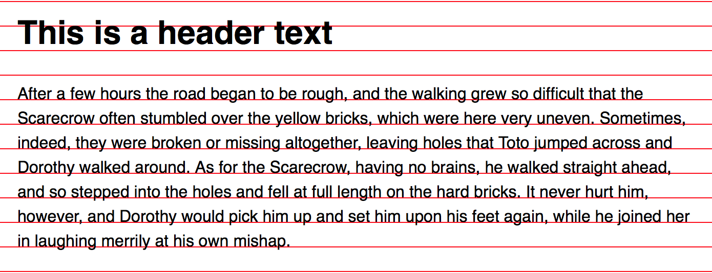
One way to fix this “off-alignment” issue is to push the header down slightly with a top property. You’ll have to do the same step for every element that doesn’t sit on the baseline.
h1 {
  position: relative;
  top: 6px;
}
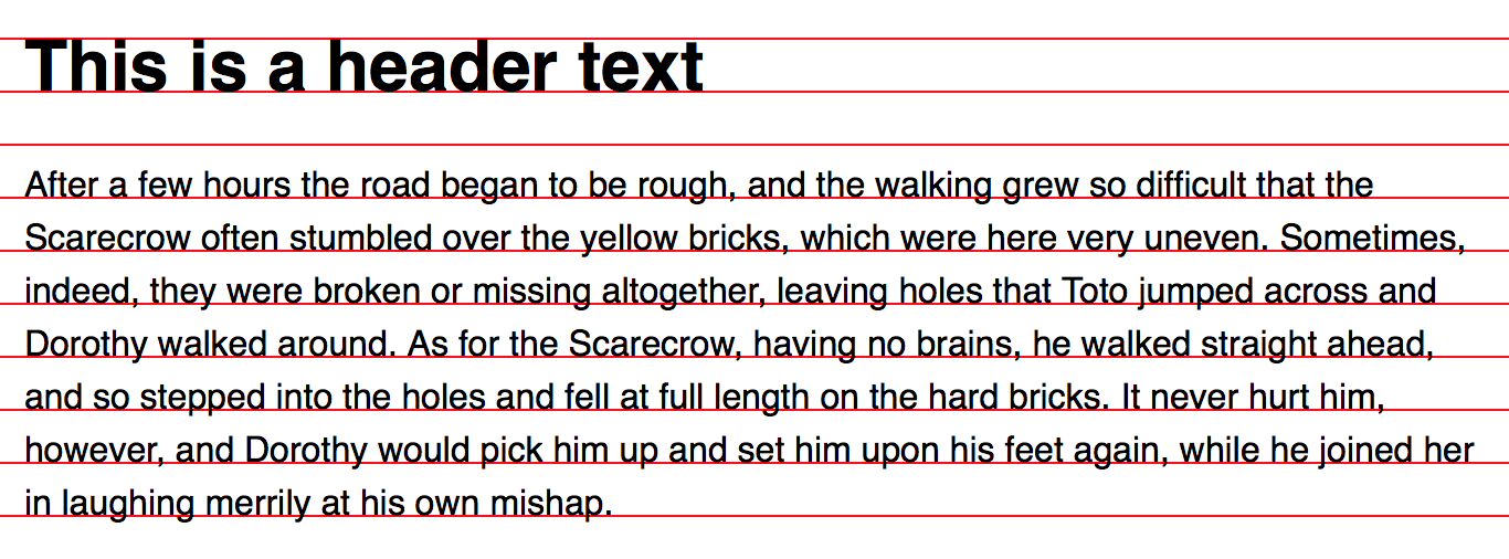
In reality, making text sit on the baseline grid isn’t as simple as what you’ve seen so far. It gets more complicated as you increase the number of typefaces. It also gets more complicated when you have to cater for responsive websites. So far, what I’ve done in this process is to manually adjust <h1> and <p> after eyeballing the results.
There are two solutions to this problem. First, there’s a library called Sassline that’s built by Jake Giltsoff. We also have another library called MegaType that’s built by Thomas Bredin-Grey
In case you were wondering, the CSS output from Sassline and MegaType are both pretty complicated. Here’s what the output from Sassline looks like:

As you can see, Sassline uses negative margins coupled with padding to reposition text. Pretty complex stuff.
The CSS output from MegaType is:

As you can see, MegaType uses position, top and margin properties. Also pretty complex stuff.
It’s amazing how Jake and Tom came up with ideas like these to correct the baseline. It’s these ingenious solutions that’ll eventually push the web to a better place.
That’s it for background knowledge. Let’s move on and find out if placing text on the baseline is indeed important. To do so, I first tried to understand why we use baseline grids.
The Why of a Baseline Grid
As I mentioned above, baseline grids is manifestation of Vertical Rhythm at work. The reason we’re using baselines is to help enforce Vertical Rhythm.
Vertical Rhythm, in turn, is important because we’re following the principle of repetition. To be specific, we’re repeating a spatial relationship. I’ve dug deep into the purpose of Vertical Rhythm in a previous article so check that out if you want to find out more.
Since we’re following the principle of repetition, the key to finding out whether it’s important to make text sit on a baseline is to repeat more elements.
Comparing Print And Web Baseline Grids
I decided to compare print and web baselines side by side while repeating more elements. Here’s the result:
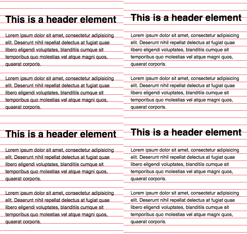
Uh. It’s hard to compare the results with the baselines turned on. Hold on, I’ll remove them.
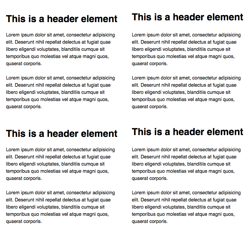
Much better now.
Pay attention to the spatial rhythm between the two implementations. What do you think?
It seems to me that type set with print baseline follows a more consistent rhythm. Type set with the web baseline seems to break the rhythm slightly whenever <h1> appears. (It’s the extra few pixels between the header and paragraph elements that stand out).
Now, let’s try repeating some more elements:

When you look at it now, the web baseline implementation doesn’t seem to go out of whack anymore, does it? It seems like the difference between web and print baseline grids becomes insignificant as the number of repetitions increases.
Wait. Don’t form a conclusion yet. There’s more to discuss.
There’s more to web design than pure text elements. Sometimes, we have elements that contain text, like a button for example:
A button
When you have elements like a button, how would you place them on the baseline? Would you put the button’s edges, the text, or both of them on the baseline?

Both Jake’s Sassline and Tom’s MegaType seem to suggest that we should place both the edges and text on the baseline:
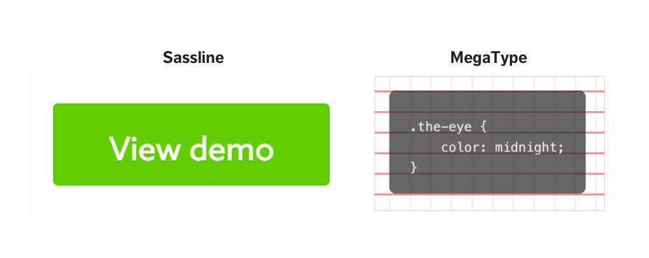
Personally, I don’t agree with Sassline nor MegaType because it’s weird to see buttons with uneven top and bottom spaces. I find that the rhythm gets broken immediately.
Instead of accepting their answers as the correct one, I decided to test all three variations to see if one was better than the other. Here are the results if I compared all four variations (plus the web one) with their respective baselines turned on.

While creating this test, I tweaked the <h1>'s font-size to 1.728em (using a modular scale of 1.2) instead of leaving it at the default 2em to make the comparison more realistic.
When I changed the <h1>'s font-size, I also realized that I had to create a baseline that was half the line-height value for the first scenario or it will look really weird.
Let me turn off the baseline grid now. Take a look and see which you prefer.
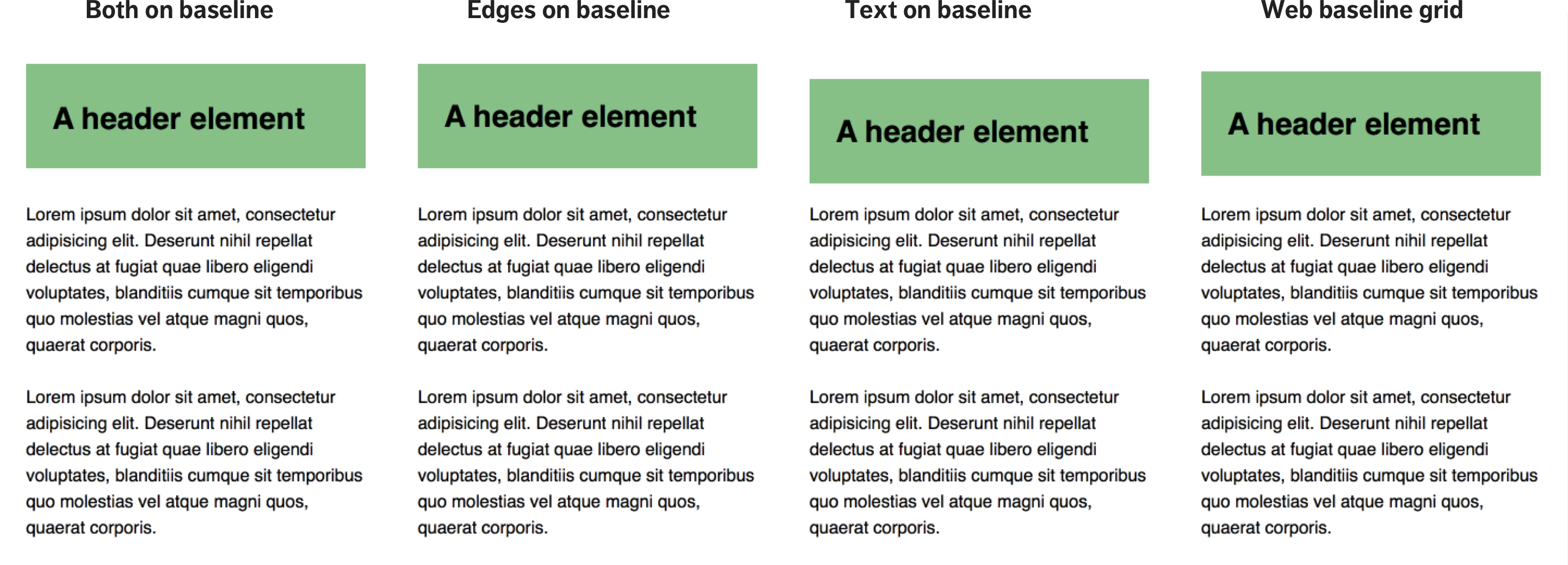
Versions 1, 2 and 4 (counting from the left) look awfully similar, don’t they?
The only one that stands out from this group is Version 3. It’s obvious that the vertical space between the header element and text is much smaller than the vertical space between the header text and it’s edges. The rhythm is broken here.
Since versions 1,2 and 4 are similar, is it worth the extra effort to push text to the baseline?
¯\_(ツ)_/¯
I’ll let you decide.
Moving on, these four variations are hypothetical scenarios I came up with. I wanted to test with some real scenarios as well. So, for the next step, I decided to check out three well-designed sites to see if they set their text with the print baseline.
Vertical Rhythm in Real Websites
Here, I shortlisted Medium, Awwwards and Dribbble as the three websites I think are well-designed. I’ll walk you through what I did, and what I’ve found.
Case Study 1: Medium
Medium has a beautiful design with long-form text. It’s a perfect case to test for Vertical Rhythm.
To conduct the case study, I picked a random article and inspected the paragraph tag.

Here, I found out what Medium uses a font-size of 21px and a line-height of 1.58. This means the baseline should be 21px * 1.58 = 33.18px.
Note: Medium changes the font-size at different device widths. What I mentioned above is the sizes when viewed on a desktop.
The next step was to create a baseline grid on Medium with repeating-linear-gradient(). Here’s what I found
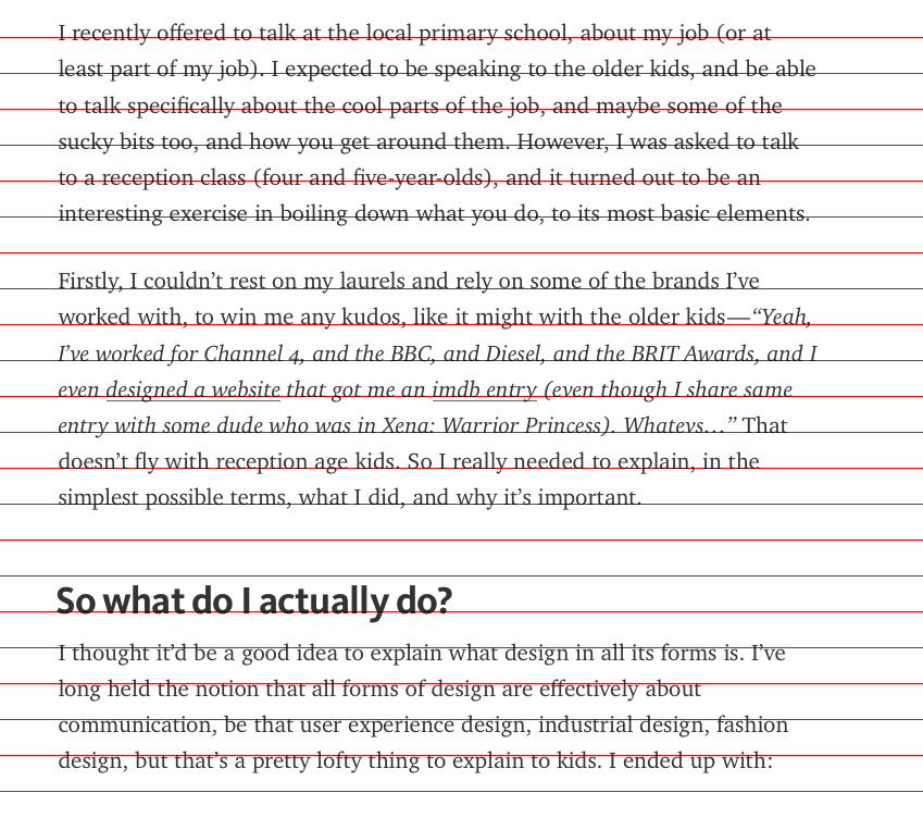
Note: I tested the grid with Firefox, which is the only browser I had that didn’t get affected by subpixel rounding errors.
Is Medium abiding completely to Vertical Rhythm?
Nope.
As I looked deeper, I realized that Medium uses a margin of 29px between paragraph elements, which pushes the rhythm off slightly. It also uses a margin-top of 56px on all h3 elements, which is slightly less than 2x of 29px.
So, here’s a food for thought: Does Medium have a bad design because it’s not following Vertical Rhythm exactly?
Let’s look at the rest of the websites before I say what I think.
Case Study 2: Awwwards
Awwward’s design is radically different from Medium’s. I picked it because I wanted to see if image-focused sites like Awwwards follow strictly to a Vertical Rhythm.
There isn’t much text on the page itself, so I picked the only text container I could see to hypothesize a baseline.

Here, I see that Awwwards uses a font-size of 16px and a line-height of 1.9.
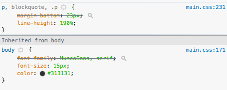
This means Awwwards should have a baseline of 16px * 1.9 = 30.4px. Here’s what it looks like when I added a baseline grid to Awwward:
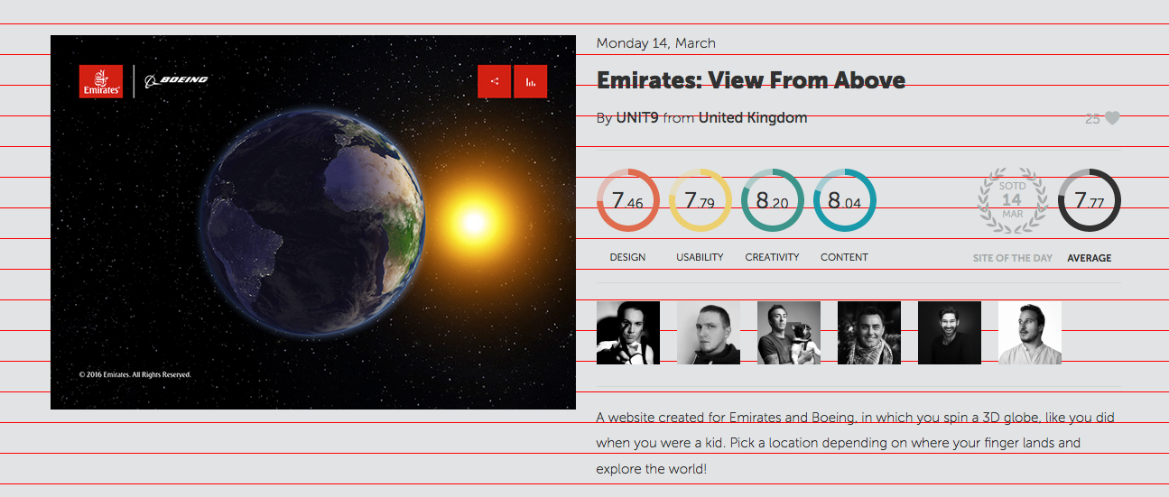
So, does Awwwards follow Vertical Rhythm?
Nope.
As I looked deeper, I noticed that Awwwards repeats a padding of 20px in multiple places:

Also, it doesn’t seem like Awwwards is forces text to sit on the baseline. I couldn’t find any margin, padding or position hacks that Sassline or MegaType uses.
Another food for thought: Does Awwward’s design suck because it doesn’t follow a Vertical Rhythm exactly?
Let’s take a look at the last case study before I conclude.
Case Study 3: Dribbble
For the third test, I wanted to find a page that uses both images and text to see if Vertical Rhythm is applied. Here I’ve chosen the shot page to conduct the test.
Dribble’s shot page uses a font-size of 16px and a line-height of 1.5, which means the baseline should be 24px.
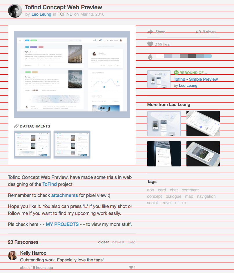
So, does Dribbble follow completely to a baseline grid?
Nope.
As I dug further, I noticed that Dribbble also used multiples of 5px as margins or paddings all around.

However, Dribbble uses a margin of 14px between paragraph elements! ???? A 1px difference!
So… Once again, does Dribbble’s design suck since it doesn’t follow a Vertical Rhythm perfectly?
You would have noticed by now that all three sites don’t follow a perfect Vertical Rhythm. Yet, they are all well-designed sites, aren’t they?
So, Does This Mean Vertical Rhythm is not Important?
On the contrary, Vertical Rhythm IS important. Following it to the pixel isn’t.
Earlier, we mentioned the principle behind Vertical Rhythm and baseline grids is the principle of repetition.
If you’ve read my article on why Vertical Rhythm is important, you would have know that repetition breeds familiarity. It has the ability to make things feel as if they belong together. It gives the feeling that someone has thought it all out, like it’s part of the plan.
The more you repeat elements, the more a design comes together. It also applies to any spatial relationships (including those that are not on the rhythm).
Here, we’ve seen that Awwwards repeats 20px spaces, Dribbble repeats multiples of 5px spaces while Medium repeats 29px spaces.
So, the main takeaway here is repetition.
Since repetition is the important thing, is there a need to push pixels and make text sit on the baseline grid?
¯\_(ツ)_/¯
Wrapping Up
We’ve gone through a ton of stuff in this article. First of all, we talked about the differences between a web baseline grid and a print baseline grid. We also found out how to convert a web baseline grid to a print one.
Next, we compared both types of baseline grids together. Here, I discovered that there’s a small (almost no) difference between print and web baseline grids when elements are repeated multiple times.
Finally, we looked at three well-designed sites to see if we can find real-life examples of Vertical Rhythm at work. None of them enforce a perfect rhythm. However, we noticed that they do repeat spatial relationships around the entire site.
After digging deep into Vertical Rhythm and baseline grids, I feel that it’s not important to push pixels and make text sit on a baseline grid. Instead, it’s more important to internalize the design principles so we can use or break them if we need to.
What’s your take? I’ll love to hear them in the comments below.
This content originally appeared on Zell Liew and was authored by Zell Liew
Zell Liew | Sciencx (2016-03-23T00:00:00+00:00) Is Web Typography Completely Broken?. Retrieved from https://www.scien.cx/2016/03/23/is-web-typography-completely-broken/
Please log in to upload a file.
There are no updates yet.
Click the Upload button above to add an update.
