
This content originally appeared on Zell Liew and was authored by Zell Liew
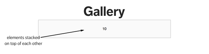
Did your span or gallery mixin behave unexpectedly (like the image below) when you’re using Susy?
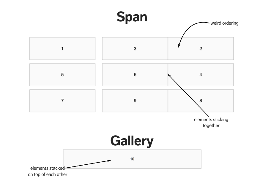
You’re not alone. Many people have faced the same problems I outlined above. When they meet with these problems, the common question was how to “reset” the output from the span, or the gallery mixin, so the weird behavior goes away, but that’s not the best way to fix the problem.
In this article, I’m going to show you why “resetting” is the wrong approach and what you can do instead.
Before we go further, I’m assuming you know how to use Susy. If you’re unfamiliar with susy, I suggest you download seven free chapters of Learning Susy to help you get up to speed quickly.
We’ll first look at the problem that arose from the span mixin, followed by the problem that arose from the gallery mixin.
The Problem from span
Let’s say you’re going to create a 2-column layout.
When you create the layout with the span mixin, you need to add a last mixin or a last keyword for the second column. (Assuming you’re using the after gutter-position).
Here’s what your SCSS might look like:
$susy: (
  columns: 12
);

.gallery__item {
  @include span(6);
  &:nth-child(2n) {
    @include last;
    // Or @include span(6 last);
  }
}
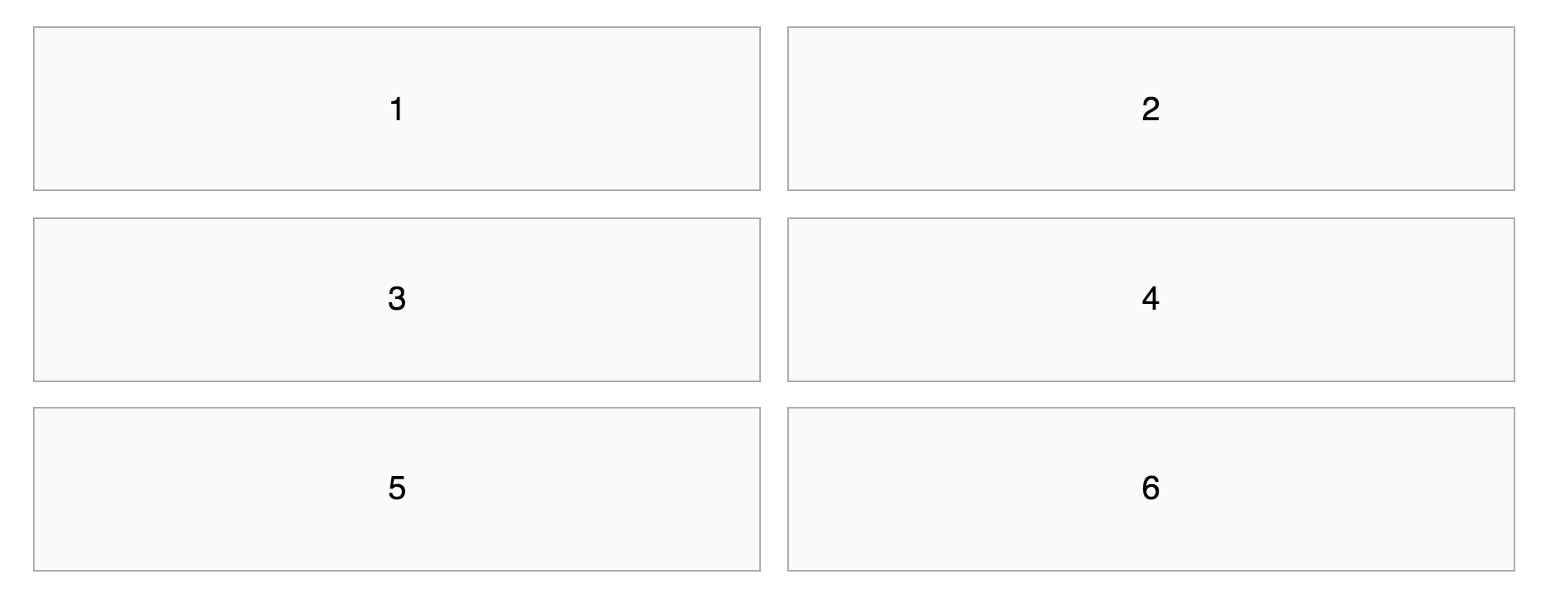
So far so good.
Now, what happens if you need to change it to a 3-column layout at 600px?
Most people add a media query to their SCSS, but they’ll forget about the :nth-child(2n) selector they’ve created previously:
.gallery__item {
  @include span(6);
  &:nth-child(2n) {
    @include last;
  }

  @media (min-width: 600px) {
    // Creates 3 column-layout
    @include span(4)
    &:nth-child(3n) {
      @include last;
    }
  }
}
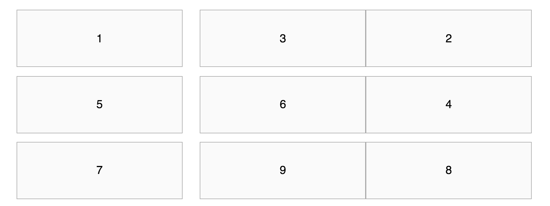
?
If you’ve opted to use the last keyword instead of the last mixin, here’s what you’ll see instead (given the same code)
.gallery__item {
  @include span(6);
  &:nth-child(2n) {
    @include span(6 last); // last keyword instead of last mixin
  }

  @media (min-width: 600px) {
    @include span(4)
    &:nth-child(3n) {
      @include span(4 last);
    }
  }
}
That’s even worse!!! ???
But why? Why is your layout screwed so badly? Why does it contain remnants of the old 2-column layout?
This happens because the gallery__item:nth-child(2n) pseudo class has a higher specificity compared to .gallery__item. Styles within .gallery__item:nth-child(2n) takes precedence over styles in .gallery__item because of the higher specificity.
A quick fix is to create a selector that overrides the previous layout with the same specificity.
.gallery__item {
  @include span(6);
  &:nth-child(2n) {
    @include span(6 last); // last keyword instead of last mixin
  }

  @media (min-width: 600px) {
    @include span(4)

   // Overriding the 2-column grid to match the 3-column grid
    &:nth-child(2n) {
      float: left;
      width: span(4)
      margin-right: gutter();
    }

    // Setting last item on the 3-column grid
    &:nth-child(3n) {
      @include span(4 last);
    }

  }
}
Although it works, you can see the code starts to get verbose.
It’s an okay solution if you didn’t need to change the layout at another breakpoint, but let’s say you had to. You need to create a 4-column grid when the viewport reaches 1000px.
If you used the same solution, you’d notice you need to override the remnants of BOTH the 2-column grid and the 3-column grid:
.gallery__item {
  // ... 2-column and 3-column grids

  // Creates 4-column grid
  @media (min-width: 1000px) {
    @include span(3);

    // Overrides 2-column and 3-column grid
    &:nth-child(2n),
    &:nth-child(3n) {
      float: left;
      width: span(3);
      margin-right: gutter();
    }

    // Sets last item on 4-column grid
    &:nth-child(4n) {
      @include last;
    }
  }
}
Ugh. Not very nice. We can agree that there’s a better solution out there.
A cleaner way is to use the :nth-child(n) pseudo-class to override all gallery items. It’s slightly better than overriding :nth-child(2n) and :nth-child(3n) separately:
.gallery__item {
  // ... 2-column and 3-column grids

  @media (min-width: 1000px) {
    // Overrides previous grid and creates 4-column grid
    &:nth-child(n) {
      @include span(3);
    }

    // Sets last item on 4-column grid
    &:nth-child(4n) {
      @include last;
    }
  }
}
Although this works, it’s not the best solution since we’re overriding code. It might come back and bite you a few weeks down the road if you forget about your approach.
By the way, since we’re overriding every gallery item, you can technically say we’re “resetting” the span mixin to its defaults.
There’s yet another solution. The cleanest one I’ve found so far.
It is to use media queries to isolate layouts so their effects don’t spill over to other breakpoints. This means we use both min-width and max-width media queries.
I’ve spoken in detail about why you should use both min-width and max-width queries in a separate post, but let me explain how to use it with our current example.
First, we know the layout is two columns on the smallest viewport. Since it’s the smallest viewport, we can safely use a max-width query to make sure styles we declare doesn’t go beyond a maximum viewport width.
.gallery__item {
  @media (max-width: 599px) {
    @include span(6);
    &:nth-child(2n) {
      @include last;
    }
  }
}
In this case, both @include span(6) and @include last will only trigger when the browser is 599px and below.
By doing this, you’ll see that each gallery item automatically returns to it’s default styles (width: 100% and float: none) when the viewport hits 600px.
With these styles, we’re free to code the 3-column layout without any side effects.
Note: Some people will also call this “resetting” the span mixin’s output. However, we’re not “resetting” anything in this case. We just contain the styles such that it doesn’t affect other viewports.
In the 3-column layout, we know there’s a 2-column layout when the viewport is below 600px. We also know there’s a 4-column layout at a viewport above 1000px. Hence, we need to contain it’s styles between 600px and 999px using both the min-width and max-width query:
.gallery__item {
  // 2-column layout

  // 3-column layout
  @media (min-width: 600px) and (max-width: 999px) {
    @include span(4);
    &:nth-child(3n) {
      @include last;
    }
  }
}
Once again, you’ll see that the gallery__item returns to its default styles at 1000px. We can then code the 4-column layout without any side effects from the previous two layouts
For the 4-column layout, we know it’s the largest layout of all, so we only need a min-width query to prevent it’s styles from affecting the 2-column and 3-column layouts:
.gallery__item {
  // 2-column layout ...
  // 3-column layout ...

  // 4-column layout
  @media (min-width: 1000px) {
    @include span(3);
    &:nth-child(4n) {
      @include last;
    }
  }
}
To quickly wrap up, the best way to fix the span problem is to isolate properties created within their correct media queries, not “resetting” them.
The Problem from gallery
The problem from the gallery mixin is similar to the problem from the span mixin. Here’s what it looks like again:
This problem happens to people who decide to write “desktop-first” CSS. By desktop-first CSS, I mean they write properties for desktop related styles without media queries, then proceed to add max-width queries for smaller viewports. Here’s what it looks like:
.selector {
  float: left;
  width: 50%

  @media (max-width: 600px) {
    float: none;
    width: 100%;
  }
}
You can already see that coding desktop-first is complicated. You have to “reset” the styles from the previous viewport. I’ve written an in depth post on mobile-first vs. desktop-first CSS, and it’s worth a read if you’re confused between the two.
Let’s continue the same desktop-first approach using Susy and we’ll soon see why the problem happens. Let’s say you have a 2-column layout above 600px and a 1-column layout below 600px.
A desktop first approach with the gallery mixin will look like this:
.gallery__item {
  @include gallery(6);

  @media (max-width: 600px) {
    @include gallery (12);
  }
}
Essentially, this code tries to override the 2-column layout by creating a new 1-column layout style. But the results you get is:
This problem happens because Susy uses the isolate technique whenever the gallery mixin is used.
The output of a 2-column gallery mixin is:
// from gallery (6)
.gallery__item {
  width: 49.15254%;
  float: left;
}
.gallery__item:nth-child(2n + 1) {
  margin-left: 0;
  margin-right: -100%;
  clear: both;
  margin-left: 0;
}
.gallery__item:nth-child(2n + 2) {
  margin-left: 50.84746%;
  margin-right: -100%;
  clear: none;
}
The output from a 1-column gallery mixin is:
// from gallery (12)
@media (max-width: 600px) {
  .gallery__item {
    width: 100%;
    float: left;
  }
  .gallery__item:nth-child(1n + 1) {
    margin-left: 0;
    margin-right: -100%;
    clear: none;
  }
}
When you look at the code above, notice that Susy creates a margin-left and margin-right property for each gallery item. The negative margins here causes elements to stack together.
If you checked the code from the 2-column layout, you’d see that the way to break this “stacking” is to use a clear: both property.
.gallery__item:nth-child(2n + 1) {
  // ...
  clear: both;
}
But, there’s no clear: both in the 1-column layout, which is why all gallery items are stacked on top of each other.
Since we know setting clear: both will unstack all gallery items, the quickest way will be to set a clear: both property on the nth-child(n) element.
.gallery__item {
  @include gallery(6);

  @media (max-width: 600px) {
    @include gallery (12);
    &:nth-child(n) {
      clear: both;
    }
  }
}
Of course, there’s a much better way. We just have to use mobile-first CSS with min-width media queries and the code becomes much simpler:
.gallery__item {
  // 1 column layout (no styles needed)

  // 2-column layout
  @media (min-width: 600px) {
    @include gallery(6);
  }
}
Hence, the best fix for this gallery problem is to use media queries properly too. Once again, check out the post on mobile-first CSS if you’re unsure why this works.
Wrapping Up
We’ve covered how to solve problems that arose from both the span and gallery mixin. In both cases, the solution is to write better media queries instead of trying to “reset” the properties created by Susy’s mixins.
To be totally honest, I covered the best practices to create flexible grids in Learning Susy. You would have saved yourself tons of time and headaches trying to overcome such problems if you have read the book.
If you’re curious and want to find out more, I invite you to download 7 sample chapters for free in the box below.
This content originally appeared on Zell Liew and was authored by Zell Liew
Zell Liew | Sciencx (2016-06-22T00:00:00+00:00) How to Reset Susy’s Span or Gallery. Retrieved from https://www.scien.cx/2016/06/22/how-to-reset-susys-span-or-gallery/
Please log in to upload a file.
There are no updates yet.
Click the Upload button above to add an update.