This content originally appeared on Zell Liew and was authored by Zell Liew
Vertical Rhythm is an important concept in web design. It has the ability to bring a design together and make different elements feel consistent on the same page.
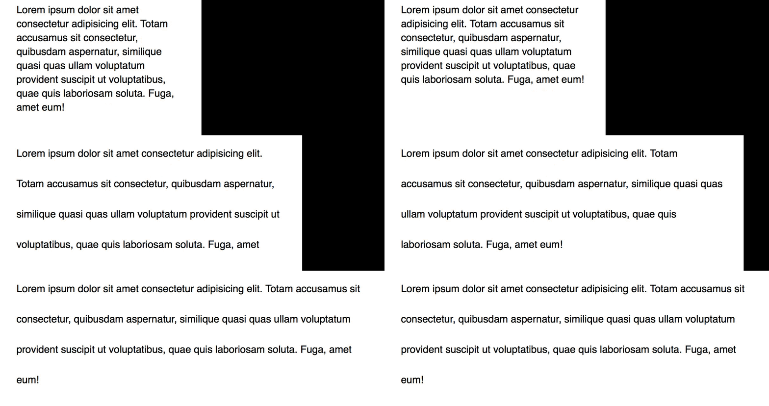
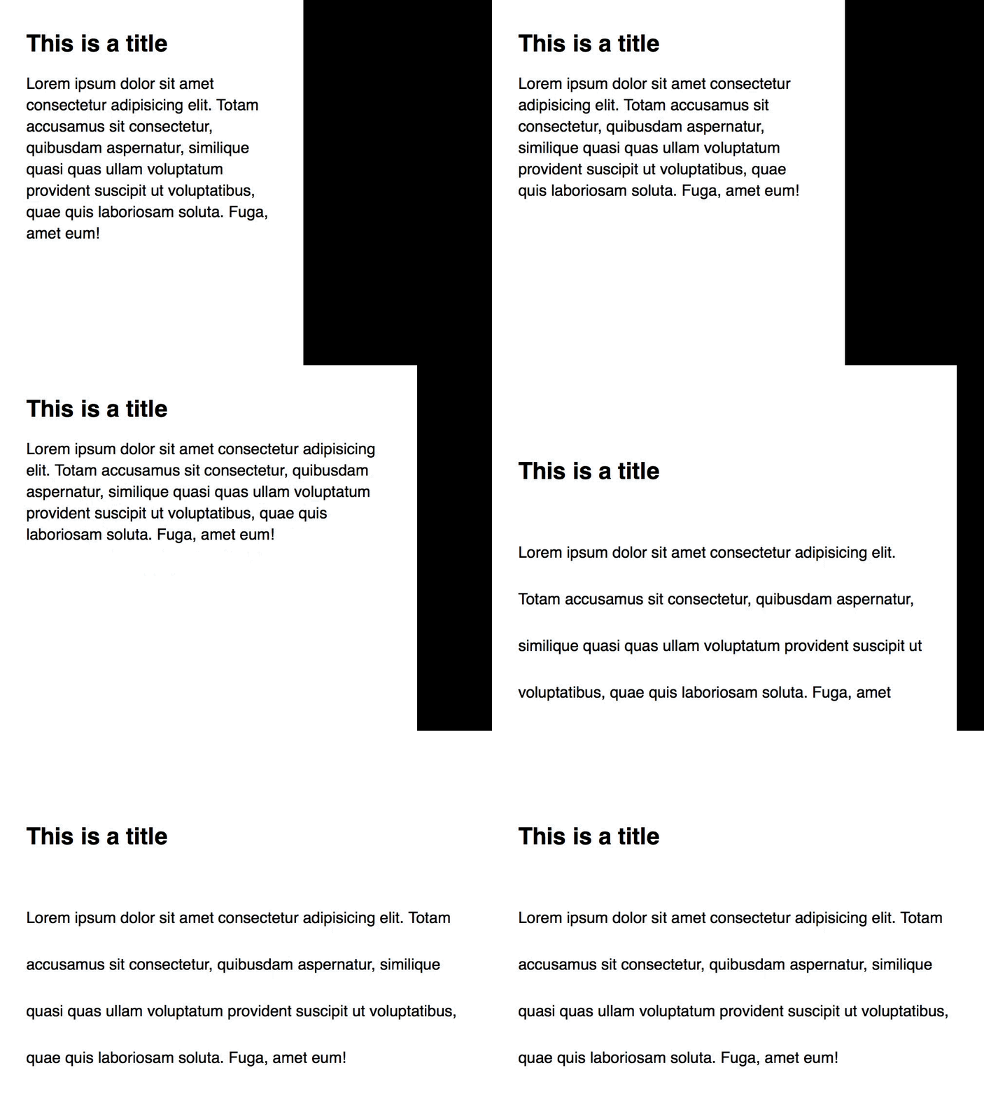
It was impossible to change Vertical Rhythm at different viewports previously, because we didn’t have the right tools. But now, with CSS Calc and CSS Custom Properties, we can change Vertical Rhythm at different viewports. This article explains how.
Calculating the rhythm unit
A rhythm unit is the base multiple you’d use for the Vertical Rhythm of your site. The value of a rhythm unit should be the line-height of your body text. Here’s why.
/* One rhythm unit would be 20px * 1.4 = 28px */
html {
  font-size: 20px;
  line-height: 1.4;
}

p {
  margin: 28px;
}
Calculating the rhythm unit becomes easier if you use relative units (and you should). One rhythm unit will always be equal to the root font-size times the line-height of your body text.
/* 1 rhythm unit, calculated with rem */
html {
  line-height: 1.4;
}

p {
  margin: 1.4rem;
}
When you create whitespace, feel free to vary the number of rhythm units. You can even include non-integer values.
/* 2 rhythm units */
h2 { margin-top: 2.8rem}

/* 0.75 rhythm units */
p { margin-top: 1.05rem }
Why change Vertical Rhythm at different viewports?
We tend to place larger devices (like desktops) farther away than smaller devices (like phones). We need to increase font-size to compensate for the loss in readability due to the increased distance. If your user can’t read your site comfortably, they’ll likely leave, they’ll squint their eyes, or increase their browser’s front-size (if they’re savvy enough).
A little more on readability.
Readability is one of the most important elements to web typography. It’s affected by three values—the font-size, line-height (or leading), and line-length (or measure) of your text. When one element changes, others may need to change to preserve readability.
When you resize a browser from a mobile view to a desktop view, you’ll notice that both measure and font-size changes. As a result, leading should change too. This concept is so important that Tim Brown came up with the Molten leading approach. One example of molten leading in use is where you write your body line-height with viewport units.
/* This is a simple example. See the complete example in the link above */
body {
  font-size: calc(1em + 1vw);
  line-height: calc(1.2em + 1vw);
}
But the problem is, when you change the line-height of your body text, the Vertical Rhythm unit changes. There’s no way to incorporate Molten leading with Vertical Rhythm.
Now, even if you discarded molten leading and used the standard unitless line-heights, you’ll probably still go insane from the amount of duplication you need to create. Not worth the effort.
/* Change line height at different breakpoints */
html {
  line-height: 1.4;
}

@media (min-width: 600px) {
  html {
    line-height: 1.5;
  }
}

/* Calculate rhythm again at each breakpoint */
p {
  margin-top: 1.4rem;
}

@media (min-width: 600px) {
  p {
    line-height: 1.5rem;
  }
}
Changing the rhythm unit with CSS Custom Properties
CSS Custom properties (better known as CSS variables) can be used to create a rhythm unit that changes at different viewports.
To create a CSS variable, you create a custom property (hence it’s name) by prepending -- to a property.
:root {
  --color: red;
}
To use a custom property you created, you write var(--your-custom-property).
p {
  color: var(--color)
}
The great thing about CSS Custom Properties is: they can be updated dynamically within different media queries.
:root {
  --color: red;
}

@media (min-width: 30em) {
  :root {
    --color: blue;
  }
}

p {
  color: var(--color)
}

That means you can create a --baseline property that correspond to one rhythm unit, then, use this --baseline property across your CSS to create responsive Vertical Rhythm.
:root {
  --baseline: 1.4;
  line-height: var(--baseline)
}

@media (min-width: 30em) {
  :root {
    /* a value of 3 used here to exaggerate the changes so you can see it in the demo below */
    --baseline: 3;
  }
}

To create rhythm values, you can need to use CSS Calc (because you can only calculate stuff in CSS with CSS Calc).
/* Two rhythm units */
h2 { margin-top: calc(var(--baseline) * 2rem); }

/* 0.75 rhythm units */
p { margin-top: calc(var(--baseline) * 0.75rem); }

Simplifying the calculation with a function
It can be a chore to write calc and var every time you create a rhythm value. You can simplify the calculation if create a function in a preprocessor like Sass.
// rvr stands for responsive vertical rhythm
@function rvr($multiple) {
  @return calc(var(--baseline) * #{$multiple} * 1rem);
}
Then, you can use the rvr function you’ve created like this. Much simpler! ?.
/* Two rhythm units */
h2 { margin-top: rvr(2); }

/* 0.75 rhythm units */
p { margin-top: rvr(0.75); }
How does support look like?
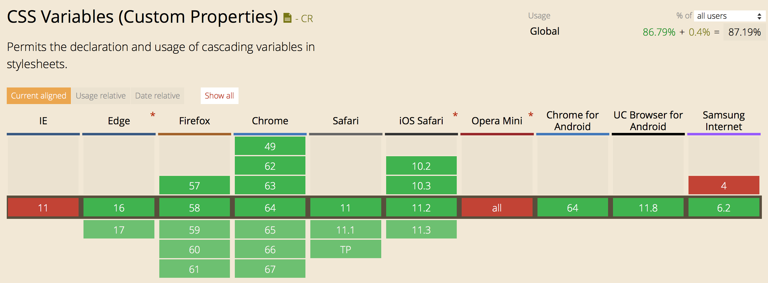
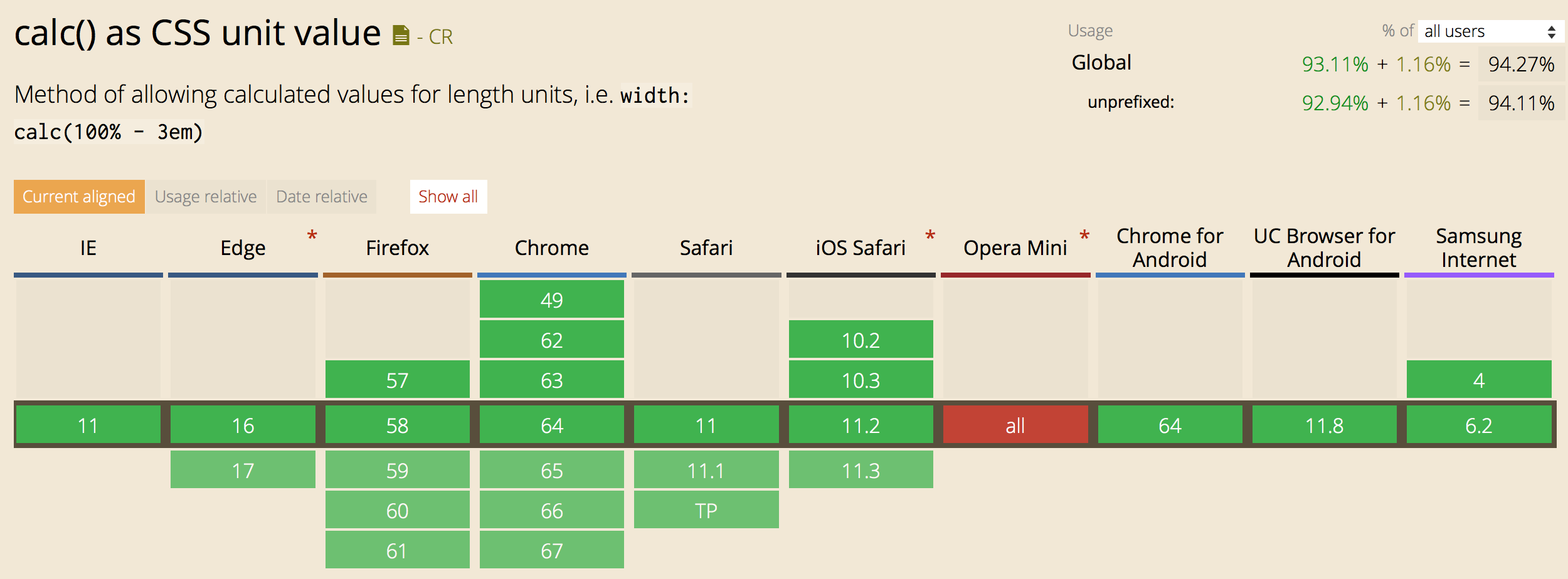
Support for both CSS Custom Properties and CSS Calc are awesome. They’re supported in all major browsers today.


Unfortunately, support for both CSS Calc and CSS Custom is lacking in Opera Mini (along with some lesser known browsers like QQ and Baidu); that’s a bummer.
Since Opera Mini doesn’t support CSS Calc and CSS Custom properties, we need to provide fallback properties each time we create a rhythm unit. This is slightly more work, but luckily, not a deal breaker.
:root {
  --baseline: 1.4;
  /* Line-height fallback */
  line-height: 1.4;
  line-height: calc(var(--baseline) * 1rem);
}

@media (min-width: 30em) {
  :root {
    --baseline: 1.5;
  }
}

p {
  /* Line-height basic vertical rhythm fallback. */
  margin-top: 1.05rem;
  margin-top: rvr(0.75);
}
To make it simpler, you can also create a vr function that calculates Vertical rhythm based on the base line-height value. Here’s a simple version you can use (specifically for this example). If you’d like a more complete version, check out Typi, which is a library I’ve made to help make responsive typography simpler.
@function vr($multiple) {
  @return 1.4 * $multiple * 1rem;
}
If you create the vr function, your rhythm fallback would be simpler:
p {
  /* Line-height basic vertical rhythm fallback. */
  margin-top: vr(0.75);
  margin-top: rvr(0.75);
}
Note: I’ve yet to include responsive vertical rhythm in Typi yet. I hope to add it when I get some time on my hands.
Wrapping up
Vertical Rhythm is an important typography principle we should pay attention to, as designs and developers. Unfortunately, we couldn’t give it as much attention as we should because we lacked the tools to do so.
But now, we can create responsive vertical rhythm with the help of CSS Custom Properties and CSS Calc. If you create responsive vertical rhythm, make sure you provide fallback for browsers that don’t support either CSS Custom Properties and CSS Calc!
This content originally appeared on Zell Liew and was authored by Zell Liew
Zell Liew | Sciencx (2018-02-28T00:00:00+00:00) Responsive Vertical Rhythm with CSS Custom Properties and CSS Calc. Retrieved from https://www.scien.cx/2018/02/28/responsive-vertical-rhythm-with-css-custom-properties-and-css-calc/
Please log in to upload a file.
There are no updates yet.
Click the Upload button above to add an update.
