
This content originally appeared on Inclusive Components and was authored by Heydon Pickering
The first thing I was told when I embarked on learning web standards about twelve years ago was, "don't use tables for layout." This was sound advice in spirit, but not very well qualified. As a result, there have been some unfortunate interpretations. Using table markup inevitably results in a visual layout, which has led some to abandon HTML tables altogether. Tables: bad.
The lesson in "don't use tables for layout" is not to use HTML elements in ways for which they were not intended. Twelve years ago, the idea that I would be coding HTML 'wrong' was enough to put me off making such classic blunders. Vanity is not a real reason, though.
The real reason — the reason it's a bad practice — is how it affects the user. Table markup, starting at <table> and including <th>, <td> et al, tells browsers to pass on certain information and produce certain behaviors. Someone using assistive software such as a screen reader will become subject to this information and behavior.
When table markup contains non-tabular content, it messes with blind users' expectations. It's not a page layout to them; it's a data table that doesn't make sense. If they're sighted or partially sighted and running a screen reader it's both, which is arguably even more confusing.
Our way of judging web technologies is oddly epochal. We believe that one epoch — the epoch of CSS Flexbox, for example — should end as it ushers in the new epoch of CSS Grid. But like <div>-based page layouts and data tables, these are actually complementary things that can co-exist. You just need to know where to use one, and where the other.
In this article, I'll be exploring how to create inclusive data tables: ones that are screen reader accessible, responsive, and as ergonomic as possible for everyone. First, though, I want to show you a trick for fixing an old layout table.
The presentation role
WAI-ARIA can be a helpful tool because it allows you to add and extend semantic information in HTML. For example, adding aria-pressed to a standard button makes it a toggle button to browsers and, therefore, assistive software. But did you know you can also use WAI-ARIA to take semantics away? That is, the following two elements are each semantically indeterminate to a screen reader. Neither are a 'button'.
<button role="presentation">Press me</button>

<span>Press me</span>
Most of the time you'll only want to add semantics where they are useful, rather than choosing elements for their appearance and removing the semantics where they aren't needed. But sometimes reverse engineering accessibility information is the most efficient way to make good of a bad decision like a layout table.
Applying role="presentation" to a <table> element removes all of that table's semantics, and therefore elicited behaviors, in screen readers. It is as if it was constructed using semantically unassuming <div>s all along.

Note that role="presentation" and role="none" are synonymous. The first is more longstanding and better supported.
In 2018, there are much better layout solutions than <table>s anyway, so there's no advantage in using them for any new layout you're trying out.
True data tables
A typical layout table consists of a <table> container, some <tr>s, and some <td>s inside them.
<table>
    <tr>
        <td><img src="some/image" alt=""></td>
        <td>Lorem ipsum dolor sit amet.</td>
    </tr>
    <tr>
        <td><img src="some/other/image" alt=""></td>
        <td>Integer vitae blandit nisi.</td>
    </tr>
</table>
The semantics issue to one side, these are all the elements you really need to achieve a visual layout. You have your rows and columns, like a grid.
Unfortunately, even where our intention is to manufacture a data table, we still tend to think visually only: "If it looks like a table, I'm good." But the following does not make an accessible table.
<table>
    <tr>
        <td>Column header 1</td>
        <td>Column header 2</td>
    </tr>
    <tr>
        <td>Row one, first cell</td>
        <td>Row one, second cell</td>
    </tr>
</table>
Why? Because our column headers — semantically speaking — are just bog standard table elements. There's nothing here to explicitly say they are headers except the text (which is likely to be less clear in a real example than "Column header 1"). Instead, we need to make them <th> elements.
<table>
    <tr>
        <th>Column header 1</th>
        <th>Column header 2</th>
    </tr>
    <tr>
        <td>Row one, first cell</td>
        <td>Row one, second cell</td>
    </tr>
</table>
Using column headers in this way is not just to be 'semantically correct'. There is a manifest effect on screen reader behavior. Now, if I use my screen reader to navigate to a row cell, it will read out the header under which it sits, letting me know which column I am currently in.
Row headers
It's possible to have both column and row headers in data tables. I can't think of any kind of data for which row headers are strictly necessary for comprehension, but sometimes it feels like the key value for a table row should be on the left, and highlighted as such.
The trouble is, unless you state it explicitly, it isn't clear whether a header labels cells below it or to its right. That's where the scope attribute comes in. For column headers you use scope="col" and for row headers you use scope="row".
Here's an example for fuel prices that I was working on for Bulb recently.
<table>
    <tbody>
        <tr>
            <th scope="col">Region</th>
            <th scope="col">Electricity</th>
            <th scope="col">Gas</th>
        </tr>
        <tr>
            <th scope="row">East England</th>
            <td>10.40</td>
            <td>2.31</td>
        </tr>
        <tr>
            <th scope="row">East Midlands</th>
            <td>10.55</td>
            <td>2.77</td>
        </tr>
        <tr>
            <th scope="row">London</th>
            <td>10.10</td>
            <td>2.48</td>
        </tr>
    </tbody>
</table>
Note that not setting row headers does not make a nonsense of the data; it just adds extra clarity and context. For a table that uses both column and row headers, some screen readers will announce both the column and row labels for each of the data cells.
Using tables with screen readers
Complex interfaces and widgets tend to have special behaviors and associated keyboard shortcuts in screen readers, and tables are no different.
JAWS, NVDA, and VoiceOver each provide the T key to move between tables on the page. To navigate between table cells, you use your arrow keys. When arriving at a table, you are typically informed of how many columns and rows it contains. The <caption>, if present, is also read out.
When you switch between cells across columns, the new column header is announced, along with the numeric placement of the column (e.g. "column 3 of 4"), and the content of the cell itself. When you switch between cells across rows, the new row header is announced, along with the numeric placement of the row (e.g. "row 5 of 8"), and the content of the cell itself.
Captions
There used to be two ways to provide descriptive information directly to tables: <caption> and <summary>. The <summary> element was deprecated in HTML5, so should be avoided. The <caption> element is superior regardless, because it provides a visual and screen reader accessible label. The <summary> element works more like an alt attribute and is not visible. Since the table itself provides textual information, such a summary should not be necessary.
Not all tables necessarily need captions, but it's recommended you either provide a caption or precede the table with a heading. That is, unless the table is inside a <figure> with a <figcaption>. As the name suggestions, the <figcaption> is a kind of caption on its own, and will suffice.
The advantage of a caption over a heading is that it is read out when a screen reader user encounters the table directly, using the T shortcut key. Fortunately HTML5 lets you place headings inside captions, which is the best of both worlds and highly recommended where you know what level the heading should be ahead of time.
<caption>, there are now three ways to discover the table: by table shortcut, heading shortcut, or just by browsing downwards.A data-driven table component
That pretty much covers basic tables and how to make them accessible. The trouble is, they're such a pain to code by hand, and most WYSIWYG tools for creating tables do not output decent markup, with the necessary headers in the correct places.
Instead, let's create a component that accepts data and outputs an accessible table automatically. In React, we can supply the headers and rows as props. In the headers' case we just need an array. For the rows: an array of arrays (or "two-dimensional" array).
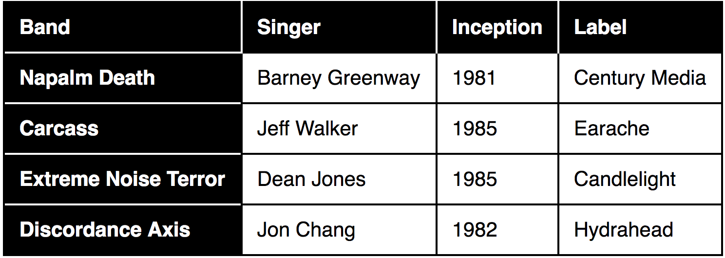
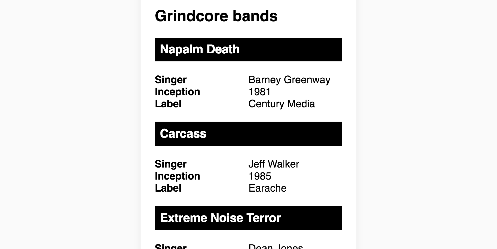
const headers = ['Band', 'Singer', 'Inception', 'Label'];

const rows = [
  ['Napalm Death', 'Barney Greenway', '1981', 'Century Media'],
  ['Carcass', 'Jeff Walker', '1985', 'Earache'],
  ['Extreme Noise Terror', 'Dean Jones', '1985', 'Candlelight'],
  ['Discordance Axis', 'Jon Chang', '1992', 'Hydrahead']
];
Now the Table component just needs those consts passed in.
<Table rows={rows} headers={headers} />
One of the best and worst things about HTML is that it's forgiving. You can write badly formed, inaccessible HTML and the browser will still render it without error. This makes the web platform inclusive of beginners, and those creating rule-breaking experiments. But it doesn't hold us to account when we're trying to create well-formed code that's compatible with all parsers, including assistive technologies.
By deferring the well-formed part to arrays, which expect a very specific structure, we can catch errors there. Where the arrays are well-formed, we can generate accessible markup from them, automatically.
Here's how the basic component that handles this might look:
class Table extends React.Component {
  render() {
    return (
      <table>
        <tr>
          {this.props.headers.map((header, i) =>
            <th scope="col" key={i}>{header}</th>
          )}
        </tr>
        {this.props.rows.map((row, i) =>
          <tr key={i}>
            {row.map((cell, i) =>
              <td key={i}>{cell}</td>
            )}
          </tr>
         )}
      </table>
    );
  }
}
If you don't supply arrays for the headers and rows props things are going to go spectacularly wrong, so if you dig 'not a function' errors, look forward.
Perhaps, though, it would be better to catch those errors early and output a more helpful message. That's where 'prop types' can be useful.
Table.propTypes = {
  headers: PropTypes.array.required,
  rows: PropTypes.array.required
};
Of course, if you're using Typescript, you'll probably be handing this with an interface instead. I personally find the extreme rigidity and perplexing syntax of Typescript in React a bit much. I'm told it's great for when you're writing complex enterprise software, but if you mostly deal with with small projects and codebases, life is probably too short.
Supporting row headers
Supporting the option of row headers is a cinch. We just need to know if the author has included a rowHeaders prop. Then we can transform the first cell of each row into a <th> with scope="row".
<tr key={i}>
  {row.map((cell, i) =>
    (this.props.rowHeaders && i < 1) ? (
      <th scope="row" key={i}>{cell}</th>
    ) : (
      <td key={i}>{cell}</td>
    )
  )}
</tr>
In my table about grindcore bands, this makes a lot of sense since the bands named down the left hand side are the basis for all the other information.
Here's a codePen demo of the basic table component, coming in at just 25 lines:
See the Pen React Inclusive Table Component by Heydon (@heydon) on CodePen.
Going responsive
Responsive tables are one of those areas where the accessible solution is more about what you don't do than what you do. As Adrian Roselli recently noted, using CSS display properties to change table layout has a tendency to remove the underlying table semantics. This probably shouldn't happen, because it messes with the separation of concerns principle. It happens anyway.
This isn't the only reason it's a bad idea to change the way tables are displayed. Visually speaking, it's not really the same table — or much of a table at all — if the columns and rows collapse on top of one another. Instead, we want to provide access to the same visual and semantic structure regardless of the space available.
It's as simple as letting the table's parent element scroll horizontally.
.table-container {
  overflow-x: auto;
}
Keyboard support
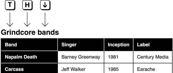
Okay, it's not quite that simple. As you may recall from A Content Slider, we need to make the scrollable element focusable so it can be operated by keyboard. That's just a case of adding tabindex="0". But since screen reader users will be able to focus it too, we need to provide some context for them.
In this case, I'll use the table's <caption> to label the scrollable region using aria-labelledby.
<div class="table-container" tabindex="0" role="group" aria-labelledby="caption">
  <table>
    <caption id="caption">Grindcore bands</caption>
    <!-- table content -->
  </table>
</div>
Notes
- As I wrote in ARIA-label Is A Xenophobe, translation services like Google's don't translate the
aria-labelattribute, so it's better to label using an element's text node. We can do this witharia-labelledby. The unique cipher shared byaria-labelledbyand theidcan be generated in React usingMath.random(). - You can't use
aria-labelledbyjust anywhere. The element has to have an appropriaterole. Here I'm using the fairly genericgrouprole for this purpose. From the spec' ongroup: "A set of user interface objects which are not intended to be included in a page summary or table of contents by assistive technologies."
Only focusable where scrollable
Of course, we don't want to make the table container focusable unless its contents overflow. Otherwise we're adding a tab stop to the focus order which doesn't do anything. In my opinion, that would be a fail under 2.4.3 Focus Order. Giving keyboard users elements to focus which don't actually do anything is confusing and obstructive.
What we can do is detect whether the content overflows on page load (or the component mounting) by adding tabindex="0" only if scrollWidth exceeds clientWidth for the container. We can use a ref (this.container) for this purpose.
componentDidMount() {
  const {scrollWidth, clientWidth} = this.container;
  let scrollable = scrollWidth > clientWidth;
  this.setState({
    tabindex: scrollable ? '0' : null
  });
}
(Thanks to Almero Steyn for the note on string ref deprecation. As he pointed out, in React 16.3 you define the ref in the constructor like this.container = React.createRef();. Then you just need to add ref={this.container} on the container element.)
Here's a truncated version of the script, showing how I use state to switch the tabindex value via the componentDidMount lifecycle function.
class Table extends React.Component {
  constructor(props) {
    super(props)
    this.state = {
      tabindex: null
    }
  }
  componentDidMount() {
    let container = ReactDOM.findDOMNode(this.refs.container);
    let scrollable = container.scrollWidth > container.clientWidth;
    this.setState({
      tabindex: scrollable ? '0' : null
    });
  }
  render() {
    const captionID = 'caption-' + Math.random().toString(36).substr(2, 9);
    return (
      <div
        className="table-container"
        ref="container"
        tabIndex={this.state.tabindex}
        aria-labelledby={captionID}
      >
        <!-- table here -->
      </div>
    );
  }
}
Perceived affordance
It's not enough that users can scroll the table. They also need to know they can scroll the table. Fortunately, given our table cell border style, it should be obvious when the table is cut off, indicating that some content is out of view.
We can do one better, just to be safe, and hook into the state to display a message in the caption:
{this.state.tabindex === '0' &&
  <div>
    <small>(scroll to see more)</small>
  </div>
}
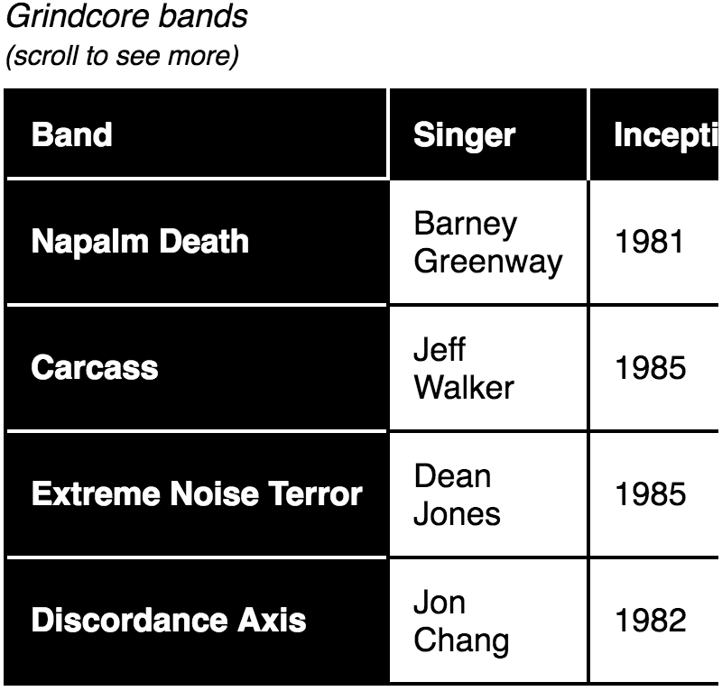
This text will also form part of the scrollable container's label (via the aria-labelledby association discussed earlier). In a screen reader, when the scrollable container is focused you will hear something similar to "Grindcore bands, open parenthesis, scroll to see more, close parenthesis, group." In other words, this extra message adds clarification non-visually too.
Very narrow viewports
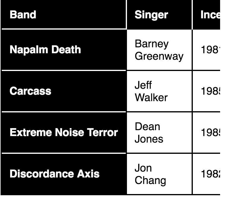
The preceding works for wide tables (with many columns) or narrow viewports. Very narrow viewports might want something a bit more radical, though. If you can barely see one column at a time, the viewing experience is pretty terrible — even if you can physically scroll the other columns into view by touch.
Instead, for very narrow (one column) viewports, we can present the data using a different structure, with headings and definition lists.
<caption>→<h2><th scope="row">→<h3><th scope="col">→<dt><td>→<dd>
This structure is much more suited to mobile, where users are more accustomed to scrolling vertically. It's also accessible, just in a different way.
Here's what the JSX might look like:
<div className="lists-container">
  <h2>{this.props.caption}</h2>
  {this.props.rows.map((row, i) =>
    <div key={i}>
      <h3>{row[0]}</h3>
      <dl>
        {this.props.headers.map((header, i) =>
          i > 0 &&
          <React.Fragment key={i}>
            <dt>{header}</dt>
            <dd>{row[i]}</dd>
          </React.Fragment>
        )}
      </dl>
    </div>
  )}
</div>
Note the use of Fragment. This allows us to output the unwrapped sibling <dt> and <dd> elements for our <dl> structure. A recent change to the spec' has made it permissible to wrap <dt>/<dd> pairs in <div>s (thanks to Gunnar for contacting me about this). But we can't be sure it won't cause parsing issues for now, and we don't need the wrappers here anyway.
All that's left to do is show/hide the equivalent interfaces at the appropriate viewport widths. For example:
@media (min-width: 400px) {
  .table-container {
    display: block;
  }

  .lists-container {
    display: none;
  }
}
For extremely large data sets, having both interfaces in the DOM will bloat an already large DOM tree. However, in most cases this is the more performant solution compared with dynamically reconstituting the DOM via matchMedia or (worse still) listening to the resize event.
If you're loading dynamic data, you don't have to worry about the two interfaces staying in sync: they are based directly on the same source.
Sortable tables
Let's give users some control over how the content is sorted. After all, we already have the data in a sortable format — a two-dimensional array.
Of course, with such a small data set, just for demonstration purposes, sorting is not really needed. But let's implement it anyway, for cases where it does make things easier. The great thing about React props, is we can easily turn the functionality on or off.
Inside each column header we can provide a sorting button:

These can toggle between sorting the data by the column in either an ascending or descending order. Communicating the sorting method is the job of the aria-sort property. Note that it works most reliably in conjunction with an explicit role="columnheader".
Here's the inception column, communicating an ascending sort (lowest value top) to screen readers. The other possible values are descending and none.
<th scope="col" role="columnheader" aria-sort="ascending">
    Inception
    <button>sort</button>
</th>
Not all screen readers support aria-sort, but a sorting button label of "sort by [column label]" makes things clear enough to those who do not have the sorting state reported. You could go one better by adapting the label to "sort by [column label] in ['ascending'|'descending'] order".
aria-label={`sort by ${header} in ${this.state.sortDir !== 'ascending' ? 'ascending' : 'descending'} order`}
Iconography
Visually, the sort order should be fairly clear by glancing down the column in hand, but we can go one better by providing icons that communicate one of three states:
- ↕ = it's sortable, but not sorted
- ↑ = It's sorted by this column, in ascending order
- ↓ = It's sorted by this column, is descending order
As ever, it's advantageous to use an SVG.
- SVGs scale without degredation, making zoom more pleasant
- SVGs using
currentColorrespect Windows High Contrast settings - SVGs can be constructed efficiently from shape and line elements
- SVGs are markup and their different parts can be targeted individually
That last advantage is not something I've explored on inclusive-components.design before, but is ideal here because each arrow is made of two or more lines. Consider the following Arrow component.
const Arrow = props => {
  let ascending = props.sortDir === 'ascending';
  return (
    <svg viewBox="0 0 100 200" width="100" height="200">
      {!(!ascending && props.isCurrent) &&
        <polyline points="20 50, 50 20, 80 50"></polyline>
      }
      <line x1="50" y1="20" x2="50" y2="180"></line>
      {!(ascending && props.isCurrent) &&
        <polyline points="20 150, 50 180, 80 150"></polyline>
      }
    </svg>
  );
}
Logic is passed in from the parent component via props (sortDir and current) to conditionally show the different polyline arrow heads. For example, the final polyline is only shown if the following are true.
- The sort order isn't ascending
- This isn't the current sorting column
Warning: Technically here I am using the arrow to express the button's current state, not the state pressing it will achieve. In many circumstances (and as discussed in Toggle Buttons) this is a mistake. The important thing here is the change in arrow direction as one toggles, communicating the switch in polarity.
A note on the grid role
WAI-ARIA provides a role, grid, that is closely associated with tables. This role is intended to be paired with specific keyboard behavior, letting keyboard users navigate table cells as they would be able via screen reader software (using their arrow keys).
You do not need to use the grid role to make most tables accessible to screen readers. The grid-related behavior should only be implemented where users not running screen reader software need to easily access each cell to interact with it. One example might be a date picker where each date is clickable within a grid representation of a calendar month.
Performance
The sorting function itself should look something like this, and uses the sort method:
  sortBy(i) {
    let sortDir;
    let ascending = this.state.sortDir === 'ascending';
    if (i === this.state.sortedBy) {
      sortDir = !ascending ? 'ascending' : 'descending';
    } else {
      sortDir = 'ascending';
    }
    this.setState(prevState => ({
      rows: prevState.rows.slice(0).sort((a, b) =>
            sortDir === 'ascending' ? a[i] > b[i] : a[i] < b[i]),
      sortedBy: i,
      sortDir: sortDir
    }));
  }
Note the use of slice(0). If this were not present, the sort method would augment the original data directly (which is an unusual characteristic peculiar to sort). This would mean both the table and the mobile-width list structure would be rebuilt in the DOM. Since there are no sorting controls provided for the list structure, this is an unnecessary performance hit.
Demo
The complete demo, including row headers, selective scrolling, the alternative representation for mobile, and the sorting functionality is available on Github.
Conclusion
Yes, it's still okay to use tables. Just don't use them if you don't need them and, when you do need them, structure them in a logical and expected way.
Checklist
- Don't use tables just for layout or, to be more clear, don't use tables for anything but tabular data.
- Always include at least column headers or row headers.
- Sorting functionality is nice, but don't include it if it isn't needed. The 'Grindcore bands' example doesn't really need sorting because there's not much data in total. Allow switching it on or off with a
sortableprop. - Make sure the visual design of the table is clear, with obvious divisions between cells, and highlighted headers. To make it easier to scan rows, you may want to consider alternating row colors for a 'zebra' effect.
This content originally appeared on Inclusive Components and was authored by Heydon Pickering
Heydon Pickering | Sciencx (2018-03-31T12:07:27+00:00) Data Tables. Retrieved from https://www.scien.cx/2018/03/31/data-tables/
Please log in to upload a file.
There are no updates yet.
Click the Upload button above to add an update.