
This content originally appeared on Zell Liew and was authored by Zell Liew
There are two ways to provide fallbacks for CSS features:
- Property fallbacks
- Feature queries
Property fallbacks
If a browser doesn’t recognize a property or its corresponding value, the browser will ignore the property altogether.
When this happens, the browser uses (or falls back) to the previous value it finds.
This is the easiest way to provide a fallback.
Here’s an example:
.layout {
  display: block;
  display: grid;
}
In this example, browsers that support CSS Grid will use display: grid. Browser doesn’t support CSS Grid will fall back to display: block.
Omit default values
If the element you’re using defaults to display: block, you can omit the display: block declaration. This means you can support CSS Grid with one line of code:
.layout {
  display: grid;
}
Browsers that support CSS Grid will be able to read other CSS properties like grid-template-columns. Browsers that don’t support CSS Grid can’t.
This means you can write additional CSS Grid properties without worrying about fallback values.
.layout {
  display: grid;
  grid-template-columns: 1fr 1fr 1fr 1fr;
  grid-gap: 1em;
}
Feature queries
Feature queries, or @supports, tell you whether a CSS property or its corresponding value is supported is supported by the browser.
You can think of CSS feature queries like if/else statements in JavaScript. It looks like this:
@supports (property: value) {
  /* Code when property or value is supported*/
}

@supports not (property: value) {
  /* Code when property or value is not supported */
}
@supports is helpful if you want browsers to read CSS only if they support a specific property.
For the CSS Grid example we had above, you can do this:
@supports (display: grid) {
  .layout {
    display: grid;
    grid-template-columns: 1fr 1fr 1fr 1fr;
    grid-gap: 1em;
    padding-left: 1em;
    padding-right: 1em;
  }
}
In this example, padding-left and padding-right will only be read by browsers that supports both @supports and CSS Grid.
Jen Simmons has a better example of @supports at work. She uses feature queries to detect whether browsers support a property like -webkit-initial-letter .
@supports (initial-letter: 4) or (-webkit-initial-letter: 4) {
  p::first-letter {
     -webkit-initial-letter: 4;
     initial-letter: 4;
     color: #FE742F;
     font-weight: bold;
     margin-right: 0.5em;
  }
}
Jen’s example brings us to a question: Should sites look the same across browsers? We’ll look at this later. But first, more about feature queries.
Support for feature queries
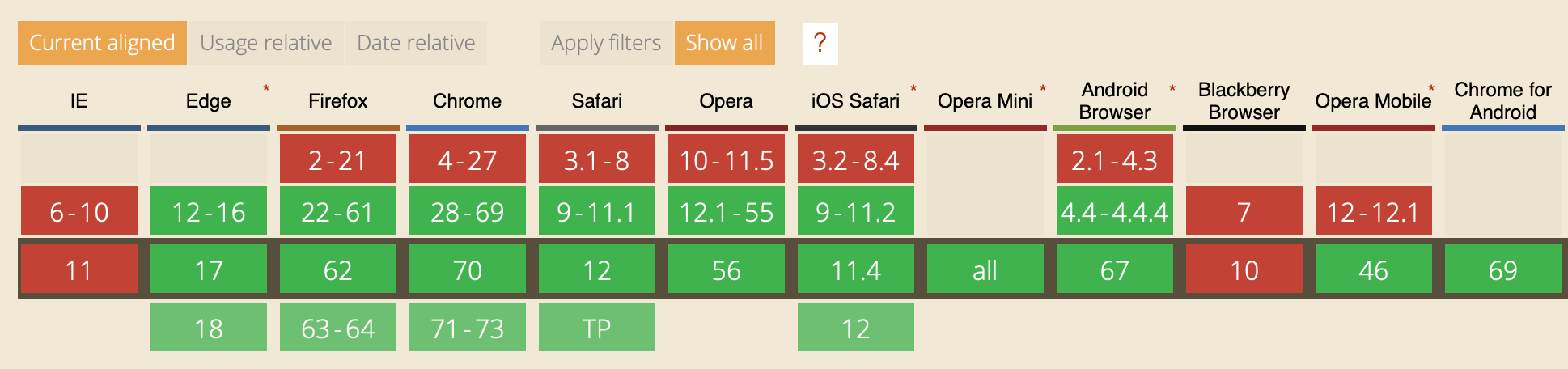
Features queries have gained great support. All current (major) browsers support feature queries.
What if a feature is supported, but feature queries aren’t
This used to be the tricky part. Jen Simmons and other experts have warned us of this possibility. You can read how to handle it in this article.
Here’s my take: I don’t support IE 11 anymore, so I use feature queries in the way I mentioned above.
Using property-fallback and feature queries at the same time
Take look at the following code. What padding values will browsers apply?
@supports (display: grid) {
  .layout {
    display: grid;
    grid-template-columns: 1fr 1fr 1fr 1fr;
    grid-gap: 1em;
    padding-left: 1em;
    padding-right: 1em;
  }
}

.layout {
  padding-left: 2em;
  padding-right: 2em;
}
The answer is: All browsers will apply 2em of left and right padding.
Why?
This happens because padding-left: 2em and padding-right: 2em were declared later in the CSS file. Properties that were declared later override properties that were declared earlier.
If you want to padding-left: 2em and padding-right: 2em to apply only to browsers that don’t support CSS Grid, you can swap the property order.
.layout {
  padding-left: 2em;
  padding-right: 2em;
}

@supports (display: grid) {
  .layout {
    display: grid;
    grid-template-columns: 1fr 1fr 1fr 1fr;
    grid-gap: 1em;
    padding-left: 1em;
    padding-right: 1em;
  }
}
Note: It’s always a good practice to declare fallback code first in CSS because of its cascading nature.
This also means, if you’re using both @supports and @supports not, you should declare @supports not first. It makes your code consistent.
/* Always write "@supports not" first if you use it */
@supports not (display: grid) {
  .layout {
    padding-left: 2em;
    padding-right: 2em;
  }
}

@supports (display: grid) {
  .layout {
    display: grid;
    grid-template-columns: 1fr 1fr 1fr 1fr;
    grid-gap: 1em;
    padding-left: 1em;
    padding-right: 1em;
  }
}
Now let’s talk about whether sites should look the same across browsers.
Should sites look the same across browsers?
Some people believe that sites should look the same across browsers. They think that branding is important, and stress that sites should look consistent to preserve the brand.
Other people say no. They believe they should embrace the spirit of progressive enhancement. They can give users with better browsers more love.
Both views are right, but they come from different angles.
The most important point of view comes from users. Is your site able to provide users with what they came for?
If yes, you don’t have to be too strict on the consistency. Go ahead and give better with better browsers even better experiences!
Other articles in this series
- Part 1: Supporting older browsers
- Part 2: This article
- Part 3: Supporting older browsers—Part 3: JS
- Part 4: Why support older browsers? (To be released!)
Wrapping up
To provide support for CSS features, you can use:
- Property fallbacks
- Feature queries
When you write CSS, make sure you declare fallback code first before the other set of code for browsers with better support.
This content originally appeared on Zell Liew and was authored by Zell Liew
Zell Liew | Sciencx (2018-11-21T00:00:00+00:00) Supporting older browsers—Part 2: CSS. Retrieved from https://www.scien.cx/2018/11/21/supporting-older-browsers-part-2-css/
Please log in to upload a file.
There are no updates yet.
Click the Upload button above to add an update.