
This content originally appeared on Zach Leatherman and was authored by Zach Leatherman
When Chris Coyier asked me to look at the font loading behavior for the new redesign of CSS-Tricks, I’ll admit that I was excited. A new case study on a web site with an intimidating, exhaustive, encyclopedic amount of existing web development content!
Design Review #
When doing any web font strategy recommendation, the first thing I like to do is have a look at the design. I want to know where and how the typefaces are being used in the design in order to give appropriate advice on how they should be loaded. Luckily, Chris gave me a sneak peek at what I was dealing with.
The new design uses the Rubik typeface, available on Google Fonts. That’s exciting, as most of the typefaces available on Google Fonts have open licenses and this was no exception: Rubik uses the Open Font License, which gives us license ? to make the modifications we need to optimize the font for the CSS-Tricks web site.

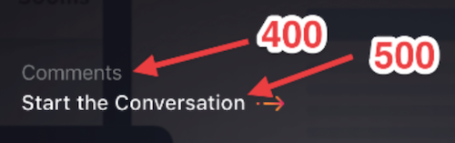
As Chris has helpfully annotated above, the design has three different weights of Rubik in play: Regular (normal or 400), Medium (500), and Bold (700).
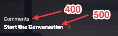
The next step I took was to code up a quick prototype to double-check that the annotations were correct. I overlaid the prototype on top of the screenshot to make sure things lined up properly. While I didn’t have access to the coded prototype, I was mostly worried that the body copy was using a web font that we hadn’t discussed—but luckily was able to determine that the body copy was using system-ui (not a web font).

There was one small problem. That Medium (500 weight) wasn’t right—it was actually a Regular (400) in disguise!
The design:
font-weight: 500 and font-weight: 400:
font-weight: 400 for both:
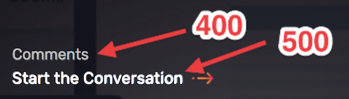
That will save us one font file!
From our design and prototype, we now know that we have two font files that are important here: Rubik Regular and Rubik Bold. Next let’s take a peak at those files to see what we’re working with.
Rubik Deep Dive #
Another great thing about Google Fonts is that they provide easy download links for all of their typefaces. Let’s download the zip for Rubik:
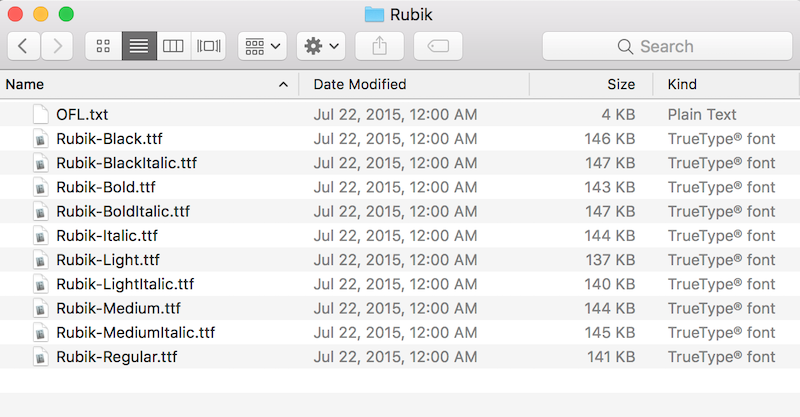
The download gives us a zip file with ten hefty TrueType fonts from the Rubik typeface.
The Merits of Two Stage Font Loading #
I’ve written about the benefits to using two stage font loading before:
- Flash of Faux Text (2015)
- Critical Web Fonts (2016)
- A Comprehensive Guide to Font Loading Strategies, the last 4 methods (2016)
The entire point of implementing a two stage font loading strategy is to mitigate text movement associated with web fonts when they finish loading and reflow the text on the page. By dividing your font load into a smaller chunk and a larger lazy loaded chunk, we can minimize and mitigate the impact of web fonts to end users. I’m not necessarily on team FOIT (invisible text) or team FOUT (fallback text)—both are bad.
In the past I’ve recommended two stage font loading strategies that were all-in on JavaScript. However, with burgeoning font-display browser support we can take advantage of font-display to deliver a good web font experience without JavaScript! Importantly, our First Stage must be feature-inclusive enough to be self sufficient if the JavaScript fonts aren’t loaded.
With our two stage font loading, we must make some hard choices about what we want to load in our first stage. To know how to make those choices, we need to know what is available to us—let’s inspect these fonts!
Wakamai Fondue #
One of the best tools I’ve found for inspecting a web font’s internals is called Wakamai Fondue (What Can My Font Do?) by Roel Nieskens (@PixelAmbacht).
Wakamai Fondue works transparently with WOFF and WOFF2 files too—which makes it a nice replacement for Mac OS X Preview until Preview gets support for those formats. It’s really great. Let’s drag and drop the Rubik-Bold.ttf file we just downloaded and take a peek inside.
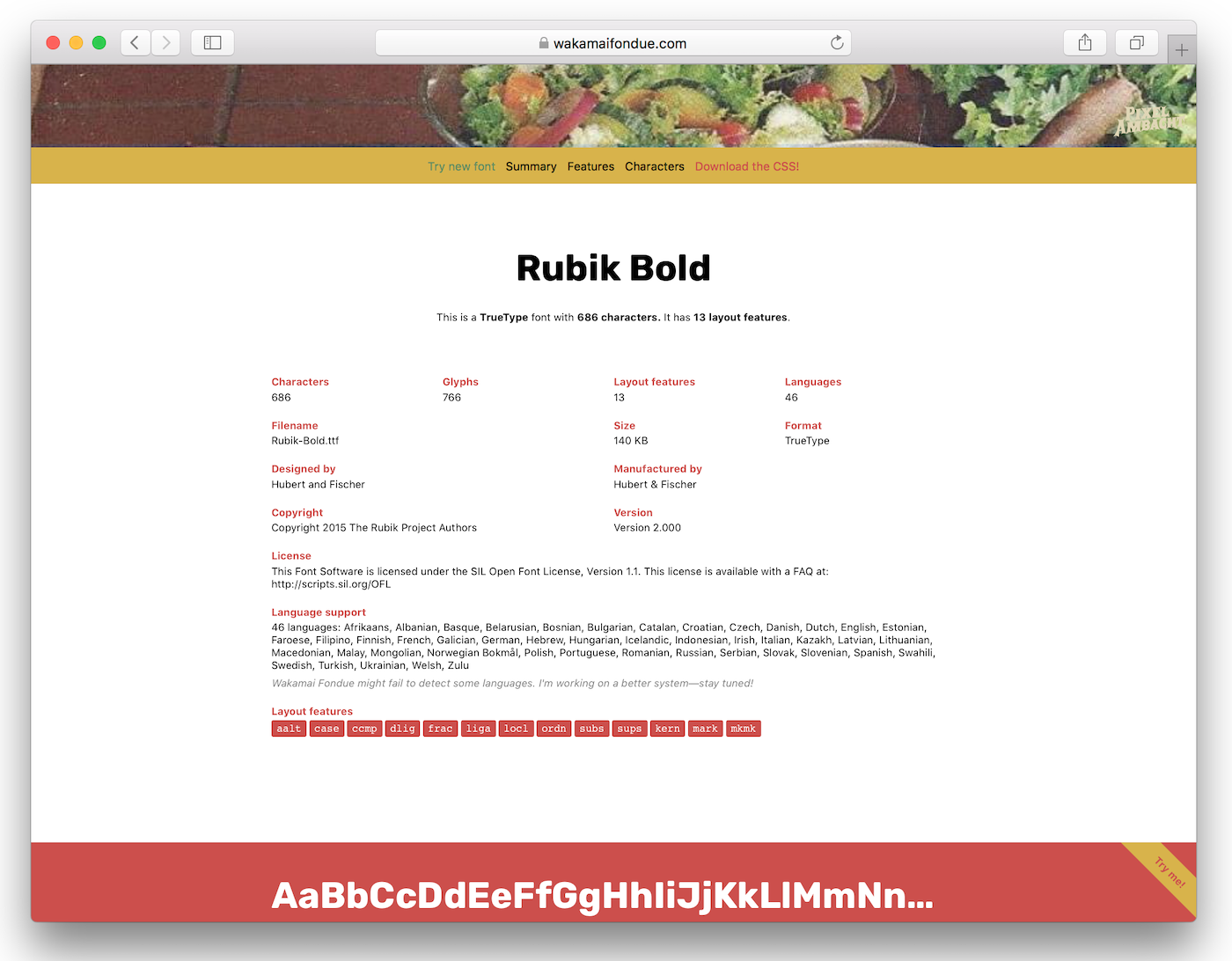
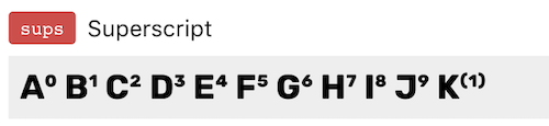
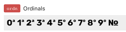
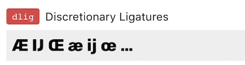
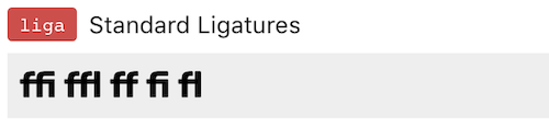
Wakamai Fondue shows that Rubik Bold (140KB TTF, 46KB WOFF2 compressed) has 686 characters and a bunch of fancy OpenType features:
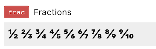
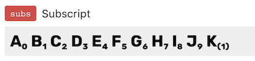
- Fractions, Numeric Subscripts and Superscripts, and Ordinals
- Ligatures
- Case-Sensitive Forms
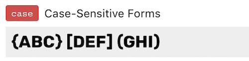
- All of the above OpenType features only cost us 2.9KB WOFF2 (6% of the total)
- Kerning: 9.7KB WOFF2 cost (21.6% of the total)
- Hinting: 11.5KB WOFF2 cost (25.7% of the total) (note that Hinting not yet reported by Wakamai Fondue—Roel consider this a feature request, please!)
(WOFF2 size costs calculated using pyftsubset with --layout-features with --no-hinting --desubroutinize for hinting size)
The nice thing here is that you customize what you want on the first stage and what you want on the second stage to your use case and preferences. Just know that the more you put into the First Stage, the more likely the user will either experience longer First Render delays (due to heavy preload cost) or longer FOUT times (as fallback text is shown while waiting for First Stage to complete).
Two Stage Choices for CSS-Tricks: #
First Stage
- Kerning
- While this is one of the heftier parts of our font, it does affect text movement if it’s not available up front. You may choose to defer this to the second stage—that’s fine! Just be aware of how much your text moves when it lazy loads in.
- Subset to Latin Character Set: 221 characters of the total 686 available to us. This seems to be a standard unicode range across many of Google’s Fonts—so this range was borrowed directly from the Google Fonts CSS ?.
Here’s the pyftsubset command (from fonttools) I used to generate first stage font files:
pyftsubset "Rubik-Bold.ttf" --output-file="Rubik-Bold-kern-latin.woff2" --flavor=woff2 --layout-features=ccmp,locl,mark,mkmk,kern --no-hinting --desubroutinize --unicodes=U+0000-00FF,U+0131,U+0152-0153,U+02BB-02BC,U+02C6,U+02DA,U+02DC,U+2000-206F,U+2074,U+20AC,U+2122,U+2191,U+2193,U+2212,U+2215,U+FEFF,U+FFFD

# Run again using "Rubik-Regular.ttf"
# To generate woff files, use `--flavor=woff`
# You may recognize the other `--layout-features=ccmp,locl,mark,mkmk` from the Required Layout Features section on Wakamai Fondue.
First stage file size results:
- 13.9KB for
Rubik-Bold-kern-latin.woff2 - 13.9KB for
Rubik-Regular-kern-latin.woff2
Second Stage
- Fancy OpenType features (Ligatures, Fractions, Subscript and Superscript, etc)
- OpenType features are some of the coolest web font tech and they largely go unused. Worse, if you’re loading Rubik from Google Fonts they prune most of them out! However, these features are clearly all Nice To Haves™ and as such we’ve deferred them to our second stage load.
- Hinting: extra instructions to fit individual glyphs to the available pixel grid
- This may be a contentious choice as Mac OS largely ignores hinting so it isn’t used.
- Some have argued that as screen resolutions get finer, hinting is increasingly unnecessary. You may even be tempted to hide this behind a
resolutionmedia query—but note that hinting (when used) is still important for small font sizes, which may or may not be relevant to your design. - Option: you may want to remove this altogether. Add
--no-hinting --desubroutinizeto yourpyftsubsetcommand below to remove it.
- The remaining character set. Our first stage only loaded 221 characters, so let’s load the remaining 465 available in the Rubik typeface.
- Option: you may want to second stage with a smaller subset of characters if your content allows it. Customize with
--unicodes. Have a look at a project I maintain called GlyphHanger that takes a URL as input and spits out theunicode-rangeof characters used on that URL (it does a lot of other things too).
- Option: you may want to second stage with a smaller subset of characters if your content allows it. Customize with
pyfsubset command (from fonttools) to generate second stage font files:
pyftsubset "Rubik-Bold.ttf" --output-file="Rubik-Bold-hint-all.woff2" --flavor=woff2 --layout-features="*" --unicodes=U+0-10FFFF

# Run again using "Rubik-Regular.ttf"
# To generate woff files, use `--flavor=woff`
Second stage file size results:
- 44.7KB for
Rubik-Bold-hint-all.woff2 - 44KB for
Rubik-Regular-hint-all.woff2
Give Me Something to Copy and Paste #
Most of the work up to this point was a large discussion about how to prioritize different features for our two stage load, but the code to implement this is really quite easy. Here are the pieces:
Preload HTML for First Stage
Preload will affect first render times, remove this if you would rather have FOUT ? (please don’t).
<link rel="preload" href="Rubik-Bold-kern-latin.woff2" as="font" type="font/woff2" crossorigin>
<link rel="preload" href="Rubik-Regular-kern-latin.woff2" as="font" type="font/woff2" crossorigin>
CSS for First Stage (inline in <head>)
@font-face {
font-family: Rubik;
src: url(Rubik-Bold-kern-latin.woff2) format("woff2"),
url(Rubik-Bold-kern-latin.woff) format("woff");
font-weight: 700;
font-display: swap;
}
@font-face {
font-family: Rubik;
src: url(Rubik-Regular--kern-latin.woff2) format("woff2"),
url(Rubik-Regular-kern-latin.woff) format("woff");
font-weight: 400;
font-display: swap;
}
We could add our subset unicode-range value we used above in our glyphhanger command, but it would not have any functional value. A few reasons for this:
- Our second stage will not be a distinct set of glyphs, it’s a superset of the first stage glyphs.
- Our second stage has other features that we don’t (or can’t yet) feature test for, namely hinting. See this proposal for a
uses-hintsmedia query.
JavaScript for Second Stage
You can put this wherever you’d like. I like to inline it into the <head> too but you may have other high priority requests you’d like to load before these.
if( "fonts" in document ) {
var regular = new FontFace("Rubik", "url(Rubik-Regular-hint-all.woff2) format('woff2'), url(Rubik-Regular-hint-all.woff) format('woff')");
var bold = new FontFace("Rubik", "url(Rubik-Bold-hint-all.woff2) format('woff2'), url(Rubik-Bold-hint-all.woff) format('woff')", { weight: "700" });

    Promise.all([ bold.load(), regular.load() ]).then(function(fonts) {
        fonts.forEach(function(font) {
            document.fonts.add(font);
});
});
}
Notably if the browser doesn’t support the CSS Font Loading API (read: Edge/Internet Explorer) they will only see the First Stage web font load (which—remember—we specifically architected to be sufficient and is a fine compromise here). If you disagree (and it’s reasonable to do so as this approach means that IE and Edge won’t get Hinting), use the following block too:
if(!("fonts" in document) && "head" in document) {
// Awkwardly dump the second stage @font-face blocks in the head
var style = document.createElement("style");
// Note: Edge supports WOFF2
    style.innerHTML = "@font-face { font-family: Rubik; src: url(/rubik/Rubik-Regular-hint-all.woff2) format('woff2'), url(/rubik/Rubik-Regular-hint-all.woff) format('woff'); } @font-face { font-family: Rubik; font-weight: 700; src: url(/rubik/Rubik-Bold-hint-all.woff2) format('woff2'), url(/rubik/Rubik-Bold-hint-all.woff) format('woff'); }";
    document.head.appendChild(style);
}
Update to use document.head per an excellent recommendation from @simaodeveloper.
Additional Optimizations and Options #
- Put our four web font URLs into your Service Worker, if you have one!
- Want to add true italics?
- Option 1: Add them to both the first stage and the second stage, using the same methodology presented above. Keep in mind: if you preload too much, you pay in first render time.
- Option 2 (my recommendation): Add the full version only to the second stage and let the first stage use font-synthesis to fake italics until the full version has loaded.
How does this load? #
For the most part, our performance profile will largely depend on how the CSS is loaded. If we add the current HTTP Archive average CSS weight of 50KB, using preload (with Fast 3G and 6x CPU slowdown in Chrome Devtools), our first stage loads before first render! This means (for this example) no FOUT! Here’s how our demo looks after the first stage is complete.
- Live Demo hosted on https://css-tricks-font-loading.netlify.com/
First Stage
Any OpenType features will display their unsupported versions while we wait for the second stage to complete. Any text rendering that relies on hinting will be unhinted (for now). Any non-Latin characters will display fallbacks.

Second Stage
All the OpenType features available in the original font, hinting as the designer intended (not depicted in this screenshot), true non-Latin characters.

Conclusion #
If I were given liberties with the design, I would recommend removing Rubik Regular from the font loading altogether. It certainly isn’t pulling as much weight as Rubik Bold is here and it might be safe to switch to use system-ui for these design elements as well.
For most headlines, you’re unlikely to notice that a second stage is loading at all. I’ve used a dramatic case here to demonstrate what’s happening behind the scenes. But this sneakiness is ideal—we want to transparently populate our cache (and/or serviceworker) with these second stage files so that they are available when they are needed for these extended character set scenarios.
The wins here are numerous compared with a Google Fonts implementation:
- Google Fonts uses two different domains to load the content, one for the CSS and one for the font files. This is not ideal. We eliminate these extra hops and connection setups by self hosting. Our demo renders our first stage web font content more than 600ms (Fast 3G) before a similar Google Fonts demo would.
- No invisible text, even if a font request is slower than expected (no FOIT!).
At time of writing, Google Fonts does not supportGoogle Fonts addedfont-displayto make our text immediately visible.font-displaysupport! - We use
preloadto mitigate most text movement on our page—in many cases this means no fallback text is shown (no FOUT!). At time of writing, Google Fonts does not supportpreloadas the font file URLs on their service are not stable. - We use the CSS Font Loading API to group our second stage font loadings into a single repaint and reflow.
But perhaps most importantly we now have more control—we decide what features we want to load in our first and second stages to suit our design needs and performance requirements.
Post-Launch Update #
Chris wrote a blog post about Design v17 and the new redesign. He even wrote up a little section on the web font implementation.
Nice job everyone that worked on the @css relaunch!
— Zach Leatherman (@zachleat) January 1, 2019
Look at those web fonts showing up on that 2.09s Fast 3G first render ?
(full disclosure I helped a wee bit with the font loading here ?) pic.twitter.com/Ih7zJhelQQ
This content originally appeared on Zach Leatherman and was authored by Zach Leatherman
Zach Leatherman | Sciencx (2019-06-26T05:00:00+00:00) Developing a Robust Font Loading Strategy for CSS-Tricks. Retrieved from https://www.scien.cx/2019/06/26/developing-a-robust-font-loading-strategy-for-css-tricks/
Please log in to upload a file.
There are no updates yet.
Click the Upload button above to add an update.