
This content originally appeared on Zell Liew and was authored by Zell Liew
Focus is important. It tells us what element we’re currently focusing on. Most developers suggest keeping the default focus style.
I think there are problems with the default style. I tried searching for inspiration to design a better focus style, but I couldn’t find anything on this topic. So I did some quick research by visiting sites I use and paying attention to their focus styles.
I want to document my research and findings in this article. I hope it helps you:
- Understand the problems with the default focus style
- Give you some inspiration to design your own focus styles
Let’s start off by talking about the pros and cons of browser default focus styles.
Pros and cons with the defaults
Pros
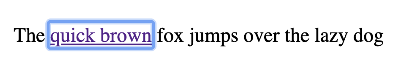
The default focus style is great because we’re familiar with it. When we see the blue ring around something, we know it is in focus.
Note: Since the default focus style is a ring around the content, I’m going to use the term “focus ring” and “focus style” interchangeably.
It is also great because you don’t have to write any code to create a usable focus ring.
Cons
Here’s the major problem. The default focus style is different across browsers. They’re not consistent.
- Safari: Blue solid outline
- Firefox: Thin dotted outline
- Chrome: Blue blurry outline
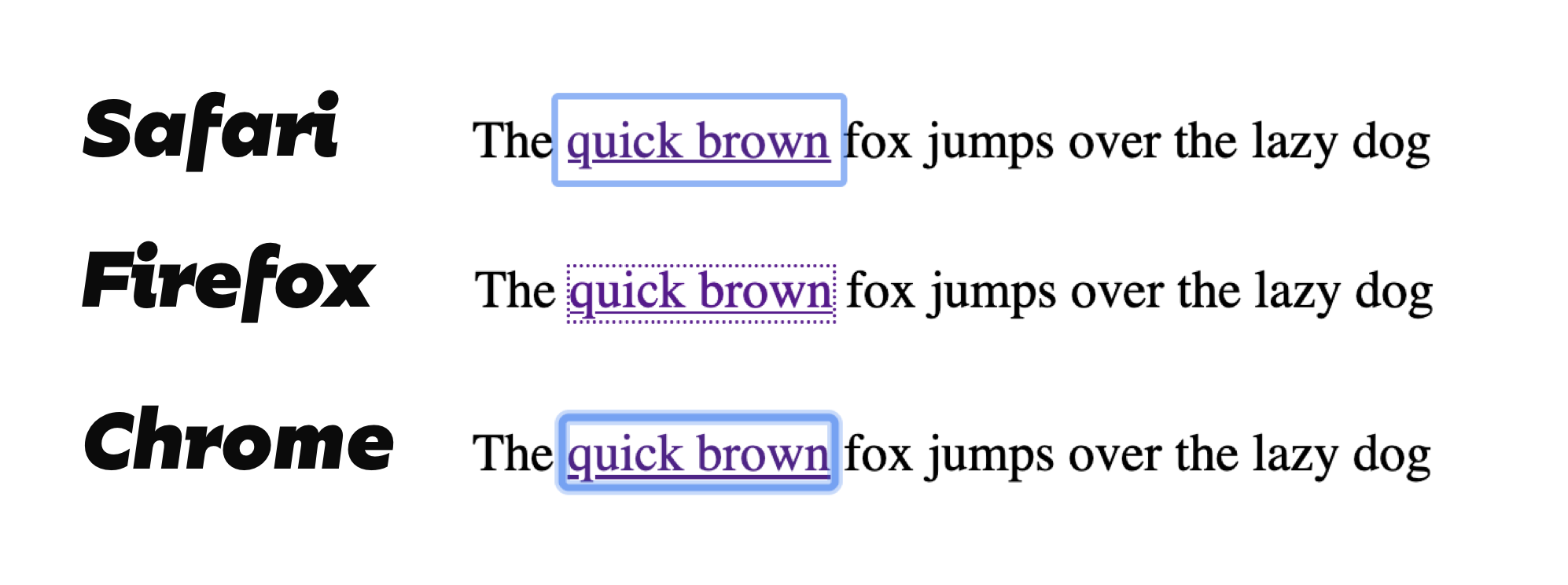
Here’s the second major problem. The default focus lacks contrast in specific situations.
Firefox’s thin dotted outline lacks contrast on pages with a white background. You can hardly see the outline. Luckily, firefox switches the outline from black to white on dark backgrounds. The contrast is okay.
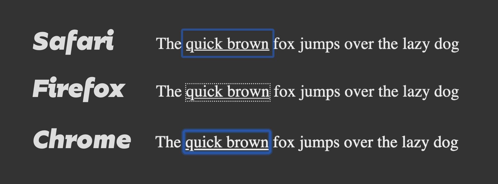
Safari and Chrome’s blue outlines lack contrast on pages with dark backgrounds. The contrast is even worse if you used a bluebackground.
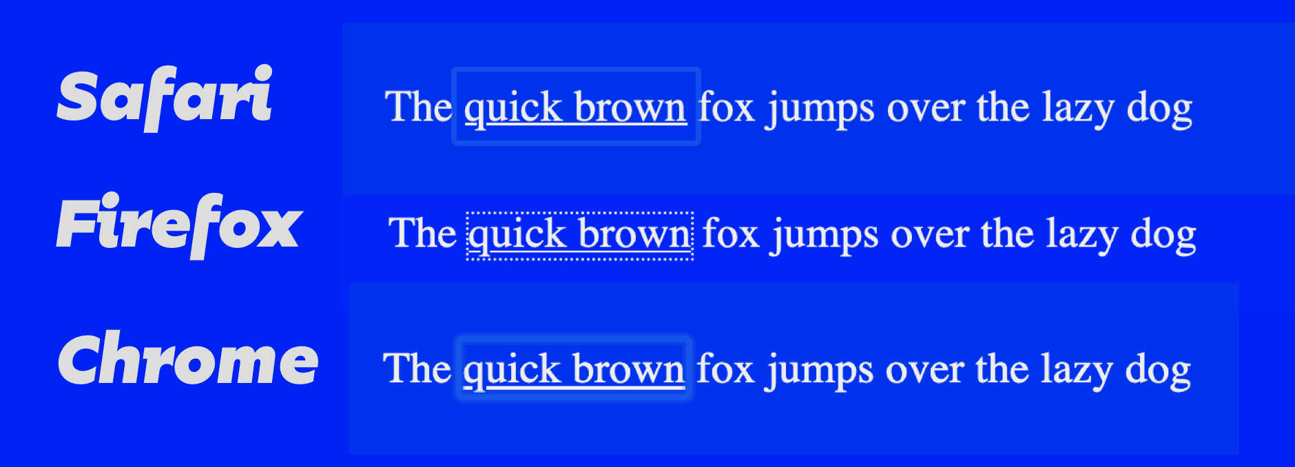
Third problem. Chrome’s focus-ring blur makes the element looks unfocused.
The purpose of a focus ring is to draw attention to the focused element. If you blur the focus ring, you lose focus. Why would you draw attention to an element, but take away attention at the same time? It doesn’t make sense. Are you telling me to focus or not?
Fourth problem. This is more of a design thing. When you think about branding, you want users to have a consistent experience across your site (as much as possible). It shouldn’t matter if they’re using Safari, or Chrome, or Firefox.
Focus is one small part of the entire experience. We have the tools to make sure focus remains consistent across browsers. It’s not hard at all!
If you “just use the default”, does it mean focus is an afterthought in your design process?
Focus inspirations
I couldn’t find any good articles about designing the focus ring, so I went to websites I normally visit, and paid special attention to their focus. ?.
CSS Tricks
CSS Tricks used the default focus ring for every element.
There’s a tiny addition to links. If you focus on links, they get a color-gradient. I love this color-gradient treatment. It brings a ton of personality to the site.
However, buttons don’t get any special treatment. If you focus over buttons, you only see the default focus style. Also, the focus ring doesn’t show up clearly on the dark background.

There was a special treatment on tags though. When I focused on the tag for the article, the white border popped out at me. I see this element clearly compared to the others.

Smashing Magazine
Smashing Magazine uses a dark-red outline instead of the default one. I found it pleasant to look at. The contrast is large enough for most of the links.
However, the dark-red outline doesn’t make focused elements stand out as much when they’re on a red background. The contrast wasn’t huge. But the text color change from white to black draws my attention.
The dark-red outline failed to catch my attention when I tabbed through a button on a red background. The color change from blue to red wasn’t enough to draw my attention.
Deep in my mind, I might have expected a change in the button’s background-color. Regardless of my expectations, I failed to realize when the button got focus.
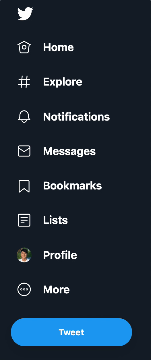
Twitter used a combination of styles for focus. They used:
- The default focus ring for most elements
- An underline (no focus ring) for text links
- Background and outline changes for buttons

Here’s what I think.
- The default focus ring does not have enough contrast
- Underlined links (without focus ring) doesn’t catch my attention. I had to search for what I focused on.
- I love the focus styles for the buttons. The slight difference in background colors gave each action distinct personalities.
On the sidebar, Twitter highlighted each menu item with a bright border (I suspect with outline) and a change in background-color. These changes were visible and held my attention.
However, the focus style on the Tweet button wasn’t as obvious since the outline was light. It does not have enough contrast when compared to the button’s bright background-color.
Slack
Slack’s focus looks good. They introduced a (tiny) dark-blue border plus a (larger) light-blue tint around their focused elements.
I liked how the dark-blue border stood out from other elements. I also liked how the light-blue tint allowed the dark-blue border to blend in with other elements on the same page.
(Although I used the word “border” here, I suspect this is created with box-shadow).
Slack used the same styles on the sidebar, but they used white instead. This stuff works for both dark and light backgrounds!
WTF Forms
Chris Coyier pointed to WTF Forms by Mark Otto during my research. The focus ring for WTF Forms looks pretty good! It contains two parts:
- A white border
- And a solid blue border
(Again, even though I used the word “border”, this is actually created with box-shadow).

My own site
No research is complete without checking whether I failed or succeeded at creating focus styles. (Bad habit).
Turns out, I did not create enough focus for the links on my own site. The color change was not enough to catch my attention immediately. It would have been sufficient if I added the focus ring though!
However, I did good work for the navigation. The pink border and animation made the focused element pop. ?.

What I learned
The default focus ring works. There are problems with it, but it can be good enough, especially if you can’t dedicate time and energy to create a custom focus ring. (This can be quite easy. I’ll show you how in the next article).
If you want to design your own focus style, you need to think about four variables. The presence of each variable helps your focus stand out more. I ranked these variables in the order of importance.
- Creating an outline (with outline, box-shadow, borders, etc).
- Animations with movement (if any)
- Changing the background color (if any)
- Changing the color of the text (if any)
Outlines are best because they create the most amount of contrast.
Animations come next because our eyes get drawn to moving objects.
Changes in background-color can sometimes be sufficient. This is because the change happens in a relatively large surface area.
Finally, you want to consider changing color. Use color with the three other things I mentioned above. Try to avoid using color by itself because contrast might not be enough to draw a keyboard user’s attention.
This content originally appeared on Zell Liew and was authored by Zell Liew
Zell Liew | Sciencx (2019-10-02T00:00:00+00:00) Designing a focus style. Retrieved from https://www.scien.cx/2019/10/02/designing-a-focus-style/
Please log in to upload a file.
There are no updates yet.
Click the Upload button above to add an update.