This content originally appeared on Zell Liew and was authored by Zell Liew
I’ve been styling :hover, :focus, and :active states the same way for years. I can’t remember when I started styling this way. Here’s the code I always use:
// Not the best approach. I'll explain why in this article
.selector {
  &:hover,
  &:focus,
  &:active {
    // Styles here
  }
}
As I paid more attention to keyboard accessibility (and therefore paying more attention to focus), I began to think we should not style hover, focus, and active states the same way.
Hover, focus, and active states should be styled different.
There’s a simple reason: They’re different states!
Today, I want to show you a magical way to style all three states effortlessly.
Let’s start with :hover.
Styling hover states
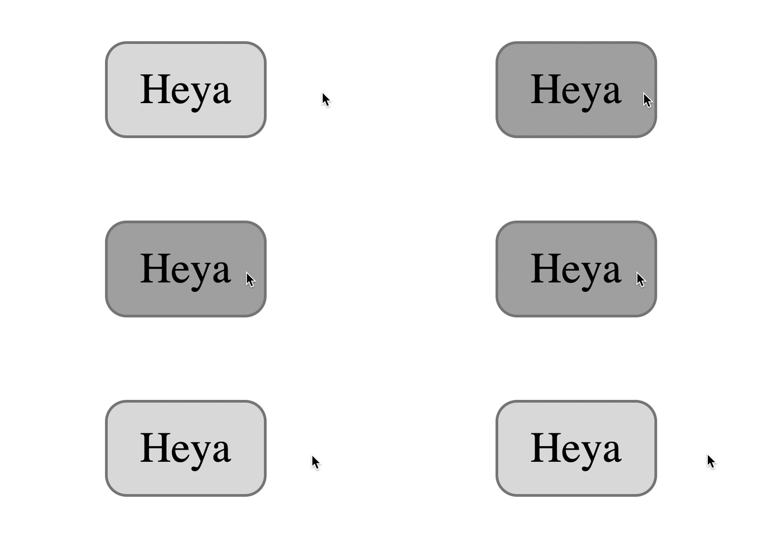
:hover triggers when a user brings their mouse over an element.
Hover states are usually represented by a change in background-color (and/or color). The difference in states doesn’t have to be obvious because users already know they hovered on something.
button {
  background-color: #dedede;
}

button:hover {
  background-color: #aaa;
}
Styling focus states
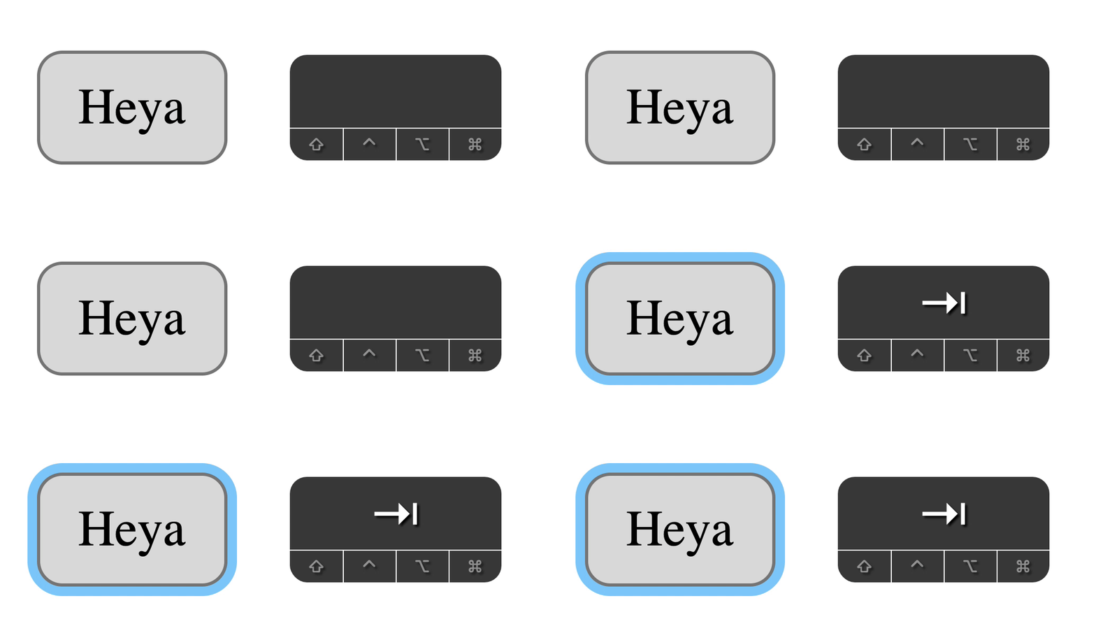
:focus activates when an element receives focus. Elements can receive focus in two ways:
- When users tab into a focusable element
- When users click on a focusable element
Focusable elements are:
- Links (
<a>) - Buttons (
<button>) - Form elements (
input,textarea, etc.) - Elements with
tabindex
Here are a few important points to note:
- Users cannot tab into an element with
tabindex="-1", but they can click on it. The click triggers focus. - On Safari and Firefox (Mac), clicks do not focus the
<button>element. More info here. - When you click on a link (
<a>), focus remains on the link until you lift your finger from your mouse. When you lift your finger, the focus gets redirected elsewhere if thehrefpoints to a valididon the same page.
For focus, we’re more concerned about users tabbing into elements than clicking on elements.
When a user hits tab, they don’t know where the focus will go to. They can only guess. This is why we need a prominent change a user’s attention attention to the focused element.
The default focus style is okay most of the time. If you want to design your own focus, think about these four things:
- Adding an outline
- Creating animations with movement
- Changing
background-color - Changing
color
Since background-color and color changes often accompany :hover, it makes sense that outlines or animations should accompany :focus.
You can use a combination of outline, border, and box-shadow properties to create nice focus styles. I share how to do this in “Creating a custom focus style”.
button {
  background-color: #dedede;
}

button:hover {
  background-color: #aaa;
}

button:focus {
  outline: none;
  box-shadow: 0 0 0 3px lightskyblue;
}
Styling active states
When you interact with things in real life, you expect some sort of feedback. For example, if you push a button, you expect the button to get pressed.
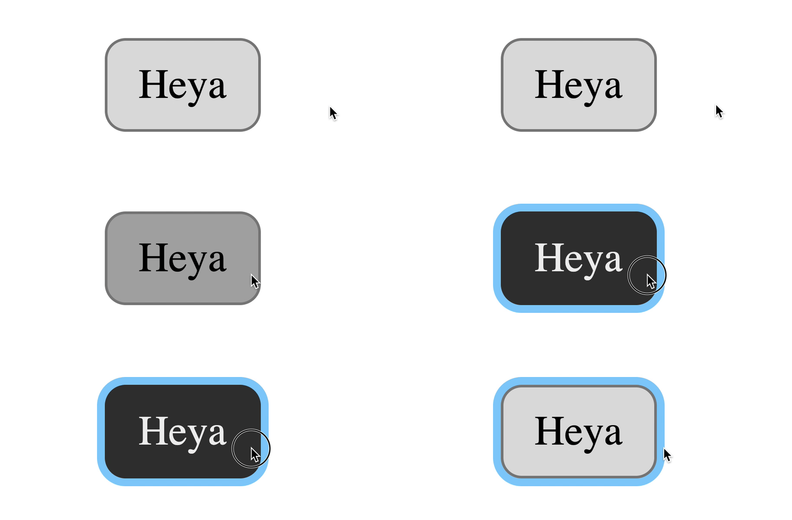
This feedback is useful on websites too. You can style the “push button” moment with :active. :active triggers when you interact with an element. Interacting here means:
- Holding down your left mouse button on an element (even non-focusable ones)
- Holding down the Space key (on buttons)
button:active {
  background-color: #333;
  border-color: #333;
  color: #eee;
}
Two weird things to take note of:
- Holding down Space triggers
:activeon buttons, but holding down Enter doesn’t. - Enter triggers links but it doesn’t create create an active state. Space doesn’t trigger links at all.
Default styles for links
Links have a default active style. They turn red when they get clicked.

The relationship between active and focus
When you hold down the left mouse button on a focusable element, you trigger the active state. You also trigger the focus state at the same time.
When you release the left mouse button, focus remains on the element
? is true for most focusable elements except links and buttons.
For links:
- When you hold down left mouse button: Triggers
:activeand:focusstate on Firefox and Chrome Only triggers active on Safari (tested on Mac only) - When you release left mouse button:
:focusremains on link (if the link’shrefdoes not match anidon the same page). On Safari, focus goes back to<body>.
For buttons:
- When you hold down left mouse button: Triggers
:activeand:focusstate on Chrome only. Does not trigger:focusat all in Safari and Firefox (Mac). I wrote about this strange behavior here.
If you want clicks to focus on buttons, you need to add this JavaScript as early as you can. (As for why, you can read the article I linked to above for more information).
document.addEventListener('click', event => {
  if (event.target.matches('button')) {
    event.target.focus()
  }
})
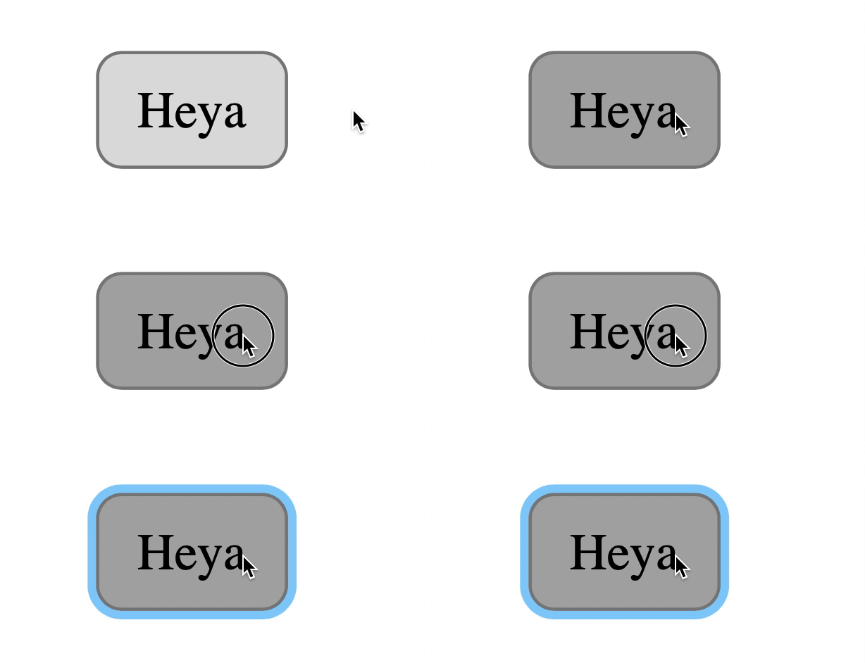
Once you have this code, click behaviour on buttons become:
- When you hold down left mouse button: Triggers
:activein all browsers. Triggers:focuson Chrome only. - When you release left mouse button: Triggers
:focuson Safari and Firefox (Mac).:focusremains on button for other browsers.
Now you know about hover, focus, and active states, I want to talk about styling all three.
The magic combination
The magic combination allows users to get feedback when they hover, focus, and interact with an element. Here’s the code you need:
.element:hover,
.element:active {
  /* Change background/text color */
}

.element:focus {
  /* Show outline /*
}
For mouse users:
- When the user hovers over an element,
background-color(and/orcolor) changes. They get feedback. - When the user clicks on an element, focus outline shows. They get feedback.
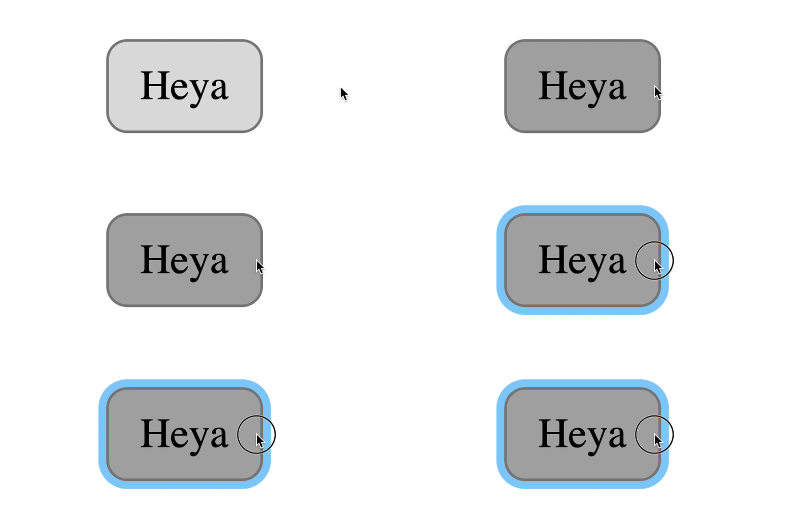
For keyboard users:
- When the user tabs into an element, focus outline shows. They get feedback.
- When they interact with the element,
background-color(and/orcolor) changes. They get feedback.
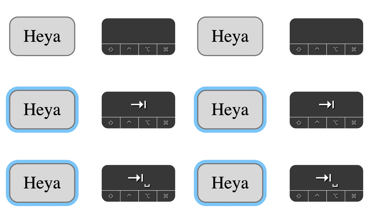
Best of both worlds!
- I have not tested the magic combination thoroughly. This is a proof of concept. I’d appreciate it if you help me with some tests and let me know how it fares.
- If you run tests, don’t use Codepen. Focus states for links are weird on Codepen. If you hover over a link, the focus outline gets removed. Why? I don’t know. Sometimes I think it’s best to test stuff like these without any fancy tools. Just plain ol’ HTML, CSS, JS.
The non-magic (but might be better) combination
Like I mentioned above, clicks on buttons have a weird behavior in Safari and Firefox (Mac). If you added the JavaScript snippet I showed you, the magic combination still works. But it’s not perfect.
For Safari and Firefox (Mac), this is what happens:
- When users hold their mouse button down, nothing changes.
- When users lift their mouse button up, the element gets focus

If you think this is enough affordance, then the magic combination works. You can stop here.
But if you think there’s not enough affordance, you’d want to style :hover, :focus, and :active separately.
.element:hover {
  /* Change background/text color */
}

.element:active {
  /* Another change in background/text color */
}

.element:focus {
  /* Show outline /*
}
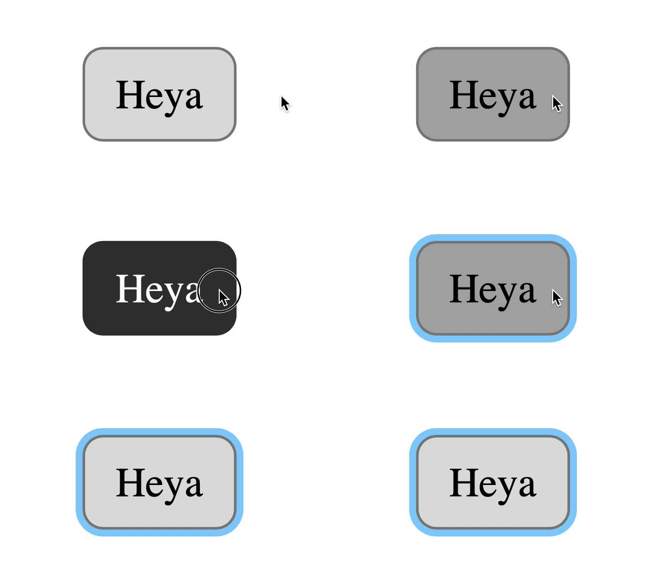
That’s it! Hope you learned something today!
This content originally appeared on Zell Liew and was authored by Zell Liew
Zell Liew | Sciencx (2019-10-16T00:00:00+00:00) Style hover, focus, and active states differently. Retrieved from https://www.scien.cx/2019/10/16/style-hover-focus-and-active-states-differently/
Please log in to upload a file.
There are no updates yet.
Click the Upload button above to add an update.
