
This content originally appeared on 24 ways and was authored by Drew McLellan
Eric Meyer gift wraps the most awkwardly shaped of boxes using nothing but CSS, HTML and a little curl of ribbon. No matter how well you plan and how much paper you have at your disposal, sometimes you just need to slant the gift to the side.
We have a lot of new layout tools at our disposal these days—flexbox is finally stable and interoperable, and Grid very much the same, with both technologies having well over 90% support coverage. In that light, we might think there’s no place for old tricks like negative margins, but I recently discovered otherwise.
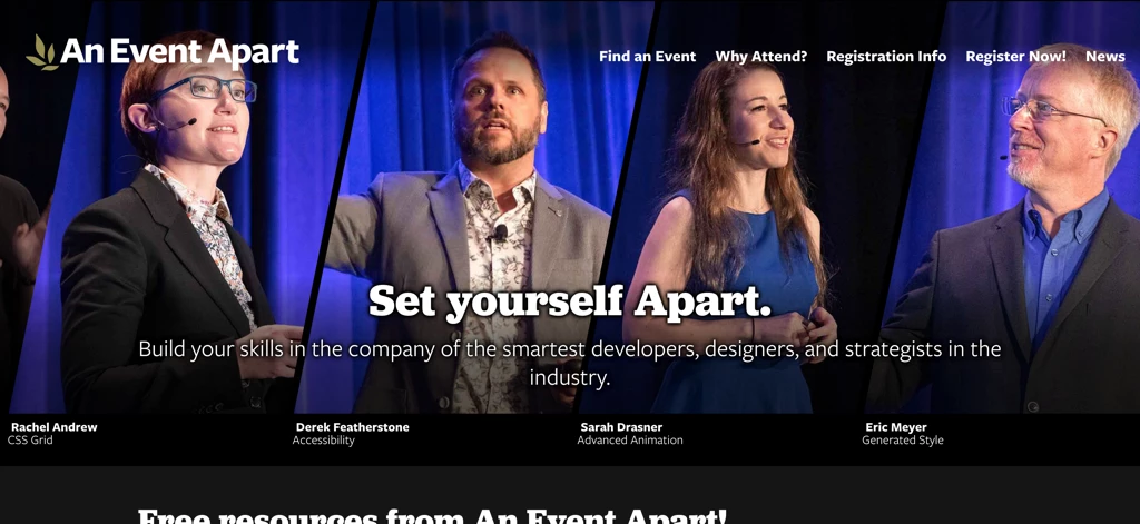
Over at An Event Apart, we’ve been updating some of our landing pages, and our designer thought it would be interesting to have slanted images of speakers at the tops of pages. The end result looks like this.
The interesting part is the images. I wanted to set up a structure like the following, so that it will be easy to change speakers from time to time while preserving accessible content structures:
<div id="page-top">
  <ul class="monoliths">
    <li>
      <a href="https://aneventapart.com/speakers/rachel-andrew">
        <img src="/img/rachel-andrew.jpg" alt="">
        <div>
          <strong>Rachel Andrew</strong> CSS Grid
        </div>
      </a>
    </li>
    <li>
      <a href="https://aneventapart.com/speakers/derek-featherstone">
        <img src="/img/derek-featherstone.jpg" alt="">
        <div>
          <strong>Derek Featherstone</strong> Accessibility
        </div>
      </a>
    </li>
    <li>
      …
    </li>
    <li>
      …
    </li>
  </ul>
</div>
The id value for the div is straightforward enough, and I called the ul element monoliths because it reminded me of the memorial monoliths at the entrance to EPCOT in Florida. I’m also taking advantage of the now-ubiquitous ability to wrap multiple elements, including block elements, in a hyperlink. That way I can shove the image and text structures in there, and make the entire image and text below it one link.
Structure is easy, though. Can we make that layout fully responsive? I wondered. Yes we can. Here’s the target layout, stripped of the navbar and promo copy.

So let’s start from the beginning. The div gets some color and text styling, and the monoliths list is set to flex. The images are in a single line, after all, and I want them to be flexible for responsive reasons, so flexbox is 100% the right tool for this particular job.
#page-top {
  background: #000;
  color: #FFF;
  line-height: 1;
}
#page-top .monoliths {
  display: flex;
  padding-bottom: 1em;
  overflow: hidden;
}
I also figured, let’s give the images a simple basis for sizing, and set up the hyperlink while we’re at it.
#page-top .monoliths li {
  width: 25%;
}
#page-top .monoliths a {
  color: inherit;
  text-decoration: inherit;
  display: block;
  padding: 1px;
}
So now the list items are 25% wide—I can say that because I know there will be four of them—and the links pick up the foreground color from their parent element. They’re also set to generate a block box.
At this point, I could concentrate on the images. They need to be as wide as their parent element, but no wider, and also match height. While I was at it, I figured I’d create a little bit of space above and below the captioning text, and make the strong elements containing speakers’ names generate a block box.
#page-top .monoliths img {
  display: block;
  height: 33rem;
  width: 100%;
}
#page-top .monoliths div {
  padding: 0.5em 0;
}
#page-top .monoliths strong {
  display: block;
  font-weight: 900;
}
It looks like the speakers were all cast into the Phantom Zone or something, so that needs to be fixed. I can’t physically crop the images to be the “correct” size, because there is no correct size: this needs to work across all screen widths. So rather than try to swap carefully-sized images in and out at various breakpoints, or complicate the structure with a wrapper element set to suppress overflow of resized images, I turned to object-fit.
#page-top .monoliths img {
  display: block;
  height: 33rem;
  width: 100%;
  object-fit: cover;
  object-position: 50% 20%;
}
If you’ve never used object-fit, it’s a bit like background-size. You can use it to resize image content within the image’s element box without creating distortions. Here, I set the fit sizing to cover, which means all of the img element’s element box will be covered by image content. In this case, it’s like zooming in on the image content. I also set a zooming origin with object-position, figuring that 50% across and 20% down would be in the vicinity of a speaker’s face, given the way pictures of people are usually taken.

This is fairly presentable as-is—a little basic, perhaps, but it would be fine to layer the navbar and promo copy back over it with Grid or whatever, and call it a day. But it’s too square and boxy. We must go further!
To make that happen, I’m going to take out the third and fourth images temporarily, so we can see more clearly how the next part works. That will leave us with Rachel and Derek.

The idea here is to clip the images to be slanted, and then pull them close to each other so they have just a little space between them. The first part is managed with clip-path, but we don’t want to pull the images together unless their shapes are being clipped. So we set up a feature query.
@supports (clip-path: polygon(0 0)) or (-webkit-clip-path: polygon(0 0)) {
  #page-top .monoliths li {
    width: 37.5%;
  }
}
I decided to test for both the un-prefixed and WebKit-prefixed versions of clip-path because Safari still requires the prefix, and I couldn’t think of a good reason to penalize Safari’s users for the slowness of its standards advancement. Then I made the images wider, taking them from 25% to 37.5%, which makes them half again as wide.

Thanks to object fitting, the images don’t distort when I change their parent’s width; they just get wider and scale up the contents to fit. And now, it is time for clipping!
@supports (clip-path: polygon(0 0)) or (-webkit-clip-path: polygon(0 0)) {
  #page-top .monoliths li {
    width: 37.5%;
    -webkit-clip-path: polygon(25% 0, 100% 0, 75% 100%, 0 100%);
    clip-path: polygon(25% 0, 100% 0, 75% 100%, 0 100%);
  }
}
Each coordinate pair in the polygon() is like the position pairs in background-position or object-position: the horizontal distance first, followed by the vertical distance. So the first point in the polygon is 25% 0, which is 25% of the way across the element box, and no distance down, so right at the top edge. 100% 0 is the top right corner. 75% 100% is on the bottom edge, three-quarters of the way across the element, and 0 100% is the bottom left corner. That creates a polygon that’s a strip three-quarters the full width of the element box, and runs from bottom left to top right.

Now we just have to pull them together, and this is where old tricks come back into play: all we need is a negative right margin to bring them closer together.
#page-top .monoliths li {
  width: 37.5%;
  margin-right: -7.5%;
  -webkit-clip-path: polygon(25% 0, 100% 0, 75% 100%, 0 100%);
  clip-path: polygon(25% 0, 100% 0, 75% 100%, 0 100%);
}
The separation between them is a little wider than we were originally aiming for, but let’s see what happens when we add the other two images back in and let flexbox do its resizing magic.
Notice how the slants actually change shape as the screen gets narrower or wider. This is because they’re still three-quarters the width of the image element’s box, but the width of that box is changing as the screen width changes. That means at narrow widths, the slant is much steeper, whereas at wide widths, the slant is more shallow. But since the clipping path’s coordinates were all set with percentage distances, they all stay parallel to each other while being completely responsive to changes in screen size. An absolute measure like pixels would have failed.
But how did the images get closer together just by adding in two more? Because the list items’ basic sizing added up to more than 100%, and they’re all set to flex-shrink: 1. No, you didn’t miss a line in the CSS: 1 is the default value for flex-shrink. Flex items will shrink by default, which after all is what we should expect from a flexible element. If you want to know how much they shrunk, and why, here’s what Firefox’s flex inspector reports.

When there were only two list items, there was space enough for both to be at their base size, with no shrinkage. Once we went to four list items, there wasn’t enough space, so they all shrank down. At that point, having a negative right margin of -7.5% was just right to pull them together to act as a unit.
So, now they’re all nicely nestled together, and fully responsive! The captions need a little work, though. Notice how they’re clipped off a bit on the left edge, and can be very much clipped off on the right side at narrower screen widths? This happens because the li elements are being clipped, and that clipping applies to all their contents, images and text alike. And we can’t use overflow to alter this: clipped is clipped, not overflowed.
Fortunately, all we really need to do is push the text over a small amount. Inside the feature query, I added:
#page-top .monoliths div {
  padding-left: 2%;
  padding-right: 26%;
}
This shifts the text just a bit rightward, enough to clear the clip path. On the right side, I padded the div boxes so their contents wouldn’t fall outside the clipped area and appear to slide under the next caption. We could also use margins here, but I didn’t for reasons I’ll make clear at the end.

At the last minute, I decided to make the text at least appear to follow the slants of the images. For that, I just needed to shift the first line over a bit, which I did with a bit more padding.
#page-top .monoliths strong {
  padding-left: 1%;
}
That’s all to the good, but you may have noticed the captions still overlap at really narrow screen widths. There are a lot of options here, from stacking the images atop one another to reverting to normal flow, but I decided to just hide the captions if things got too narrow. It reduces clutter without sacrificing too much in the way of content, and by leaving them still technically visible, they seem to remain accessible.
@media (max-width: 35rem) {
  #page-top .monoliths div {
    opacity: 0.01
  }
}
And that, as they say, is that! Fully responsive slanted images with text, in an accessible markup structure. I dig it.
I did fiddle around with the separations a bit, and found that a nice thin separator occurred around margin-right: -8%, whereas beefier ones could be found above -7%. And if you crank the negative margin value to something beyond -8%, you’ll make the images overlap entirely, no visible separation—which can be a useful effect in its own right.
I promised to say why I used padding for the caption text div rather than margins. Here’s why.
#page-top .monoliths div {
  padding-left: 3%;
  padding-right: 26%;
  border-top: 2px solid transparent;
  background: linear-gradient(100deg,hsl(292deg,50%,50%) 50%, transparent 85%);
  background-clip: padding-box;
}
It required a wee bit more padding on the left to look decent, and an alteration to the background clipping box in order to keep the purple from filling the transparent border area, but the end result is pretty nifty, if I do say so myself. Alternatively, we could drop the background gradient on the captions and put one in the background, with a result like this.

I have no doubt this technique could be extended, made more powerful, and generally improved upon. I really wished for subgrid support in Chrome, so that I could put everything on a grid without having to tear the markup structure apart, and there are doubtless even more interesting clipping paths and layout patterns to try out.
I hope these few ideas spark some much better ideas in you, and that you’ll share them with us!
About the author
Eric A. Meyer (@meyerweb) has been a burger flipper, a college webmaster, an early blogger, one of the original CSS Samurai, a member of the CSS Working Group, a consultant and trainer, and a Standards Evangelist for Netscape. Among other things, Eric co-wrote Design For Real Life with Sara Wachter-Boettcher for A Book Apart and CSS: The Definitive Guide with Estelle Weyl for O’Reilly, created the first official W3C test suite, assisted in the creation of microformats, and co-founded An Event Apart with Jeffrey Zeldman. Eric lives with his family in Cleveland, Ohio, which is a much nicer city than you’ve probably heard. He enjoys a good meal whenever he can and considers almost every form of music to be worthwhile.
This content originally appeared on 24 ways and was authored by Drew McLellan
Drew McLellan | Sciencx (2019-12-21T12:00:00+00:00) Flexible Captioned Slanted Images. Retrieved from https://www.scien.cx/2019/12/21/flexible-captioned-slanted-images/
Please log in to upload a file.
There are no updates yet.
Click the Upload button above to add an update.