Corner ribbon with trigonometry

I was never the best at trigonometry, so I was very proud finally cracking how to perfectly position a corner ribbon within a box with CSS.

Colorful corner ribbon saying “Express”

Unfortunately for us, CSS does not provide trigonometry functions yet (although there are plans to implement them), so we have to rely on another language for that. We have three options:

  • We can use a preprocessor like Sass (although we might have to implement our own math functions).
  • We can use JavaScript, which is a compelling option when using CSS-in-JS.
  • We can run the math on the side and hard-code the value. That’s what we’ll do here.

Let’s start with some simple markup:

div class="container">
div class="ribbon">Expressdiv>
div>

And some basic styling (without all purely aestethic considerations):

/**
* 1. Positioning context for the ribbon.
* 2. Prevent the edges of the ribbon from being visible outside the
* box.
*/

.container {
position: relative; /* 1 */
overflow: hidden; /* 2 */
}

/**
* 1. Start absolutely positioned in the top right corner of the
* container.
* 2. Horizontal padding is considered in the ribbon placement.
* The larger the ribbon (text + padding), the lower in the
* container it might have to be.
* 3. Make sure the content is centered within the ribbon itself.
* 4. Position the ribbon correctly based on its width, as per
* the following formula: `cos(45 * π / 180) * 100%`.
*/

.ribbon {
position: absolute; /* 1 */
top: 0; /* 1 */
right: 0; /* 1 */
padding: 0 2em; /* 2 */
text-align: center; /* 3 */
transform:
translateY(-100%)
rotate(90deg)
translateX(70.71067811865476%)
rotate(-45deg); /* 4 */
transform-origin: bottom right; /* 4 */
}

Trigonometry, just like in school

This transform declaration is quite a mouthful. Let’s apply it left to right and see the result at every step to try and make sense of it. We start with the ribbon absolutely positioned in the top right corner of the container.
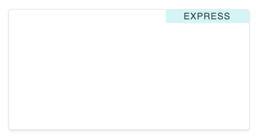
Ribbon positioned in the top right corner of its container

  1. translateY(-100%) translates the ribbon on its Y axis by its height.
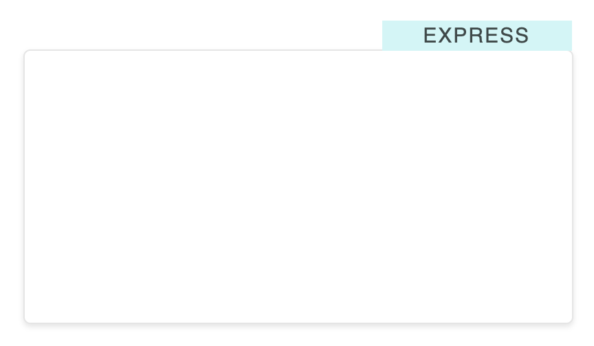
Ribbon translated on its Y axis by its height

  1. rotate(90deg) rotates the ribbon 90 degrees clockwise to inverse its axis.
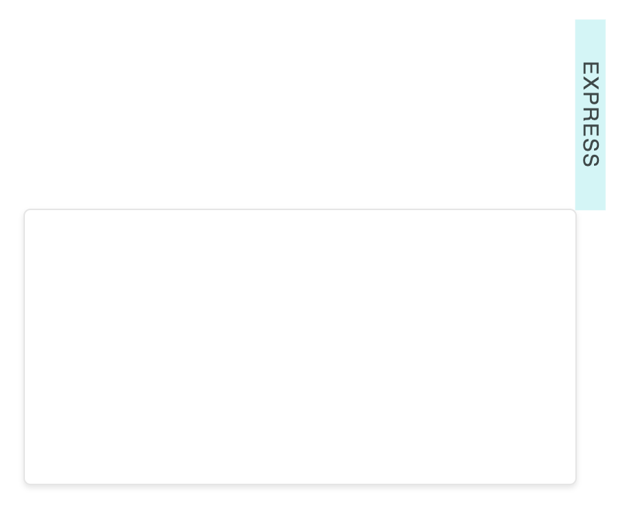
Ribbon rotated 90 degrees to inverse its axis

  1. translateX(70.71067811865476%) translates the ribbon vertically (axes have been swapped) by cos(45) (while remembering that math functions expect radians, not degrees).

Ribbon translated vertically by cos(45)

  1. rotate(-45deg) rotates the ribbon 45 degrees counter-clockwise to orient it correctly. overflow: hidden on the container is enough to clip these corners.

Ribbon rotated -45 degrees

That’s it! ✨ What is nice with this solution is that tweaking the horizontal padding or the text content will automatically preserve the ribbon in the corner as expected. No need to change anything!

Feel free to play with the interactive demo on CodePen.


This content originally appeared on Hugo “Kitty” Giraudel and was authored by Hugo “Kitty” Giraudel

I was never the best at trigonometry, so I was very proud finally cracking how to perfectly position a corner ribbon within a box with CSS.

Colorful corner ribbon saying “Express”

Unfortunately for us, CSS does not provide trigonometry functions yet (although there are plans to implement them), so we have to rely on another language for that. We have three options:

  • We can use a preprocessor like Sass (although we might have to implement our own math functions).
  • We can use JavaScript, which is a compelling option when using CSS-in-JS.
  • We can run the math on the side and hard-code the value. That’s what we’ll do here.

Let’s start with some simple markup:

<div class="container">
<div class="ribbon">Expressdiv>
div>

And some basic styling (without all purely aestethic considerations):

/**
* 1. Positioning context for the ribbon.
* 2. Prevent the edges of the ribbon from being visible outside the
* box.
*/

.container {
position: relative; /* 1 */
overflow: hidden; /* 2 */
}

/**
* 1. Start absolutely positioned in the top right corner of the
* container.
* 2. Horizontal padding is considered in the ribbon placement.
* The larger the ribbon (text + padding), the lower in the
* container it might have to be.
* 3. Make sure the content is centered within the ribbon itself.
* 4. Position the ribbon correctly based on its width, as per
* the following formula: `cos(45 * π / 180) * 100%`.
*/

.ribbon {
position: absolute; /* 1 */
top: 0; /* 1 */
right: 0; /* 1 */
padding: 0 2em; /* 2 */
text-align: center; /* 3 */
transform:
translateY(-100%)
rotate(90deg)
translateX(70.71067811865476%)
rotate(-45deg); /* 4 */
transform-origin: bottom right; /* 4 */
}

Trigonometry, just like in school

This transform declaration is quite a mouthful. Let’s apply it left to right and see the result at every step to try and make sense of it. We start with the ribbon absolutely positioned in the top right corner of the container.

Ribbon positioned in the top right corner of its container

  1. translateY(-100%) translates the ribbon on its Y axis by its height.

Ribbon translated on its Y axis by its height

  1. rotate(90deg) rotates the ribbon 90 degrees clockwise to inverse its axis.

Ribbon rotated 90 degrees to inverse its axis

  1. translateX(70.71067811865476%) translates the ribbon vertically (axes have been swapped) by cos(45) (while remembering that math functions expect radians, not degrees).

Ribbon translated vertically by cos(45)

  1. rotate(-45deg) rotates the ribbon 45 degrees counter-clockwise to orient it correctly. overflow: hidden on the container is enough to clip these corners.

Ribbon rotated -45 degrees

That’s it! ✨ What is nice with this solution is that tweaking the horizontal padding or the text content will automatically preserve the ribbon in the corner as expected. No need to change anything!

Feel free to play with the interactive demo on CodePen.


This content originally appeared on Hugo “Kitty” Giraudel and was authored by Hugo “Kitty” Giraudel


Print Share Comment Cite Upload Translate Updates
APA

Hugo “Kitty” Giraudel | Sciencx (2020-01-22T00:00:00+00:00) Corner ribbon with trigonometry. Retrieved from https://www.scien.cx/2020/01/22/corner-ribbon-with-trigonometry/

MLA
" » Corner ribbon with trigonometry." Hugo “Kitty” Giraudel | Sciencx - Wednesday January 22, 2020, https://www.scien.cx/2020/01/22/corner-ribbon-with-trigonometry/
HARVARD
Hugo “Kitty” Giraudel | Sciencx Wednesday January 22, 2020 » Corner ribbon with trigonometry., viewed ,<https://www.scien.cx/2020/01/22/corner-ribbon-with-trigonometry/>
VANCOUVER
Hugo “Kitty” Giraudel | Sciencx - » Corner ribbon with trigonometry. [Internet]. [Accessed ]. Available from: https://www.scien.cx/2020/01/22/corner-ribbon-with-trigonometry/
CHICAGO
" » Corner ribbon with trigonometry." Hugo “Kitty” Giraudel | Sciencx - Accessed . https://www.scien.cx/2020/01/22/corner-ribbon-with-trigonometry/
IEEE
" » Corner ribbon with trigonometry." Hugo “Kitty” Giraudel | Sciencx [Online]. Available: https://www.scien.cx/2020/01/22/corner-ribbon-with-trigonometry/. [Accessed: ]
rf:citation
» Corner ribbon with trigonometry | Hugo “Kitty” Giraudel | Sciencx | https://www.scien.cx/2020/01/22/corner-ribbon-with-trigonometry/ |

Please log in to upload a file.


There are no updates yet.
Click the Upload button above to add an update.

You must be logged in to translate posts. Please log in or register.