This content originally appeared on Lea Verou and was authored by Lea Verou
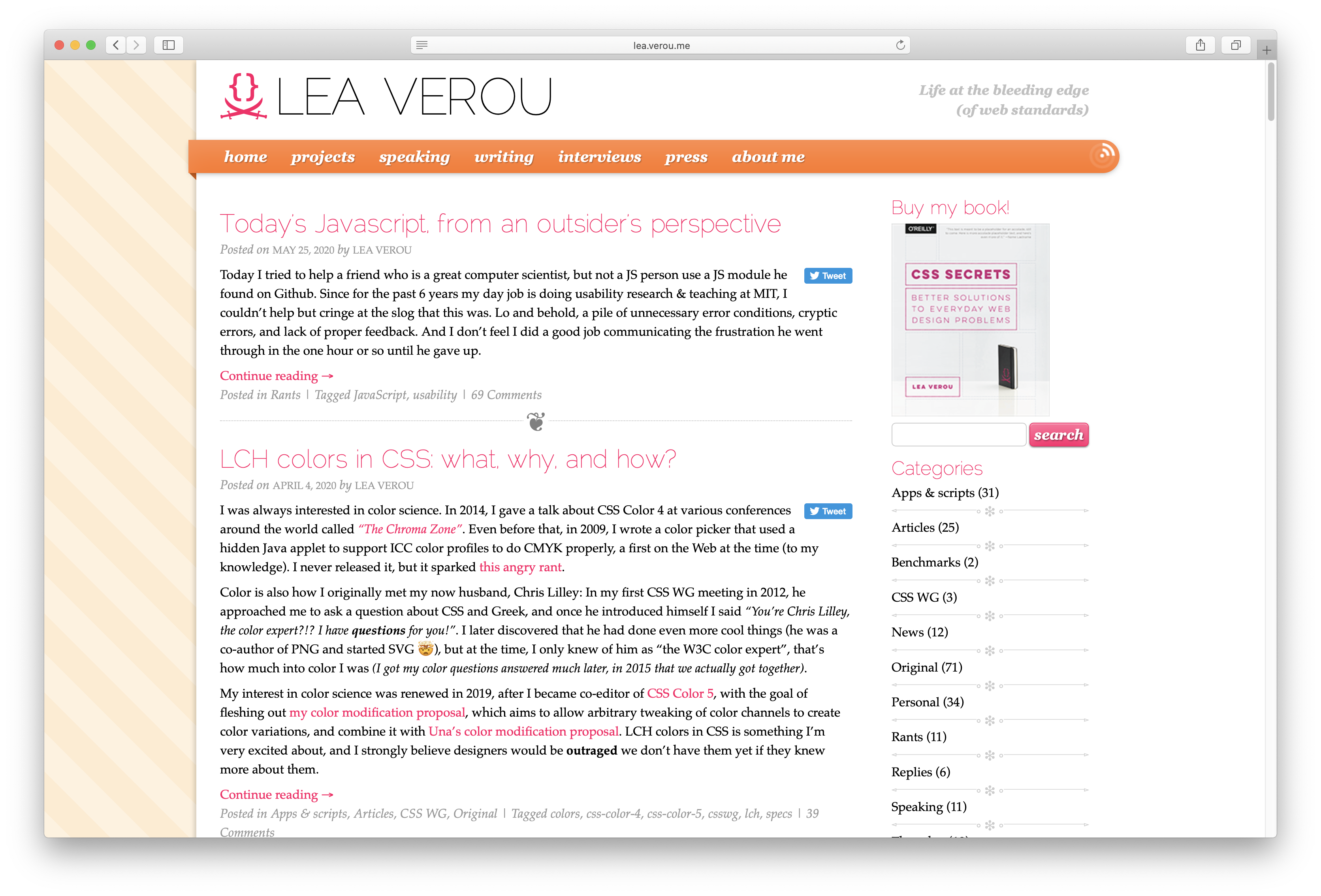
It has been almost a decade since this blog last saw a redesign.

In these 9 years, my life changed dramatically. I joined and left W3C, joined the CSS WG, went to MIT for a PhD, published a book, got married, had a baby, among other things. I designed dozens of websites for dozens of projects, but this theme remained constant, with probably a hasty tweak here and there but nothing more than that. Even its mobile version was a few quick media queries to make it palatable on mobile.
To put this into perspective, when I designed that theme:
- CSS gradients were still cutting edge
- We were still using browser prefixes all over the place
- RSS was still a thing that websites advertised
- Skeuomorphism was all the rage
- Websites were desktop first, and often desktop-only.
- Opera was a browser we tested in.
- IE8 was the latest IE version. It didn’t support SVG, gradients, border-radius, shadows, web fonts (except .eot), transforms,
<video>,<audio>,<canvas> - We were still hacking layout with floats, clearfix and
overflow: hidden
Over the course of these years, I kept saying “I need to update my website’s theme”, but never got around to it, there was always something more high priority.
The stroke that broke the camel’s back was this Monday. I came up with a nice CSS tip on another website I was working on, and realized I was hesitating to blog about it because I was embarrassed at how my website looked. This is it, I thought. If it has gotten so bad that I avoid blogging because I don’t want people to be reminded of how old my website looks, I need to get my shit together and fix this, I told myself.
My plan was to design something entirely from scratch, like I had done the previous time (the previous theme used a blank HTML5 starter theme as its only starting point). However, when I previewed the new WordPress default (Twenty Twenty), I fell in love, especially with its typography: it used a very Helvetica-esque variable font as its heading typeface, and Hoefler Text for body text. 
It would surely be very convenient to be able to adapt an existing theme, but on the other hand, isn’t it embarrassing to be known for CSS and use the default theme or something close to it?
In the end, I kept the things I liked about it and it certainly still looks a lot like Twenty Twenty, but I think I’ve made enough tweaks that it’s also very Lea. And of course there are animated conic gradients in it, because duh. 
Do keep in mind that this is just a day’s work, so it will be rough around the edges and still very much a work in progress. Let me know about any issues you find in the comments!
PS: Yes, yes, I will eventually get around to enforcing https://!
This content originally appeared on Lea Verou and was authored by Lea Verou
Lea Verou | Sciencx (2020-06-03T06:25:12+00:00) New decade, new theme. Retrieved from https://www.scien.cx/2020/06/03/new-decade-new-theme/
Please log in to upload a file.
There are no updates yet.
Click the Upload button above to add an update.
