
This content originally appeared on Stefan Judis Web Development and was authored by Stefan Judis
Today I read Addy Osmani's article Preload late-discovered Hero images faster. It's a good summary of ways to preload resources if you want to adjust and improve the browser's loading behavior. The cool thing about this article; I discovered a recently added web platform feature to help speed up the loading of responsive images.
Let's assume you have the following responsive image in your page.
<img srcset="image-400.jpg 400w, image-800.jpg 800w, image-1600.jpg 1600w"
     sizes="100vw"
     alt="...">
The srcset and sizes attribute of this image element provide browsers with the information that it will span over the whole viewport width (100vw) and that it is available in three sizes ranging from 400px to 1600px. With this information, browsers can load the best-suited image without wasting high-res image data on tiny screens.
You have to consider, though, that browsers load resources in a particular order. They usually request images after critical resources like stylesheets and fonts. To change this loading order and re-prioritize resources, you can use <link rel="preload"> elements in your document's head to signal that certain resources are high-priority or requested by the document soon.
<!-- preload a font that will be discovered later -->
<link rel="preload"
      href="fonts/cicle_fina-webfont.woff2"
      as="font"
      type="font/woff2"
      crossorigin>
If you want to learn more about preloading, I recommend looking at the article Preload: What Is It Good For?.
But how would you preload a responsive image with sizes and srcset attributes injected into the DOM later when a JavaScript component renders?
Preload responsive images with rel="preload"
Section titled Preload responsive images with `rel="preload"`
It turns out that iamgesrcset and imagesizes made it into the spec. You can use these attributes on link elements to give browsers the information of high-priority responsive images coming with sizes and srcset attributes.
<head>
  <!-- Hey browser! Please preload this important responsive image -->
  <link rel="preload"
        as="image"
        imagesrcset="
          image-400.jpg 400w,
          image-800.jpg 800w,
          image-1600.jpg 1600w"
        imagesizes="100vw">
</head>
<body>
  <img srcset="image-400.jpg 400w, image-800.jpg 800w, image-1600.jpg 1600w"
       sizes="100vw"
       alt="...">
</body>
imagesrcset and imagesizes follow the same rules as srcset and sizes on img elements so that you can reuse the same attribute values you use for the image itself.
Things to consider when using imagesrcset and imagesizes on link elements
imagesizes and imagesrcset only work on link elements with the attributes rel="preload" and as="image". Also, omit the href on the link element so that unsupporting browsers won't request a useless image because the browser loads a more suitable image.
Browser support
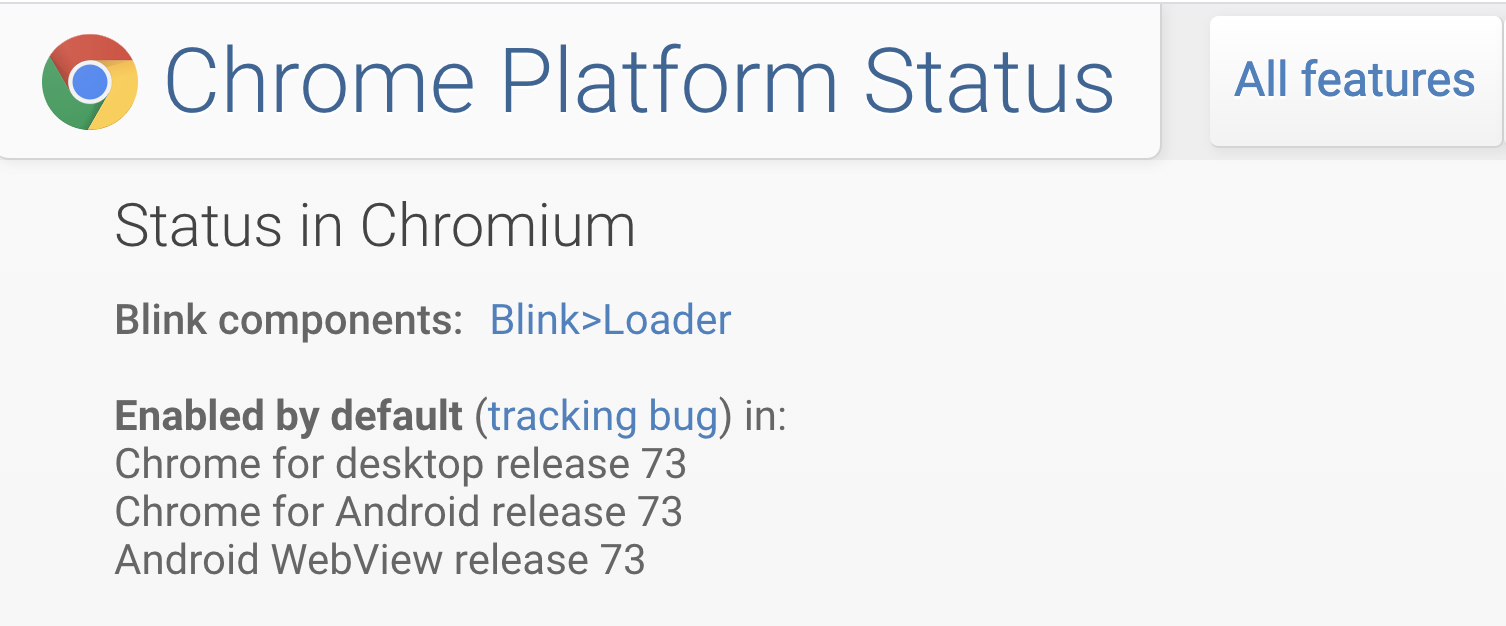
There is no browser support data on caniuse.com or MDN at the time of writing. But you can look at the Chrome status ticket for imagesrcset and imagesizes, and it appears that this web platform addition is currently a Chrome-only (and Edge ?) thing.
Nevertheless, looking at Chrome's market share these days(roughly 70%), it's something to check out! Happy preloading! ?
Additional resources
Section titled Additional resourcesReply to Stefan
This content originally appeared on Stefan Judis Web Development and was authored by Stefan Judis
Stefan Judis | Sciencx (2020-09-10T22:00:00+00:00) How to preload responsive images with imagesizes and imagesrcset (#tilPost). Retrieved from https://www.scien.cx/2020/09/10/how-to-preload-responsive-images-with-imagesizes-and-imagesrcset-tilpost/
Please log in to upload a file.
There are no updates yet.
Click the Upload button above to add an update.