
This content originally appeared on Bits and Pieces - Medium and was authored by Lahiruka Wijesinghe
How to use responsive images for better user experience
Creating a responsive image isn’t rocket science. I’m sure you are already created many of those using CSS. However, the flexible size is only one factor when it comes to responsive images.
Sometimes depending on the device type, we need to adjust the image quality and even the image type for a better user experience.
Today we can find different techniques to maintain the right quality and size. This article will explore those approaches and help you find the one that best fits your project.
Different Approaches to Implement Responsive Images
- Device pixel-based method: This approach allows you to use multiple versions of the same image with different resolutions and choose the most suitable one to render based on the users’ screen resolution. This method is more suitable for devices that don’t render high-resolution images.
- Fluid-image method: By default, images are not fluid. They tend to crop or stay at a fixed size when screen size changes. With the fluid-image method, you can insert an image into a responsive layout and give the ability to stretch or scrunch as necessary.
- Art Direction method: Art direction is a common issue we face when dealing with different screen sizes. We can address this by altering image content, cropping down the image, or using a different image based on users’ screen size.
- Type-switching method: There are some browsers and devices that don’t support modern image types like WebP. The type-switching method can be used to switch between image types allowing you to serve the best content to the user based on device and browser compatibility.
Since you understand the approaches and situations where they most suit, let’s see how we can implement those methods.
Tip: Next time you create a responsive image component with the soon-to-be-learned techniques, make sure to share it using Bit (Github) to make it available for reuse by other web projects.
Implementing Responsive Images
As mentioned earlier, there are several ways to implement responsive images, and it’s important to know the best ways to implement them to get the maximum from your effort.
By default, there are several excellent tags and attributes like img, picture, sizeand srcset provided by HTML for image rendering in web development. Now, I will show you how to implement the above-discussed methods using those tags and attributes in no time.
1. Device Pixel-Based Method
Before going deeper, let me tell you about high-density displays. Modern flagship mobile devices such as Samsung Galaxy S10 have Density Displays of 4x, whereas some economy models may have low-density displays.
If we push to load a high-density image in a low-density display, it will result in a very poor user experience and a waste of resources. So, we’ll use different images for various device pixel-ratios.
In the below example, we have considered two images. The small-kitten.jpg with 320×240 pixels and large-kitten.jpg with 640×480 pixels, making the latter one suitable for high-resolution displays. (x descriptor shows the expected device pixel-ratio)
<img
   srcset="small-kitten.jpg 1x, large-kitten.jpg 2x"
   src="small-kitten.jpg"
   alt="A cute kitten"
/>
If users’ device resolution is above 640x480 pixels, large-kitten.jpg will be rendered, and if not, small-kitten.jpg image will be rendered. Most importantly, the users with low res devices will not feel any delay in image loading time, while users who have high res devices will not feel any issue in image quality.
2. Fluid-Image Method
This method is focused on using the same image with different sizes rather than using different images.
For example, we can implement simple fluid-images by giving image size in relative ratios rather than giving precise pixel values. The most common method used is max-width:100%.
<img
   src=”black-dog.jpg”
   style=”max-width: 100%;
   height: auto;”
   alt=”Black dog image”
>
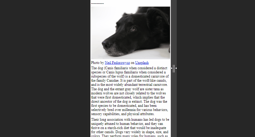
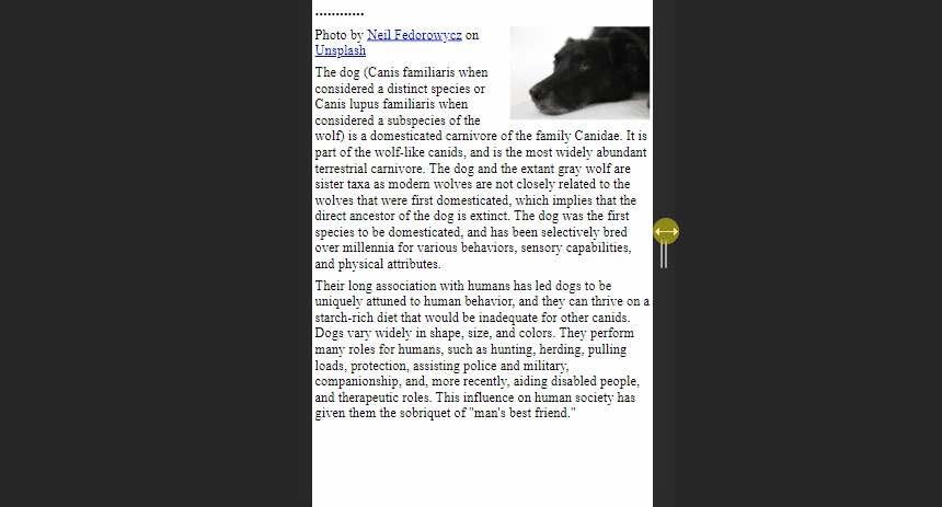
As you can see above image is free to scale and fit the browser window size. This method will be ideal for occasions where there are large images as article headers.
Furthermore, there is an advanced method with fluid-images to compute the dimensions using the image’s width and the page’s overall width.
As an example, consider a web page with 1200px wide and an image with 500px wide. Then the calculation of how much the image takes up on the page will be as follows:
width of the image = image width/page width
(500/1200) x 100 = 41.66%
Then we can use this value as shown in the below code snippet. It will enable the image to always keep scaled with the size of the web page.
<img
   src=”black-dog.jpg”
   style=”float: right;
   width: 41.66%;”
   alt=”Black dog image”
>
However, this calculation might cause some issues when the viewport is too large or too small.
We can overcome this issue by adding max and min values for image width in pixels to mark upper and lower bounds.
<img
   src=”black-dog.jpg”
   style=” width: 41.66%;
   max-width: 500px;”
   alt=”Black dog image”
>
3. Art Direction Method
The main idea behind Art Direction is to display different images based on the screen sizes of the device. We can address this issue by switching to picture tag instead of using img tag since it allows to provide images in multiple ratios or multiple focus points when viewed on different devices.
A simple code snippet like the below can obtain the above result. Here we provide values for 2 different attributes inside <source> element; media and srcsetdefining image size and sources respectively.
<picture>
 <source media=”(min-width: 650px)” srcset=”kitten-stretching.png”>
 <source media=”(min-width: 465px)” srcset=”kitten-sitting.png”>

 <img src=”kitten-curled.png” alt=”A cute kitten”>
</picture>
In the above example, If the screen size is greater than 560px browser will show the images from the first image, and if the screen size is greater than 465px and below 650px browser will use the second image.
You’ll notice the regular <img> tag as the final nested tag of the <picture> element, which is crucial to make this code snippet work. It will be used as a replacement when conditions in the media query are not matching and as a backup on browsers that do not support the <picture> element.
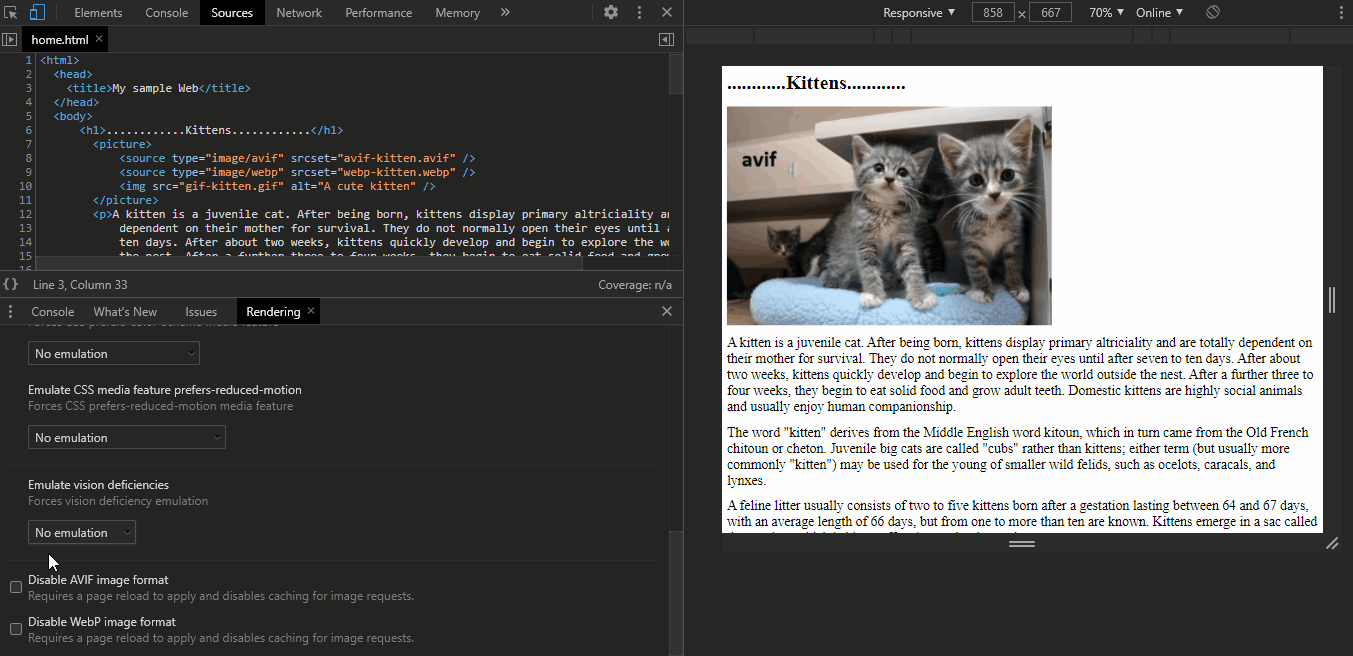
4. Image Type-Switching Method
With the rapid development of technologies, different types of modern image types like avif, webpare introduced day by day. Although these image types provide a high user experience, there are some browsers that don’t support those image types yet.
So, we can use type switching to address such situations by changing the image format.
For example, the below code contains 2 modern image types and gif image. First, the browser will try avif format, and if that fails, it will try webp format. If the browser does not support both of these, it will use png image.
<picture>
   <source type="image/avif" srcset="avif-kitten.svg" />
   <source type="image/webp" srcset="webp-kitten.webp" />
   <img src="kitten.gif" alt="A cute kitten" />
</picture>
You can also use chrome DevTools to emulate this to see how your image will look like when the browser isn't supporting the modern image types.
Final thoughts
I believe now you have a good understanding of the methods we can use to implement responsive images and what are the situations they mostly suit.
Make sure to get the most out of this knowledge when you develop any web application since implementing responsive images in the correct way helps to provide a better user experience.
So, I invite all of you to try out these methods and share your ideas in the comment section.
Thank you for Reading !!!
Learn More
- Improve Page Rendering Speed Using Only CSS
- Why You Should Use Picture Tag Instead of Img Tag
- Technique for Color Blind Friendly Web Apps using Chrome DevTools
Responsive Images: Different Techniques and Tactics was originally published in Bits and Pieces on Medium, where people are continuing the conversation by highlighting and responding to this story.
This content originally appeared on Bits and Pieces - Medium and was authored by Lahiruka Wijesinghe
Lahiruka Wijesinghe | Sciencx (2021-03-03T23:01:43+00:00) Responsive Images: Different Techniques and Tactics. Retrieved from https://www.scien.cx/2021/03/03/responsive-images-different-techniques-and-tactics/
Please log in to upload a file.
There are no updates yet.
Click the Upload button above to add an update.