
This content originally appeared on Bits and Pieces - Medium and was authored by Dulanka Karunasena
Create a web timeline component hands-on using CSS styles
Timelines have become a common feature in many web designs, and users find them very attractive. However, implementing these timelines is not that easy since clients always request something unique for their websites.
But you don't have to start everything by scratch if you have a basic foundation. So in this article, I will guide you through the steps to create a customizable horizontal timeline with pure CSS.
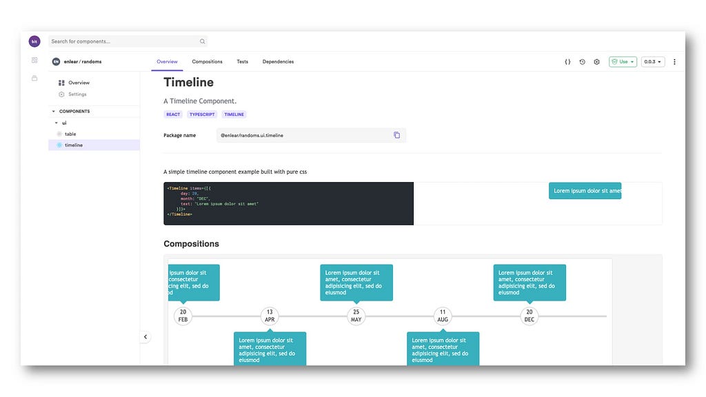
I’ve created the slider as an independent component and shared it with Bit. Feel free to examine it, install it, or import it into your own Bit workspace.
Step 1: Creating the Basic Structure
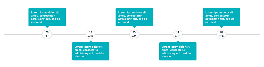
I will start off things by creating the basic structure of the timeline. First, I will design the middle line and then arrange the Date and Event inside the Container Box.
Then I will combine multiple Container Boxes to form the flow of events. You will be able to create the basic structure as it is in the diagram using the below code.
Step 2: Adjusting the Heights and Widths
Now, I will create a wrapper for the timeline to fix its height and width. According to the below example, timeline-wrapper has a 300px height, and it will take the entire width of the screen. By setting margin: auto the timeline will be horizontally centered.
.timeline-wrapper {
  position: relative;
  width: 100%;
  margin: auto;
  height: 300px;
}
Tip: Make sure to set position: relative for parent elements and position: absolute for child elements so that the child elements can be properly arranged relative to their parent.
Step 3: Drawing the Middle Line
As the third step, I will be adding the styles to the middle line. The middle-line will take the entire width of the timeline-wrapper and it will have a height of 5px. It is positioned to the exact middle of the timeline-wrapper by setting top: 50% and transform: translateY(-50%).
.timeline-wrapper .middle-line {
  position: absolute;
  width: 100%;
  height: 5px;
  top: 50%;
  transform: translateY(-50%);
  background: #d9d9d9;
}
Tip: Giving top: 50% isn’t enough to position the middle line to the exact middle. As it has a height of 5px, the middle line will stretch downwards from the center of the timeline. A translation of -50% along Y-axis is essential to position the middle line to the exact center.
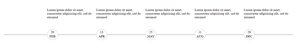
Step 4: Positioning the Dates
Now let’s position the dates in the timeline! First, I will break the timeline into several parts.
I have set the width of the box as 17% so that I can divide the timeline into six parts — also, the float property is set as right to arrange the elements horizontally.
.box {
  width: 17%;
  position: relative;
  min-height: 300px;
  float: right;
}
Tip: The box class should be positioned relative as it will be the parent element for date and box-content classes.
The date class is positioned to the middle of the timeline using top: 50% and transform: translateY(-50%). The border-radius is set to 100% to design the circular border around the date. The date is placed inside paragraph tags with centered text.
.box .date {
  position: absolute;
  top: 50%;
  left: 0px;
  transform: translateY(-50%);
  width: 50px;
  height: 50px;
  border-radius: 100%;
  background: #fff;
  border: 2px solid #d9d9d9;
}
.date p {
text-align: center;
margin-top: 3px;
margin-bottom: 0px;
}Let’s see what we have achieved so far!
Impressive right? ?.But, I think we can do better than this. So, let’s do some modifications to our awesome timeline more to give it a better look.
Step 5: Styling the Event Boxes
Next I will style the box-content with a width of 180px and background color set to #00b0bd. The border-radius will be set to 5px to get the rounded corners.
The box-content is positioned -77px away from the left of the box to align with dates properly. Margin is set to 0, and font color to white for the paragraphs inside the box-content.
.box .box-content {
  border-radius: 5px;
  background-color: #00b0bd;
  width: 180px;
  position: absolute;
  left: -77px;
  padding: 15px;
}
.box-content p {
margin: 0;
color: white;
}I thought it would be better to move the boxes to either side of the centerline. So I moved the box-content of box-bottom 65% down from the top of the box element.
.box-bottom .box-content {
  top: 65%;
}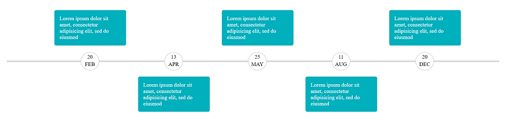
Now I will add some icing to the Event Boxes in the timeline by styling the box-content a little bit more. For that, I used ::before selector. It will contain whitespace as content and a border of 10px, which will add a small triangular shape to the top or bottom of the box-content.
left: 50%; and transform: translateX(-50%); will align the content to the exact center of box-content.
.box-content::before {
  content: " ";
  position: absolute;
  left: 50%;
  transform: translateX(-50%);
  border: 10px solid transparent;
}
You might not see any change in the Event Boxes yet. But we are almost there! I colored the relevant border and positioned the ::before selector -20px away from top or bottom of box-content depending on its position.
.box-bottom .box-content::before {
  border-bottom-color: #00b0bd;
  top: -20px;
}
.box-top .box-content::before {
border-top-color: #00b0bd;
bottom: -20px;
}
Bingo! We have designed a horizontal timeline from scratch using pure CSS. Find the complete source code from here.
Summary
This article is a comprehensive and hands-on guide on how to develop a timeline using pure CSS. I have followed a horizontal approach since you might not find them abundant on the web.
In addition to the above steps, we can bring more additions to the timeline, such as horizontal scrolling, by adding a bit of JavaScript. You could also try to make it responsive, but I will not recommend it as it will break the timeline, and the process will be tedious.
I believe you managed to design a cool timeline with the help of this guide. See you again in another awesome article. Until then, happy coding! ?
Learn More
- Improve Page Rendering Speed Using Only CSS
- Pure CSS to Make a Button “Shine” and Gently Change Colors Over Time
- Creating morphing animations with CSS clip-path
How to Create a Timeline with Pure CSS was originally published in Bits and Pieces on Medium, where people are continuing the conversation by highlighting and responding to this story.
This content originally appeared on Bits and Pieces - Medium and was authored by Dulanka Karunasena
Dulanka Karunasena | Sciencx (2021-04-05T22:20:27+00:00) How to Create a Timeline with Pure CSS. Retrieved from https://www.scien.cx/2021/04/05/how-to-create-a-timeline-with-pure-css/
Please log in to upload a file.
There are no updates yet.
Click the Upload button above to add an update.