
This content originally appeared on Perishable Press and was authored by Jeff Starr
![]() Finally! Writing this post is the final step in the 2021 redesign of my WordPress plugins site, Plugin Planet. The site launched seven years ago in 2014. I think I spent a couple of months or so building the original site to the best of my ability.
Finally! Writing this post is the final step in the 2021 redesign of my WordPress plugins site, Plugin Planet. The site launched seven years ago in 2014. I think I spent a couple of months or so building the original site to the best of my ability.
That first design stood the test of time, and honestly it would have been fine for another couple of years or more. But after seven years of changes, modifications, swapping out plugins, adding new content, tweaking the design here and there.. on the surface it looked fine, but under the hood everything had become quite piecemeal and inconsistent. So in April this year, I rolled up my sleeves and got to work.
The Plan
The first step in my redesign slash complete site overhaul, was to create a plan. So I gathered up all of the little “to-do” notes accumulated over the years. I put together a master list of everything that needed done. Everything from building a new theme to updating all 400+ posts and upscaling all the images to HD/retina resolution. Seriously, that to-do list — filled with seven plus years’ worth of miscellaneous tasks — was the longest list I’ve ever had to work through.
After the first six weeks of cranking away, I was still adding new items to the list. It felt like I was going backward for the first half of the project. The deeper I got into it, the more new tasks I was adding to the list. The amount of work that needed done just continued to increase. It was a bit discouraging and frustrating..
Tipping Point
Then around the seventh week diligently working away, I hit the tipping point. The point where you’re not battling to get uphill, adding new stuff to the list. But after you get to the top of the hill and the to-do list begins to get shorter and shorter. It’s a great feeling, when things finally begin to take shape and you’re knocking items off the list literally as fast as you can go. Because you finally see the end of the tunnel and have built up enough momentum to get you there.
The second half of the project — the sort of “coasting downhill” part, was very enjoyable. The puzzle finally was coming together, the new improved site was beginning to manifest, which only added fuel to the “git ’er done” fire.
Before & After
Completing the site took about 12 weeks, working an average of around 5 hours per day. The finished product was well worth the effort. Before the redesign, the site looked good, and functioned well, but behind the scenes was suffering from disorganization and a familiar randomness.
Going into the redesign, I wanted to keep the original look and feel of the site. I didn’t want a completely new design. I felt that would be a disservice to the site’s users. Plus, I liked the old 2014 design; it worked great for years so why change a winning recipe. Thus the goal was to enhance and refine the existing design, and completely revamp everything else.
I imagine it like one of those restoration projects on Pawn Stars. Where Rick buys some beat down looking wagon or something. Then gives it to that one guy who’s awesome at fixing things up. And next thing you know, that old wagon rolls out looking all shiny and new.
I could not be happier with the results. I managed to resolve every issue (except one or two odd things) and complete every item on the to-do list. The new design is like a rebirth of the old design; same basic layout and appearance, but with brighter colors, clearer content, and more focused branding. Under the hood everything is logical and streamlined. Optimized code, eliminated redundancies, removed tons of unused code, scripts, plugins, etc. Also streamlined and consolidated file structure, better focus on performance, SEO, usability, maintainability, and so forth.


Goals
Two main goals: frontend and backend. For the frontend, the big #1 goal was to strengthen brand and product identity. I wanted to enhance and boost the original design without making any drastic changes. I think users in general get familiar with an interface, and it’s sort of counter-productive to completely change everything just for the sake of changing it. So I wanted to keep the flavor of the original but heighten it with bolder/crisper colors, cleaner fonts, and so forth.
For the backend, the main goal was to optimize code, database, and file structure. I wanted clean it all up, streamline and optimize everything, and remove or consolidate as much code as possible. Think DRY on steroids and you’ve got it. Just wanted (and now have) a site that feels like new frontend and backend, knowing deep in my bones that all the code is optimized and secure, with no compromises, exceptions, workarounds, or weirdness.
So those are the two main goals. Other goals include things like:
- Remove all 3rd-party dependencies and scripts
- Restructure/streamline key directories and files
- Update and clean up as much code as possible
- Replace jQuery with vanilla JavaScript (for example)
- Better design responsiveness for smaller screens
- Better performance optimization and SEO
- Update the content of 400+ posts and pages
- Upscale all images, images optimization
Other goals focused more on the details:
- Keep theme structure and code super simple and clean
- No page builders or heavy-handed “do-it-all” plugins
- Keep the amount of JavaScript to absolute minimum
- Replace old code-escaping script with Prismatic
- Add syntax highlighting to all code snippets (for example)
- Optimize Apache/.htaccess and other server configs
- Better navigation, improved menu logic, etc.
- Move search bar from sidebar to header
- Move signup form from sidebar to footer
The trick with the Plugin Planet redesign is that I was organizing tons of post content using minimal categories and tags. In fact, no tags. Only a handful of categories including one for each plugin. That means all of the news and docs are displayed via category templates, so no need for so many theme templates in the new design. To get a better idea of the new theme structure, check out this screenshot.
Also worth mentioning, regarding the pricing of the store’s pro plugins. Since 2014, the plugin licenses were sold as “lifetime” or non-recurring. So pay once, own forever type deal. With the new site, the lifetime licenses remain the same, but I went ahead and added “yearly” or recurring pricing to the mix. Now when you visit the store, you have the option of purchasing a lifetime or yearly license. So it will be interesting to compare sales at the end of the year, get to find out for myself which pricing model is preferred, at least at this particular site.
Methodology
For client sites, I do all the development work on a private server. For my own sites, I go cowboy and just work directly on the live site. I find it’s simpler and faster, more direct, zero disruption, seamless transition, etc. I know what I’m doing and frankly the site is relatively low traffic, so it’s a very low pressure scenario. And for the record, I’m not recommending this technique to anyone. Just sharing how I personally, after many years of developing, prefer to handle things on my own sites.
Here is the basic method to my madness:
- Start with shapeSpace starter theme
- Install Theme Switcha to switch themes privately
- Develop and test the new WordPress theme behind the scenes
- Site visitors continue to use the original 2014 theme unawares
- Go thru all site files and code, update, streamline, organize, etc.
- Cannibalize/recycle any useful bits from old theme
At this point, the new theme is working nicely alongside the old theme. I am working on the new stuff, while visitors get the old stuff. Both themes serve the exact same content, posts, pages, etc. There are many tasks that can be done by this point, but many others that must wait until the new theme is live. One example: handling any necessary redirects due to modified site structure. So:
- When ready, switch to new theme
- Do all those post-switch tasks
- Continue cleaning up the site
- Update post/page content
- Update/upscale all images
- Test and optimize cross-browser, responsiveness, etc.
- Test and optimize SEO, HTML/CSS validation, etc.
- Test and optimize performance
- After: delete old theme
After the new theme is live, it’s all about iterative testing and refining. It’s the point when you have the entire project well in hand and in full view. No surprises, you’re familiar with every aspect of the site and enjoy surfing around checking out the new stylez. It’s the best part of any design project, as things finally are coming together, you get to put your work to the test and really focus on enhancing the details.

Test Results
After launching the new design, it was time to measure the results. For performance, I like to test as many site pages from as many performance tests as possible. Here are some of the results:
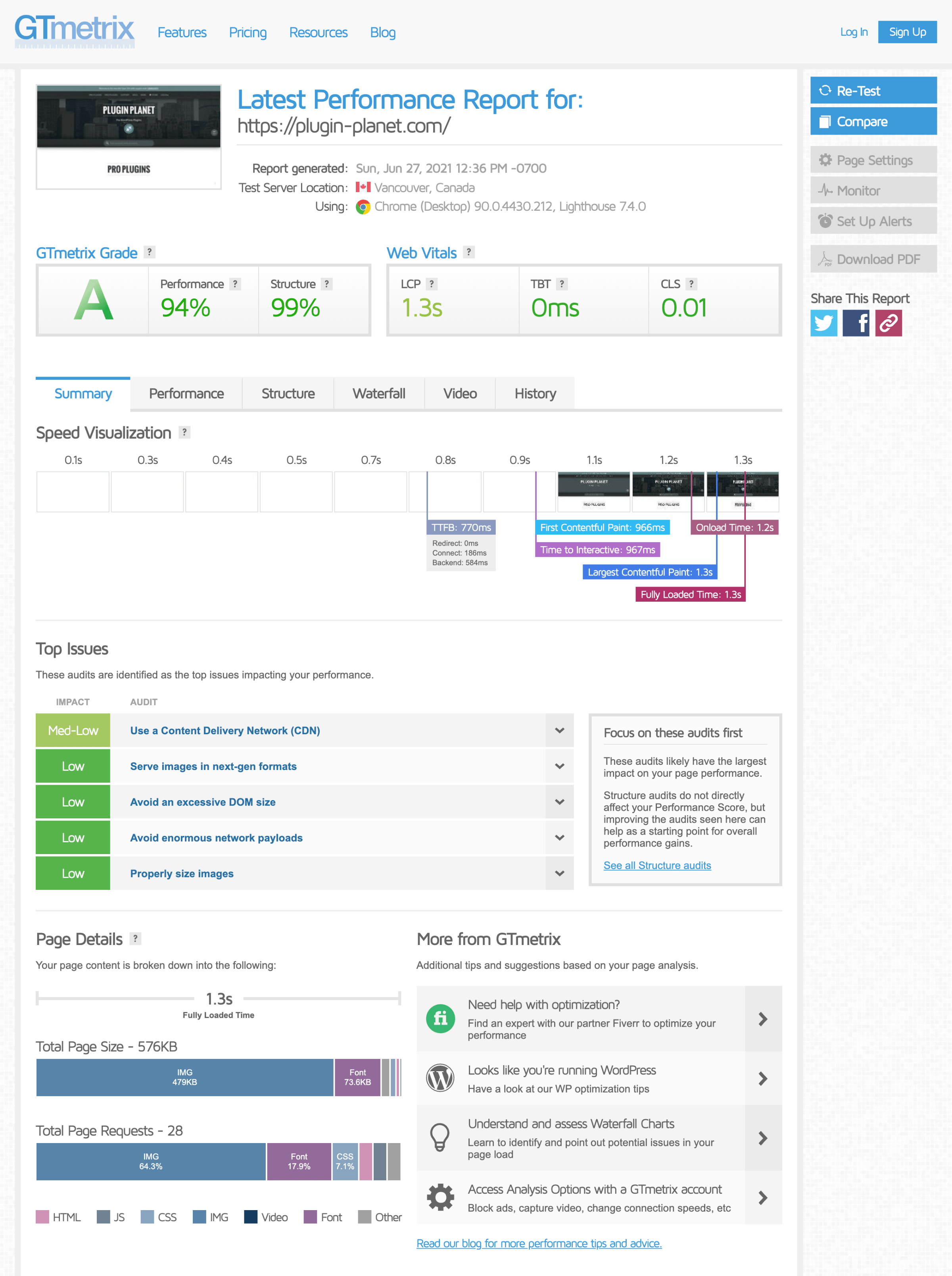 Performance results at gtmetrix.com (click image to view full-size)
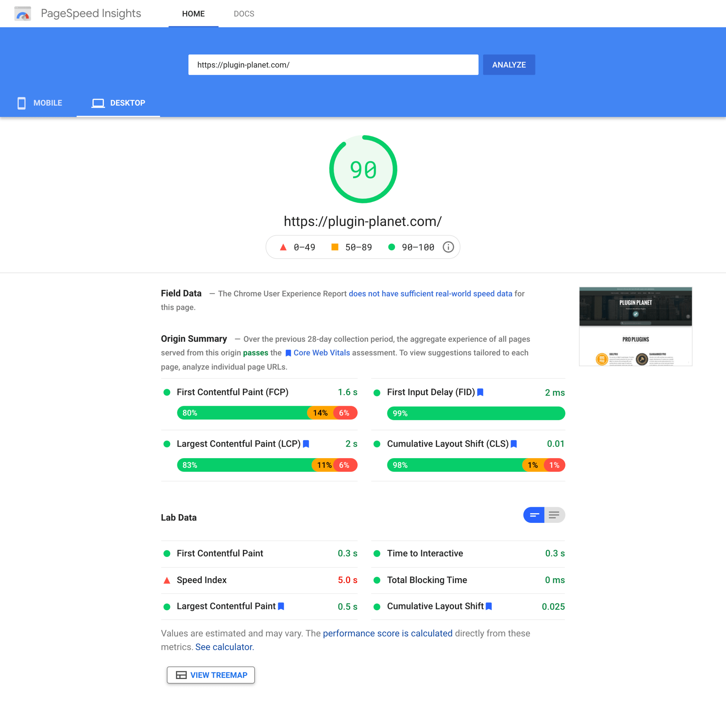 Performance results at Google Pagespeed (click image to view full-size)
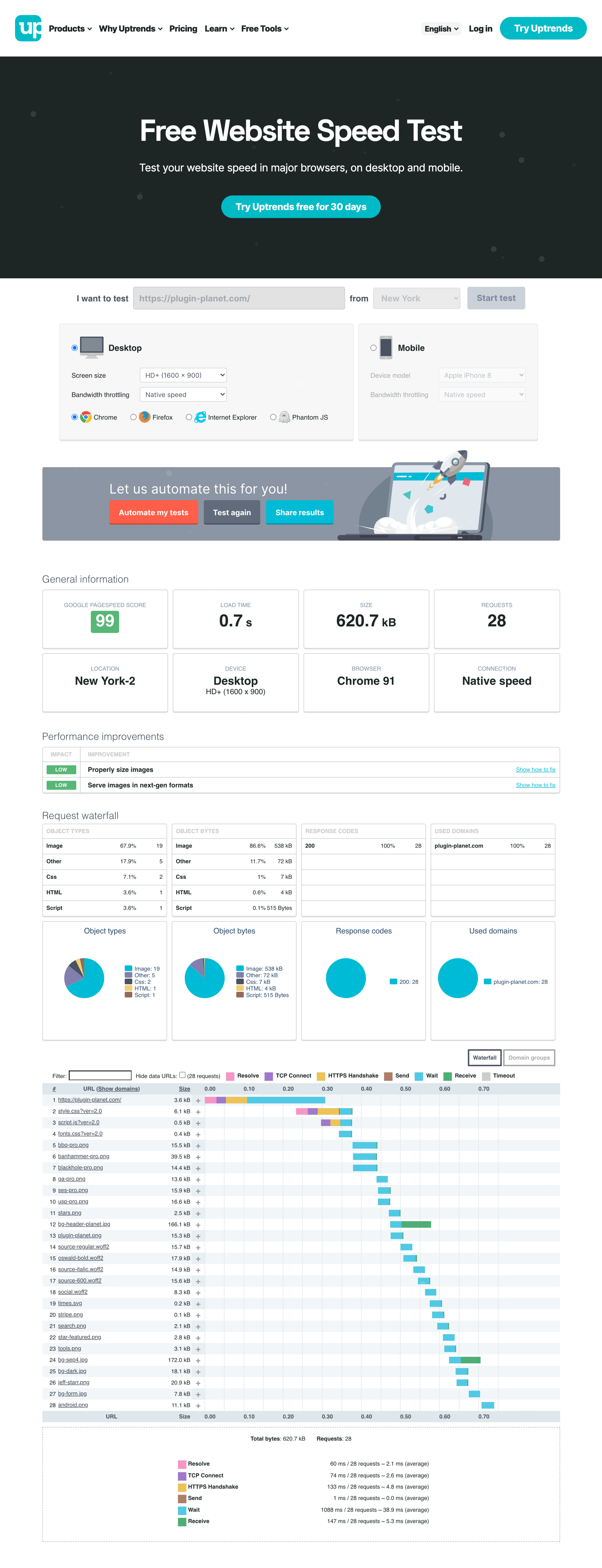 Performance results at uptrends.com (click image to view full-size)
As you can see the site does very well on average. The site is designed for optimal display and experience on desktop/larger screens, and thus performs great in that case. On mobile, the site performs slightly less well, and that’s fine because most of my visitors are desktop visitors.
I also test many pages for valid HTML and CSS. The test results are 100% in both cases for virtually all web pages at Plugin Planet. Quick links if you want to check:
I invite you to visit Plugin Planet and examine the HTML/markup and CSS for yourself. I feel my work provides a solid example of lean/minimal web development. Everything is super tight, crystal clear, and 100%. And of course, if you notice anything that could be improved, please let me know so I can take advantage of your wisdom ;)
Final Thoughts
This project turned out to be a much larger project than I had anticipated. The sheer number of things that needed done was mind boggling, and I’ve been doing this sort of thing for over a decade. All said and done, it took about 12 weeks to finish, and another couple of weeks for further testing, refining, and sharing.
Was it worth it? Absolutely. Plugin Planet is now a leaner, cleaner, lighter, faster site that’s up to speed with all the latest and greatest. The way it is now, managing and updating the site will be simpler and easier, with less overall exposure and liability going forward. And that my friend, is inspiring.
Related Posts
- Plugin Planet Celebrates 7 Years Online
- Redesign #25: Performance Over Perfection
- Building the Perishable Press Bookstore


This content originally appeared on Perishable Press and was authored by Jeff Starr
Jeff Starr | Sciencx (2021-07-12T20:07:22+00:00) Plugin Planet 2021 Redesign. Retrieved from https://www.scien.cx/2021/07/12/plugin-planet-2021-redesign/
Please log in to upload a file.
There are no updates yet.
Click the Upload button above to add an update.