
This content originally appeared on Level Up Coding - Medium and was authored by Florian Charlier
Effortlessly Show Statistical Significance on Seaborn Plots
Add text, stars, or p-values to your beautiful plots!
Introduction
Many libraries are available in Python to clean, analyze, and plot data. Using Python also gives access to free robust statistical packages which are used by thousands of other projects. On Github only, statsmodels is used today in more than 44,000 open-source projects, and scipy in more than 350,000 ! (granted, probably not all for scipy.stats).
Seaborn is an effective and very popular library for visualizing data, but if you wish to add p-values to your plots, with the beautiful brackets and all as you can see in papers using R or other pieces of statistical software, there are not many options available. You could find a few online, but they do require you to write quite a few lines of code to draw each line and add each text label.
This tutorial will go over the main features of statannotations, a package that enables users to add statistical significance annotations on seaborn categorical plots.
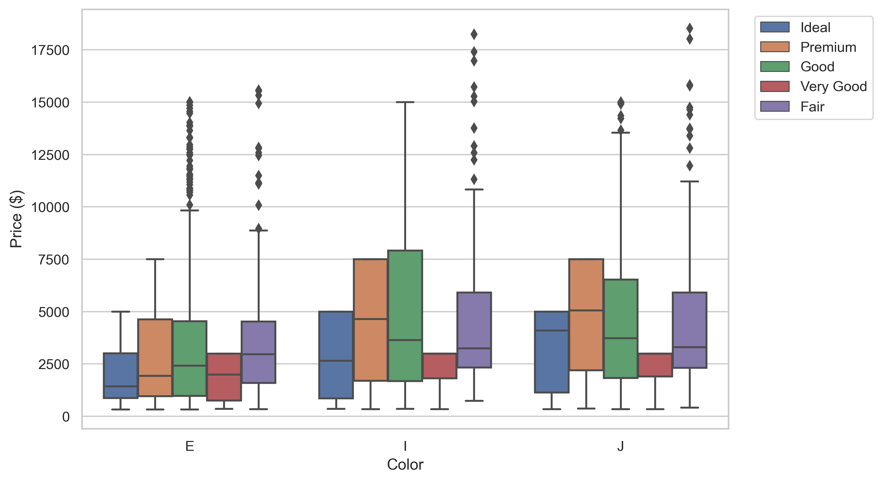
In the first two sections, we will setup the required tools and quickly describe what dataset we’ll work on. Then, we will learn how to transform plots like this:
into plots like this ↓ !
Specifically, after showing how to install and import the latest version of statannotations (currently v0.4.1), we will answer the following questions:
- How to add custom annotations to a seaborn plot?
- How to automatically format previously computed p-values in several ways, then add these to a plot in a single function call?
- How to both perform the statistical tests and add their results to a plot, optionally applying a multiple comparisons correction method?
A subsequent tutorial will cover more advanced features, such as interfacing other statistical tests, multiple comparisons correction methods, and a detailed review of formatting options.
The Jupyter notebook version of this tutorial (just a little less polished) is available on Github here.
DISCLAIMER: This tutorial aims to describe how to use a plot annotation library, not to teach statistics. The examples are meant only to illustrate the plots, not the statistical methodology, and we will not draw any conclusions about the dataset explored. A correct approach would have required the careful definition of a research question and maybe, ultimately, different group comparisons and/or tests, and, of course, the p-value is not the right answer to everything either. This is the topic of many other resources.
Prerequisites
Knowledge —To benefit the most from this tutorial, the reader should be familiar with Python 3 (better yet 3.6+). Some prior experience with pandas, matplotlib, and seaborn will prove useful to understand the value proposition of statannotations.
Physical — To follow along with the tutorial, you will need a few libraries and data, the source of which is described below. To reduce the length of this post, a few helper functions are used but not reproduced here. You can find them in the tutorial’s repository.
Preparing the tools
We import pyplot, pandas, and seaborn to manipulate the data and make the plots. scipy and numpy are used to illustrate one of the possible use cases only.
A few additional functions implemented for this tutorial only are imported from a utils module, available on the github repository, including:
1. Pretty printing functions: print_n_projects and describe_array
2. Repetition-avoiding functions related to plotting: get_log_ax, label_plot_for_subcats, label_plot_for_states, add_legend
Preparing the data
For this tutorial, we’ll use the Kickstarter dataset “Data for 375,000+ Kickstarter projects from 2009–2017” which includes 374,853 campaigns records, downloaded from https://www.mavenanalytics.io/data-playground.
Let’s have a quick peak:
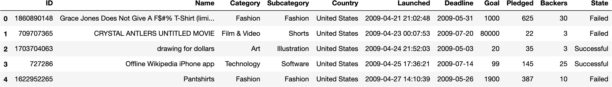
We’ll consider the Category, Subcategory, Goal, and State columns.
Campaigns are assigned to “Categories”:
We’ll explore the category “Technology”, first by number of projects:
There are 32562 projects in Technology.
 1. Technology         6,930
 2. Apps               6,340
 3. Web                3,910
 4. Hardware           3,660
 5. Software           3,050
 6. Gadgets            2,960
 7. Wearables          1,230
 8. DIY Electronics      902
 9. 3D Printing          682
10. Sound                669
11. Robots               572
12. Flight               426
13. Camera Equipment     416
14. Space Exploration    323
15. Fabrication Tools    250
16. Makerspaces          238
Then, we’ll explore the Goal column, representing the campaigns financing objectives in USD.
Total Goal amounts of projects in Technology subcategories:
 1. Technology          1.11 B
 2. Apps                 449 M
 3. Web                  400 M
 4. Hardware             343 M
 5. Software             285 M
 6. Space Exploration    186 M
 7. Gadgets              155 M
 8. Robots               107 M
 9. Wearables           74.7 M
10. Flight              59.3 M
11. 3D Printing         31.8 M
12. Sound               31.2 M
13. Makerspaces         31.1 M
14. Fabrication Tools   29.0 M
15. DIY Electronics     18.1 M
16. Camera Equipment    16.6 M
We see that the order of Sound(#10), Robots(#11), and Flight (#12) with respect to the total number of projects is not the same as their order considering total goal amounts which is Robots(#8, +3 positions), Flight(#10, +2 positions), and Sound(#12, -2 positions).
in this tutorial, we’ll perform a few analyses on the Robots, Flight, and Sound subcategories
For simplicity, we define a subset of the dataset as a new DataFrame named rfs, keeping only the rows belonging to the three Subcategories.
First Plots
We define some colors and ordering for subcategories for seaborn plots.
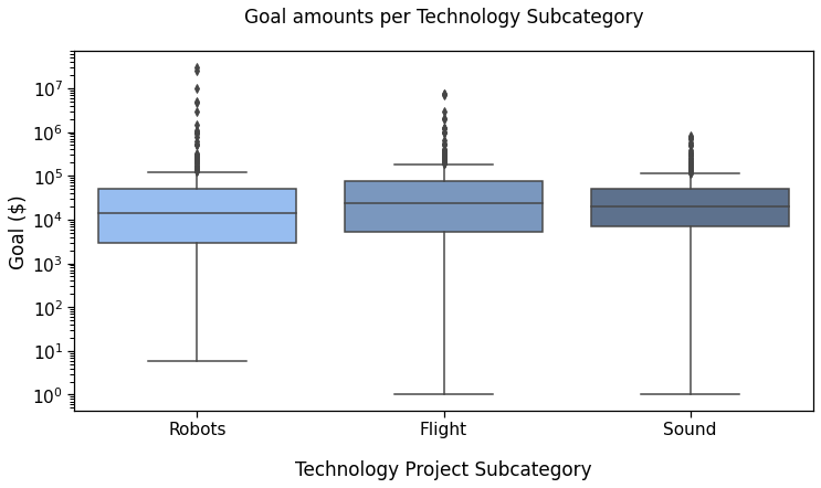
Reference plot 1
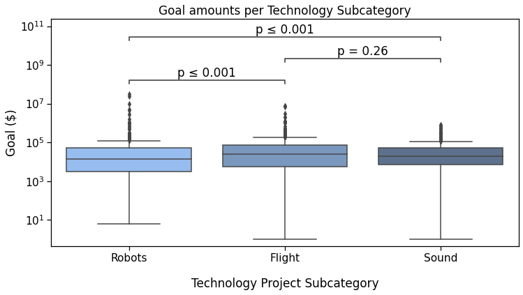
The first plot we will annotate will show the campaigns Goal depending on theSubcategory (Robots, Flight or Sound).
Important — Lines 1 — 3 and 8 — 10 here must be used for all plots of this tutorial, even in some examples where they are not shown, unless stated otherwise.
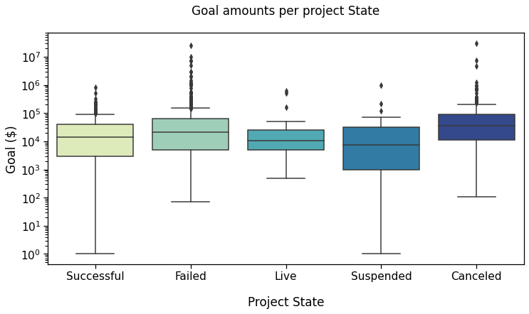
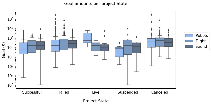
Reference plot 2
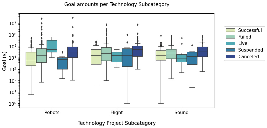
Now, we plot the goal amounts per project state, i.e., if the campaign was Successful, had Failed, was Live, Suspended, or Canceled, (as of January 2018).
First, defining colors and order:
Then making the plot:
Statistics first
At this point, you may need to add annotations to the plot. Statannotations enables to add any arbitrary text. But to demonstrate the gains at hand with statistical results in particular, we will rather compute some statistical tests and then show how to add these to the plot.
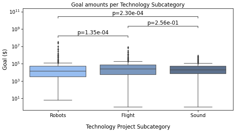
Our first plot showed the goal amounts by Subcategory. We first create arrays of each subcategory goals, as well as their logarithm, to test for log-normality too.
Test for normality
(Log-)Normality tests were almost all highly significant (check the notebook if you’d like to see exactly what we did here).
So, we’ll use a non parametric test for independent samples: Mann-Whitney-Wilcoxon.
Which outputs
Robots vs Flight:
MannwhitneyuResult(statistic=104646.0, pvalue=0.0001348514046808899)
Flight vs Sound:
MannwhitneyuResult(statistic=148294.5, pvalue=0.2557331102364572)
robots vs Sound:
MannwhitneyuResult(statistic=168156.0, pvalue=0.0002298546492900512)
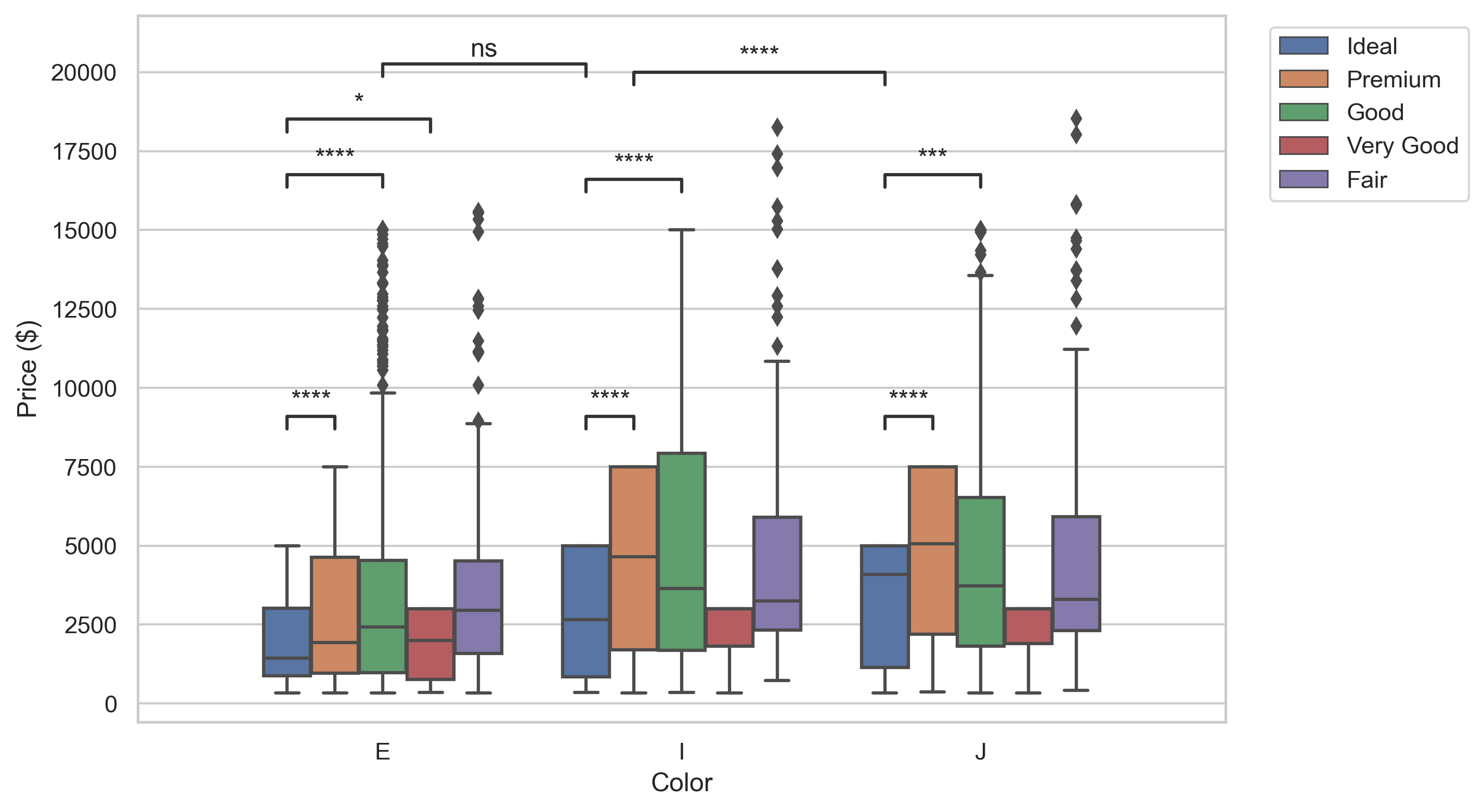
In the following section, we will add these results to the first box plot we made.
Statannotations
Statannotations is an open-source package enabling users to add statistical significance annotations onto seaborn categorical plots (barplot, boxplot, stripplot, swarmplot, and violinplot).
It is based on statannot, but has additional features and now uses a different API.
Installation
You can install statannotationswith pip from your favorite command line interface:
pip install statannotations
Optionally, to use multiple comparisons correction as described further down in this tutorial, you will also need statsmodels.
pip install statsmodels
Importing the main class
This is the only import required for the material described in this tutorial.
from statannotations.Annotator import Annotator
Preparing the annotations and adding them to the plot is generally a 5-steps procedure, which we’ll cover in details:
STEP 1— Decide which pairs of data to annotate
E.g., which boxes in cases of a boxplot, which bars for barplots, etc.
STEP 2— Create an Annotator
It is also possible to prepare an Annotator used previously when making several plots such that the same configuration is used.
STEP 3— Configure the annotator
This includes text formatting, statistical test to apply, multiple comparisons correction method…
STEP 4— Make the annotations
This can be done in three different modes, that we’ll go over in this order:
A — Providing completely custom annotations
B — Providing p-values to be formatted before being added to the plot
C — Applying a statistical test that was configured in step 3
STEP 5— Annotate !
We’ll see that in many cases, steps 4 and 5 can be performed in the same function call.
A — Add any text, such as previously calculated results
This is the situation were we already have statistical results, or any other text that we would like to display on a seaborn plot (and its associated ax).
STEP 1— What to compare
To annotate the plot, we must pass which groups of data (represented by boxes, bars, violins, etc) to be annotated in a pairs parameter.
In our demo, it is the equivalent of 'Robots vs Flight' and others.
pairs is a list of tuples like ('Robots', 'Flight'), so in this case:
STEP 2 — Create the annotator
The first parameter is the ax of the seaborn plot, and the second is the pairs to annotate. The remaining parameters are exactly and all those used to generate the seaborn plot in the first place.
We will see in the examples, that making a dict containing the parameters to pass to both functions is the safest way to avoid missing parameters and code duplication
STEP 3 — Configure the annotator
We will not configure anything for this first example.
STEP 4 — Make the annotations
In this case, use the p-values from scipy’s returned values, with a little “manual” formatting (with F-strings, number formatting, and list comprehension).
And provide these to the annotator with
annotator.set_custom_annotations(formatted_pvalues) .
NB: Make sure provided pairs and annotations (formatted_pvalues here) follow the same order, i.e. the first pair corresponds to the first annotation in the list, etc.
STEP 5 — Annotate !
Simply call annotator.annotate() .
All together:
And voilà !
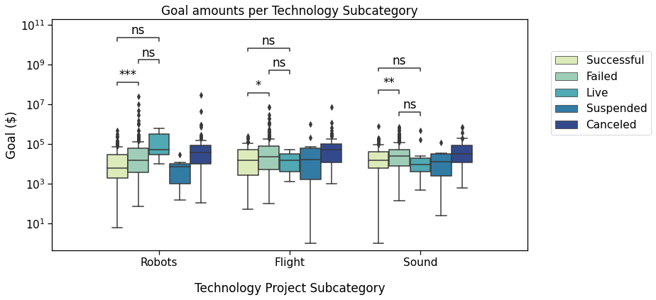
Reference plot 1 with custom annotationsNote that we could just as easily have added any other text in this way, such as ***, NS, and ***.
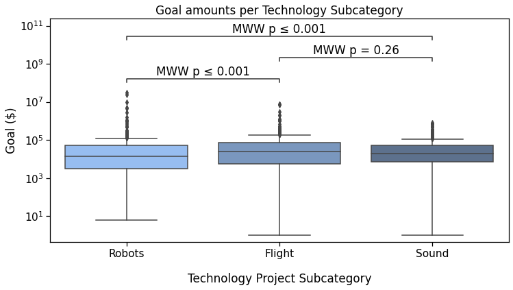
B — Automatically format p-values
To benefit from formatting options, we use the methodset_pvalues instead of set_custom_annotations.
As we are working on copies of the same seaborn plot, the plotting_parameters do not need to change, and neither do the pairs defined above.
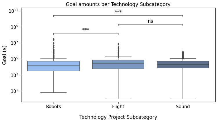
With the star notation (default)
Outputs
p-value annotation legend:
      ns: p <= 1.00e+00
       *: 1.00e-02 < p <= 5.00e-02
      **: 1.00e-03 < p <= 1.00e-02
     ***: 1.00e-04 < p <= 1.00e-03
    ****: p <= 1.00e-04

Sound v.s. Flight: Custom statistical test, P_val:2.557e-01
Robots v.s. Sound: Custom statistical test, P_val:2.299e-04
Robots v.s. Flight: Custom statistical test, P_val:1.349e-04
With a “simple” format to display significance
Simply configure text_format to "simple" to show p-values in this way. This is obtained by changing the annotator-related lines in the previous code snippets, while the others do not change.
As you can see, the syntax is quite succinct. We added the STEP 3 part of the annotating procedure by calling annotator.configure().
You may also have noticed the substitution of set_pvalues(pvalues) and annotate() into a single function call set_pvalues_and_annotate(pvalues).
There is also a "full" option for text_format. Feel free to try it if you are actively coding while reading. Otherwise, we’ll see it later.
This code outputs:
Sound v.s. Flight: Custom statistical test, P_val:2.557e-01
Robots v.s. Sound: Custom statistical test, P_val:2.299e-04
Robots v.s. Flight: Custom statistical test, P_val:1.349e-04
Still within STEP2, we can also provide a test_short_name parameter to be displayed right before the p-value.
In this snippet, you can also see how to reduce the code needed a little more by reusing the annotator instance, since we are not changing the data and pairs. This is done by calling new_plot, which still requires the new ax and seaborn parameters. This also allows to remember our already configured text_format option.
Output
Sound v.s. Flight: Custom statistical test, P_val:2.557e-01
Robots v.s. Sound: Custom statistical test, P_val:2.299e-04
Robots v.s. Flight: Custom statistical test, P_val:1.349e-04
Tweak the layout
Parameters for the configure and annotate methods allow to modify the annotations layout, most of which will be covered in the next tutorial.
However, we can already see how we can widen the spacing between the lines and annotation:
which results in

It may be subtle, but it’s there.
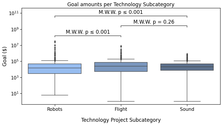
C — Apply scipy tests with statannotations
Finally, statannotations can call scipy.stats tests directly on the specified pairs. The readily available options are:
- Mann-Whitney
- t-test (independent and paired)
- Welch’s t-test
- Levene test
- Wilcoxon test
- Kruskal-Wallis test
In the next tutorial, we’ll see how to use a test that is not one of those already interfaced in statannotations. If you are curious, you can also take a look at the usage notebook in the package repository.
As for set_pvalues_and_annotate, a shortcut methodapply_and_annotate is available. You can also notice that configure() returns the annotator object, so there is no need to write annotator.apply_and_annotate() on a subsequent line. Of course you still can.
Output:
Sound v.s. Flight: Mann-Whitney-Wilcoxon test two-sided, P_val:2.557e-01 U_stat=1.367e+05
Robots v.s. Sound: Mann-Whitney-Wilcoxon test two-sided, P_val:2.299e-04 U_stat=1.682e+05
Robots v.s. Flight: Mann-Whitney-Wilcoxon test two-sided, P_val:1.349e-04 U_stat=1.046e+05
The last possible text_format option is full:
Output

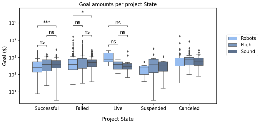
Now, back to that plot by State :
In this plot, we’ll compare the Successful, Failed, Live, and Canceled states.
We will need to define the new pairs to compare, then apply the same methods to configure, get test results and annotate the plot.
Output
p-value annotation legend:
      ns: p <= 1.00e+00
       *: 1.00e-02 < p <= 5.00e-02
      **: 1.00e-03 < p <= 1.00e-02
     ***: 1.00e-04 < p <= 1.00e-03
    ****: p <= 1.00e-04

Successful v.s. Failed: Mann-Whitney-Wilcoxon test two-sided, P_val:2.813e-08 U_stat=1.962e+05
Failed v.s. Canceled: Mann-Whitney-Wilcoxon test two-sided, P_val:1.423e-05 U_stat=7.239e+04
Successful v.s. Canceled: Mann-Whitney-Wilcoxon test two-sided, P_val:4.054e-16 U_stat=3.910e+04
Canceled v.s. Live: Mann-Whitney-Wilcoxon test two-sided, P_val:6.641e-03 U_stat=3.096e+03
Failed v.s. Live: Mann-Whitney-Wilcoxon test two-sided, P_val:2.511e-01 U_stat=9.932e+03
Successful v.s. Live: Mann-Whitney-Wilcoxon test two-sided, P_val:9.215e-01 U_stat=5.971e+03

Let’s pause here for a few seconds, we’ve already come a long way.
Basically, we defined the pairs to compare, and with 2 more lines of code, we got this pretty plot !
If you are worried about multiple testing and correction methods, read on ! But first, let’s see how to handle two levels of categorization in “box plots with hue”.
Box plots with hue
We will now work on these two plots of the same dataset
Reference plot 3
Starter plotting code:
Here, we’ll compare the Successful, Failed, and Live states in the three subcategories we already looked at Robots, Flight, and Sound.
The pairs must contain the information about the subcategory and the state. We define them as lists of tuples such as
[(subcat_1, state_1), (subcat_1, state_2)]
In this case, this makes it
Again, we put the plot parameters in a dictionary. We will use it for both our boxplot and Annotator calls.
Output
p-value annotation legend:
      ns: p <= 1.00e+00
       *: 1.00e-02 < p <= 5.00e-02
      **: 1.00e-03 < p <= 1.00e-02
     ***: 1.00e-04 < p <= 1.00e-03
    ****: p <= 1.00e-04

Sound_Failed v.s. Sound_Live:
Mann-Whitney-Wilcoxon test two-sided,
P_val:5.311e-02 U_stat=2.534e+03
Robots_Successful v.s. Robots_Failed:
Mann-Whitney-Wilcoxon test two-sided, P_val:1.435e-04 U_stat=2.447e+04
Robots_Failed v.s. Robots_Live:
Mann-Whitney-Wilcoxon test two-sided,
P_val:2.393e-01 U_stat=2.445e+02
Flight_Successful v.s. Flight_Failed:
Mann-Whitney-Wilcoxon test two-sided,
P_val:4.658e-02 U_stat=8.990e+03
Flight_Failed v.s. Flight_Live:
 Mann-Whitney-Wilcoxon test two-sided,
P_val:4.185e-01 U_stat=6.875e+02
Sound_Successful v.s. Sound_Failed:
Mann-Whitney-Wilcoxon test two-sided,
P_val:1.222e-03 U_stat=3.191e+04
Robots_Successful v.s. Robots_Live:
Mann-Whitney-Wilcoxon test two-sided,
P_val:8.216e-02 U_stat=1.405e+02
Flight_Successful v.s. Flight_Live:
Mann-Whitney-Wilcoxon test two-sided,
P_val:7.825e-01 U_stat=1.650e+02
Sound_Successful v.s. Sound_Live:
Mann-Whitney-Wilcoxon test two-sided,
P_val:2.220e-01 U_stat=2.290e+03
PLOT 4
To compare the states, across categories, we’ll plot it differently:
You now know all the basics to have statannotations call statistical tests and annotate the plot:
Output
Now again, that is a lot of tests. If one would like to apply a multiple testing correction method, we’ll introduce it just now.
Correcting for multiple testing
In this section, I will quickly demonstrate how to use one of the readily available interfaces. More advanced uses will be described in the following tutorial.
Basically, you can use the comparisons_correction parameter for the configure method, with of the following correction methods (as implemented by statsmodels)
- Bonferroni ("bonf" , or "bonferroni")
- Benjamini-Hochberg ("BH" )
- Holm-Bonferroni ("HB" )
- Benjamini-Yekutieli ("BY" )
Output
p-value annotation legend:
      ns: p <= 1.00e+00
       *: 1.00e-02 < p <= 5.00e-02
      **: 1.00e-03 < p <= 1.00e-02
     ***: 1.00e-04 < p <= 1.00e-03
    ****: p <= 1.00e-04

Failed_Flight v.s. Failed_Sound:
Mann-Whitney-Wilcoxon test two-sided with Bonferroni correction, P_val:1.000e+00 U_stat=3.803e+04
Live_Robots v.s. Live_Flight:
Mann-Whitney-Wilcoxon test two-sided with Bonferroni correction, P_val:1.000e+00 U_stat=9.500e+00
Live_Flight v.s. Live_Sound:
Mann-Whitney-Wilcoxon test two-sided with Bonferroni correction, P_val:1.000e+00 U_stat=2.900e+01
Successful_Robots v.s. Successful_Flight:
Mann-Whitney-Wilcoxon test two-sided with Bonferroni correction, P_val:8.862e-01 U_stat=7.500e+03
Successful_Flight v.s. Successful_Sound:
Mann-Whitney-Wilcoxon test two-sided with Bonferroni correction, P_val:1.000e+00 U_stat=1.013e+04
Failed_Robots v.s. Failed_Flight:
Mann-Whitney-Wilcoxon test two-sided with Bonferroni correction, P_val:8.298e-01 U_stat=3.441e+04
Live_Robots v.s. Live_Sound:
Mann-Whitney-Wilcoxon test two-sided with Bonferroni correction, P_val:1.000e+00 U_stat=3.400e+01
Failed_Robots v.s. Failed_Sound:
Mann-Whitney-Wilcoxon test two-sided with Bonferroni correction, P_val:3.771e-01 U_stat=3.364e+04
Successful_Robots v.s. Successful_Sound:
Mann-Whitney-Wilcoxon test two-sided with Bonferroni correction, P_val:1.504e-03 U_stat=2.491e+04

Notice that the annotate functions return data. The second values allows to retrieve the p-values. As we see here, they were indeed adjusted:
8.04e-01 => 1.00e+00
2.85e-01 => 1.00e+00
9.58e-01 => 1.00e+00
9.85e-02 => 8.86e-01
7.23e-01 => 1.00e+00
9.22e-02 => 8.30e-01
1.15e-01 => 1.00e+00
4.19e-02 => 3.77e-01
1.67e-04 => 1.50e-03
The p-value for the difference in total goal amounts for Robots and Sound Failed projects went from about 0.04 to about 0.4 (the one before last in previous list), and is no longer considered statistically significant with the default alpha of 0.05.
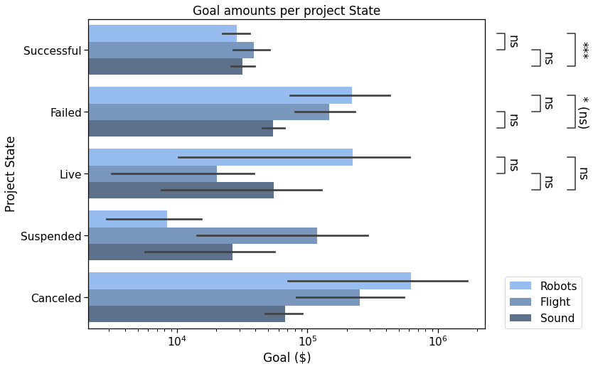
Bonus
Other types of plots are supported. Here is the same data with boxplot, and other tweaked parameters.
Output
Conclusion
Congratulations on reaching the end of this tutorial. In this post, we covered several use cases for an Annotator, from using custom labels to having the package apply statistical tests, all with several formatting options.
This already covers many use cases, but you may want to wait for the next part to discover more features.
What’s next?
In the following part(s), we will see how we can:
- Annotate different kinds of plots
- Use other functions for statistical tests and multiple comparisons correction which are not already available in the library, with minimal extra code (more technical)
- Further customize the p-values format within the annotations text_format options
- Adjust the spacing between annotations and/or position them outside the plotting area
- Use the output values of annotate
Acknowledgements
Statannotations was a collaborative work even before it existed. A great deal was done in statannot before I contributed to it for the first time two years ago, and it was very gratifying to be a part of it.
The Jupyter to Medium and Junix packages were very helpful resources to reduce the workload to make this article. You should check them out if you need to export your notebooks.
Resources
- The Kickstarter dataset “Data for 375,000+ Kickstarter projects from 2009–2017”
- Jupyter notebook for this tutorial
- statannotations repository
Thank you for reading!
Please feel free to leave a response if you have any question or comment.
Statistics on seaborn plots with statannotations was originally published in Level Up Coding on Medium, where people are continuing the conversation by highlighting and responding to this story.
This content originally appeared on Level Up Coding - Medium and was authored by Florian Charlier
Florian Charlier | Sciencx (2021-08-03T15:16:19+00:00) Statistics on seaborn plots with statannotations. Retrieved from https://www.scien.cx/2021/08/03/statistics-on-seaborn-plots-with-statannotations/
Please log in to upload a file.
There are no updates yet.
Click the Upload button above to add an update.