
This content originally appeared on DEV Community and was authored by vansh bhardwaj
Hello everyone, my name is Vansh and I'm a frontend developer. A lot of people have asked me this question,"Do I need to learn design to be Front end developer?"
Before I answer this question first you need to understand that many companies do have in-house UX/UI designers, who will do the designing part and build mockups while you can concentrate on the development part. It's our task to give life to mockups, to make them interactive.
But what if you don't have a designer or you're building some side project for yourself, and when you have one, they're not always available because they have a lot of work or maybe if some mockups are missing.
So you cannot always be dependent on a designer to make minor changes to the design as well.
And you having a design sense is of considerable value for you and your team.
See I'm not saying you need to be a designer nor we are here to replace them.
But it wouldn't hurt for you to pick up some designing skills as well.
And it definitely helps to have a creative eye and develop knowledge esthetics.
So in this blog post, I'm going to share how you can build interfaces/apps that look good by just following these 7 UI fundamentals.
Let's Jump in!
- White space
- Color
- Contrast
- Scale
- Alignment
- Typography
- Visual Hierarchy
1. White Space
The first UI fundamental we are going to discuss is the white space.
White space is the empty space between the elements in your UI.
it's just a void of space but that gives your UI a structure.
let's look at an example

we can see the right side container is much more readable and looks good from the left container.
By using just 3 CSS properties, padding, margin and line-height, you can significantly improve the appearance of your text.
2. Alignment
Alignment is the process of ensuring that every element is positioned correctly in relation to other elements.
Visual alignment is one of the foundations of design, we humans prefer visually aligned objects.
First, let's look at this UI

We can see here are 4 elements, logo, headline, text and button,
and they all seem to be off a little bit in terms of their alignment.
Again, with just 3 properties: margin, transform and text-align we can solve this.
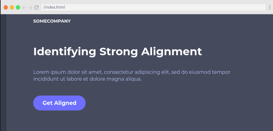
we can see now it looks much better because everything is aligned properly.
3. Contrast
Contrast is defined as being in a 'strikingly' different state from something else.
While building UIs we should keep in mind if users can clearly see and distinguish all the necessary details on the screen or page.

Look at the first image where there is a grey subheading and grey text on a button, we can see there is hardly any contrast from the background, it's hard to read text, especially on the button.

Now if we increase the contrast, using a darker color for text and white on top of the button, we can see it's much more readable.
Lack of readability can be a serious reason why users are not retained even with attractive products.
4. Scale
Scale is the size of elements that must be carefully considered. Leveraging the scale of different elements, you can greatly improve a design.
Let's look at this example, we can work on the scale on this UI.
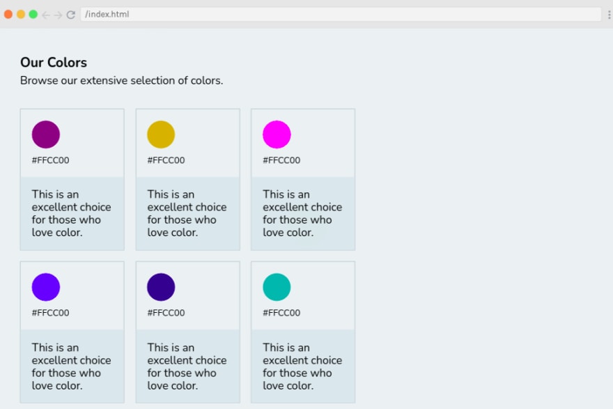
First of all, cards are too small for this given layout. Also, there isn't much difference between headline and subheadline beneath it. Also, we can increase the size of the Hex color code.
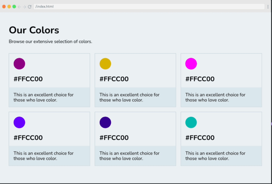
In our second UI, our cards look much more filled out and better with the space around them, we also increased the size of the heading and subheading and it looks much better than the previous.
5. Typography
Typography isn't just the font but it is the art that involves arranging a typeface in various combinations of font, size, and spacing.
Typography requires the understanding of other fundamentals, along with a few other considerations like how to effectively choose fonts, their size, spacing and a few more.

If we look at our first UI, we can see there's a lot going wrong in terms of typography. First, there are 3 fonts used which are unnecessary. second, we are not really sure where to look at or which text is really important so we need to fix the scale as well.

In our second UI, we are sticking to just 1 font family, increased the font size of headings and decreased the size of cite that is 'John Doe' which is not really important and now it looks so much better.
6. Color
Color is the first UI design fundamental that shapes the user's experience.
If you go to any website or app before you're able to process and even read anything your eyes are exposed to the colors, so color in terms of UI design is extremely important.
Different colors can have different meanings like green for instance can be associated with growth and wealth, red with loss or warmth, black for elegance and luxury and so on and so forth.
Before building UI be aware of your target audience for this particular app and what you need to project eliciting emotions

Another thing you should focus is on avoiding a bunch of colors in your UI design. Too many color destroy the quality of UI. Also, avoid colors that don't work well with each other and don't complement each other well.
7. Visual Hierarchy
Every element on a user interface has a level of importance. Some elements are more important than others. Visual hierarchy is how you establish this importance. The way we do it is by utilizing the above UI fundamentals that we have discussed.

If we look at this UI, this lacks visual hierarchy as we are not really sure where to look at first and our call-to-action button lacks enough contract as well.

Fixing this by scaling our heading and making call-to-action stand out, we have improved the visual hierarchy
Looks better than before? Right?
conclusion
There isn't one UI fundamental that is more important than the other.
They are all equally important in order to get the design right. If the design is lacking in one of these areas, it's really easy to notice that something is not quite right with the quality of the design.
So be sure to think about all these fundamentals the next time you need to build a user interface.
Good luck
This content originally appeared on DEV Community and was authored by vansh bhardwaj
vansh bhardwaj | Sciencx (2021-09-23T23:01:13+00:00) 7 UI Design Fundamentals for Developers. Retrieved from https://www.scien.cx/2021/09/23/7-ui-design-fundamentals-for-developers/
Please log in to upload a file.
There are no updates yet.
Click the Upload button above to add an update.