
This content originally appeared on DEV Community and was authored by Masa Kudamatsu
TL;DR
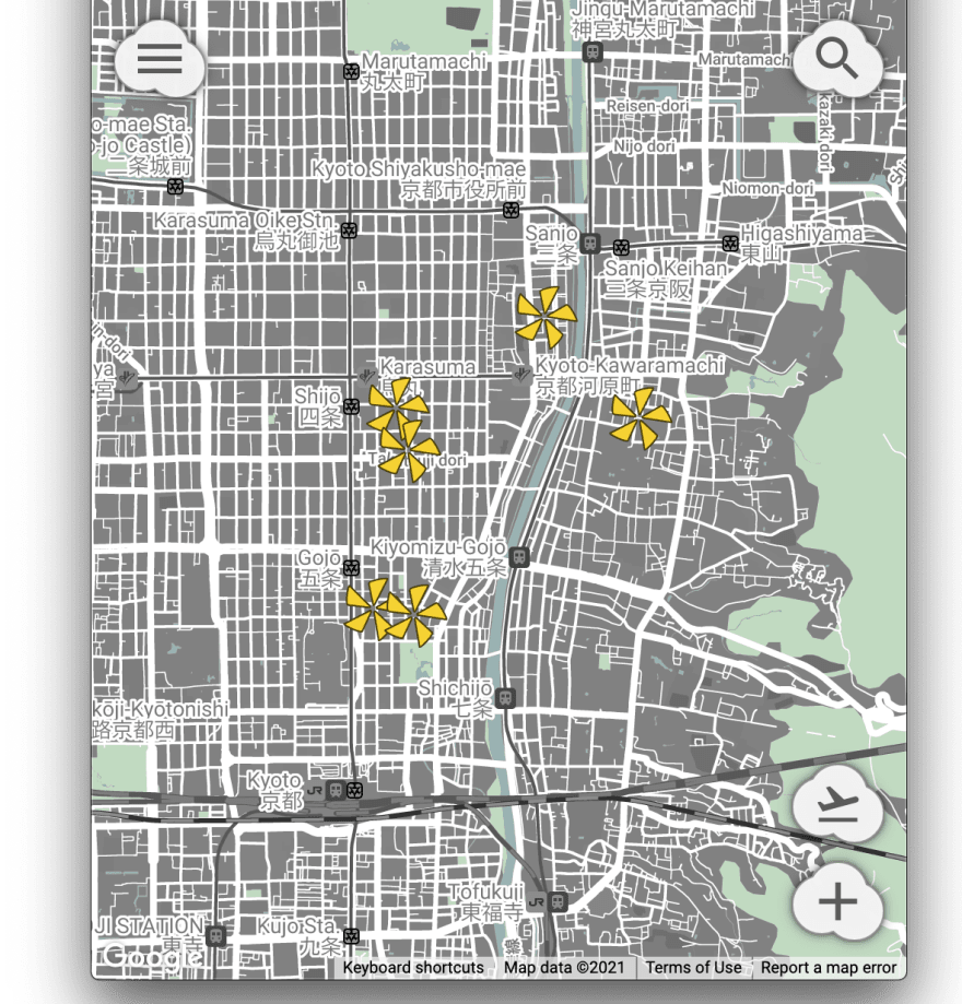
For a web app that embeds full-screen Google Maps, I position the menu button at the top-left corner of the screen, the search button at the top-right, and the buttons for the app's main features at the bottom-right (as seen in the image at the top of this article).
For implementation, I use Styled Components with “design tokens” and data attribute selectors for making CSS code easy to maintain and for speeding up the browser's rendering of these buttons (at least a little bit).
Introduction
As explained in the previous article (Day 7 of this blog series), I've designed (and written the HTML/CSS code for) a cloud-shaped button for My Ideal Map App, a web app I'm currently making to improve the UX of Google Maps.
Now I need to decide how many of, and which kinds of, buttons to display on the app's main user interface, with the appropriate choice of button labels (which will be described in Section 1 below).
Then, I need to design the layout of these four buttons, with the least amount of friction with the user's mental model (Section 2).
Finally, I need to implement the layout with CSS code, by taking into consideration the speed of rendering the app's UI and the ease of maintaining the code (Section 3).
This article documents these three steps I've taken, including what I have learned during the process. Hopefully, these pieces of information will help someone who develop their own web app.
1. Four buttons and their label icons
First, I've decided to show four buttons on the screen immediately after the user logs in to My Ideal Map App. Beyond four, I believe the user will need to take a moment to figure out which button to tap/click. Too many options will backfire, making us less happy (Schwartz 2005).
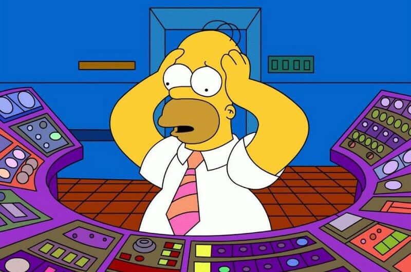
Homer Simpsons scratches his head, surrounded by dozens of buttons (image source: Babich 2018)
The functions of these four buttons, and their label icons, are as follows.
1.1 Search button
The first is the search button. Tapping it will open a search box to find a place of interest. Searching for a place is one of the major features of My Ideal Map App. It allows the user to find a place of their interest to save. It also allows the user to plan their trip by searching for a destination to discover the saved places around it (see Day 2 of this blog series for an example of this user experience).
An alternative is to show a search box at the top of the screen by default, as the Google Maps app does. But the top part of the map will then be hidden beneath the search box. Consequently, the user may miss some places of their interest near the top of the screen. There will be no difference in the number of taps/clicks to start the search if the app automatically focuses on the search box after the search button is tapped/clicked.
My Ideal Map App uses the magnifying glass icon as the label of the search button. The magnifying glass icon is so common that the user can immediately tell what the button will do when tapped (Sherwin 2014).
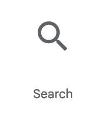
Search icon (image source: Material Icons via Google Fonts)
1.2 Save button
The second button is for saving a place of the user's interest. This is another of the major features of My Ideal Map App, as it allows the user to remember the places of their interest for future (see Day 3 of this blog series for an example of this user experience).
While the Google Maps app doesn't explicitly show how to save a place on its main UI, My Ideal Map App will always show the save button on the map so the user can always start the process of saving a place with one tap.
As the label of the save button, My Ideal Map App uses the plus sign icon. It's an icon that we immediately associate with the addition of something to the user's database:
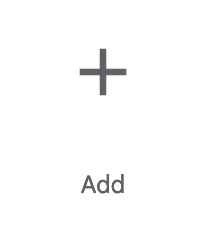
Add icon (image source: Material Icons via Google Fonts)
1.3 Location button
The third button is for showing the user's current location. Tapping it will enable GPS and show the place where the user is currently standing (or sitting). This button is also part of the core user experiences of My Ideal Map App, where the user can find the saved places around their current location (see Day 1 of this blog series for an example of this user experience).
While the Google Maps app uses a compass needle icon, My Ideal Map App uses an airplane takeoff icon often used for indicating the departure gates in the airport. Why? Because seeing our current location on the map is like flying up into the sky and looking down to understand where we are—the idea in line with the design concept of My Ideal Map App: dyeing a map in the user's hue from the sky (see Day 2 of this blog series for more detail on the design concept of My Ideal Map App).

Flight takeoff icon (image source: Material Icons via Google Fonts)
1.4 Menu button
The last button is for showing the menu of other features of the map. Less important features of an app are best tucked away in the hidden menu which will be opened by clicking/tapping the menu button. This way, the user won't be visually distracted when they execute the app's main features.
Its label should be nothing but the infamous hamburger icon. When it was first introduced to mobile webpage design in the mid-2010s, it stirred controversy (e.g., Pernice and Budiu 2016). But since then, so many websites have adopted it as a menu button. I think it's fair to assume that the user understands what those three horizontal stripes represent. Its use is also justified as the menu for secondary features (Seno 2019).
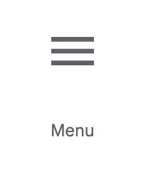
Hamburger icon (image source: Material Icons via Google Fonts)
1.5 Material Icons
There are many icon repositories out there, but Font Awesome and Material Icons are the only ones that have all these four icons. Given that My Ideal Map App embeds Google Maps, Material Icons, designed by Google, is more likely to ensure visual consistency in the user interface.
So I download the SVG data of these four icons from Google Fonts, import each to Sketch to center-align them over the cloud-shaped button, and export the results as SVG code. (See Day 7 of this blog series for how I've written the HTML code for showing buttons with the exported SVG code.)

Cloud-shaped buttons created with Sketch app (image source: author)
Now buttons are ready. Next, I need to decide which button should be positioned in which part of the user interface.
2. Positioning buttons: design considerations
2.1 Search button
First of all, the search button should be placed at the top-right corner of the screen. Sherwin (2014) reports the following user research finding by Nielsen Norman Group:
“People first look to the upper-right corner for search. If they don’t find it there, they start scanning the top of the page.”
It's a bit old research finding, but as far as I know, many websites and applications still place a search button at the top-right corner. So it's fair to assume that this research finding is still relevant in 2021.
2.2 Menu button
The menu button is placed top-left, following a common pattern of user interface. Some websites place it at top-right, but the search button already occupies the top-right corner of the screen. If the menu button is placed next to a search button, the user may get confused as it's not a common UI pattern.
2.3 Buttons for the app's core features
The remaining two buttons are placed bottom-right, because the user needs to see the entire screen first before deciding whether to press these buttons.
Syzonenko (2019) argues that buttons at bottom-right make sense when the user scans the screen in a z-shaped manner, while buttons at bottom-left make more sense if the user interface contains just one column of left-aligned UI elements (which induces the F-shaped pattern of the user's eye movement).
Applying this logic to a map application, the user will scan the map in a z-pattern or possibly diagonally from top-left to bottom-right. The user wants to tap the location button once they learn that the map is showing somewhere else. Or they want to tap the save button once they know a place of their interest is shown on the map. So it makes sense to place these two buttons at the bottom-right corner of the screen.
For the menu and search buttons, in contrast, the user doesn't need to check what the map is currently showing. When they want to change the user setting, or when they want to search for a place, it doesn't matter which part of the earth the screen is currently showing. So it makes sense to place them at the top of the screen.
Among the two bottom-right buttons, the location button is placed above the save button. Moving a map to the user's current location is like flying across the sky, and that's why the location button has the flight-takeoff icon on it. It'd be incongruent to this metaphor if the button to trigger this process is "capped" by another button from above.
The overall design decision has been made. Now it's time to start coding while deciding the detail of button-positioning.
3. Positioning buttons: using Styled Components
To implement the positioning of buttons as described above with Styled Components (my favorite CSS-in-JS tool), I'll create a <Button> component as follows:
import styled from 'styled-components';

const Button = styled.button`
    ${styleCloudButton}
    ${positionButton}
};
where styleCloudButton contains all the other CSS declarations for styling a button (see Day 7 of this blog series for detail). In the rest of this article, I'll define the positionButton variable with the CSS code for positioning a button.
3.1 Rendering buttons over the map
The first thing to do with CSS is to make each button shown over the full-screen embedded Google Maps.
We have the following DOM structure in the HTML code:
<body>
  <button></button> <--! Menu button -->
  <button></button> <--! Search button -->
  <button></button> <--! Current location button -->
  <button></button> <--! Save-a-place button -->
  <div id="map"></div> <--! Embedded Google Maps -->
</body>
where I've set the <div> element (which embeds Google Maps) to spread across the whole screen with:
html,
body,
#map {
  height: 100%;
}
This CSS code is what Google Maps Platform documentation recommends.
To show the <button> elements over the <div id="map">, they need to be absolutely-positioned" with the "z-index" of 1:
import {css} from 'styled-components';

const positionButton = css`
  position: absolute;
  z-index: 1;
`;
As the map occupies the full screen, by default, browsers won't make buttons visible to the user. With position: absolute;, the <button> elements will be lifted up over other HTML elements.
Plus, z-index:1 is necessary given our DOM structure where the <button> elements come before the <div id="map">. I initially didn't understand why. But inspecting DevTools, I've learned that <div id="map"> is styled with position: relative. Seems like Google Maps JavaScript API automatically does this. Consequently, the infamously confusing "stacking context" principle applies (see Walton 2013, Comeau 2021b, for example), where the stacking order of HTML elements with position:relative and position:absolute will be based on its position in the HTML code: the first element goes beneath the second one. So the <button> elements go beneath the <div> element. To lift up buttons over the map, we need z-index:1.
If we change the order of HTML elements so the <div> element comes first, we don't need z-index:1. But I may need to change the order of these elements later, and I'm sure I'll get panicked by having buttons disappear. For future-proof, I think it's best to add z-index:1.
3.2 Improving code readability with "design tokens"
The next step is to pick the exact pixel values to position each button relative to the screen edges. I start with the button's clickable area dimension (48px high and 56px wide) and divide these two values with 4 to obtain 12px for y-axis and 14px for x-axis. I use these values to create a space between the buttons and the screen edges, because the layout will look great when dimensions are set with multiples of the same numbers.
I can hard-code these values into CSS code, but then the code doesn't tell us why I've picked 12px or 14px. This is a long-time headache for me, ever since I learned about CSS. But I realize that I can embed the reasons to choose particular values into CSS code by borrowing an idea of design tokens (see Rendle 2019 for a good introduction; see also Chenais 2021 for how Adobe's Specify app adopts it).
Specifically, I create a file called designtokens.js in which I set the dimension values as follows:
export const dimension = {
  button: {
    'height 100': '48px',
    'height 25': '12px',
    'width 100': '56px',
    'width 25': '14px',
  },
};
This way, the code incorporates how I've derived the values of 12px and 14px. 48px is assigned the name of height 100. A quarter of this length, 12px, is therefore called height 25. Similarly, 56px is called width 100. As a quarter of this length, 14px is called width 25.
Incidentally, the above code doesn't exactly follow the recommended syntax of design tokens, but I think that's fine because I don't plan to use a tool like Style Dictionary. I may need to follow the recommended syntax if I decide to create iOS/Android versions of My Ideal Map App.
I can now refactor the code for setting a button's clickable area with these "design tokens":
import {css} from 'styled-components';
import {dimension} from './designtokens';

const setClickableArea = css`
  height: ${dimension.button['height 100']};
  width: ${dimension.button['width 100']};
`;
For your information, the original code for setClickableArea is described in Section 5 of Day 7 of this blog series.
3.3 Positioning buttons at the screen corners
Now, to position the menu button at the top-left corder, I can code like this:
const positionButton = css`
  position: absolute;
  z-index: 1;
  top: ${dimension.button['height 25']};
  left: ${dimension.button['width 25']};
`;
It means that the top-left corner of the menu button is 12px down from the top screen edge and 14px to the right of the left screen edge.
For the other three buttons, I can replace the last two CSS declarations in the above code as follows.
For the search button at top-right:
  top: ${dimension.button['height 25']};
  right: ${dimension.button['width 25']};
It means that the top-right corner of the button is 12px down from the top screen edge and 14px to the left of the right screen edge.
For the save button at bottom-right, I need to take into consideration that the embedded Google Maps will show a row of tiny rectangle buttons at the bottom-right corner (which seems to be never disabled):
 Bottom-right corner of embedded Google Maps (screenshot by the author)
So I add an extra 12px to the vertical distance between the save button and the bottom edge of the screen. I code like this:
  bottom: ${dimension.button['height 50']};
  right: ${dimension.button['width 25']};
where I define height 50 to be:
export const dimension = {
  button: {
    'height 100': '48px',
    'height 50': '24px',  // ADDED
    'height 25': '12px',
    'width 100': '56px',
    'width 25': '14px',
  },
};
It means that the bottom-right corner of the button is 24px up from the bottom screen edge and 14px to the left of the right screen edge.
For the current location button:
  bottom: ${dimension.button['height 175']};
  right: ${dimension.button['width 25']};
where height 175 is defined as:
export const dimension = {
  button: {
    'height 175': '84px', // ADDED
    'height 100': '48px',
    'height 50': '24px',
    'height 25': '12px',
    'width 100': '56px',
    'width 25': '14px',
  },
};
It's the sum of the space between the two buttons (height 25), the height of the save button (height 100), and the space below the save button (height 50).
These CSS declarations will position the four buttons as follows:
User interface of My Ideal Map App at this moment (screenshot by the author)
3.4 Three ways of switching the styling for positioning buttons
However, I haven't finished coding yet. I want to style all the four buttons as the same <Button> component with only the styling for positioning switched by button.
Approach 1: Props
To switch styling for each button, the standard approach with Styled Components is to use props (see Styled Components Documentation for detail). For example, to position the menu button and the search button at top-left and top-right, respectively:
// Button.js

const positionButton = css`
  position: absolute;
  z-index: 1;
  ${({$topLeft}) => $topLeft && `
    top: ${dimension.button['height 25']};
    left: ${dimension.button['width 25']};
  `}
  ${({$topRight}) => $topRight && `
    top: ${dimension.button['height 25']};
    right: ${dimension.button['width 25']};
  `}
`;

export const Button = styled.button`
    ${styleCloudButton}
    ${positionButton}
};
Then, when rendering the search button, set the <Button> component's $topRight prop to be true:
// SearchButton.js

import {Button} from './Button';

const SearchButton = () => {
  return (
    <Button $topRight />
  );
};

export default SearchButton;
For the menu button, use <Button $topLeft /> instead.
Initially I used this approach. However, I learned from Arvanitakis (2019) that such a "dynamic" styled component takes longer to be rendered. It's best to avoid using props for performance:
Some CSS-in-JS libraries will optimize their execution when your CSS has no dependencies on theme or props. The more “static” your tagged templates are, the higher the chances that your CSS-in-JS runtime will execute faster.
But how can I switch the style by button without using props?
Approach 2: CSS variables with inline style
Comeau (2021a) proposes using CSS variables with inline style (see also Comeau 2021c for why this improves performance). For the search button, it goes something like this:
// Button.js

const positionButton = css`
  position: absolute;
  z-index: 1;
  top: var(--button-top, auto);     /* REVISED */
  left: var(--button-left, auto);   /* REVISED */
  right: var(--button-right, auto); /* REVISED */
  bottom: var(--button-bottom, auto); /* REVISED */
`;

export const Button = styled.button`
    ${styleCloudButton}
    ${positionButton}
};
Here, the top, left, and right properties are set with CSS variables. If these variables are not defined elsewhere, the auto value will be applied (which is the default value for these properties).
Then we inject the variable definitions as the style attribute when rendering the Button component. For the search button, the React code goes like this:
// SearchButton.js

import {Button} from '.Button';

const SearchButton = () => {
  return (
    <Button style={{                                  // REVISED
      '--button-top': dimension.button['height 25'],  // REVISED
      '--button-right': dimension.button['width 25']  // REVISED
    }} />
  );
};
I'd never used CSS variables (aka. CSS custom properties), but it's increasingly becoming popular among web developers (see Dodds 2020). And the approach described above opened my eyes: CSS variables are NOT the substitute of Styled Components but they are complements! We can benefit from the best parts of both!
So I decided to spend half a day to learn about it. Coyier (2021) was very helpful.
But, personally, I don't like the idea that CSS declarations are part of the React component code (i.e, SearchButton.js). I want all the pieces of information on styling buttons to be in one place, that is, Button.js. Then I know where to look at in the future if I want to change the styling of buttons.
Approach 3: Data attribute selectors
I've found a workaround: the use of data attribute selectors (see Coyier 2020 for an introductory tutorial). This approach appears to be popular for switching the color scheme between light and dark modes (Adhuham 2020, Dodds 2020).
Take the search button as an example. Render the button in the React code as follows:
// SearchButton.js

import {Button} from '.Button';

const SearchButton = () => {
  return (
    <Button data-position="top-right" /> {/* REVISED */}
  );
};
I add the data-position attribute and set its value to be top-right.
For the menu button, I replace it with <Button data-position="top-left" />.
Then, when styling the <Button> component:
// Button.js

const positionButton = css`
  position: absolute;
  z-index: 1;

  /* REVISED FROM HERE */
  &[data-position='top-left'] {
    top: ${dimension.button['height 25']};
    left: ${dimension.button['width 25']};
  }
  &[data-position='top-right'] {
    top: ${dimension.button['height 25']};
    right: ${dimension.button['width 25']};
  }
  /* REVISED UNTIL HERE */
`;

export const Button = styled.button`
    ${styleCloudButton}
    ${positionButton}
};
We can repeat this for the other two buttons.
This way, depending on the value of the data-position attribute, the top, bottom, left, and right property values will change, positioning each button at a different location.
Now all the pieces of information on styling buttons are in one place. Plus, the styling of buttons is applied without running JavaScript code, because all the styling information is already written as CSS. It will speed up the rendering of buttons.
Performance consequences
But how much? I deploy the app with Cloudflare Pages for both the versions with props and with the data attribute selectors. Then I test both versions with WebPageTest. Here are the results (click the link in the caption to see the deployed app):
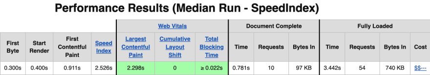 WebPageTest performance results when positioning buttons with props (image source: WebPageTest)
 WebPageTest performance results when positioning buttons with data attribute selectors (image source: WebPageTest)
With data attribute selectors, the rendering speed is slightly improved, with Largest Contentful Paint (LCP) 0.2 seconds faster.
LCP is one of the Core Web Vitals, which affects Google search ranking (Subramanian 2020). So it is desirable to have it as short as possible.
Next step
Making buttons for My Ideal Map App is not finished yet, however. I need to set their color scheme for the dark mode. And there is a big gotcha for switching the color scheme between light and dark modes, because I use Next.js, a static site generator. Next article will discuss these experiences of mine.
References
Adhuham (2020) “A Complete Guide to Dark Mode on the Web”, CSS-Tricks, Jul 1, 2020.
Arvanitakis, Aggelos (2019) “The unseen performance costs of modern CSS-in-JS libraries in React apps”, Web Performance Calendar, Dec 9, 2019.
Chenais, Louis (2021) “Introduction to design tokens”, Specify Blog, May 27, 2021.
Comeau, Josh (2021a) “The styled-components Happy Path”, joshwcomeau.com, Feb 21, 2021.
Comeau, Josh (2021b) “What the heck, z-index??”, joshwcomeau.com, Jun 9, 2021.
Comeau, Josh (2021c) “Demystifying styled-components”, joshwcomeau.com, Jun 27, 2021.
Coyier, Chris (2020) “A Complete Guide to Data Attributes”, CSS-Tricks, Feb 17, 2020.
Coyier, Chris (2021) “A Complete Guide to Custom Properties”, CSS-Tricks, Apr 27, 2021.
Dodds, Kent C. (2020) “Use CSS Variables instead of React Context”, Epic React, Oct 2020.
Pernice, Kara, and Raluca Budiu (2016) “Hamburger Menus and Hidden Navigation Hurt UX Metrics”, Nielsen Norman Group, Jun 26, 2016.
Rendle, Robin (2019) “What Are Design Tokens?”, CSS-Tricks, Apr 3, 2019.
Schwartz, Barry (2005) “The paradox of choice”, TED, July 2005.
Seno, Broto (2019) “The state of the hamburger menu”, UX Collective, Apr 5, 2019.
Sherwin, Katie (2014) “The Magnifying-Glass Icon in Search Design: Pros and Cons", Nielsen Norman Group, Feb 23, 2014.
Subramanian, Sowmya (2020) “Evaluating page experience for a better web”, Google Search Central Blog, May 28, 2020.
Syzonenko, Artem (2019) “Buttons on the web: placement and order”, UX Collective, May 26, 2019.
Walton, Philip (2013) “What No One Told You About Z-Index”, philipwalton.com, Jan 15, 2013.
This content originally appeared on DEV Community and was authored by Masa Kudamatsu
Masa Kudamatsu | Sciencx (2021-10-07T11:39:31+00:00) Day 8: Positioning buttons over embedded Google Maps. Retrieved from https://www.scien.cx/2021/10/07/day-8-positioning-buttons-over-embedded-google-maps/
Please log in to upload a file.
There are no updates yet.
Click the Upload button above to add an update.