
This content originally appeared on DEV Community and was authored by Rajat Gupta
Note: This is the first part of a 3 part series in which we'll understand the transform property of CSS.
In this part, we'll understand the value 'rotate' of the transform property.
The transform property is most commonly used in animations as it allows us to do a ton of things such as moving an element, scaling it, rotating it etc.
There are 5 types of "rotate" in the transform property:
1. transform: rotate();
2. transform: rotateX();
3. transform: rotateY();
4. transform: rotateZ();
5. transform: rotate3d;
Let's understand them one by one by applying these values on the below👇code:
<!DOCTYPE html>
<html lang="en">
<head>
    <meta charset="UTF-8">
    <meta http-equiv="X-UA-Compatible" content="IE=edge">
    <meta name="viewport" content="width=device-width, initial-scale=1.0">
    <title>Document</title>
    <style>
        body{
            display: flex;
            justify-content: center;
            height: 100vh;
            align-items: center;
        }
        img{
            height: 120px;
            width: 250px;
            object-fit: cover;
        }
    </style>
</head>

<body>
    <div>
        <img src="tiger.jpg" alt="">
    </div>
</body>
</html>

Note: Although I am applying these values on an image, you can do the same for any element (div, nav, p, h1 etc).
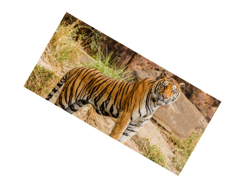
1. transform: rotate()
This property is used to rotate our element. Compared to the other rotate values, we'll use this value in 90% of the use cases. see the below example to understand:
img{
            height: 120px;
            width: 250px;
            object-fit: cover;
            transform: rotate(30deg);
        }
As you could see below 👇 our image gets rotated by 30 degrees.
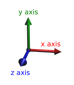
Now, instead of "deg" we can also use the unit "turn" (0.25turn = 90deg). Before proceeding further have a look at the diagram below.
2. transform: rotateX()
Here the image will rotate along the x-axis. The top is getting away from us and the bottom is getting closer.
img{
            height: 120px;
            width: 250px;
            object-fit: cover;
            transform: rotateX(0.15turn);
        }

Let us see another example:
img{
            height: 120px;
            width: 250px;
            object-fit: cover;
            transform: rotateX(0.25turn);
        }

There is an image above👆, can you see it? and no, I can't because it gets rotated 90 degrees(0.25 turn) along the x-axis.
3. transform: rotateY()
Here the image will rotate along the y-axis. We can see the image getting skinnier as the left side of the image is getting closer and the right side is getting away from us.
img{
            height: 120px;
            width: 250px;
            object-fit: cover;
            transform: rotateY(0.15turn);
        }

4. transform: rotateZ()
Here the image will rotate along the z-axis. Therefore "transform: rotateZ()" = "transform: rotate". They both behave the same way.
5. transform: rotate3d()
This is quite confusing and difficult to use. I would recommend you to stick to the above four. Although as I said earlier we'll use "transform: rotate()" in 90% of our use cases.
PS: I'll provide you with the link to my next blogs on transform here (after writing the same).
If you have any doubt ask me in the comments section and I'll try to answer as soon as possible.
I write one article every day related to web development (yes, every single f*cking day). Follow me here if you are learning the same..
my Twitter handle: @therajatg
If you are the Linkedin type, let's connect: https://www.linkedin.com/in/therajatg/
Have an awesome day ahead 😀!
This content originally appeared on DEV Community and was authored by Rajat Gupta
Rajat Gupta | Sciencx (2022-02-03T20:31:10+00:00) transform property in css- part 1. Retrieved from https://www.scien.cx/2022/02/03/transform-property-in-css-part-1/
Please log in to upload a file.
There are no updates yet.
Click the Upload button above to add an update.