
This content originally appeared on Level Up Coding - Medium and was authored by Sheri Wilson
Designing Accessible Components for the Web
Code an ADA Compliant Listbox in React

I don’t need the background, just take me straight to the code
Who should read this?
For the purposes of this article, let’s assume the following:
- You have some general knowledge of front-end web development or specific knowledge of the React framework
- You want to learn more about coding for accessibility, regardless of your current knowledge. Maybe it’s become important for your job role or is just an area where you’d like to gain more expertise.
I won’t delve into the complexities of ADA Compliance in this article; others have already written great pieces on this topic. But, for those who are new to this facet of software engineering and just need some general understanding, a website is accessible if it can be used successfully by persons with disabilities. For example, someone with vision problems may require a screenreader to relay the information on the screen to them, or someone unable to use a mouse or trackpad may need to traverse the site with a keyboard.
Most of the time, accessible coding isn’t very hard. There are a few main rules that cover most of it for you:
- Always use correct and precise HTML5 semantic elements. If you need a button on your site, use a <button> tag. Yes, it’s possible to style a <div> tag to look like a button and add an event listener to it so it behaves exactly like a button. A sighted user wouldn’t know the difference. However, then you’d also need to add ARIA tags to tell a screenreader that this is supposed to be a button. You’d need to add a tabindex property in order to make the <div> behave like an interactive element that will receive focus if the user tabs through the page with a keyboard. You’d have to go to a lot of trouble to make your custom element accessible. When you use precise semantic elements, you get the accessibility for free.
- Use your precise HTML5 semantic elements to create a logical and hierarchal page structure. Have a single <h1> tag on every page and make certain that lesser headings only come after it. Wrap the main content in a <main> tag and fill it with <section> tags. The <h1> tag goes with <main>. CSS can change the appearance of nearly everything on your site, but accessibility just relies on the simple structure of the page to interpret the type of information that needs to be relayed to the user and make the page easy for disabled individuals to navigate.
Those 2 rules (which are really sort of 1 extended rule) probably take care of 80% of accessibility concerns when coding.
Reasons to build a custom accessible component
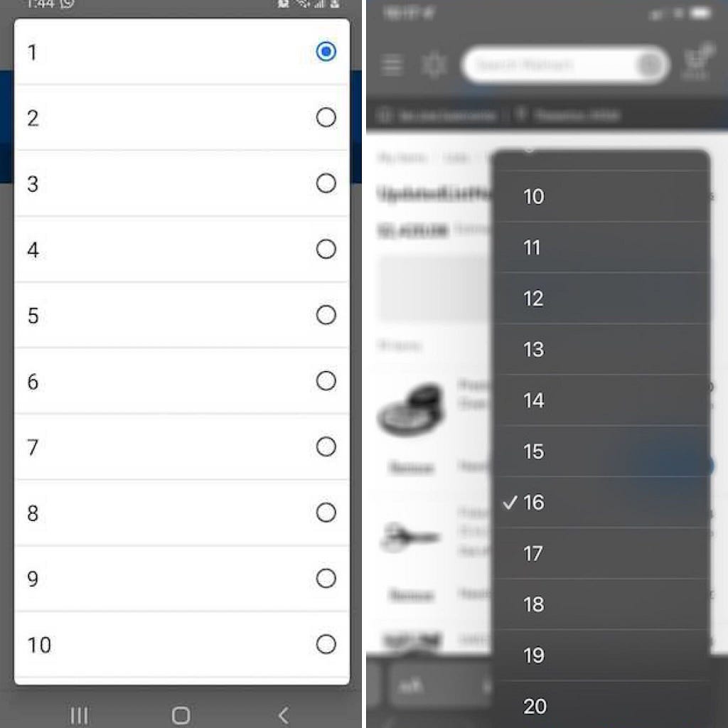
What happens when you can’t easily apply the above simple rules? My requirement was to develop a feature where the user would interact with a dropdown. Some mocks from UX were included that presented the dropdown with explicit styling. There was also a requirement to use the native <select> tag on mobile web for this feature in order to take advantage of browser-specific styling on small screens. Only desktop browsers would use the explicitly styled dropdown mocked by UX.
There are a couple things to take note of here…
- My tickets acknowledged that a native <select> tag will be styled differently on every browser, particularly mobile ones. Developers have few options to control that styling directly. I spent a little time to research this without turning up anything new, but I couldn’t find a way to coax a native <select> tag to match my UX mocks.
- To NOT use a native <select> tag automatically puts accessibility at risk for this feature because I’d have to break the first rule of accessible coding — use semantic elements. There simply wasn’t an available, out-of-the-HTML5-box element for this use case. I would need to build my own.
Accessible Authoring Guidelines
The Goals
There are 2 main areas to be concerned with when it comes to building accessible web applications:
- Keyboard navigation — is a user able to traverse the webpage with keyboard only? Is focus unexpectedly lost when navigating between elements? Does keyboard navigation behavior follow expected patterns?
- Screenreader announcements — does a user of assistance technology (AT) have access to the same information that is available visually? Are AT users notified of errors or other significant changes to the page?
The World Wide Web Consortium (W3C) provides comprehensive web accessibility resources. Included within their hierarchy of links are authoring guides which precisely describe the expected behavior of every component. (Note: the W3C site will refer to widgets, while the common term in React is component. I feel these terms can be used interchangeably. The bottom line is that we’re building an interactive piece of a webpage that has a specific function.)
After looking through the options, there is no reference to a <select> tag, but that’s because this site doesn’t cover the behavior of native HTML elements. It covers what we need to incorporate in creating our own accessible elements.
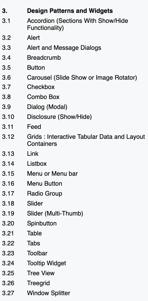
If we explore these design patterns a little further, we find that a Listbox describes the functionality of a native <select> element, so that’s what we’ll code. Actually, there are variations of functionality that can be achieved depending on how this component is authored. For example, we may want the user to be able to make multiple selections or to be able to scroll within the selections. The site includes detailed explanations for how to code each of these variations accessibly. For this example, we’re specifically going to code a Collapsible Listbox.
The site provides us with 2 charts, one for each main area of concern, that lay out precisely what we need to code in order for the listbox to work the way it’s supposed to.
So, this completes all the background to the Accessible Listbox. On to the code!
Coding the Accessible Listbox
To summarize before diving in, the challenge is to design and build an accessible component that will behave exactly the same as a native <select> tag.
We’re going to build our accessible custom listbox in React, but the goals we want to achieve for accessibility would be the same regardless of the specific framework or library used.
Keyboard navigation
This chart shows us the keyboard interactions we’ll need to support. Let’s begin to break this down. Reading through the requirements, we see that we’ll have a button that will toggle the listbox state between collapsed and expanded. Specific keys then have specific capabilities depending on that state.
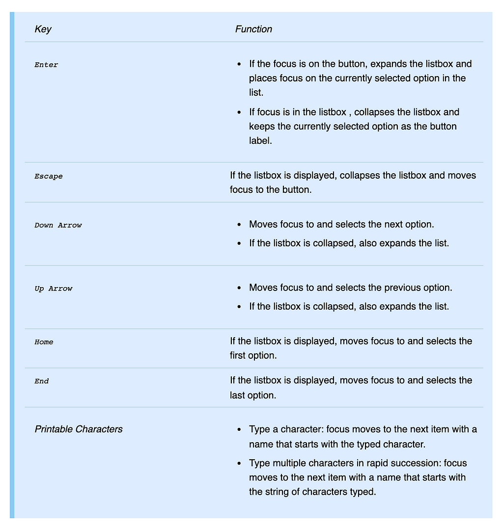
So this is what we’re going to build:
- A component with a button that will toggle between showing and hiding a dropdown.
- The dropdown will present options from an array of strings passed in as a prop, and consist of a <ul> tag that will map through a list item for each option.
- We’ll need a few helper functions and state to handle the toggle.
Focusing in React
Since this is a React project, we’re going to set Refs on our main DOM elements to manage focus. This is considered one of the main acceptable uses of Refs in React. We’ll need direct DOM access to every element — the outer listbox <div>, the button, and the list item elements — in order to be able to call the focus method on them.
Initial Code
The code below is a starting structure for the Listbox component. Refs are set on all the necessary elements, but we’re only managing focus on the button when it’s clicked in the toggleDropdown function. Truthfully, the browser really takes care of this for us anyway since we’re using a native HTML <button>. The code would still work the same without setting explicit focus on line 43. However, the rest of the elements will need to have focus managed explicitly in order to behave like a native <select>.
Managing Focus
The Listbox has anonSelected method that expects either a MouseEvent or a KeyboardEvent when the user interacts with the button. Regardless of the event type, the onChange and toggleDropdown methods are executed.
We need some focus handling methods that will only respond to keyboard events. The functions below will implement the keyboard behavior defined by the W3C for a Collapsible Listbox as outlined in the Keyboard Support chart.
Important Considerations
- The use of event.preventDefault() is especially important here so that only the specified keyboard behavior is implemented, although not all keys require it.
- We also need to consider that the list items are not natively interactive elements, so they‘re normally unable to receive browser focus. That means we’ll need to control their ability to be focused ourselves. We can do this by conditionally setting thetabindex attribute of each list item to -1 when it needs focus.
handleButtonPress fires on the button to toggle the dropdown when the button is clicked and returns focus to the button
handleKeyPress fires on the individual list items with specific behavior for specific keys.
Keyboard interactions within the list items are now being handled, but there’s still no way to transfer focus from the button to the list items for keyboard users. After examining the requirements, we see that we really always want to focus on the selected option when the Listbox is expanded, so we can just focus automagically in a useEffect.
In this example, focusedValue is going to be tracked with a Ref so we can maintain the value between renders. We can’t use state here or the value will be reset whenever the dropdown is collapsed and expanded again. We want to have the focus in the listbox always reflect the selected option if the user opens and closes the dropdown multiple times. If this were an application fetching and mutating data from a backend via this Listbox, we could rely on state for this.
Keyboard navigation is now working! Using a keyboard only, a user can perform all of the following actions using the same keys as expected for a native <select> tag:
- Open and close the dropdown
- Traverse the dropdown options
- Leave the listbox
Managing ARIA
As far as the browser is concerned though, this component is still not a Listbox just because the keyboard navigation is suggestive of one. To the browser, this is still just a collection of generic elements. ARIA provides a way to let the browser know it’s rendering a Listbox. As defined in the MDN Web Docs:
Accessible Rich Internet Applications (ARIA) is a set of attributes that define ways to make web content and web applications (especially those developed with JavaScript) more accessible to people with disabilities.
Returning to the authoring practices for a Collapsable Listbox, there is another chart which addresses the expected attributes. We’ve actually already covered one attribute, the tabindex needed for focus in keyboard navigation.
The remainder of the attributes are ARIA attributes, and the Usage column in the chart references HTML on the site that provides a clear example to follow when setting these attributes within our own listbox if we inspect the elements there.
The Usage column also provides some indication of each attribute’s purpose.
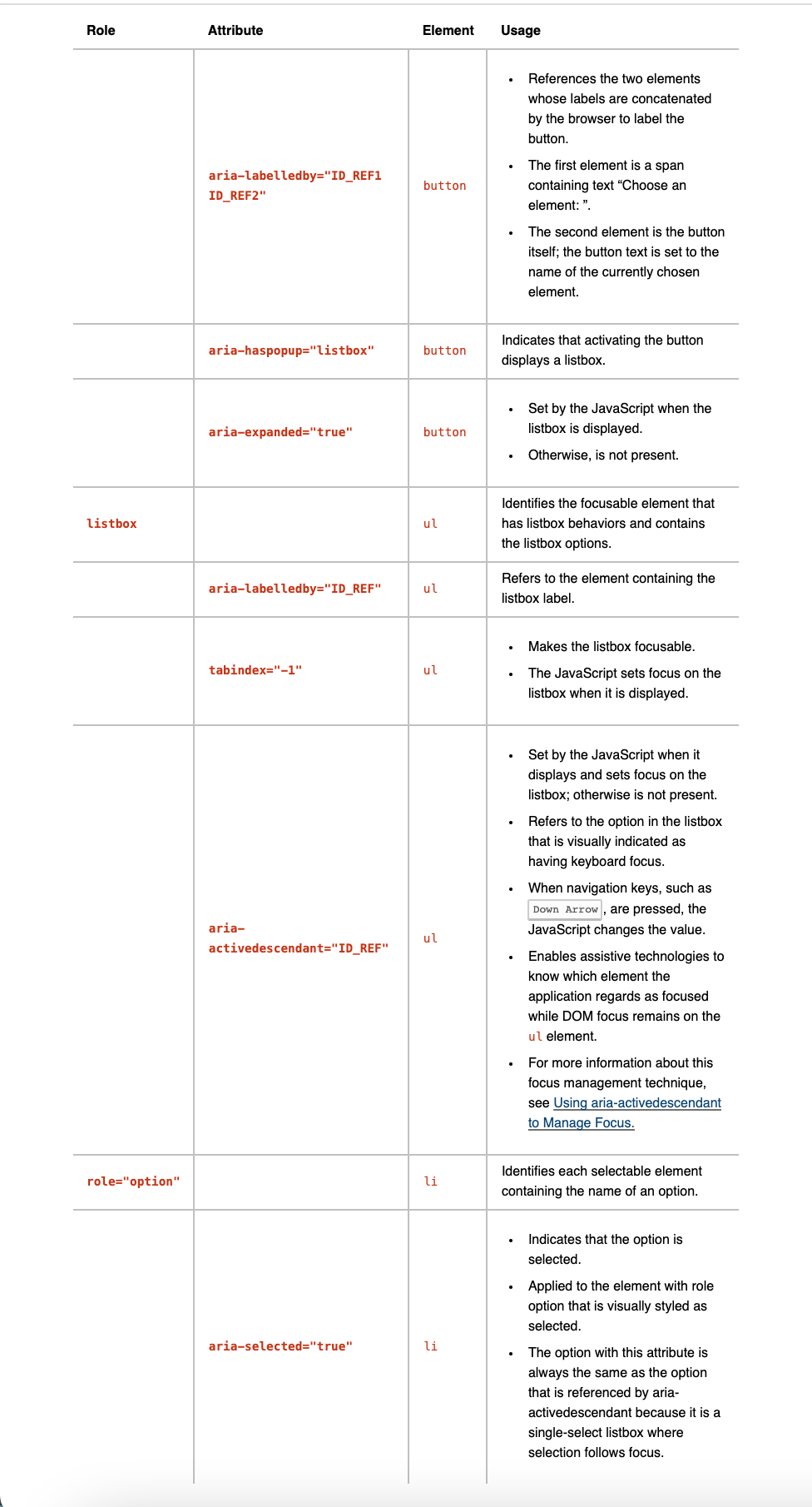
We need to set IDs on some elements so we can reference them when setting ARIA attribute values. We also need to make sure that IDs on a page will be unique even if we render multiple instances of the listbox, so let’s add a prop to ensure we can pass a unique value in.
After adding these ARIA attributes, a screen reader will announce the purpose and state of the button.
Let’s continue with the <ul> and <li> elements. Along with setting various ARIA attributes, we need to assign the roles of listbox to the <ul> and option to each <li> to indicate their purpose to the browser as part of this widget.
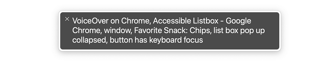
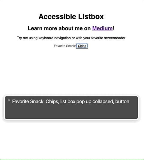
Accessible Listbox in Action
Wrapping Up
The Listbox is now accessible! It’s still missing a lot of features we’d probably want to have for sighted users (maybe props in order to pass in classes for custom styling?), but it works for someone using a screenreader or keyboard navigation.
Here’s a summary of what was covered:
- Always use a semantic HTML5 element when possible.
- If not possible to use a semantic element:
- Find WAI-ARIA authoring guidelines for what you want to build.
- In React, manage focus by setting Refs on elements. This could also be handled with vanilla JavaScript.
- Set a tabindex attribute of -1 to allow a non-interactive element to programmatically receive focus.
- When coding functions for specific keys, note the default behavior for that key and preventDefault when appropriate.
- Set unique IDs on elements to reference for ARIA attributes (and make sure they’re unique to the webpage).
- Set ARIA attributes and roles on the elements.
Please visit this Code Sandbox to view the complete project and thank you for reading!
Designing Accessible Components for Web was originally published in Level Up Coding on Medium, where people are continuing the conversation by highlighting and responding to this story.
This content originally appeared on Level Up Coding - Medium and was authored by Sheri Wilson
Sheri Wilson | Sciencx (2022-02-07T00:30:53+00:00) Designing Accessible Components for Web. Retrieved from https://www.scien.cx/2022/02/07/designing-accessible-components-for-web/
Please log in to upload a file.
There are no updates yet.
Click the Upload button above to add an update.