This content originally appeared on Level Up Coding - Medium and was authored by Anjan Shomodder

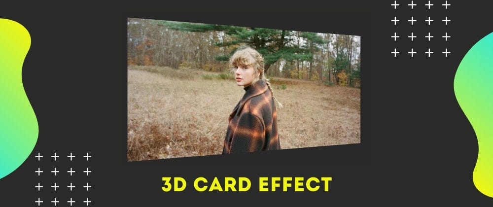
In this article, I will show you how to create a 3D card flipping effect with vanilla HTML and CSS.
Video Tutorial
I have already made a video about it on my youtube channel. Check that out.
Please like and subscribe to Cules Coding. It motivates me to create more content like this.
HTML
<div class="flip-box">
    <div class="flip-box-inner">
        <div class="flip-box-front">
            <img src="1.webp" alt="Paris" />
        </div>
        <div class="flip-box-back">
            <h1>Taylor Swift</h1>
        </div>
    </div>
</div>
Explanation:
- flip-box is the parent element. It will stay the same.
- flip-box-inner is the child element. It will actually rotate.
- flip-box-front is the front part and will be visible.
- flip-box-back is the back part and will be hidden.
CSS
* {
    padding: 0;
    margin: 0;
    box-sizing: border-box;
}

body {
    display: grid;
    place-items: center;
    min-height: 100vh;
    overflow: hidden;
    font-family: 'Segoe UI', Tahoma, Geneva, Verdana, sans-serif;
}

h1 {
    font-size: 3rem;
}

.flip-box {
    background-color: transparent;
    width: 60vw;
    perspective: 1000px;
    cursor: pointer;
}
Explanation:
- Some basic styles to center the flip-box.
- perspective property is for the 3d effect. I don't understand how it works but it works.

Learn more about the perspective property here.
.flip-box-inner {
    position: relative;
    width: 100%;
    height: 100%;
    padding-top: 52.65%;
    text-align: center;
    transition: transform 0.8s;
    transform-style: preserve-3d;
}

.flip-box:hover .flip-box-inner {
    transform: rotateY(180deg);
}

img {
    width: 100%;
    height: 100%;
    object-fit: cover;
}
Explanation:
- flip-box-inner is position relative. The front and the back element will be positioned relative to the parent element.
- padding-top is 52.65% of the parent element. This is for maintaining the ratio so that our image stays responsive. If you want to learn more in-depth, you can watch the following video.
- transform-style is preserve-3d. This is for maintaining the 3d effect.
.flip-box-front,
.flip-box-back {
    position: absolute;
    top: 0;
    left: 0;
    width: 100%;
    height: 100%;
    -webkit-backface-visibility: hidden; /* Safari */
    backface-visibility: hidden;
}

.flip-box-front {
    color: black;
}

.flip-box-back {
    background-color: #ff6f00;
    color: white;
    transform: rotateY(180deg);
    display: grid;
    align-content: center;
}

@media screen and (max-width: 600px) {
    .flip-box-inner {
        padding-top: 100%;
    }
    .flip-box {
        width: 90vw;
    }
}
Explanation:
- flip-box-front and flip-box-back are aligned with the parent element.
- backface-visibility is for hiding the backside of the element when we will rotate.
- transform: rotateY(180deg); is for rotating the back element. Because we want the front element to be visible when the page loads
- Finally some code for media queries.
Shameless Plug
I have made a few project based videos with vanilla HTML, CSS, and JavaScript.
You will learn about:
- Javascript intersection observer to add cool effects
- DOM manipulation
- Aligning elements with CSS positions.
- How to make responsive websites.
These will be great projects to brush up on your front end skills.
If you are interested you can check the videos.
Please like and subscribe to Cules Coding. It motivates me to create more content like this.
That’s it for this blog. I have tried to explain things simply. If you get stuck, you can ask me questions.
By the way, I am looking for a new opportunity in a company where I can provide great value with my skills. If you are a recruiter, looking for someone skilled in full stack web development, feel free to contact me. Also, I am open to talking about any freelance project.
See my work from here
Contacts
- Email: thatanjan@gmail.com
- LinkedIn: @thatanjan
- portfolio: anjan
- Github: @thatanjan
- Twitter: @thatanjan
3D card flipping effect with vanilla HTML and CSS was originally published in Level Up Coding on Medium, where people are continuing the conversation by highlighting and responding to this story.
This content originally appeared on Level Up Coding - Medium and was authored by Anjan Shomodder
Anjan Shomodder | Sciencx (2022-03-29T19:38:26+00:00) 3D card flipping effect with vanilla HTML and CSS. Retrieved from https://www.scien.cx/2022/03/29/3d-card-flipping-effect-with-vanilla-html-and-css/
Please log in to upload a file.
There are no updates yet.
Click the Upload button above to add an update.
