
This content originally appeared on Bits and Pieces - Medium and was authored by Jonathan Saring
How to create extendable React components that you can easily evolve and compose with other components.
Components should be written once and evolved over time.
That means that new components should be written with extendability in mind, making them easy to evolve and compose together by design.
Just like Atoms and Molecules in nature, the granular pieces rarely change — it is how you compose them that decides what you create.
At Bit, we build everything in components as composable software.
That also means building our UI in components with React, TS and friends. We know that every component we make can and should be composed with other components to create infinite new experiences for the dev community.
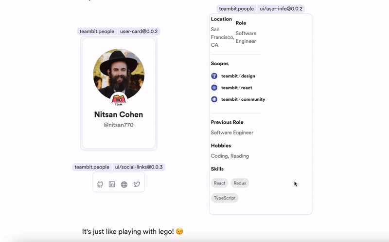
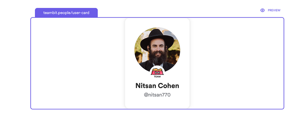
For example, here’s the user-card used on bit.cloud:
And here’s the user info component that adds information to the user card:
And here’s the social-links component that adds the user’s social links:
Each of these is an “Atomic” component that can be composed with the others to create the complete Bit user-card experience:
Extending the component with Plugins
So how is it done?
As you can see, we’ve chosen to extend the component from the bottom and on the right side. The thing about plugins is that they don’t offer limitless options, but once you choose you get a great dev experience.
CSS is simple here
First we’ll set our card container to be a flexbox. The first default div is our user card and every div that will enter after it will be on its right as this is the default behavior of CSS flexbox.
By defining the user-card div as a flexbox with a flex-direction of a column, we will get precisely the behavior we want. Every div we insert inside the user card div will take its position right below the existing content.
We will give user-card a width of 50% so that when we inject the plugin on the right, they both take an equal space. But we will also add the pseudo-class :only-child to give it 100% width when we don't render any plugins.
Go ahead and fork the user-card component to your local Workspace. It will be easier to follow the code coming up (make sure to have bit installed).
bit fork teambit.people/user-card
Planning the extendable card component API
Now comes the interesting part: planning the API!
Here is the API for the user-card:
export type UserCardProps = {
  /**
   * The username to fetch the user profile from the cloud API.
   * */
  username: string;
/**
* Plugins to be injected to the bottom and right side of the card.
* */
plugins?: UserCardPlugin<unknown, unknown>[];
} & React.HTMLAttributes<HTMLDivElement>;
The plugins array will contain objects that store a component either on the right or the bottom key. Here’s the interface:
import { ComponentType } from "react";export interface UserCardPlugin<T = {}, P = {}> {
bottom?: ComponentType<T>;
right?: ComponentType<P>;
}We are then using the find() method to store the first plugin we encounter in that array (we do it to limit the consumers of our component, in case they decide to pass more than one plugin:
const BottomPlugin = plugins?.find((plugin) => plugin.bottom);
const RightPlugin = plugins?.find((plugin) => plugin.right);
Finally, we render the bottom plugin inside the first div (the column), and the right plugin in the main div:
<div className={classNames(styles.cardContainer, className)} {...rest}>
  <div className={styles.userCard}>
    ...
    {BottomPlugin?.bottom && <BottomPlugin.bottom />}
  </div>
{RightPlugin?.right && (
<>
<div className={styles.verticalLine} />
<RightPlugin.right />
</>
)}
</div>Creating the plugins
We have to create a class that implements our UserCardPlugin interface and injects a component in the right place. Here’s how it looks:
export class SocialLinksPlugin implements UserCardPlugin {
  constructor(readonly links: SocialLinksProps["links"]) {}
  bottom? = () => <SocialLinks links={this.links} />;
}
Now we can initiate the class inside the plugins array:
<UserCard
  className={styles.employeeCard}
  {...rest}
  username={username}
  plugins={[
    new SocialLinksPlugin([
      { url: "https://github.com/NitsanCohen770", name: "github" },
      { url: "https://www.linkedin.com/in/nitsan-cohen/", name: "linkedin" },
      { url: "soon", name: "website" },
      { url: "https://twitter.com/bitdev_", name: "twitter" },
    ]),
    new UserInfoPlugin(userInfo),
  ]}
/>
The benefits of composable components
Developer experience
Let’s say that later on, another task was open: create a developer card. The developer card structure is similar to the employee card, but instead of employee info, it has developer information on the right and ‘frameworks/programming languages’ at the bottom.
So how would we compose the developer card?
We could create a plugin for the developers’ information and the frameworks/programming languages. We would then inject them into the plugins array, and there you go — a developer card!
Collaboration and consistency
The place where this really shines is when it comes to collaboration. You can have a team of developers working on plugins, and you can share them throughout your projects. This is true autonomy.
Each plugin is independently versioned and has its own release pipeline. If a new version of a plugin is released, each team using it can decide whether they want to update the plugins’ version or not.
We for example use the same components to build Bit’s community (open-source) website, the bit cloud platform for teams, and even the bit blog. We extend and compose our components to create new experiences, but still get updates from each other and build in harmony.
Efficiency and velocity
When you don’t have to rewrite the same component in many projects and you don’t have to maintain many instances of the same code, you make it easier to develop efficiently, fast, and at a larger scale.
This means that composability and extendability don’t just make for a better software design and developer experience, but also better business. That’s not surprising; The most scalable and efficient systems in the universe and in nature on this planet are built of Atomic and extendable components.
Based on this great article by my amazing teammate Nitsan Cohen:
Extending UI components: Better Developer Experience was originally published in Bits and Pieces on Medium, where people are continuing the conversation by highlighting and responding to this story.
This content originally appeared on Bits and Pieces - Medium and was authored by Jonathan Saring
Jonathan Saring | Sciencx (2022-04-20T13:50:36+00:00) Extending UI components: Better Developer Experience. Retrieved from https://www.scien.cx/2022/04/20/extending-ui-components-better-developer-experience/
Please log in to upload a file.
There are no updates yet.
Click the Upload button above to add an update.