
This content originally appeared on Bits and Pieces - Medium and was authored by Mujtaba Murtaza
Your company would love you if you build the best accessible product for users.

The Problem
As a developer, it’s important to find tools and resources that make your job easier and more efficient. Specially in context to finding the right balance between great accessibility and ideal developer experience.
I love a11y and try to make things as accessible as possible but would rather prefer a library to do it for me. Now there are component libraries such as MUI, React Bootstrap, etc, however, I prefer adding my own style to the components and it can be a quick tug-o-war with inspecting elements and overriding CSS using !important which would end up consuming more time than we need to. Specifically when you're working with a team and trying to ship features fast.
The Solution
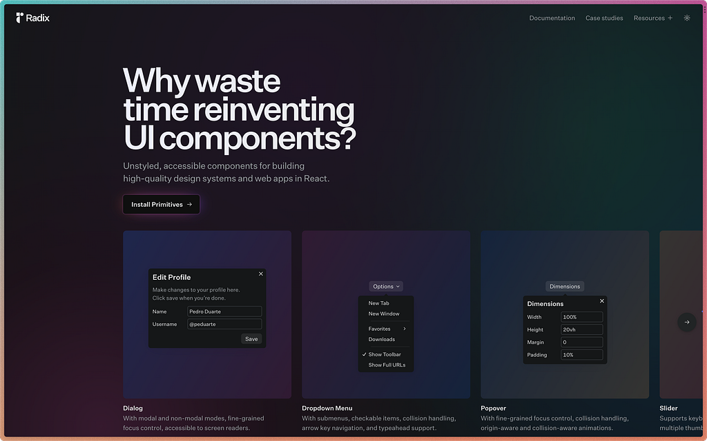
Key features
- Accessible — follows the WAI-ARIA design patterns. Includes cool accessibility stuff such as aria and role attributes, focus management, and keyboard navigation.
- Unstyled — comes completely raw and unstyled. Perfect for building your own design system and use any CSS framework to style components as per your needs.
- Opened — the open component architecture provides granular access to each component part which means you can wrap them and add your own events, props, or refs.
- Uncontrolled — depending on the component, they’re usually uncontrolled but can be controlled.
- Developer experience — Radix Primitives components share a similar API which makes it easy to use. They also have a asChild prop which gives us full control over the rendered element.
And the best of all — Incremental adoption which means you can download a primitive component individually and they’re versioned independently which helps in incremental adoption.
Enough talk. Let’s code
Let’s install a couple packages first:
yarn add @radix-ui/react-select
yarn add @radix-ui/react-icons
yarn add classnames
After that we’re going to magically spawn the component along with the styles that happens to be in a CodeSandbox below.
Before diving into the code
You should interact with the Select component and see how it works — clicking or keyboard navigating with it. You should also click on the first and last values and check how the component behaves when it’s too long (that’s the beauty of these Primitives that come with everything).
Code breakdown time!
Let’s start off with the anatomy of the component.
import React from "react";
import cn from "classnames";
import * as Select from "@radix-ui/react-select";
import {
  CheckIcon,
  ChevronDownIcon,
  ChevronUpIcon
} from "@radix-ui/react-icons";

import "./SelectDemo.css";

<Select.Root>
  <Select.Trigger>
    <Select.Value></Select.Value>
    <Select.Icon>...</Select.Icon>
  </Select.Trigger>
  <Select.Portal>
    <Select.Content>
      <Select.ScrollUpButton>...</Select.ScrollUpButton>

      <Select.Viewport>
        <Select.Group>
          <Select.Label>...</Select.Label>
          <Select.Item>...</Select.Item>
        </Select.Group>

        <Select.Separator />
      </Select.Viewport>

      <Select.ScrollDownButton>...</Select.ScrollDownButton>
    </Select.Content>
  </Select.Portal>
</Select.Root>
This should simplify a bit. The code above is just to get scaffold our component. If you want to understand what each specific component does and the props it accepts, then check out the API reference page.
Some components inside the anatomy are optional. For e.g, if you have only one type of list of options then you don’t need Select.Group , Select.Label and Select.Separator . You can also remove Select.ScrollUpButton and Select.ScrollDownButton if you prefer.
Adding content + design
Now that we have an understanding of the component’s anatomy, let’s add content to make it come to life. And design for making it look pretty.
import React from "react";
import cn from "classnames";
import * as Select from "@radix-ui/react-select";
import {
  CheckIcon,
  ChevronDownIcon,
  ChevronUpIcon
} from "@radix-ui/react-icons";

import "./SelectDemo.css";

<Select.Root>
  <Select.Trigger className="SelectTrigger" aria-label="Food">
    <Select.Value placeholder="Select..."></Select.Value>
    <Select.Icon>
      <ChevronDownIcon className="SelectIcon" />
    </Select.Icon>
  </Select.Trigger>
  <Select.Portal>
    <Select.Content className="SelectContent">
      <Select.ScrollUpButton className="SelectScrollButton">
        <ChevronUpIcon />
      </Select.ScrollUpButton>

      <Select.Viewport className="SelectViewport">
        <Select.Group>
          <Select.Label className="SelectLabel">Foods</Select.Label>
          <SelectItem value="burger">Burger</SelectItem>
          <SelectItem value="pizza">Pizza</SelectItem>
          <SelectItem value="popcorn">Popcorn</SelectItem>
          <SelectItem value="sandwich">Sandwich</SelectItem>
          <SelectItem value="steak">Steak</SelectItem>
        </Select.Group>

        <Select.Separator className="SelectSeparator" />

        <Select.Group>
          <Select.Label className="SelectLabel">Country</Select.Label>
          <SelectItem value="uae">Brazil</SelectItem>
          <SelectItem value="canada">Canada</SelectItem>
          <SelectItem value="singapore">Singapore</SelectItem>
          <SelectItem value="switzerland">Switzerland</SelectItem>
          <SelectItem value="thailand">Thailand</SelectItem>
        </Select.Group>

        <Select.Separator className="SelectSeparator" />

        <Select.Group>
          <Select.Label className="SelectLabel">Color</Select.Label>
          <SelectItem value="black">Black</SelectItem>
          <SelectItem value="green">Green</SelectItem>
          <SelectItem value="maroon">Red</SelectItem>
          <SelectItem value="white">White</SelectItem>
          <SelectItem value="yellow">Yellow</SelectItem>
        </Select.Group>
      </Select.Viewport>

      <Select.ScrollDownButton className="SelectScrollButton">
        <ChevronDownIcon />
      </Select.ScrollDownButton>
    </Select.Content>
  </Select.Portal>
</Select.Root>

const SelectItem = React.forwardRef(
  ({ children, className, ...props }, forwardedRef) => {
    return (
      <Select.Item
        className={cn("SelectItem", className)}
        {...props}
        ref={forwardedRef}
      >
        <Select.ItemIndicator className="SelectItemIndicator">
          <CheckIcon />
        </Select.ItemIndicator>
        <Select.ItemText>{children}</Select.ItemText>
      </Select.Item>
    );
  }
);

export default SelectDemo;
As mentioned before, you can remove the whole Select.Group component if you only have a single group of items.
Finally, let’s add our CSS:
.SelectTrigger {
  padding: 12px 16px;
  font-size: 16px;
  font-weight: 600;
  background-color: #faf3ec;
  border: 2px solid #27272b;
  border-radius: 12px;

  display: inline-flex;
  justify-content: center;
  align-items: center;
  column-gap: 8px;

  cursor: pointer;
}
.SelectTrigger:focus {
  outline: 2px solid #fad161;
}

.SelectIcon {
  display: flex;
  justify-content: center;
  align-items: center;
  stroke: #27272b;
}

.SelectContent {
  padding: 8px;
  background-color: #faf3ec;
  border-radius: 12px;
  box-shadow: 0px 10px 38px -10px rgba(22, 23, 24, 0.35),
    0px 10px 20px -15px rgba(22, 23, 24, 0.2);
}

.SelectScrollButton {
  color: #a04163;
  display: inline-flex;
  justify-content: center;
  align-items: center;
}

.SelectViewport {
  padding: 4px;
}

.SelectLabel {
  padding: 0 24px;
  margin-bottom: 8px;
  font-size: 12px;
  font-weight: 500;
  color: #aaaab2;
}

.SelectItem {
  padding: 6px 32px 6px 24px;
  font-size: 14px;
  font-weight: 500;
  color: #a04163;
}
.SelectItem:focus {
  background-color: #a04163;
  color: #faf3ec;
  outline: none;
  border-radius: 8px;
}

.SelectItemIndicator {
  position: absolute;
  left: 4px;
  width: 24px;
  display: inline-flex;
  justify-content: center;
}

.SelectSeparator {
  height: 1px;
  width: 100%;
  margin: 8px 0;
  background-color: #e8c5d2;
}
And there you have it. A fully accessible Select component! Way to go impressing the users and the dev team 🚀
Any drawbacks?
Well maybe a couple which is subjective:
- Code can look bloated — and this comes from a not-building-a-design-system perspective. If you’re just adopting this then it can look a bit intimidating. Specially if you're trying couple components on the same page.
- Not enough community support — I love Radix and I’m gonna keep using it but if I’m stuck, a quick Google search won’t do the trick. You might have to get a hold of the devs in the discussions section of the repo.
- This is not a replacement for building a proper design system. If you want to do that, you should reach for a tool such as Bit. There are a bunch of resources online that can show you how to do this and I’ll link a a few here, here and here.
Fun fact: I’ve been using Radix for a little over a year now. And I still haven’t explored a lot of components they have to offer.
If you happen to like this read in any way, then you should tap on the 👏 emoji and leave a comment what you wanna see next.
Build design systems with reusable components, just like Lego!

Bit’s open-source tool help 250,000+ devs to build apps with components.
Turn any UI, feature, or page into a reusable component — and share it across your applications. It’s easier to collaborate and build faster.
Split apps into components to make app development easier, and enjoy the best experience for the workflows you want:
→ Micro-Frontends
→ Design System
→ Code-Sharing and reuse
→ Monorepo
Learn more
- How We Build Micro Frontends
- How we Build a Component Design System
- Bit - Component driven development
- Build a design system · Bit
Enhance Your DX with Radix: A Customizable and A11y-Friendly React Component Library was originally published in Bits and Pieces on Medium, where people are continuing the conversation by highlighting and responding to this story.
This content originally appeared on Bits and Pieces - Medium and was authored by Mujtaba Murtaza
Mujtaba Murtaza | Sciencx (2023-02-04T07:22:26+00:00) Enhance Your DX with Radix: A Customizable and A11y-Friendly React Component Library. Retrieved from https://www.scien.cx/2023/02/04/enhance-your-dx-with-radix-a-customizable-and-a11y-friendly-react-component-library/
Please log in to upload a file.
There are no updates yet.
Click the Upload button above to add an update.