
This content originally appeared on Level Up Coding - Medium and was authored by Sumonta Saha Mridul
What can you do with flexbox in CSS?

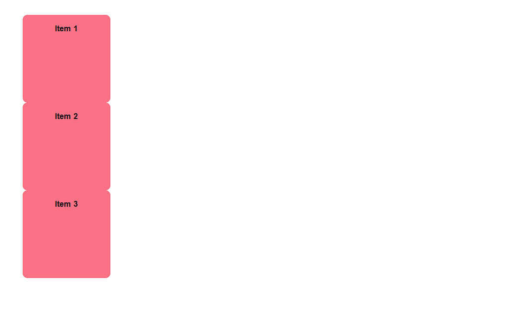
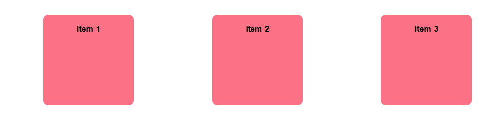
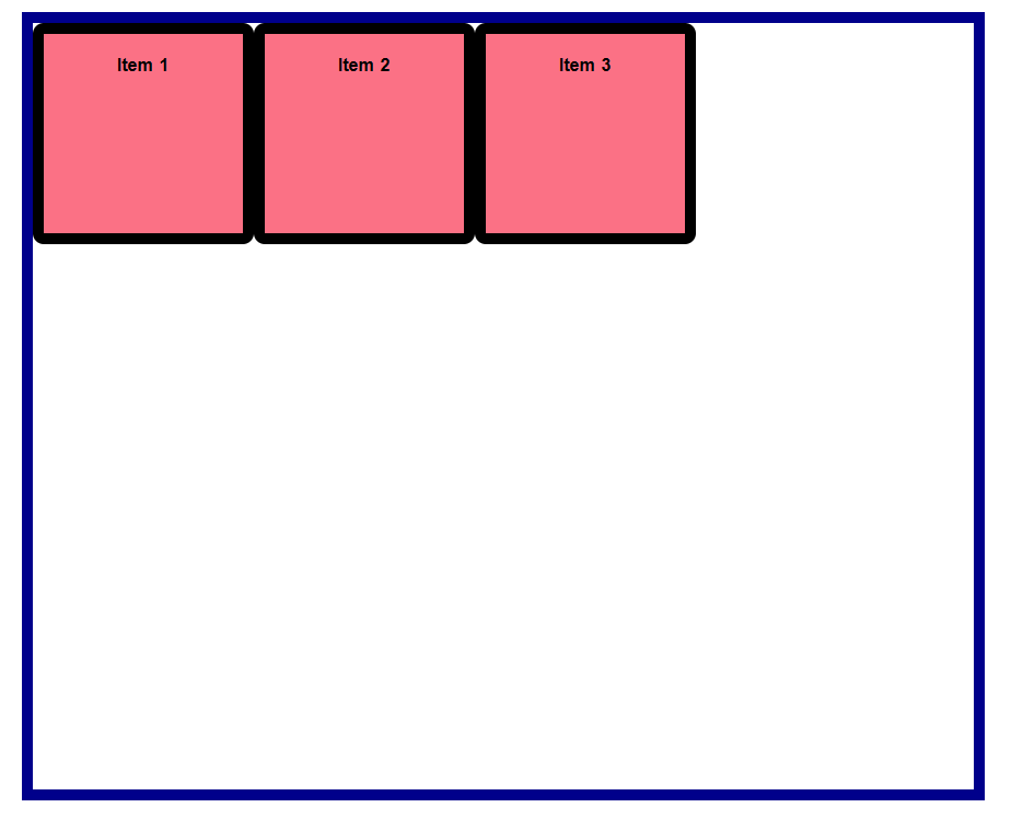
Let’s see how it looks if we don't use flexbox:
<div class="container">
        <div class="item item-1">Item 1</div>
        <div class="item item-2">Item 2</div>
        <div class="item item-3">Item 3</div>
</div>
body {
    margin: 0;
    padding: 0;
    line-height: 1.6;
    word-spacing: 1.4px;
    font-family: "Roboto", sans-serif;
    color: var(--clr-dark);
    background-color: var(--clr-light);
    display: flex;
    justify-content: center;
    align-items: center;
    height: 100vh;
}

.container {
    width: 80%;
    height: 700px;
    margin: 0 auto;
    /* border: 10px solid darkblue; */
}

.item {
    width: 150px;
    height: 150px;
    background-color: #fb7185;
    padding: 1em;
    font-weight: 700;
    color: var(--clr-light);
    text-align: center;
    /* border: 10px solid black; */
    border-radius: 10px;
}
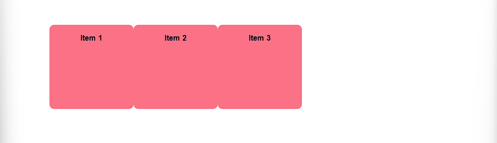
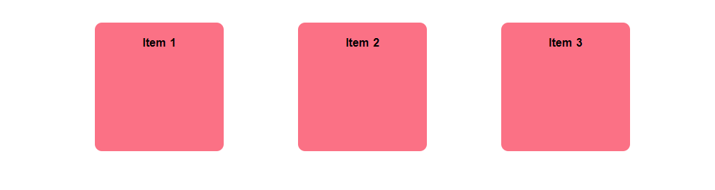
Let's give the container the display of flex in CSS.
.container {
    display: flex;
  }
Use of flex-direction Property
The flex-direction property specifies the direction of the flexible item.
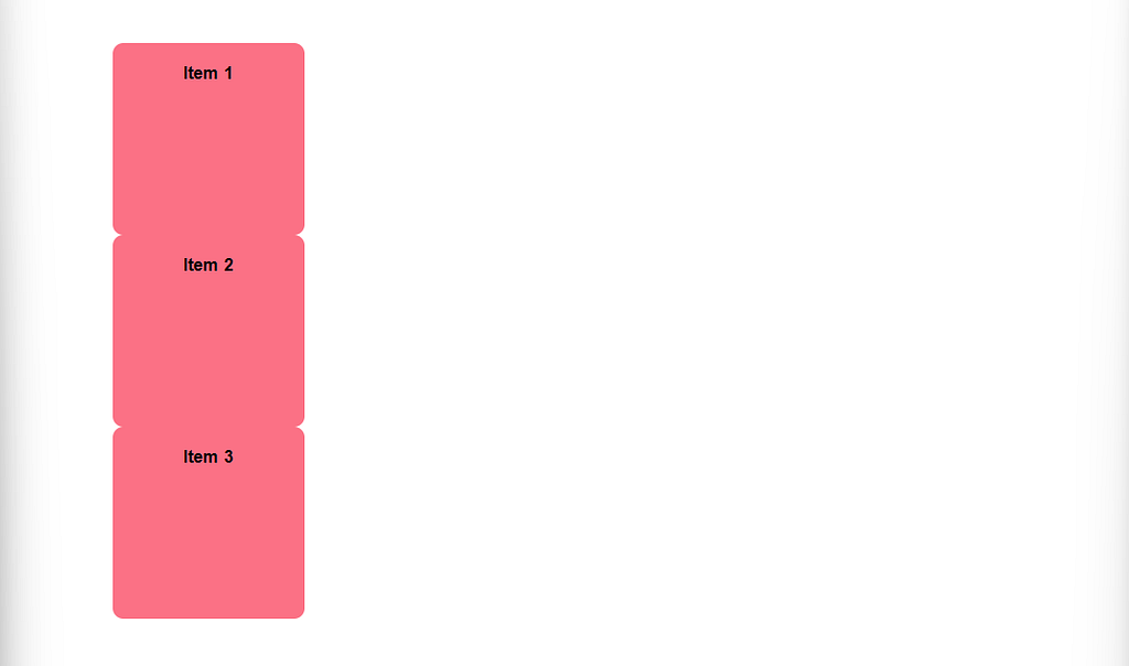
flex-direction: row
.container {
    display: flex;

   /* By default */
   flex-direction: row;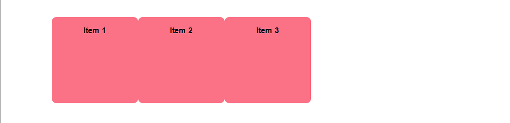
}flex-direction: column;
.container {
    display: flex;
    flex-direction: column;
  }
Use of Justify Content Property
The justify-content property is used in CSS to align and distribute flex items (the child elements of a flex container) along the main axis of the flex container.
flex-start
.container {
    display: flex;
    justify-content: flex-start; /* By Default */
  }
flex-end
.container {
    display: flex;
    justify-content: flex-end;
  }
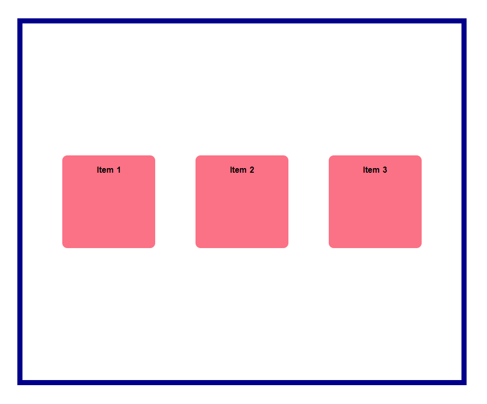
center
.container {
    display: flex;
    justify-content: center;
  }
space-between
.container {
    display: flex;
    justify-content: space-between;
  }
space-around
.container {
    display: flex;
    justify-content: space-around;
  }
space-evenly
.container {
    display: flex;
    justify-content: space-evenly;
  }
Use of Align-items Property
The align-items property is a CSS property that is used to define how flex items are aligned along the cross-axis of their container. It applies only to a flex container and has no effect on non-flex elements.
flex-start
.container {
    display: flex;
    justify-content: space-evenly;
    align-items: flex-start;
}
flex-end
.container {
    display: flex;
    justify-content: space-evenly;
    align-items: flex-end;
}
center
.container {
    display: flex;
    justify-content: space-evenly;
    align-items: center;
}
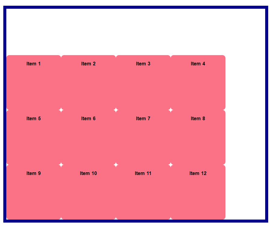
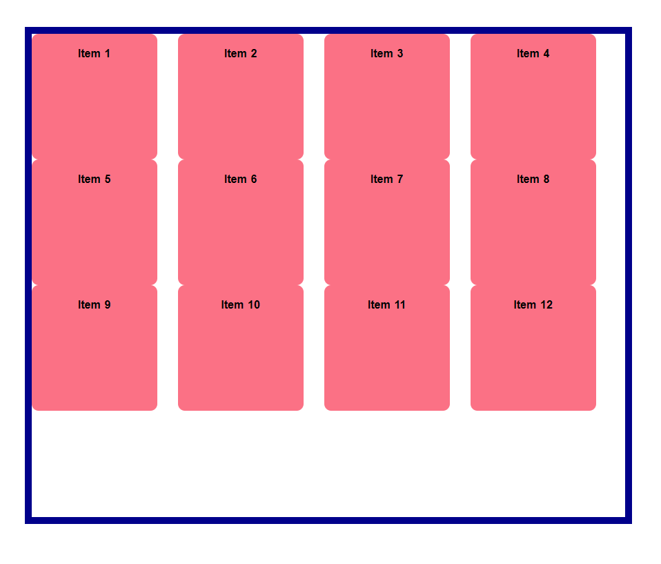
Use of flex-wrap Property
The flex-wrap property is a CSS property that controls whether flex items are forced into a single line or can be wrapped onto multiple lines within their container. It applies only to a flex container and has no effect on non-flex elements.
  <div class="container">
        <div class="item item-1">Item 1</div>
        <div class="item item-2">Item 2</div>
        <div class="item item-3">Item 3</div>
        <div class="item item-1">Item 4</div>
        <div class="item item-2">Item 5</div>
        <div class="item item-3">Item 6</div>
        <div class="item item-1">Item 7</div>
        <div class="item item-2">Item 8</div>
        <div class="item item-3">Item 9</div>
        <div class="item item-1">Item 10</div>
        <div class="item item-2">Item 11</div>
        <div class="item item-3">Item 12</div>
    </div>
nowarp
.container {
    display: flex;
    flex-wrap: nowrap; /* By Default */
}
wrap
.container {
    display: flex;
    flex-wrap: wrap;
}
Use of align-content Property
The align-content property is a CSS property that is used to control the vertical spacing and alignment of flex items within their container when there is extra space along the cross-axis. It applies only to a flex container with multiple lines of flex items and has no effect on non-flex elements or single-line flex containers.
flex-start
.container {
    display: flex;
    flex-wrap: wrap;

    /* only works when flex-wrap is enabled */
    align-content: flex-start;
}
flex-end
.container {
    display: flex;
    flex-wrap: wrap;

    /* only works when flex-wrap is enabled */
    align-content: flex-end;
}
center
.container {
    display: flex;
    flex-wrap: wrap;

    /* only works when flex-wrap is enabled */
    align-content: center;
}
space-between
.container {
    display: flex;
    flex-wrap: wrap;

    /* only works when flex-wrap is enabled */
    align-content: space-between;
}
space-around
.container {
    display: flex;
    flex-wrap: wrap;

    /* only works when flex-wrap is enabled */
    align-content: space-around;
}
Justify Content vs Align Content: space-around
.container {
    display: flex;
    flex-wrap: wrap;
    justify-content: space-around;
}
What if we use both Justify Content & Align Content: space-around
.container {
    display: flex;
    flex-wrap: wrap;
    justify-content: space-around;
    align-content: space-around;

}
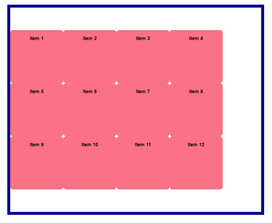
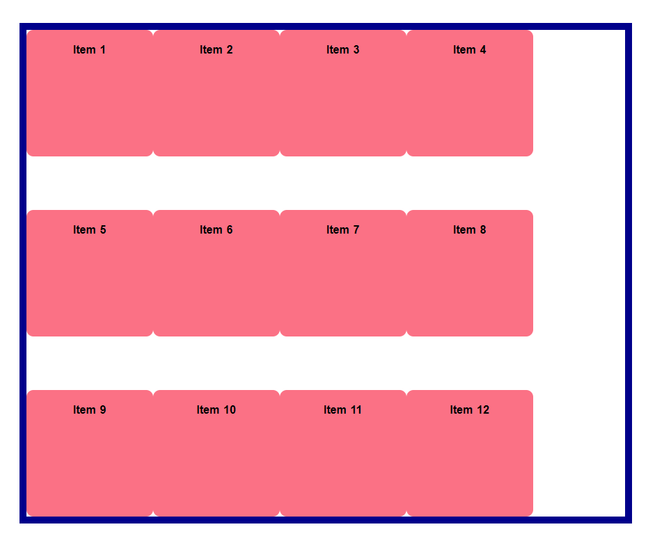
Use of Gap Property
gap is a CSS property that allows you to specify the spacing between grid items in a grid container.
Before Using Gap
.container {
    display: flex;
    flex-wrap: wrap;
    align-content: flex-start;
}
After Using Gap
.container {
    display: flex;
    flex-wrap: wrap;
    align-content: flex-start;
    gap: 40px;
}
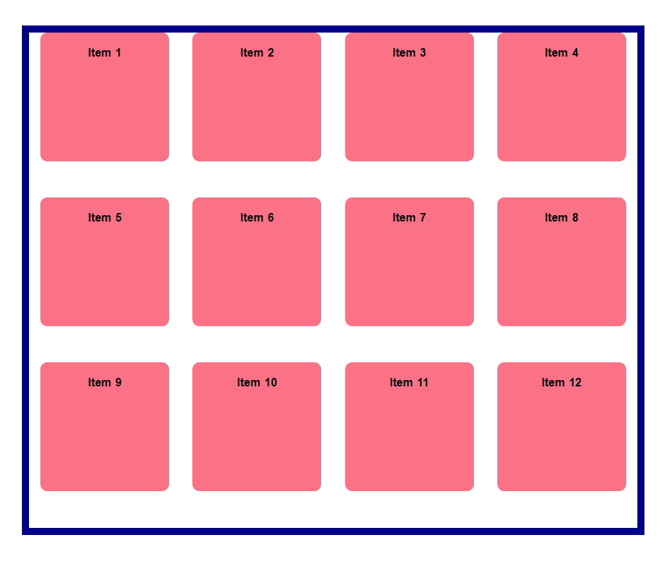
row-gap
.container {
    display: flex;
    flex-wrap: wrap;
    align-content: flex-start;
    row-gap: 40px;
}
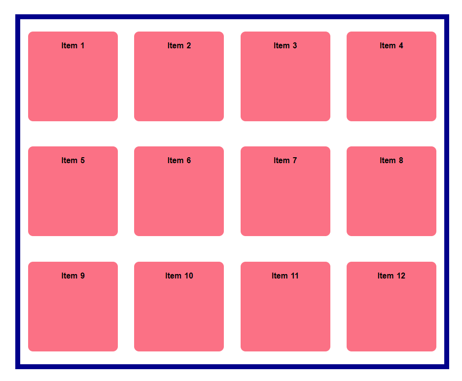
column-gap
.container {
    display: flex;
    flex-wrap: wrap;
    align-content: flex-start;
    column-gap: 30px;
}
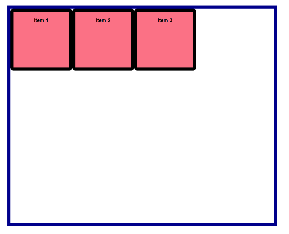
Use of flex-grow Property
flex-grow is a CSS property that is used in a flex container to specify how much an item should grow along the main axis if there is extra space available.
Before using flex-grow
<div class="container">
  <div class="item item-1">Item 1</div>
  <div class="item item-2">Item 2</div>
  <div class="item item-3">Item 3</div>
</div>
.container {
    display: flex;
}
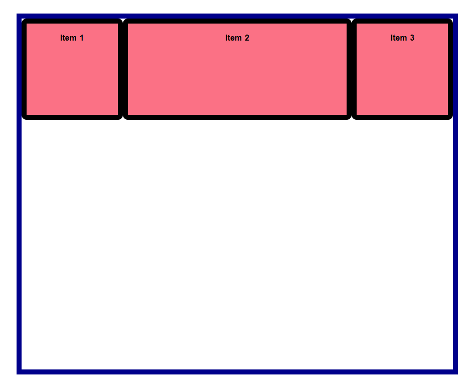
After using flex-grow
Using flex-grow in item-3
.container {
    display: flex;
}

.item-3{
    flex-grow: 1; /* by default flex-grow set to 0 */
}
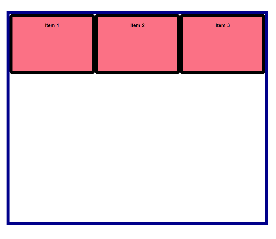
Using flex-grow in item-2
.container {
    display: flex;
}

.item-2{
    flex-grow: 1;
}
Using flex-grow in item-1,2,3
.container {
    display: flex;
}

.item-1 , .item-2 , .item-3{
    flex-grow: 1;
}
Use of flex-basis Property
Basically, if your item already has a size like a width but you want to overwrite that size with something else than you use flex-basis.
For example, my item has a width of 150px, I can overwrite that by setting the flex-basis to something else like 400px. Now my item has a width of 400px.
.container {
    display: flex;
}

.item-1 {
    width: 150px;
}
Now we are overwriting the size of item-1 using flex-basis
.container {
    display: flex;
}

.item-1 {
    width: 150px;
}

.item-1 {
   flex-basis: 300px;
}
Use of flex Property
flex is the shorthand property for the flex-grow, flex-shrink and flex-basis properties combined, but the second and third parameters are optional.
When you set flex shorthand property to only one value like flex: 1, the other 2 optional values are set automatically and intelligently for you.
Using flex in item 1
.container {
  display: flex;
}

.item-1 {
  flex: 1;
}


Use of order Property
By default, our items are laid out in the order of our HTML, item 1, item 2 and item 3.
However, we can use the order property to change the order in which items appear. If I want the last item to appear first, I can give it the order property and set it to -1. -1 because the default value for this property is 0, that means all item have an order of 0 so for us to have the third item appear first I need to set the third item to have an order of -1.
Using order in item 3
.container {
    display: flex;
}

.item-3 {
    order: -1;
}
Conclusion
let's recap the properties of Flex-box.
    display: flex;

    flex-direction: row;
    flex-direction: column;

    justify-content: flex-start;
    justify-content: flex-end;
    justify-content: center;
    justify-content: space-between;
    justify-content: space-around;
    justify-content: space-evenly;

    align-items: flex-start;
    align-items: flex-end;
    align-items: center;
    align-items: stretch;
    align-items: baseline;

    flex-wrap: nowrap;
    flex-wrap: wrap;
    flex-wrap: wrap-reverse;

    align-content: flex-start;
    align-content: flex-end;
    align-content: center;
    align-content: stretch;
    align-content: space-between;
    align-content: space-around;
    align-content: space-evenly;

    order: 0;
    order: 1;
    order: 2;
    order: 3;

    flex-grow: 0;
    flex-grow: 1;

    flex-basis: 0;
    flex-basis: 100px;

    flex: 1;
    flex: 0 0 0;
    flex: 1 1 1;

    gap: 0;
    gap: 1rem;
    gap: 2rem;
    row-gap: 1rem;
    column-gap: 1rem;
Level Up Coding
Thanks for being a part of our community! Before you go:
- 👏 Clap for the story and follow the author 👉
- 📰 View more content in the Level Up Coding publication
- 💰 Free coding interview course ⇒ View Course
- 🔔 Follow us: Twitter | LinkedIn | Newsletter
🚀👉 Join the Level Up talent collective and find an amazing job
Learn “Flexbox” in CSS was originally published in Level Up Coding on Medium, where people are continuing the conversation by highlighting and responding to this story.
This content originally appeared on Level Up Coding - Medium and was authored by Sumonta Saha Mridul
Sumonta Saha Mridul | Sciencx (2023-04-12T17:27:52+00:00) Learn “Flexbox” in CSS. Retrieved from https://www.scien.cx/2023/04/12/learn-flexbox-in-css/
Please log in to upload a file.
There are no updates yet.
Click the Upload button above to add an update.